The mobile web refers to websites accessed through mobile browsers on smartphones and tablets, designed to adapt to smaller screens, touch input, and varied network conditions. Unlike native apps, mobile websites don’t require installation and can be accessed instantly from any device with a browser.
This article explains what the mobile web is, how it works, how it differs from web apps, and why testing on real devices and browsers is critical for delivering reliable performance and responsive design.
What is Mobile Web?
Mobile web refers to browsing the internet using a web browser on a mobile device, such as a smartphone or tablet. This can include accessing websites, searching for information, and using web-based applications.
The main difference between mobile web and mobile web apps is that mobile web refers to accessing websites through a web browser, while mobile web apps are web-based applications that provide a more app-like experience.
Here are some examples:
Mobile web:
- Using a web browser such as Google Chrome, Safari, or Firefox on your smartphone to search for information on Google.
- Checking your email using the web-based version of Gmail.
- Visiting a news website, such as CNN or BBC, to read the latest headlines.
Mobile web apps:
- Using the Twitter mobile web app to browse tweets and post updates.
- Using the Google Maps web app to get directions and search for nearby locations.
- Accessing the Spotify web app to stream music on your mobile device.
Both mobile web and mobile web apps offer a way to access the internet and web-based content on mobile devices. However, mobile web apps provide a more app-like experience, while mobile web is more focused on browsing websites.
Learn More: All about Mobile Browser Automation
Why Do You Need Mobile Web?
Whether users are shopping, reading, or troubleshooting, they expect fast, seamless experiences on any screen.
Here’s why mobile web matters:
- Majority of Internet Traffic Is Mobile: Over half of global web traffic comes from mobile devices, making mobile optimization essential for visibility and engagement.
- Mobile-First Indexing by Google: Google primarily uses the mobile version of a website for indexing and ranking, which directly impacts SEO results.
- Higher User Expectations: Users expect mobile sites to load fast, navigate easily, and work like native apps. On the other hand, poor mobile UX leads to high bounce rates.
- Cross-Device Journeys Are the Norm: Users often move between desktop and mobile. A consistent experience builds trust and improves conversion.
How Does Mobile Web Work?
The mobile web delivers web content through mobile browsers like Chrome, Safari, or Firefox. These browsers are built to handle smaller screens, touch input, and varying network conditions.
Here’s how it works at a high level:
- Browser requests content: The mobile browser sends an HTTP request to the server for HTML, CSS, and JavaScript files.
- Responsive design adapts the layout: CSS media queries detect screen size and apply appropriate styles to adjust layout, font sizes, and image scaling.
- Touch-optimized interactions: Elements like buttons, sliders, and menus are designed to respond to taps instead of clicks or hover actions.
- Performance optimization for mobile: Scripts are deferred, images are compressed, and resources are loaded conditionally to reduce load time on slow or unstable connections.
Read More: Top 15 Ways to Improve Website Performance
- Progressive enhancement: Core content loads first. Additional features and interactivity are added based on the device’s capabilities.
Mobile Web vs. Web App vs. Mobile App
Here is a comparison table that highlights some of the key differences between mobile web, web apps, and mobile apps:
| Category | Mobile Web | Web App | Mobile App |
|---|---|---|---|
| Platform | Accessible via web browser on a mobile device. | Accessed through a web browser, but designed to work like an app. | Installed on a mobile device and accessed through an app icon |
| Development | Designed to be responsive to mobile devices. | Designed to work like an app, with additional features such as offline functionality and push notifications. | Developed specifically for the mobile platform. |
| User experience | May require more scrolling and zooming. | Offers an app-like experience, but it may not be as smooth as a mobile app. | Provides a smooth and optimized user experience. |
| Performance | Can be slower due to internet connectivity and reliance on web browsers. | May be slower than a native app, but can still offer good performance. | Provides fast and responsive performance. |
| Access | Accessible to anyone with a mobile device and internet connectivity. | Accessible through a web browser and internet connectivity. | You must download and install it on a mobile device. |
| Features | Limited to what can be accomplished through a web browser. | Can offer additional features, such as offline functionality and push notifications. | It offers features including access to device hardware (camera, microphone, etc.) |
| Maintenance | Easier to maintain as you can change the website. | The maintenance is simple, as you can easily change a web app. | Requires regular updates and maintenance. |
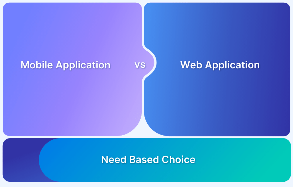
Each type of application has its strengths and weaknesses, and the choice between mobile web, web apps, and mobile apps will depend on the application’s specific needs and its users.
To ensure you deliver a bug-free user experience on these applications, you can perform multiple tests like:
Must Read: Software testing strategies and approaches
What is Mobile Web Design?
It refers to designing and creating websites optimized for viewing and interacting with on mobile devices like smartphones and tablets.
Mobile web design considers the smaller screen size, touch-based interactions of mobile devices, varying screen resolutions, and internet connectivity speeds.
Here are different elements considered in mobile-first web design:
1. Responsive design: A mobile website must be designed using multiple responsive design techniques to ensure that it can adapt to different screen sizes and orientations.
You can test your mobile website’s responsive design on multiple device-browser-OS combinations using BrowserStack Automate, App Automate, App Live, and Live to ensure a seamless user experience with your software. BrowserStack provides automated and manual options for online mobile testing for websites and apps.
2. Simplified navigation: Mobile users must find what they want on a website. Mobile web design should simplify navigation and minimize the clicks required to access the content.
3. Optimized content: Mobile web design should optimize content for mobile devices, including using smaller images and simplified layouts to reduce load times and improve user experience.
4. Touch-based interactions: Mobile devices rely on touch-based interactions, so mobile web design should consider how users interact with the website using touch gestures.
5. Fast load times: Mobile web design should optimize for fast load times, including reducing the size of images and using caching techniques.
With more and more people using smartphones and tablets for quick internet access, mobile web design has become a highly important aspect of web design.
Read More: How to create an ultimate mobile experience
Frameworks to Build Mobile Web Apps
Responsive frameworks are a collection of pre-written code and stylesheets that make creating responsive websites and applications that work well on mobile devices easier.
Here are some popular responsive frameworks for building mobile web and mobile web applications:
1. Bootstrap: It offers a wide range of pre-built components, such as navigation bars, modals, forms, and typography, as well as a grid system for creating responsive layouts. It also comes with various CSS and JavaScript plugins and utilities for adding interactivity and functionality to your web pages.
One of the benefits of using Bootstrap is that it is designed to be mobile-first, meaning that its components and layout are optimized for use on mobile devices. This makes it an excellent choice for building mobile web and mobile web applications.
2. Materialize: It is an open-source CSS and JavaScript framework for building responsive and modern web applications. It is based on Google’s Material Design guidelines, which provide a set of design principles and guidelines for creating user interfaces that are visually appealing and intuitive to use.
Materialize is easy to get started with, and it provides comprehensive documentation and a variety of templates and examples to help you get started quickly. It also has a large community of developers who contribute to its development and provide support to other users.
3. Ionic: Ionic is a popular framework for building mobile web and hybrid mobile applications. It provides a range of responsive design components, including grids, typography, and navigation, that can be used to build mobile-friendly applications. It is built on top of AngularJS, a popular JavaScript framework, and provides a range of features, such as native app integration and offline support.
4. Semantic UI: Semantic UI is a front-end framework that provides multiple responsive design components. It includes pre-built templates and themes that can be customized to fit specific design needs. It also offers a range of customization options, such as theming and modularization.
These frameworks can be highly effective in helping you achieve the desired performance of your application.
How to Optimize your Mobile Web Application for Performance?
Optimizing the performance of a mobile web application is crucial for providing a good user experience and improving engagement.
Here are some tips for optimizing your mobile web application for performance:
- Large images can slow down the performance of your mobile web application. Ensure to compress images to reduce their file size without compromising quality. Use compressed images with the appropriate file format (JPEG, PNG, SVG) and dimensions to reduce the size of your web pages and improve loading speed.
- Use lazy loading to delay the loading of non-critical content, such as images and videos, until the user scrolls to that part of the page.
- A CDN can fasten up the delivery of your mobile web application’s content by caching it in multiple locations worldwide. This can reduce the time it takes for your application to load, especially for users far from your server.
- Each mobile web application’s HTTP request can slow down performance. Minimize the number of HTTP requests by combining multiple resources, such as CSS and JavaScript files, into a single file.
- Caching can help to speed up your mobile web application by storing frequently accessed data on the user’s device or in the browser cache. It can reduce the number of requests to be made to the server.
- Optimize your mobile web application’s code and minimize the size of your HTML, CSS, and JavaScript files by removing unnecessary code and optimizing loops and conditionals. Use asynchronous loading for scripts to avoid blocking the rendering of the page.
- The time it takes for your server to respond to requests can impact your mobile web application’s performance. Optimize your server response time by using a content delivery network, optimizing your database queries, and using a caching layer.
- Use responsive design to optimize your web pages for different screen sizes and devices.
- Regularly test your mobile web application’s performance using tools like Google PageSpeed Insights or GTmetrix. Also, apart from performance, you can run a detailed speed test on real browsers and devices using the BrowserStack which is ideal for covering real-world conditions for the most accurate results.
How to Test the Responsiveness of your Mobile Website?
Testing your mobile website on real devices is the only way to know how it truly performs. Emulators and simulators can help during development, but they often miss real-world issues like gesture behavior, network inconsistencies, rendering bugs, and device-specific layout breaks.
Testing on real devices helps catch these problems early and ensures that users get a consistent experience.
BrowserStack is a real device cloud platform that allows you to test your website across thousands of real mobile devices and browsers. You can instantly access devices without needing to maintain your own lab and run both manual and automated tests to validate responsiveness, usability, and performance.
- Browser Coverage: Ensure compatibility by testing across popular mobile browsers, including the latest and legacy versions, like Chrome, Safari, Firefox, and Samsung Internet.
- Responsive Testing: Verify how your layout and components behave across different screen sizes, resolutions, and orientations using tools designed for real-device rendering.
- Real Device Features: Mimic real-world network conditions such as 3G, 4G, and offline modes to test performance under constrained or unstable connectivity scenarios.
- DevTools Support: Use native debugging tools like Chrome DevTools and Safari Web Inspector to inspect elements, track performance, and troubleshoot issues directly on devices.
Conclusion
The mobile web has become the primary way users interact with content online. As devices, screen sizes, and usage contexts continue to evolve, it is essential to design responsive, fast, and user-friendly websites.
BrowserStack helps teams test their mobile websites on real devices and browsers without the overhead of managing physical hardware. With powerful features like responsive testing, network simulation, and CI/CD integration, it enables faster development cycles and higher-quality mobile experiences.


