 Ask the Community
Integrate UI Widget - React Guide
Setup and get running with the Project Management Tools UI widget for React.
For setting up Integrate, you can refer to the Integrate Getting Started.
This guide will get you up and running with the React UI Widget for Project Management Tools.
For embedding the UI Widget into your React application, follow the steps below:
Step 1: Configure your backend
First, you need to generate a temporary User Access Token (JSON Web Token) for authenticating your requests. Here are the steps to do it:
- In your backend, create a route(e.g.
/user/generate-token) and pass your username, access-key, and your end user’s email(as a unique identifier) for authorization. - Now there are two options for the User Access Token generation:
- Make your own requests to the Unified API.
- Or, use our SDKs (Coming soon).
Finally, pass the generated token to the UI widget.
Step 2: Add UI widget into your application
You can now add UI widget to your own application to enable your users to authorize and manage integrations. It also makes handling credentials more secured.
You can embed the widget in any React application with just a few lines of code.
Install the latest version of ‘browserstack/integrate’ node package
The code block below shows a snippet on how you could use the UI widget into your React application.
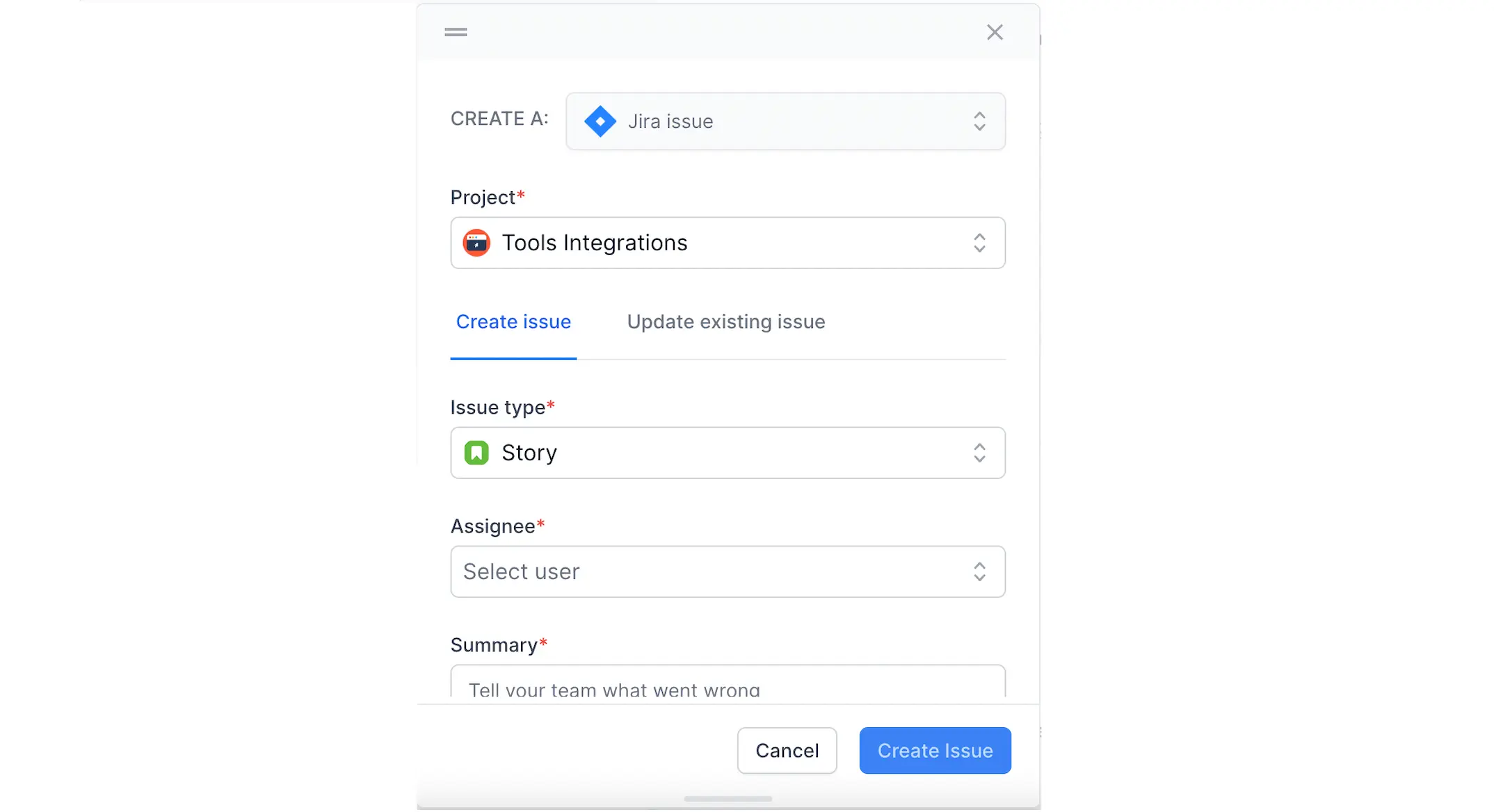
Here is a screenshot of the UI widget styled using Tailwind CSS.
UI widget Props
| Property | Type | Default | Optional/Required | Description |
|---|---|---|---|---|
| auth | object | required |
url parameter must be provided to authenticate the user. In addition, a headers object can be passed, if necessary |
|
| attachments | array | optional | Filepath of the attachment to be included. | |
| config | object | {baseURL: null} |
optional | All calls to integrations service will use default production URL, if baseURL is not specified. Otherwise, this URL will be used instead. (useful for staging testing purposes.) |
| handleClose | func | optional | Callback function that will be fired when the widget closes. | |
| isOpen | bool | false |
optional | Opens the widget if set to true. |
| options | object | {successCallback : null, failureCallback: null, description: null, } |
optional | Callback function successCallback will be triggered upon successful creation or update of the ticket, whether it is completed in full or partially. Callback function failureCallback will be triggered when there is a failure in creation or update of the ticket. description text provided will be automatically filled in the description metadata for the ticket creation flow and the comment metadata for the ticket update flow. |
| positionRef | node | optional | Reference of the DOM element relative to which the widget must be rendered. | |
| position | string | center |
optional | Can be set to left, center, right if positionRef is not specified. can be set to left, right otherwise. |
We're sorry to hear that. Please share your feedback so we can do better
Contact our Support team for immediate help while we work on improving our docs.
We're continuously improving our docs. We'd love to know what you liked
We're sorry to hear that. Please share your feedback so we can do better
Contact our Support team for immediate help while we work on improving our docs.
We're continuously improving our docs. We'd love to know what you liked
Thank you for your valuable feedback!