Text Color Contrast (Minimum)
App accessibility checks if text elements have sufficient color contrast for readability. The contrast ratio between text and background colors should be at least 4.5:1 for normal text and 3:1 for large text. The goal is to make content accessible to users with varying levels of visual sensitivity, including those with color vision deficiencies.
- Rule Category :
Color Contrast - WCAG 2.1 & 2.2 SC :
1.4.3 (AA) - Rule Severity :
Serious - Supported Platforms :
Android,iOS
Success criteria
Bold text requires a lower contrast ratio than regular text. Currently, BrowserStack App Accessibility supports bold text detection only on iOS. On Android, App Accessibility treats bold text as regular text for contrast ratio checks.
The rule checks if the text contrast ratio is at least 4.5:1 for standard text (less than 18pt in iOS or less than 18dp in Android) and 3:1 for large text (18pt or larger in iOS, or 18dp or larger in Android).
How to fix
To prevent insufficient color contrast violations:
- Adjust colors: If the contrast ratio is insufficient, modify the text or the background colors to meet the required thresholds.
- Font size: Use a sufficient font size to ensure the text is clearly readable.
Example
The following screenshot highlights an insufficient color contrast violation in a mobile app:
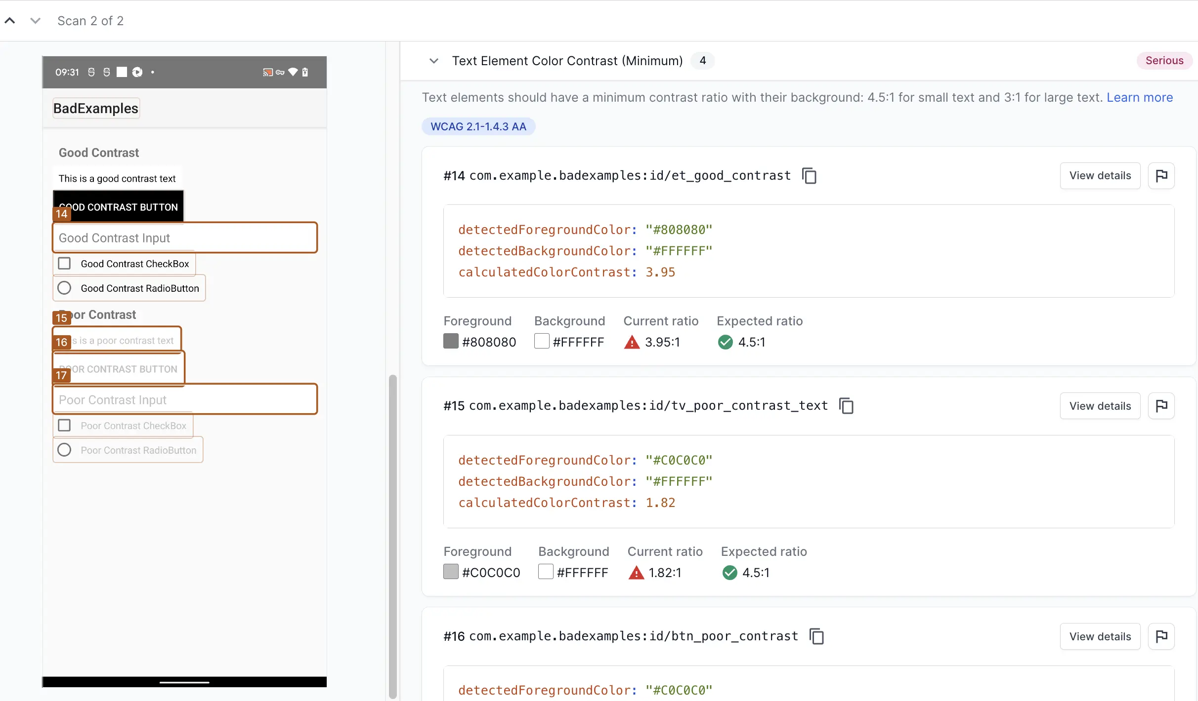
The following text elements have insufficient contrast ratios:
-
Element #14: The text color
#808080against the background color#FFFFFFresults in a contrast ratio of 3.95:1, which is below the WCAG 2.1 AA requirement of 4.5:1 for standard text. -
Elements #15 and #16: The text color
#C0C0C0against the background color#FFFFFFhas a contrast ratio of 1.82:1, which is significantly below the required 4.5:1.
Fix
To resolve this violation:
-
Increase the text color contrast: Adjust the text color to a darker shade or one with a higher-contrast color. For example, black (
#000000). -
Adjust the background: If design constraints allow, slightly darkening the background can also improve the contrast. For example, changing the background color to a light gray (
#F0F0F0). - Adjust the font size: For text with a contrast ratio between 3.0:1 and 4.5:1, increase the font size to 18pt or higher on iOS and 18dp or higher on Android, instead of adjusting the color.
Additional information
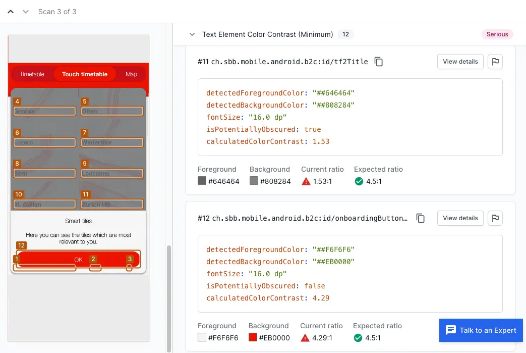
isPotentiallyObscured element is applicable only to Android apps.
What does isPotentiallyObscured mean?
This attribute indicates that the element evaluated for contrast is overlaid by another element. The other element can be opaque or translucent. If this attribute is reported as true, additional factors, such as overlaying elements, might further affect the readability and accessibility of the text, requiring even higher contrast.
References
We're sorry to hear that. Please share your feedback so we can do better
Contact our Support team for immediate help while we work on improving our docs.
We're continuously improving our docs. We'd love to know what you liked
We're sorry to hear that. Please share your feedback so we can do better
Contact our Support team for immediate help while we work on improving our docs.
We're continuously improving our docs. We'd love to know what you liked
Thank you for your valuable feedback!