Custom Dashboards
Learn to build and use custom dashboards in Test Reporting & Analytics.
Custom dashboards are configurable dashboards that can give you all the important statistics and information across different projects in your testing organization. You can build these custom dashboards in Test Reporting & Analytics by choosing from a list of widgets. As you create these dashboards according to your preferences, you get a lot of flexibility in deciding the most important information that is needed for your testing organization.
Benefits of using custom dashboards
You can make informed decisions on your testing activity by making use of custom dashboards.
Every organization possesses distinct key performance indicators (KPIs) that they aim to enhance within their testing activities. Off-the-shelf dashboards may not be sufficient to capture the intricacies of the metrics you wish to monitor in your organization. By utilizing custom dashboards, you can construct goal-specific dashboards using a diverse array of widgets. These widgets offer flexibility in aggregating data from various sources such as multiple projects, builds, users, etc., empowering you with actionable insights.
How to create a custom dashboard
Follow these steps to create a custom dashboard in Test Reporting & Analytics.
- Select Dashboards from the menu and click Create dashboard.
- Select a widget from the options or click View more widgets.
- Select a widget you want to add to your dashboard. In this example, the Failure Categories widget is selected.
- Configure the widget using the available options and click Done. Each widget has a different set of configurations. In the Failure Categories widget, you can set a widget name, add a description, choose a visualization, include or exclude failure categories, and add filters.
- Click Add Widgets to include more widgets in your dashboard. Repeat Step 3 to Step 4 until you have added all the widgets you need in your custom dashboard.
- Click Save and finish.
- Give a name to the dashboard. If you want the dashboard to be public, switch on the toggle button. Click Done.
Clone widgets
If you need more than one widget of the same type on a custom dashboard, you can use the clone option to build it much faster. These widgets of the same type could be to track data from different projects, builds, users, etc.
Follow these steps to clone a widget while building or modifying a custom dashboard:
- Click the kebab menu on the right-hand side and select Clone.
- Give the new widget a suitable name. Configure the widget using the available options and click Done.
- Click Save.
The new widget gets added to the custom dashboard.
Clone dashboards
If you are building a new custom dashboard which is quite similar to an existing dashboard, you can use the clone option to build it much faster.
Follow these steps to clone a custom dashboard:
- Select Dashboards from the menu and click the dashboard you want to clone from.
- Click the kebab menu on the right-hand side and select Clone dashboard.
- Give the new dashboard a new name.
- If you want the dashboard to be public, switch on the Public dashboard toggle button.
- Click Done.
A copy of the dashboard gets created. You can edit the dashboard to fine-tune the new dashboard according to your requirements.
List of widgets in custom dashboards
Following are the widgets you can choose from in your custom dashboard:
Flakiness
This widget illustrates the change in the percentage of flaky tests as per the conditions set in the Flaky Smart Tag. A higher percentage of flaky tests or an upward trend indicates quality issues in your automation tests.
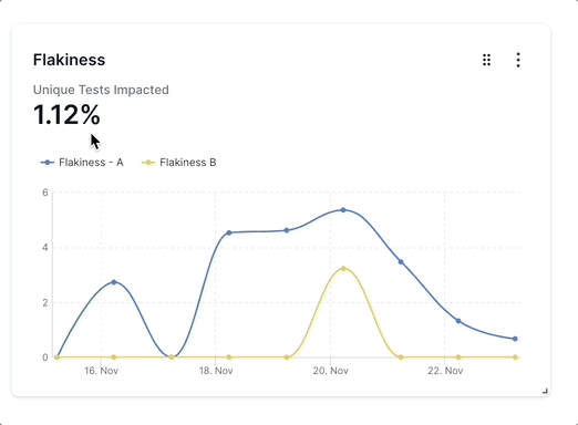
You can add up to five segments in the Flakiness widget using the Add segment option while creating the widget. These segments appear as separate line charts in the widget. Such segments can be used to compare different projects, builds, users, etc.
In the Flakiness widget, you can choose Unique Tests Impacted or Average Flakiness as the chart summary. You can configure the widget to display or hide the chart summary. Using the See values in: setting, you can also choose the values in the Flakiness widget to appear as a number or as a percentage.
Stability
This widget helps you understand how stable the testing activity in your organization is. It illustrates the fluctuation in the stability (total passing test executions as a percentage of overall test executions) of builds over time.
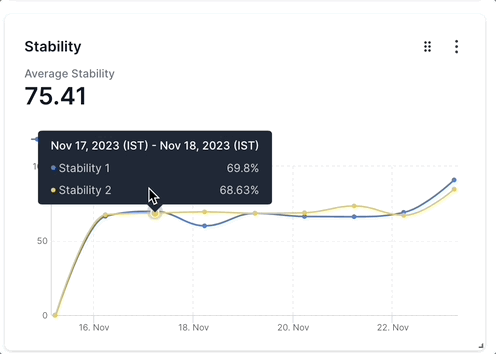
You can add up to five segments in the Stability widget using the Add segment option while creating the widget. These segments appear as separate line charts in the widget. Such segments can be used to compare different projects, builds, users, etc.
In the Stability widget, you can choose Unique Tests Impacted or Average Stability as the chart summary. You can configure the widget to display or hide the chart summary.
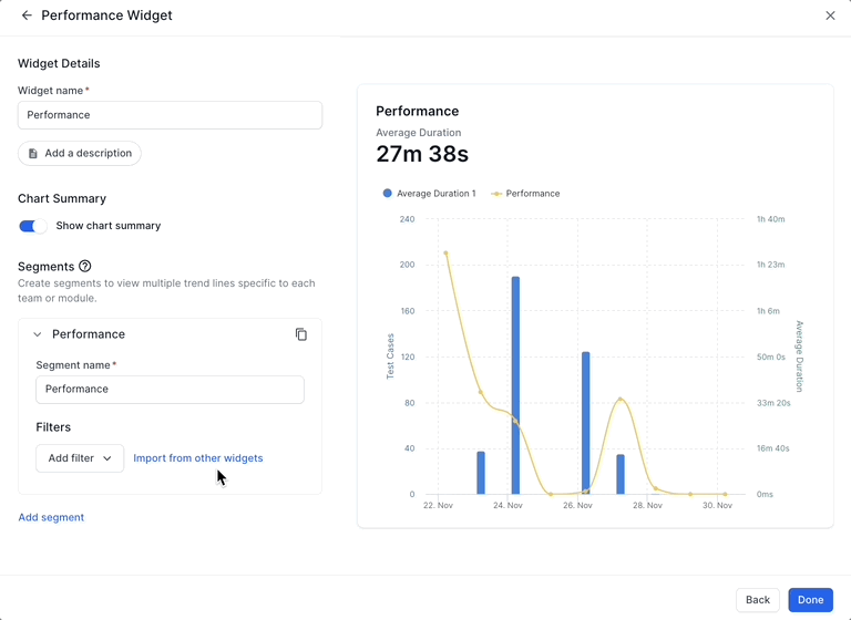
Performance
This widget helps you understand if the performance of your test setup is improving or worsening over time, enabling you to uncover bottlenecks in your testing. It illustrates the number of test cases and the average duration of projects, builds, etc over time on a line chart. If the average duration trends downwards, it indicates that the performance is improving.
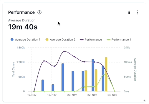
You can add up to five segments in the Performance widget using the Add segment option while creating the widget. These segments appear as separate line charts in the widget. Such segments can be used to compare different projects, builds, users, etc.
You can configure the widget to display or hide Average Duration as the chart summary value.
Always Failing
A high number of Always Failing tests in this chart indicates lower effectiveness of the test cases in your automation tests. This chart illustrates the number of tests that continuously fail, as per the conditions set in the Always Failing Smart Tag.
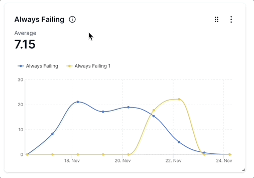
You can add up to five segments in the Always Failing widget using the Add segment option while creating the widget. These segments appear as separate line charts in the widget. Such segments can be used to compare different projects, builds, users, etc.
In the Always Failing widget, you can choose Unique Tests Impacted or Average as the chart summary. You can configure the widget to display or hide the chart summary. Using the See values in setting, you can also choose the values in the widget to appear as a number or as a percentage.
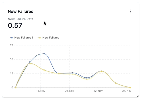
New Failures
This widget helps you discover suboptimal development quality impacting many tests. New failures are test cases that failed at least once within the data you include in the widget, as per the conditions set in the New Failure Smart Tag. A high number of New Failures every day or an upward trend points to an opportunity to improve the dev quality.
You can add up to five segments in the New Failures widget using the Add segment option while creating the widget. These segments appear as separate line charts in the widget. Such segments can be used to compare different projects, builds, users, etc.
In the New Failures widget, you can choose Unique Tests Impacted or New Failure Rate as the chart summary. You can configure the widget to display or hide the chart summary. Using the See values in setting, you can also choose the values in the widget to appear as a number or as a percentage.
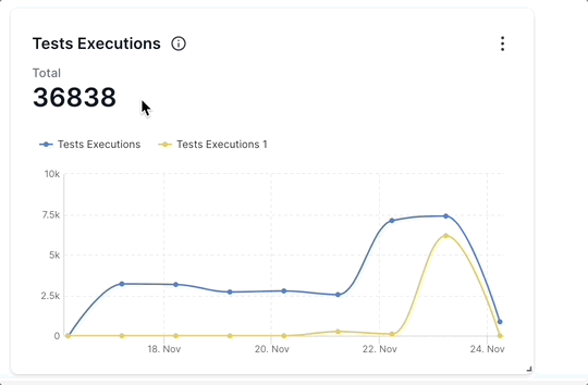
Tests Executions
This widget represents the scale of test automation activity in your organization, by displaying the number of test executions as per the configurations you have selected. You can use the Tests Executions widget to forecast the future scale of testing and progress made toward goals. An upward trend indicates that the scale of automation testing is increasing.
You can add up to five segments in the Tests Executions widget using the Add segment option while creating the widget. These segments appear as separate line charts in the widget. Such segments can be used to compare different projects, builds, users, etc.
You can configure the widget to display or hide the Total Tests Execution as the chart summary.
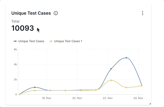
Unique Test Cases
This widget tracks the growth of unique test cases being run. An upward-trending graph represents more automation scenarios being added, and a more complete test suite being built.
You can add up to five segments in the Unique Test Cases widget using the Add segment option while creating the widget. These segments appear as separate line charts in the widget. Such segments can be used to compare different projects, builds, users, etc.
You can configure the widget to display or hide the total number of unique test cases as the chart summary.
Failure Categories
This widget helps you understand the common causes of test failures and how it is changing over time. You can use this information to compare the failure categories of different projects, builds, users, etc. and prioritize the efforts of your engineering and QA teams.
The Failure Categories widget uses the result of Automatic Failure Analysis performed by Test Reporting & Analytics. Automatic Failure Analysis learns from the testing activity over time and classifies test failures like Product Bug, Automation Bug, Environment Issue, No Defect, and To Be Investigated.
You can choose between an area chart or a stacked column visualization.
Top Unique Errors
This widget lists the top errors and the number of tests and test executions impacted by these errors. This widget provides you with a unique approach to identifying the unique errors that are causing the most number of failures and solving them.
You can choose to include 20, 50, or 100 errors in this widget. You can configure the widget to display or hide the total number of tests impacted as the chart summary.
Failure Rate by Folders
Explore test failure rates categorized by folders.
Platform Coverage
This widget helps you understand the coverage of your automation tests across various device-os-browser combinations. A high number of combinations and a well-distributed percentage of tests in multiple combinations indicate a more rigorous testing activity across multiple device-os-browser combinations.
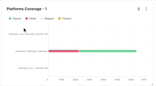
You can choose to group the chart by Device, OS, Browser, or a combination. You can further enrich the dashboard by grouping information based on Browser Version and OS Version.
Build Summary
This widget helps you get a summary of unique builds with frequency and status. You can quickly get to know how many tests in each build, project, etc. are in Passed, Failed, Skipped, or Unknown statuses. Using this widget, you can quickly identify problematic builds and prioritize your efforts to improve them.
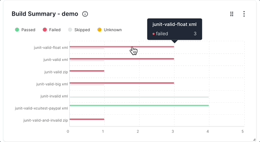
You can choose between a bar chart or a stacked bar visualization.
Tests by Status
This chart helps you visualize the distribution of test statuses over time. You can choose to include or exclude Passed, Failed, Skipped, and Unknown tests in the visualization. An upward trend in the Passed tests and a downward trend in the Failed tests indicate an improvement in the testing activity over time.
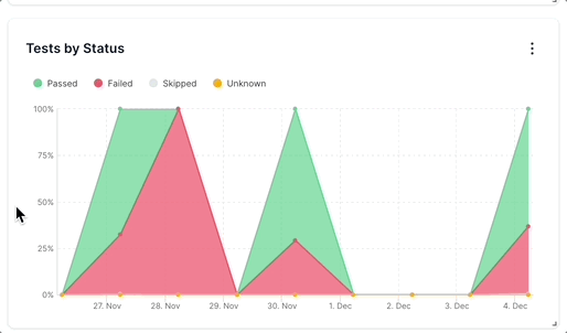
You can choose between an area chart or a stacked column visualization.
Aggregated Summary
This widget is a concise summary banner in which you can include the most valuable insights about selected projects and builds. You can include information like Tests Summary, Failure Rate, Failure Count, Stability, Flakiness, Muted Tests, New Failures, Always Failing, Defect Summary, Platforms Covered, and Unit Test Cases.
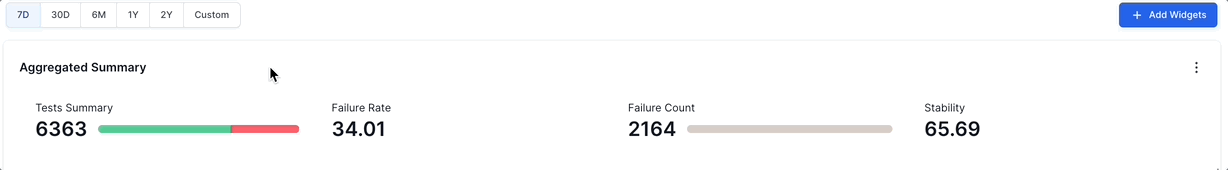
You can use the Aggregated Summary widget as an indicator of the Key Performance Indicators you want to track on your projects and builds.
Edit dashboards
You can edit an existing dashboard to change the name, access permissions, add or remove widgets, edit individual widgets, resize widgets, reposition widgets, etc.
Modify the name and access permissions of a custom dashboard
Follow these steps to change the name or access permissions of a custom dashboard:
- Select Dashboards from the menu and click the dashboard you want to edit.
- Click the kebab menu on the right-hand side and select Edit basic details.
- Type in the new name of the dashboard.
- Switch on the Public dashboard toggle button to make the dashboard public. Switch off this button to make the dashboard private.
- Click Done.
A success message “Successfully updated” is displayed to confirm that your changes are live.
Add widgets to a custom dashboard
Follow these steps to add a new widget to an existing custom dashboard:
- Select Dashboards from the menu and click the dashboard you want to edit.
- Click Add Widgets.
- Select a widget you want to add to your dashboard.
- Configure the widget using the available options and click Done.
- Repeat steps 2 - 4 if you want to add more widgets.
- Click Save and finish.
The new widget gets added to the custom dashboard.
Remove widgets from a custom dashboard
Follow these steps to delete a widget from an existing custom dashboard:
- Select Dashboards from the menu and click the dashboard you want to edit.
- Click the kebab menu on the right-hand side and select Delete.
- Click Delete on the popup if you are sure to remove the widget permanently from the dashboard.
The widget gets removed from the custom dashboard.
Edit widgets in a custom dashboard
Each widget in custom dashboards has a unique list of settings. To edit a widget, you can follow these general steps:
- Select Dashboards from the menu and click the dashboard you want to edit.
- Click the kebab menu on the right-hand side and select Edit.
- Make widget-specific changes that you want to make.
- Click Done.
The widget gets updated with the new changes.
Reorder and resize widgets
You can organize your dashboard by resizing and repositioning individual widgets.
Follow these steps to resize a widget in a custom dashboard:
- Hover your mouse over a widget.
- Click the candy bar menu and drag the chart to a different part of your screen.
Use this feature to reorder the charts based on the priorities of your project.
To resize the charts and widgets, click the small arrow mark at the bottom-right corner of a widget and drag it to the size you prefer.
Delete dashboards
Follow these steps to delete a custom dashboard:
- Select Dashboards from the menu and click the dashboard you want to delete.
- Click the kebab menu on the right-hand side and select Delete.
- Click Delete on the popup if you are sure to remove the dashboard permanently.
The custom dashboard gets deleted.
Import filters from other widgets
While configuring or editing a widget, you can import filters from other widgets. This saves you time and effort if the filter you want is similar to that of an existing widget.
Follow these steps while configuring or editing a widget to import filters:
- Click Import from other widgets.
- Select the widget from which you want to import the filter.
- Include the filters you want to import by selecting them. By default, all filters are selected. You can exclude a filter by deselecting it.
- Click Import and continue configuring your widget.
- Click Done after configuring your widget. You can view these steps in the following GIF:
Segments
Segments are a tool to compare two or more different sets of data side by side. For example, you might want to compare the performance of multiple projects. In that case, you can add separate segments for each of the projects. The performance data of each project will then be plotted in separate line graphs in the same widget.
Similarly, if you want to compare the number of unique test cases for multiple users, you can create a separate segment for each of the users. The test case data of each user will be plotted in separate line graphs in the same widget.
All widgets in custom dashboards that use a line chart have segments in them. You can add a maximum of five segments in a widget.
Download and share dashboards
You can share custom dashboards with your colleagues and also download them to your system as PDF files.
How to download custom dashboards
Follow these steps to download a custom dashboard:
- Select Dashboards from the menu and click the dashboard you want to download.
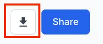
-
Click the download button in the top-right corner.
A message pops up informing that the report is being generated.

- Your requested report will be automatically downloaded as a PDF.
How to share custom dashboards with your team
You can share only public dashboards. Follow these steps to share a custom dashboard:
- Select Dashboards from the menu and click the dashboard you want to share.
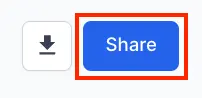
-
Click Share in the top-right corner.
-
Enter the user’s name and select the user from the Share with drop-down. Click Share. The recipient receives an email invite to view the page.
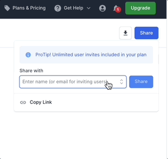
In case you want to share a dashboard with someone who doesn’t have a Test Reporting & Analytics account, you can enter their email address and click Share.
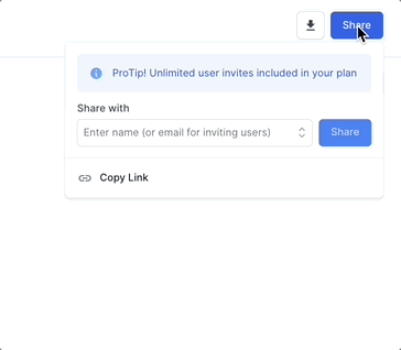
Alternatively, you can click Copy Link to copy the link to your clipboard. You can share the link via email or messaging apps like Slack or MS Teams.
Access levels in dashboards
You have two access levels in custom dashboards:
- Private: Only the owner of the dashboard can view, edit, or delete a private dashboard. You cannot share private dashboards, but you can download them. Use this access level for individual analysis.
- Public Everyone in your user group can view, edit, download, share, and delete public dashboards. Use this access level for collaborative analysis. It is a good idea to clone public dashboards and save a private copy to maintain a backup.
We're sorry to hear that. Please share your feedback so we can do better
Contact our Support team for immediate help while we work on improving our docs.
We're continuously improving our docs. We'd love to know what you liked
We're sorry to hear that. Please share your feedback so we can do better
Contact our Support team for immediate help while we work on improving our docs.
We're continuously improving our docs. We'd love to know what you liked
Thank you for your valuable feedback!