New Failures widget in custom dashboards
Monitor new failures in your test suites.
This widget illustrates the trend of new failures discovered over time, as per the conditions set in the New Failure Smart Tag. A high number of New Failures every day or an upward trend points to an opportunity to improve the dev quality.
The New Failures widget is a collection of one or more line charts in which the X-axis represents time and the Y-axis represents the number of new test failures. Each line is a different segment that you can configure to compare different projects, builds, users, etc.
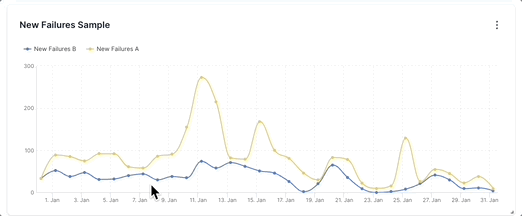
In the sample above, there are two segments: New Failures A (yellow line) and New Failures B (blue line). The value of New Failures A increases from 58 on 7th January to 273 on 11th January. Similarly, the value of New Failures B increases from 44 to 74. This spike in the number of new test failures on 11th January, especially for New Failures A warrants a deeper audit. The insights from such an analysis could help reduce the number of new test failures in the future.
Drill down for more information
You can investigate more contextual information on all dashboard widgets using the drill-down feature.
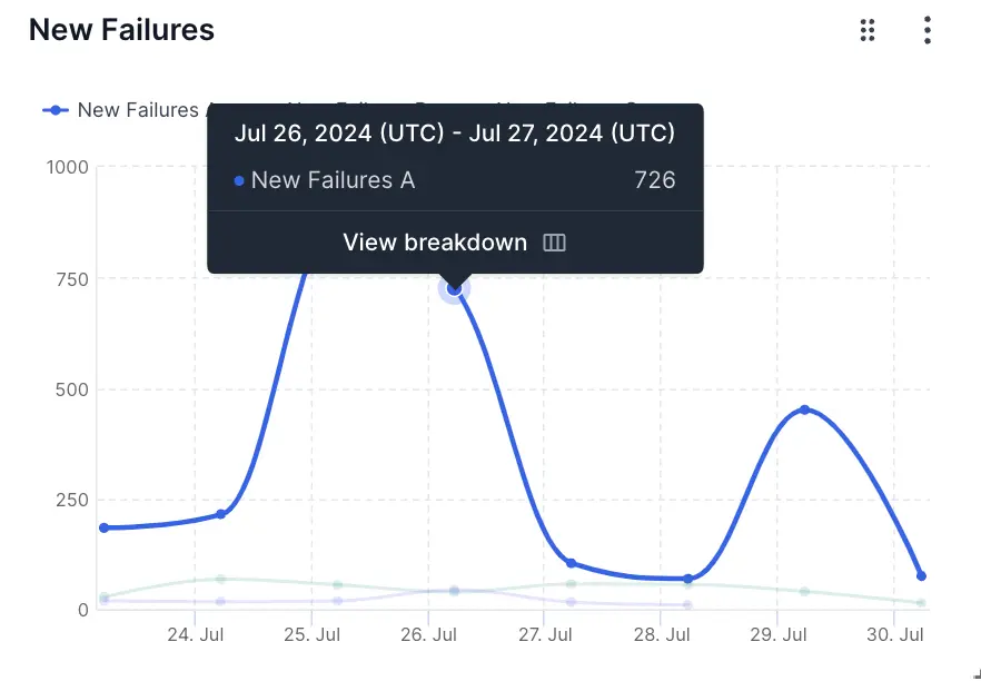
You can use the drill-down feature in the New Failures widget to analyze more details on the reasons for test failures. For example, if you see a spike in the number of new test failures, you can investigate why the spike occured.
Follow these steps to use the drill-down feature:
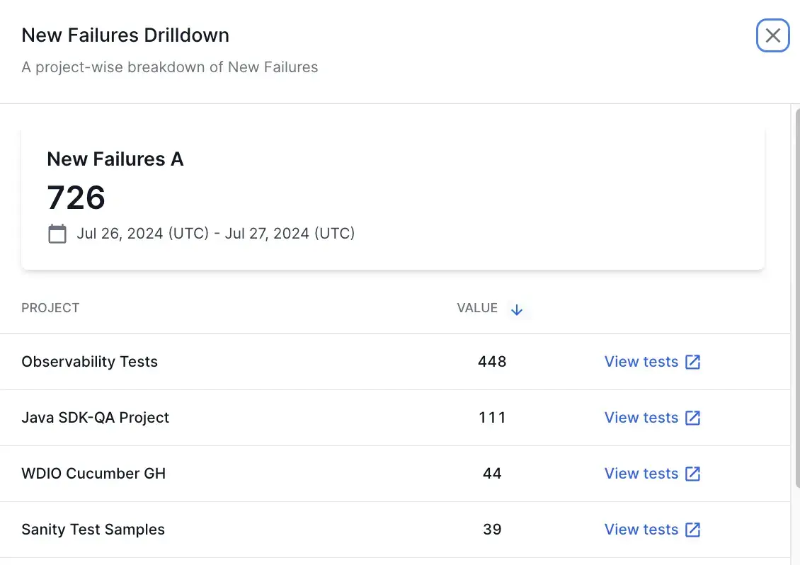
- Hover on any point in the New Failures widget and click View breakdown. A project-wise breakdown of the metrics for the selected date range opens up in a side pane.
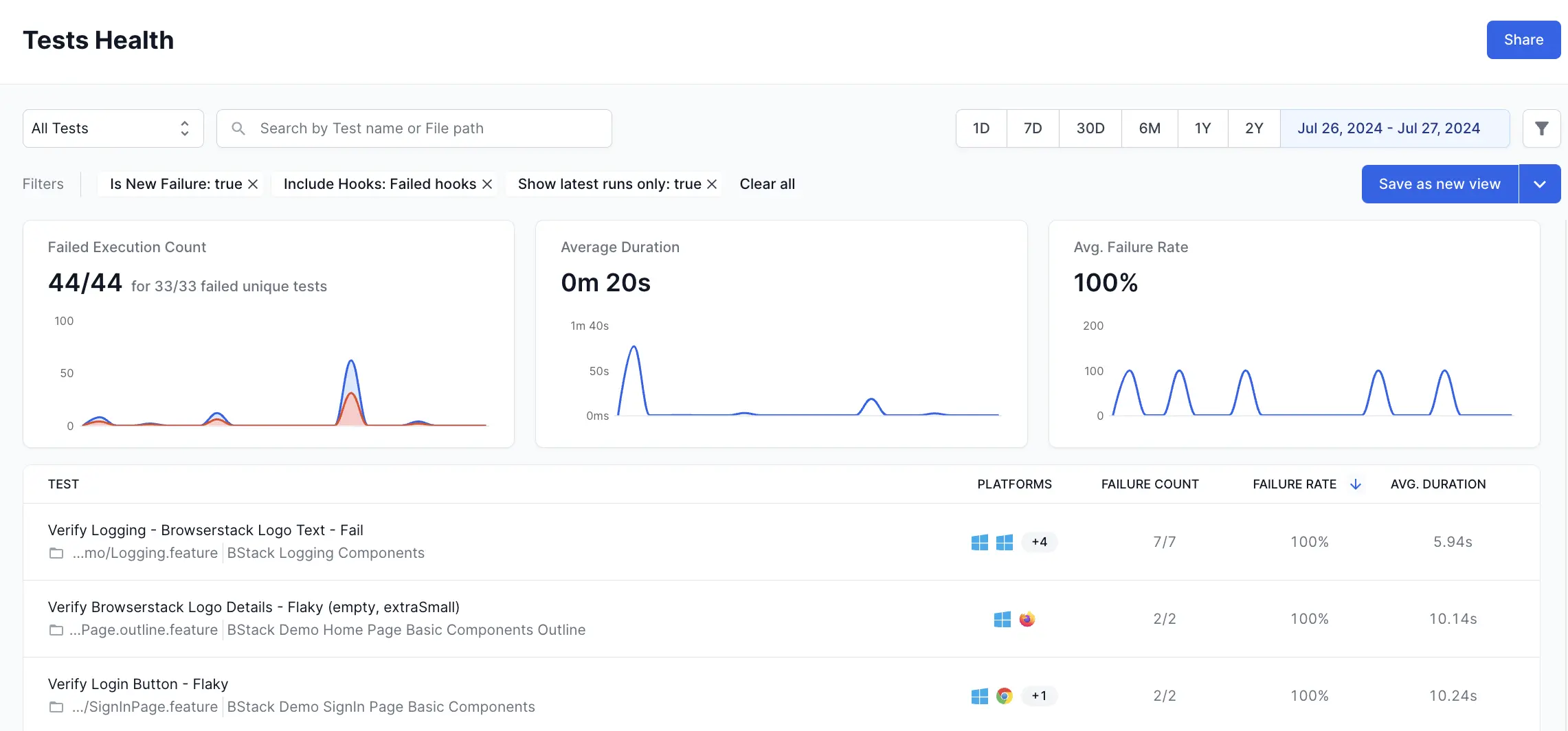
- Click View tests to get to the tests that contribute to the new failures count.
This opens Tests Health in a new tab with the applicable filters. On Tests Health, you can view the individual tests that are categorized as new failures and further investigate what caused the test failures.
Widget configuration - New Failures
You can configure the following options in the New Failures widget:
-
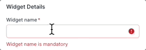
Widget name: A suitable name to easily identify the purpose of the widget.
-
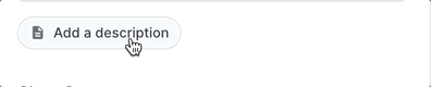
Description: An optional widget description to explain the purpose in detail. A user can view this description by hovering over an info icon on the widget and gain valuable context about the widget.
-
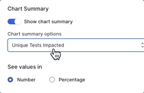
Chart Summary: A toggle to show or hide the chart summary, a concise banner that displays summarized information on your New Failures widget. In this widget, you can choose Unique Tests Impacted or New Failure Rate as the chart summary. By default, the widget displays Unique Tests Impacted as the chart summary. You can also choose to show or hide this chart summary. Chart summary is available only on widgets with a single segment.
-
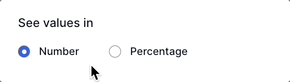
Number/Percentage: The Number/Percentage setting lets you choose the unit of measurement on the Y-axis: either the total number of newly failing test runs or the percentage of newly failed tests against total test runs. By default, it shows the absolute number of newly failing test runs. However, if your daily number of test runs varies, you can switch to “Percentage” for a more precise analysis.
-
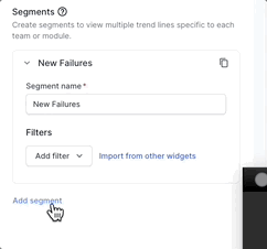
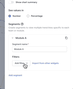
Segments: Add up to five segments in the New Failures widget using the Add segment option. These segments appear as separate line charts in the widget. Segments should be used along with filters. You can use various filters in each segment to compare different projects, builds, users, etc.
-
Filter: You can add a filter to include only the data you want in a particular segment. The parameters by which you can filter data are Projects, Unique Build Names, Users, Build Tags, Test Tags, Hooks Visibility, Host Names, Folder names, Device, OS, and Browser.
You can also import filters from other widgets to avoid duplicate efforts.
Sample use cases
You can use the New Failures widget to track and compare the trend of new failures across several aspects of your testing organization. Here are a few sample use cases to get you started:
Analyze new test failures by modules or teams
You can configure separate segments for different modules or teams in your test suites. You can use segments in combination with the following filters to identify modules and teams:
- Unique build names filter to identify build names that belong to a particular module or team.
- Users filter to differentiate between team members who triggered the build.
- Folder names filter to identify modules based on folders in your test repository.
- Build tags and Test Tags that represent team or module information.
Consider the following example in which new test failures in three modules are compared.
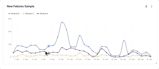
Here, the three line charts represent Module A (purple line), Module B (blue line), and Module C (yellow line) in a test suite. Such a graph can quickly tell you that Module B has the most number of new failures and there are several spikes that need to be analyzed in detail. Module C has the least number of new failures over time. Module A displays a moderate number of new failures and there are a few spikes over time that need further analysis. Using such insights, you can prioritize Module B and find out the reasons for the persistently high number of new test failures using the drill-down feature. In many cases, you will be able to apply best practices followed by top-performing teams to reduce new failures in the modules handled by other teams.
To create the above widget, in the following sample configuration, different Folder names filters are configured on each of the three segments that define Module A, Module B, and Module C.
Analyze new test failures on different platforms
You can track the new test failures across multiple devices, OS, and browser combinations using the New Failures widget. This can be achieved by configuring separate segments for each of the OS-device-browser combinations that you want to track.
In the following example, new test failures run on three different browsers are compared.
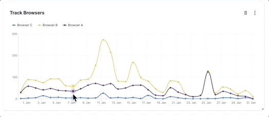
Here, the three line charts represent the new test failures run on Browser A (purple line), Browser B (yellow line), and Browser C (blue line). This graph informs you that the number of new tests that fail on Browser B varies more than that of Browser A or C. Also, it tells that the tests run on Browser C display fewer new failures than those of other browsers. You can analyze deeper using the drill-down feature. Using these insights you will be able to concentrate on reducing new test failures in tests run on Browser A and B.
We're sorry to hear that. Please share your feedback so we can do better
Contact our Support team for immediate help while we work on improving our docs.
We're continuously improving our docs. We'd love to know what you liked
We're sorry to hear that. Please share your feedback so we can do better
Contact our Support team for immediate help while we work on improving our docs.
We're continuously improving our docs. We'd love to know what you liked
Thank you for your valuable feedback!