Requests tab
Analyze request-wise latency, response codes, and percentiles to spot slow or failing flows.
You use the Requests tab to drill into how each user flow (label in case of JMeter, or a request URL for k6) performed during the run. Start with the latency trend to see where spikes occur, review the response code distribution for health, then scan the performance table for outliers in tail percentiles.
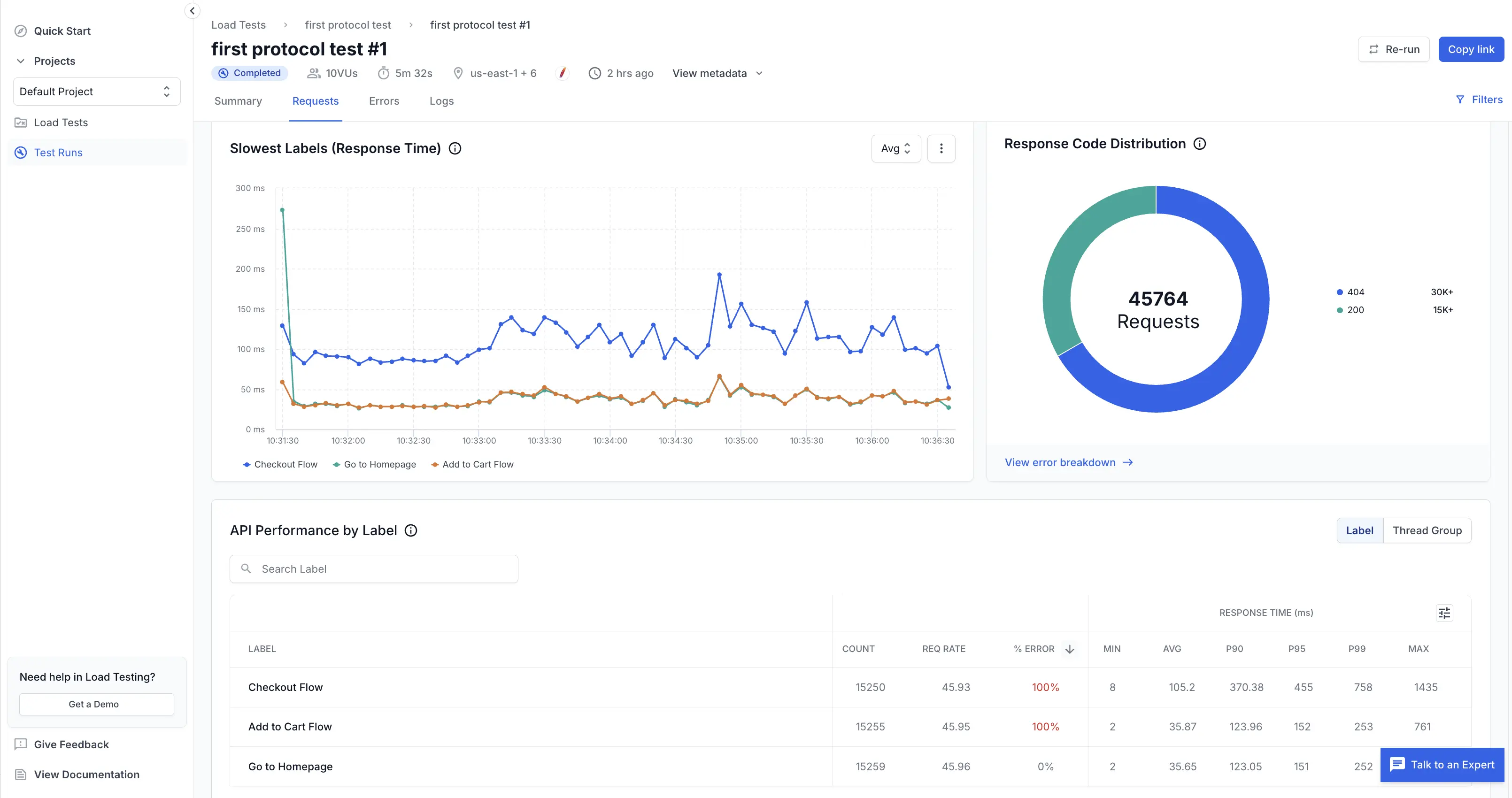
Slowest labels (response time)
This time-series chart compares latency trends across your selected labels. It helps you identify which flows degrade under load and when.
What you see:
- Lines per label: Each color maps to a label (for example, Checkout Flow, Add to Cart Flow).
- Aggregation dropdown (Avg / P90 / P95 / P99): Switch to higher percentiles to expose tail latency spikes that averages hide.
- Hover values (UI): Reveal precise response time at a given timestamp for each label.
How to use it:
- Begin on Avg to establish the baseline.
- Switch to P90 or P99 if users report slowness. Tail percentiles show the worst experiences.
- Note spike timestamps and correlate with system events (autoscaling, deployments) or error bursts in the Errors tab.
Edge cases:
- A single label spiking while others remain flat often indicates a dependency unique to that flow.
- Uniform spikes across all labels suggest shared infrastructure saturation (DB, cache, network).
Response code distribution
The donut chart summarizes total requests by broad response categories (successful vs. error codes). It provides a quick health snapshot.
What it shows:
- Total requests count in the center (e.g., 45,764).
- Colored segments for major code groups or specific codes (200, 404, 500, etc.).
- Legend with counts per code.
Usage tips:
- A large 4xx segment: Validate script paths, query params, and authentication.
- Presence of 5xx codes: Investigate backend stability or scaling limits.
- Click or follow View error breakdown (if available) to jump directly to detailed errors.
API performance by label
The table gives per-label throughput, error rate, and latency statistics so you can prioritize optimization.
Columns defined:
- Count: Total number of requests executed for the label.
- Req rate: Average requests per second for that label.
- % error: Percentage of requests returning error codes.
- Min: Fastest observed successful response.
- Avg: Mean response time.
- P90 / P95 / P99: 90th, 95th, and 99th percentile latencies. Focus here for user experience issues.
- Max: Slowest observed response.
How to interpret:
- Sort by % error to surface completely broken flows before tuning performance.
- Compare Avg vs P99; a large gap means high variance (potential intermittent bottlenecks).
- High Max with stable percentiles often indicates a single pathological request. Investigate logs for anomalies.
Tail analysis example:
- If Avg = 40 ms but P99 = 750 ms, 1% of users see ~19× slower responses; prioritize reducing tail latency.
Drill down into label details
Click on any label row to view granular performance metrics for that specific request.
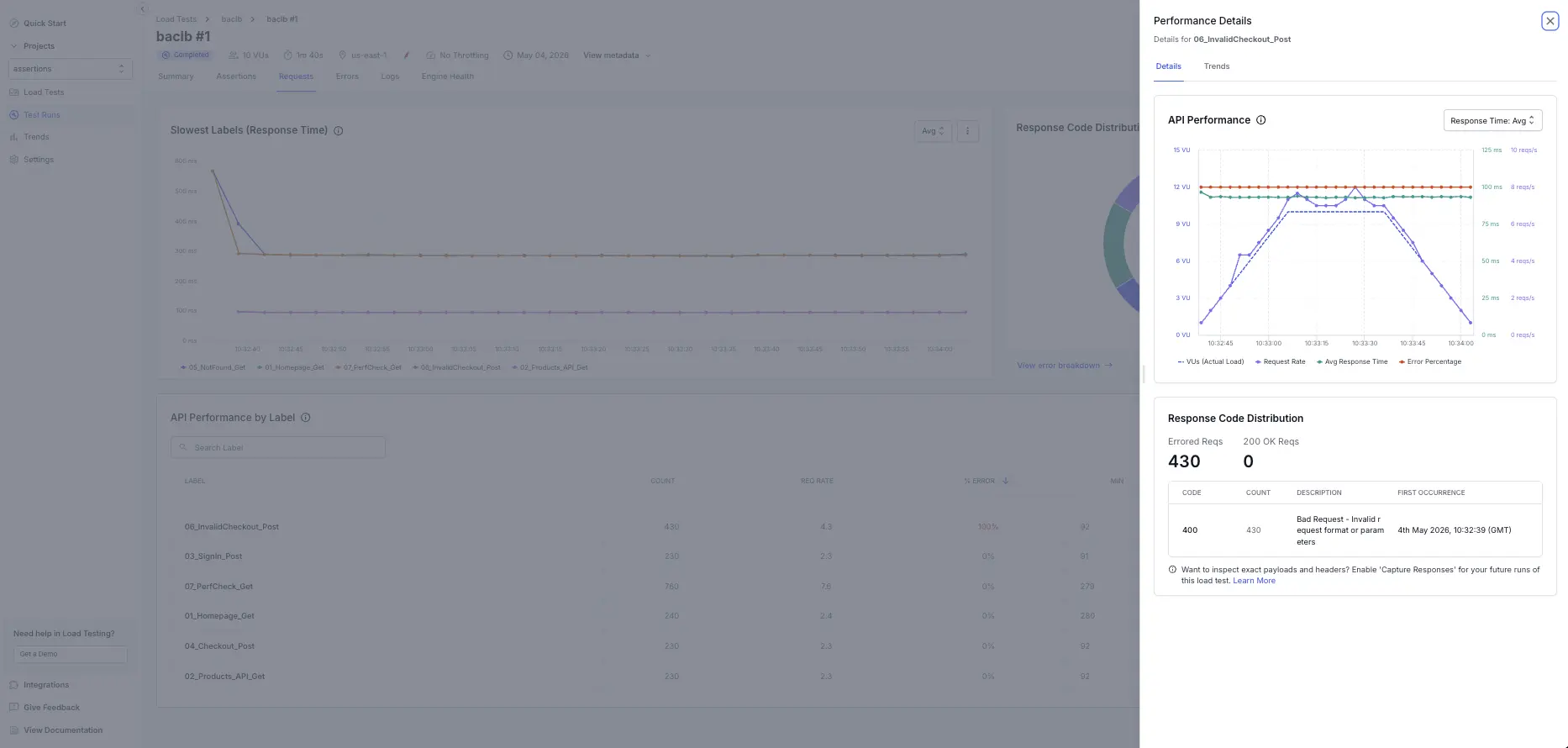
The detailed view shows:
- API Performance chart: A time-series breakdown of latency trends, request rate, and response time percentiles (Avg, P90, P95, P99) across the test duration.
- Response Code Distribution: All response codes encountered for that label, with counts and error percentages.
- Trend data: Identify patterns—whether slowness is sustained, spiky, or concentrated in specific time windows.
Use this to isolate bottlenecks: a label with stable Avg but spiking P99 may reveal intermittent backend issues, while a degrading trend line suggests resource contention as load increases.
Best practices
- Track percentiles, not just averages; tail latency drives perceived performance.
- Keep label names meaningful (include action + context) for faster diagnosis: Checkout API, Inventory Query.
- Use consistent data sets (avoid mixing cached and cold-start requests when comparing runs).
- Pair this tab with infrastructure metrics (CPU, memory, DB connections) to avoid guesswork.
- Export the table after major releases to build a historical performance baseline.
Related pages
- Errors tab – Investigate failed requests and error codes.
- Summary tab – High-level test health metrics.
Next steps
Once you stabilize high error flows and reduce tail latency, raise virtual user counts and monitor whether P95/P99 remain within acceptable SLAs. Continue iterating until critical transactional paths stay consistently fast under peak load.
We're sorry to hear that. Please share your feedback so we can do better
Contact our Support team for immediate help while we work on improving our docs.
We're continuously improving our docs. We'd love to know what you liked
We're sorry to hear that. Please share your feedback so we can do better
Contact our Support team for immediate help while we work on improving our docs.
We're continuously improving our docs. We'd love to know what you liked
Thank you for your valuable feedback!