Segments
Learn to compare information in line charts using segments.
Segments are a tool to compare two or more different sets of data side by side. For example, you might want to compare the stability of multiple projects. In that case, you can add separate segments for each of the projects. The stability data of each project will then be plotted in separate line graphs in the same widget.
Similarly, if you want to compare the number of unique test cases for multiple users, you can create a separate segment for each of the users. The test case data of each user will be plotted in separate line graphs in the same widget.
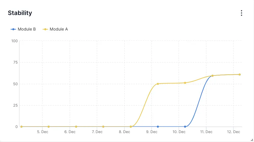
In the following example, the stability of Module A is plotted in the yellow segment and the stability of Module B is plotted in the blue segment:
All widgets in custom dashboards that use a line chart have segments in them. You can add a maximum of five segments in a widget.
We're sorry to hear that. Please share your feedback so we can do better
Contact our Support team for immediate help while we work on improving our docs.
We're continuously improving our docs. We'd love to know what you liked
We're sorry to hear that. Please share your feedback so we can do better
Contact our Support team for immediate help while we work on improving our docs.
We're continuously improving our docs. We'd love to know what you liked
Thank you for your valuable feedback!