 Ask the Community
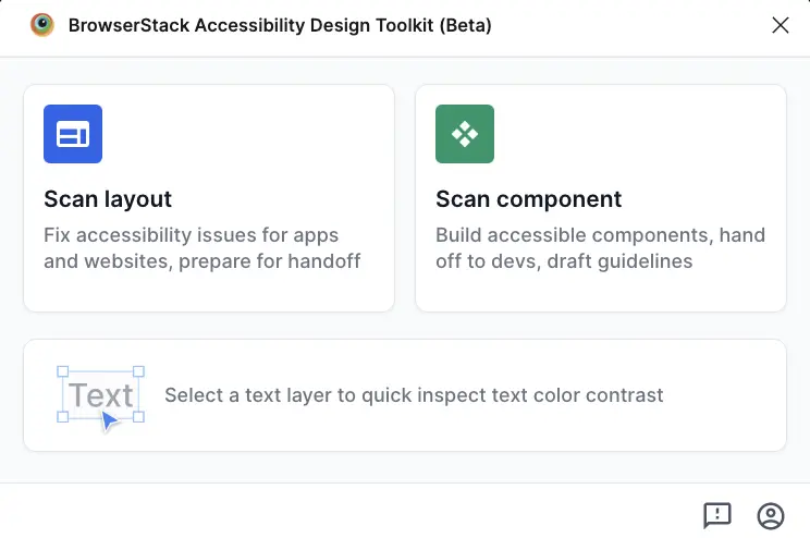
Scan your component
Scan your components to identify accessibility issues and generate developer handoff guidelines.
BrowserStack’s Accessibility Design Toolkit offers a component scanner that runs comprehensive accessibility checks on UI components and generates ARIA annotations and developer documentation.
To run a component scan, follow these steps:
-
In the toolkit, click on Component Scanner.
- In the Figma file, select the component set you want to scan.
- From the dropdown, select the component type:
- Button
- Checkbox
- Radio Button
- Input Field
- Link
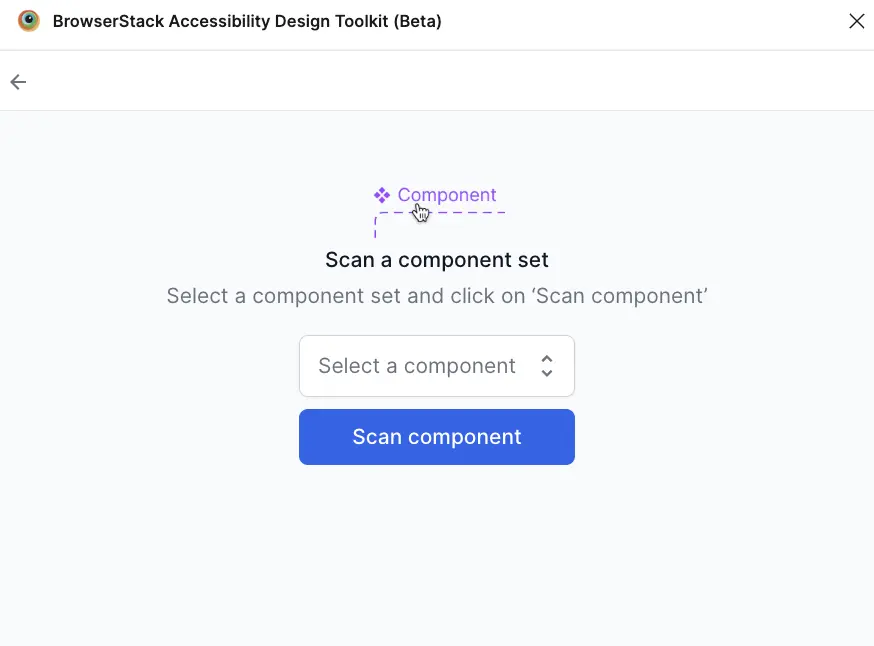
- Click Scan Component to start the scan. Scan results appear when the scan is complete.
Scan results
The component scan checks for accessibility issues based on WCAG guidelines.
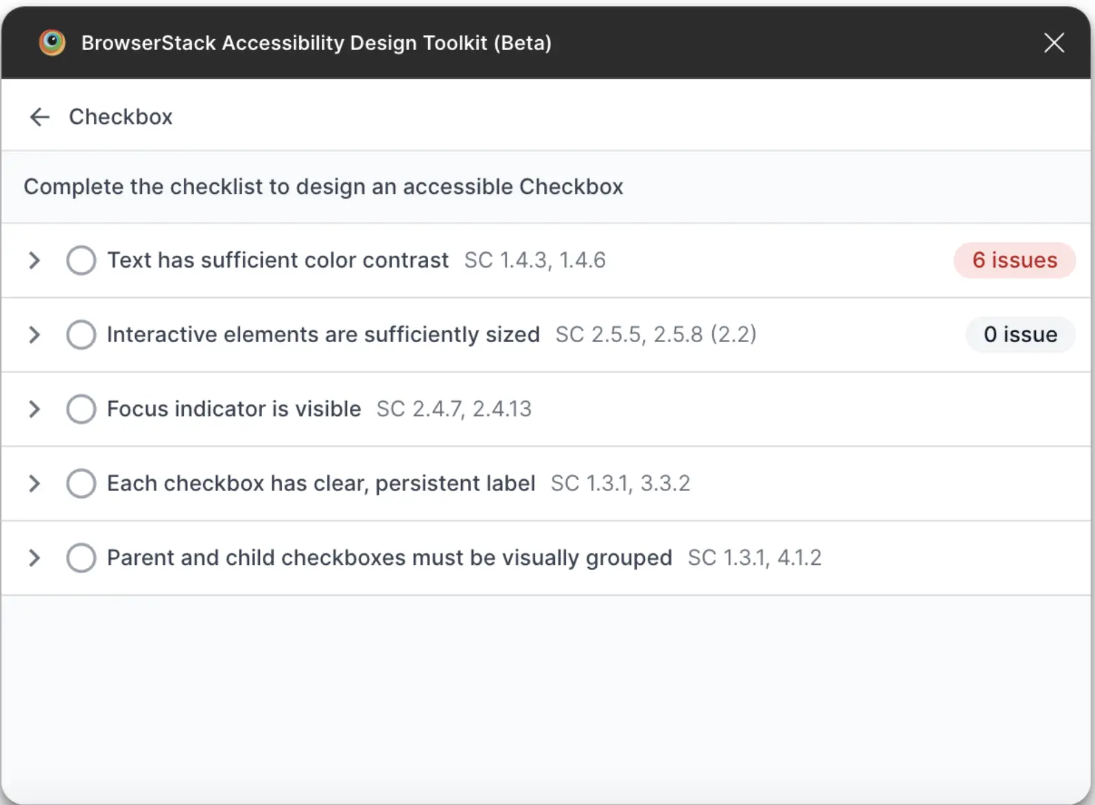
Automated checks
The toolkit automatically evaluates:
- Color contrast: Checks whether text meets WCAG AA or AAA contrast requirements. If the plugin detects a color contrast issue, it suggests accessible color combinations. You can apply a suggestion without quitting the plugin.
- Target size: Verifies interactive elements meet the WCAG AA and AAA requirements.
Manual guidelines
The toolkit provides a checklist and instructions for components that require manual intervention.
- The guidelines generated are specific to the selected components.
- Component states, such as focus or error, are included when relevant.
For example, a Checkbox component may include the following manual checks:
- Keyboard compatibility: Instructions for ensuring the component is keyboard accessible
- Screen reader compatibility: Guidelines for proper naming and role assignment
- Focus management: Recommendations for visible focus indicators
- Error states: Guidelines for accessible error messaging
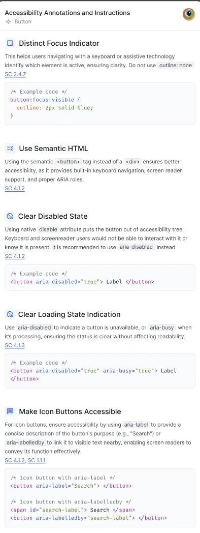
Developer handoff frame
The toolkit automatically generates a developer handoff frame, which is displayed next to the scanned component. The documentation includes:
- ARIA annotations: Role, state, and property attributes for the component
- Keyboard Interaction patterns: Expected keyboard behavior
- Accessibility Requirements: Component-specific WCAG success criteria
- Code Snippets: Example implementation with appropriate accessibility attributes
We're sorry to hear that. Please share your feedback so we can do better
Contact our Support team for immediate help while we work on improving our docs.
We're continuously improving our docs. We'd love to know what you liked
We're sorry to hear that. Please share your feedback so we can do better
Contact our Support team for immediate help while we work on improving our docs.
We're continuously improving our docs. We'd love to know what you liked
Thank you for your valuable feedback!