non-text-contrast
Ensure that all user interface components have a contrast ratio of at least 3:1 against their adjacent colors.
Description
The non-text-contrast rule ensures that all non-text user interface components and graphical elements have sufficient contrast (minimum 3:1) against adjacent colors. This includes interactive elements like buttons, text inputs, checkboxes, radio buttons, etc.
This rule aligns with WCAG Success Criterion 1.4.11 (Non-text Contrast), which requires that visual elements essential for understanding or interaction meet minimum contrast thresholds.
WCAG considers buttons with visible text as passing Non-Text Contrast because users recognize them as interactive elements. However, WCAG does not clearly specify what constitutes visibility in the criteria. In our rule, if button text does not pass the minimum 3:1 contrast with the button’s base color, then this is considered a failure for non-text-contrast. This check ensures that users can see the button text clearly.
Examples
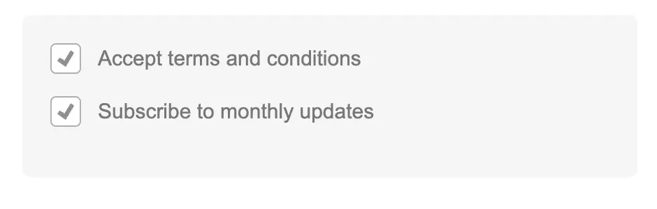
In the following example, a checkbox fails the non-text-contrast rule due to insufficient contrast between the elements of the checkbox:
```html
<!DOCTYPE html>
<html lang="en">
<head>
<meta charset="UTF-8">
<meta name="viewport" content="width=device-width, initial-scale=1.0">
<title>Improved Checkbox Example</title>
<style>
.checkbox-container {
background-color: #f5f5f5;
padding: 20px;
border-radius: 6px;
font-family: Arial, sans-serif;
max-width: 400px;
margin: 20px auto;
}
.checkbox-label {
display: flex;
align-items: center;
gap: 12px;
margin-bottom: 16px;
color: #777777;
cursor: pointer;
font-size: 15px;
position: relative;
}
.hidden-checkbox {
position: absolute;
opacity: 0;
width: 0;
height: 0;
}
.custom-checkbox {
width: 20px;
height: 20px;
border: 1px solid #b0b0b0;
border-radius: 4px;
background-color: #ffffff;
display: inline-flex;
align-items: center;
justify-content: center;
transition: all 0.2s ease;
}
.checkmark {
width: 12px;
height: 12px;
background-color: #909090;
clip-path: polygon(14% 44%, 0 65%, 50% 100%, 100% 16%, 80% 0%, 43% 62%);
display: none;
}
.checkmark.checked {
display: block;
}
/* Focus and hover states */
.hidden-checkbox:focus + .custom-checkbox {
box-shadow: 0 0 0 2px rgba(0, 120, 212, 0.3);
border-color: #0078d4;
}
.hidden-checkbox:hover + .custom-checkbox {
border-color: #909090;
}
</style>
</head>
<body>
<div class="checkbox-container">
<!-- First checkbox -->
<label class="checkbox-label">
<span class="custom-checkbox">
<span class="checkmark"></span>
</span>
<input type="checkbox" id="terms-checkbox" class="hidden-checkbox">
Accept terms and conditions
</label>
<!-- Second checkbox (pre-checked) -->
<label class="checkbox-label">
<span class="custom-checkbox">
<span class="checkmark checked"></span>
</span>
<input type="checkbox" id="newsletter-checkbox" class="hidden-checkbox" checked>
Subscribe to monthly updates
</label>
</div>
<script>
document.addEventListener('DOMContentLoaded', function() {
// Get all checkbox elements
const checkboxes = document.querySelectorAll('.hidden-checkbox');
// Add event listeners to each checkbox
checkboxes.forEach(checkbox => {
const checkmark = checkbox.parentElement.querySelector('.checkmark');
// Set initial state
if(checkbox.checked) {
checkmark.classList.add('checked');
}
// Toggle checkmark on click
checkbox.addEventListener('change', function() {
if(this.checked) {
checkmark.classList.add('checked');
} else {
checkmark.classList.remove('checked');
}
});
});
});
</script>
</body>
</html>
```
Copy icon
Copy
Note the lack of contrast in the html output:
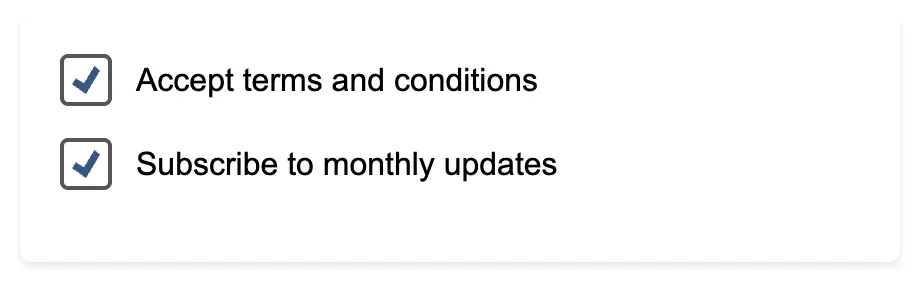
In contrast, the following code snippet has sufficient contrast between the different elements f the checkbox. This contrast ensures that the non-text-contrast rule is followed.
```html
<!DOCTYPE html>
<html lang="en">
<head>
<meta charset="UTF-8">
<meta name="viewport" content="width=device-width, initial-scale=1.0">
<title>High Contrast Checkbox Example</title>
<style>
.checkbox-container {
background-color: #ffffff;
padding: 20px;
border-radius: 6px;
font-family: Arial, sans-serif;
max-width: 400px;
margin: 20px auto;
box-shadow: 0 2px 4px rgba(0,0,0,0.1);
}
.checkbox-label {
display: flex;
align-items: center;
gap: 12px;
margin-bottom: 16px;
color: #333333; /* 12:1 contrast on white */
cursor: pointer;
font-size: 16px;
position: relative;
}
.hidden-checkbox {
position: absolute;
opacity: 0;
width: 0;
height: 0;
}
.custom-checkbox {
width: 22px;
height: 22px;
border: 2px solid #555555; /* 7:1 contrast on white */
border-radius: 4px;
background-color: #ffffff;
display: inline-flex;
align-items: center;
justify-content: center;
transition: all 0.2s ease;
}
.checkmark {
width: 14px;
height: 14px;
background-color: #2a5885; /* 7:1 contrast on white */
clip-path: polygon(14% 44%, 0 65%, 50% 100%, 100% 16%, 80% 0%, 43% 62%);
display: none;
}
.checkmark.checked {
display: block;
}
/* Focus and hover states */
.hidden-checkbox:focus + .custom-checkbox {
box-shadow: 0 0 0 3px rgba(42, 88, 133, 0.3);
border-color: #2a5885;
}
.hidden-checkbox:hover + .custom-checkbox {
border-color: #2a5885;
background-color: #f0f6ff;
}
/* Darker text when checked for better affordance */
.hidden-checkbox:checked ~ span:last-child {
color: #000000;
font-weight: 500;
}
</style>
</head>
<body>
<div class="checkbox-container">
<!-- First checkbox -->
<label class="checkbox-label">
<span class="custom-checkbox">
<span class="checkmark"></span>
</span>
<input type="checkbox" id="terms-checkbox" class="hidden-checkbox">
<span>Accept terms and conditions</span>
</label>
<!-- Second checkbox (pre-checked) -->
<label class="checkbox-label">
<span class="custom-checkbox">
<span class="checkmark checked"></span>
</span>
<input type="checkbox" id="newsletter-checkbox" class="hidden-checkbox" checked>
<span>Subscribe to monthly updates</span>
</label>
</div>
<script>
document.addEventListener('DOMContentLoaded', function() {
const checkboxes = document.querySelectorAll('.hidden-checkbox');
checkboxes.forEach(checkbox => {
const checkmark = checkbox.parentElement.querySelector('.checkmark');
// Set initial state
if(checkbox.checked) {
checkmark.classList.add('checked');
}
// Toggle checkmark on click
checkbox.addEventListener('change', function() {
this.parentElement.querySelector('span:last-child').style.fontWeight =
this.checked ? '500' : 'normal';
checkmark.classList.toggle('checked', this.checked);
});
});
});
</script>
</body>
</html>
```
Copy icon
Copy
Note the contrast in the html output:
How to fix?
To comply with the non-text-contrast rule:
Verify contrast ratios (≥3:1) for all UI components against adjacent colors.
Test graphical elements (icons, charts, diagrams) against their backgrounds.
Ensure visual distinctions (e.g., graph lines, chart segments) meet the contrast requirement.
Check all component states (hover, focus, disabled, etc.) for consistent contrast.
Reference
 Ask the Community