Non-text color contrast
App accessibility checks whether non-text elements have sufficient color contrast for readability. Non-text elements must have sufficient color contrast against their backgrounds to be easily seen by all users. Your app should have a minimum contrast ratio of 3:1 to comply with accessibility guidelines.
Setting a sufficient contrast ratio helps with:
- Accessibility: Users with visual impairments, such as low vision or color blindness, rely on adequate contrast to navigate and interact with your app.
- Usability: Clear visual elements enhance the overall user experience and ensure inclusivity.
Non-text UI components
The rule checks the contrast ratio of the following non-text UI components:
- Buttons
- Image buttons
- Seek controls
- Progress bars
- Icons
- Images
- Rule Category :
Color contrast - WCAG 2.1 & 2.2 SC :
1.4.3 (AA) - Rule Severity :
Serious - Supported Platforms :
Android,iOS
Success criteria
The rule checks whether non-text elements, such as <ImageView>, <ImageButton>, buttons, seek controls, and progress bars, have a minimum contrast ratio of 3:1 against adjacent colors.
How to fix
To prevent insufficient non-text color contrast violations:
-
Identify affected elements: Review non-text UI components in your app, such as buttons, image buttons, seek controls, progress bars,
ImageView,ImageButton, or similar elements, and confirm they meet contrast requirements against their backgrounds. - Adjust colors: Modify foreground (icons or images) or background colors to achieve a minimum contrast ratio of 3:1.
Example
The following screenshot highlights an insufficient non-text color contrast violation in a mobile app:
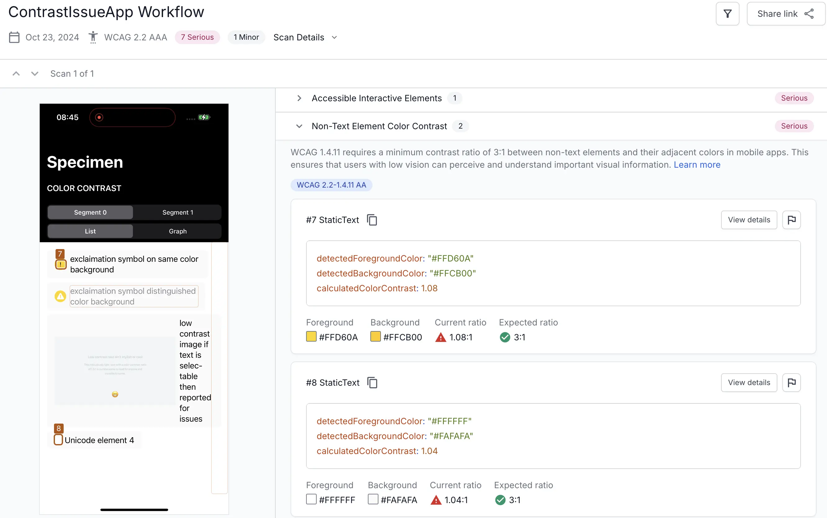
The example highlights the following violations:
-
Issue #7: A yellow icon (
#FFD60A) on a slightly darker yellow background (#FFCB00) has a low contrast ratio of 1.08:1, which is below the required 3:1 contrast ratio. This low contrast makes the icon difficult to perceive for users with visual impairments. -
Issue #8: A white icon (
#FFFFFF) on a light gray background (#FAFAFA) has a contrast ratio of 1.04:1. As a result, it fails to meet the minimum 3:1 contrast requirement.
Fix
To resolve these violations:
- Adjust the foreground color: Modify the colors of the icons in the button or image elements to darker shades (for example, use a darker yellow or gray) to achieve better contrast ratio against the background.
- Modify the background color: Adjust the background colors to ensure the existing icon colors meet the 3:1 contrast ratio.
- Add a contrasting outline: If color modifications are not feasible, add a contrasting outline or border around the icons to enhance visibility.
References
We're sorry to hear that. Please share your feedback so we can do better
Contact our Support team for immediate help while we work on improving our docs.
We're continuously improving our docs. We'd love to know what you liked
We're sorry to hear that. Please share your feedback so we can do better
Contact our Support team for immediate help while we work on improving our docs.
We're continuously improving our docs. We'd love to know what you liked
Thank you for your valuable feedback!