 Join our Discord
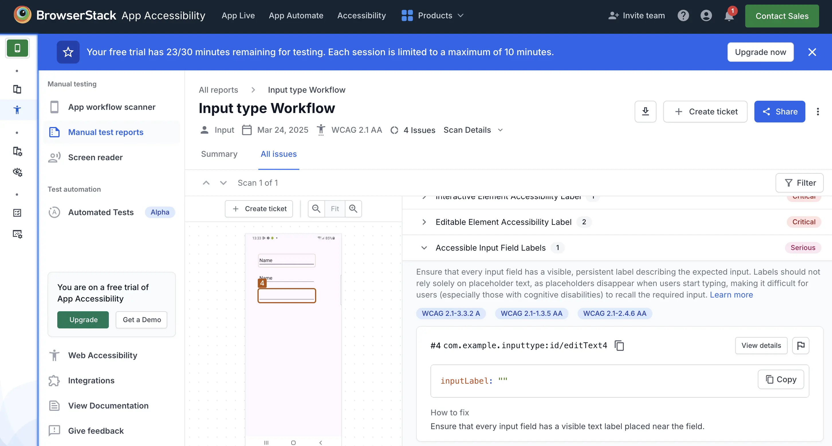
Accessible input field labels
The accessible input field labels rule ensures that every input field has a visible and persistent label that can also be identified by assistive technologies. Input field labels should accurately describe the purpose of the field and the expected input.
Missing or inadequate labels severely impact usability and accessibility, especially for users with visual impairments or cognitive disabilities. Providing appropriate visible labels and instructions helps users understand the purpose of input fields.
- Rule Category :
Input Purpose - WCAG 2.1 & 2.2 SC :
1.3.5 (AA),2.4.6 (AA),3.3.2 (A) - RAAM 1.1 :
9.1,9.2,9.3,9.4 - Rule Severity :
Serious - Supported Platforms and Frameworks :
Android,iOS,React Native,Flutter apps
Success criteria
The specific criteria for success are:
- Input fields must have a visible text label that describes the purpose of the field and the type of data the user is expected to enter.
- Labels should remain visible even when the user interacts with the input field.
- Placeholder text must provide hints about the expected input. However, it should not be the only source of information about the field’s purpose.
How to fix
Ensure that every input field has a visible and persistent text label to help users understand the expected input:
Add the following to provide a visible, persistent, and accessible label for your input field:
-
android:labelFor(inTextView): Associates the label with the correspondingEditText. -
android:hint(inEditText): Provides placeholder text that describes the expected input. Do not use this as a replacement for the label.
Add the following to provide a visible, persistent, and accessible label for your input field:
-
UILabel: Use aUILabelto create a visible, persistent text label for the field. -
accessibilityLabel(inUITextField): Set a descriptive label for screen readers. You can often set this to the same text as yourUILabel. -
placeholder(inUITextField): Provide placeholder text that suggests the expected input. Do not use this as a replacement for the visible label.
Add the following properties to the input field’s TextFormField widget to provide a visible, persistent, and accessible label for your input field:
-
labelText: Provides a text label that describes the purpose of the field. -
floatingLabelBehavior: FloatingLabelBehavior.always: Ensures the label remains visible even when the user interacts with the input field. -
hintText: Provides placeholder text that describes the expected input.
In React Native, there is no built-in attribute to link a label directly to an input field. To ensure accessibility and usability, combine a Text component with the input field’s TextInput component, and add the following properties:
-
Text: Provides a visible, persistent label for the input field. -
accessibilityLabel(inTextInput): Sets a descriptive label for screen readers. -
placeholder(inTextInput): Provides placeholder text that suggests the expected input. Do not use this as a replacement for the label.
Example
Android
Consider the following example:
Error
- The input field element does not have an input label. It is unclear what information the user is expected to enter in this field.
Fix
- Add the following attributes:
-
android:labelFor(inTextView): Associate a visible, persistent text label, such as “Email Address” or “Last Name”, with the input field. -
android:hint(inEditText): Provide placeholder text that describes the expected input, such as “Enter your email address” or “Enter your last name”.
-
References
WCAG
- 1.3.5 Identify Input Purpose (Level AA): WCAG 2.1 · WCAG 2.2
- 2.4.6 Headings and Labels (Level AA): WCAG 2.1 · WCAG 2.2
- 3.3.2 Labels or Instructions (Level A): WCAG 2.1 · WCAG 2.2
RAAM 1.1
We're sorry to hear that. Please share your feedback so we can do better
Contact our Support team for immediate help while we work on improving our docs.
We're continuously improving our docs. We'd love to know what you liked
We're sorry to hear that. Please share your feedback so we can do better
Contact our Support team for immediate help while we work on improving our docs.
We're continuously improving our docs. We'd love to know what you liked
Thank you for your valuable feedback!