 Ask the Community
Overlapping interactive elements
Interactive elements, such as buttons, links, or input fields, should not overlap. This ensures users can reliably identify, focus, and activate each control without confusion or ambiguity.
When interactive elements overlap, users may experience the following issues:
- Obstruct navigation for screen reader users.
- Cause focus order confusion.
- Lead to incorrect touch target registration, making it difficult or impossible for users to tap the intended control, especially for users with motor disabilities or low vision.
- Violate reflow requirements when the layout breaks at higher zoom levels or on small screens.
- Rule Category:
Focus and Navigation - WCAG 2.1 SC:
1.3.2 (A), 1.4.10 (AA), 2.1.1 (A), 2.4.3 (A) - WCAG 2.2 SC:
1.3.2 (A), 1.4.10 (AA), 2.1.1 (A), 2.4.3 (A), 2.4.11 (AA), 2.5.8 (AA) - Rule Severity:
Serious - Supported Platforms and Frameworks :
Android,iOS,React Native,Flutter apps
Success criteria
The specific criteria for success are:
- Controls must be operable via keyboard without being obstructed by other elements.
- The logical navigation order must be maintained, preventing focus order confusion.
- Focus indicators must remain visible and not be hidden by overlapping elements.
- The meaningful reading or navigation sequence must be preserved, especially for users of assistive technologies.
- Controls must remain accessible and visible on small screens or at higher zoom levels, adhering to reflow requirements.
- The effective target area of interactive elements must be sufficient to prevent incorrect touch target registration.
How to fix
To prevent overlapping interactive elements violations, follow these steps:
-
Design with clear spacing
Ensure adequate visual and interactive spacing between all interactive elements during UI design. -
Remove or reposition overlaps
Modify the layout so that each interactive component occupies a unique and distinct area on the screen. -
Avoid dynamic overlap
Prevent interactive elements from being dynamically created or moved in a way that causes them to overlap existing controls. -
Test responsiveness
Verify that elements maintain their distinct boundaries and do not overlap across various screen sizes, orientations, and zoom levels. -
Implement unambiguous hit targets
Ensure the interactive area for each element is clearly defined and sufficiently large to preclude ambiguity when a user attempts activation. -
Verify functionality with assistive technologies
Conduct thorough testing with keyboards and screen readers to confirm proper focus management and activation behavior.
Platform-specific implementation
- Use layout managers (such as
LinearLayoutorConstraintLayout) to ensure that views marked asclickable="true"orfocusable="true"do not visually or functionally overlap.
- Check that interactive
UIViewsubclasses (such asUIButtonandUITextField) do not have overlapping frames. Ensure that Auto Layout constraints do not resolve in a way that causes elements to overlap.
- Use Flexbox properties (such as
flexDirection,justifyContent,alignItems,margin, andpadding) to arrange components without overlap. Avoid usingposition: 'absolute'unless you have accounted for all nearby interactive elements.
- Use widgets like
Row,Column,Padding,SizedBox, andExpandedto define clear spacing and prevent overlaps. When using aStack, ensure that interactive widgets do not unintentionally obscure one another.
Example
The following example scan report highlights an overlapping interactive element violation with the UIButton element overlapping another element.
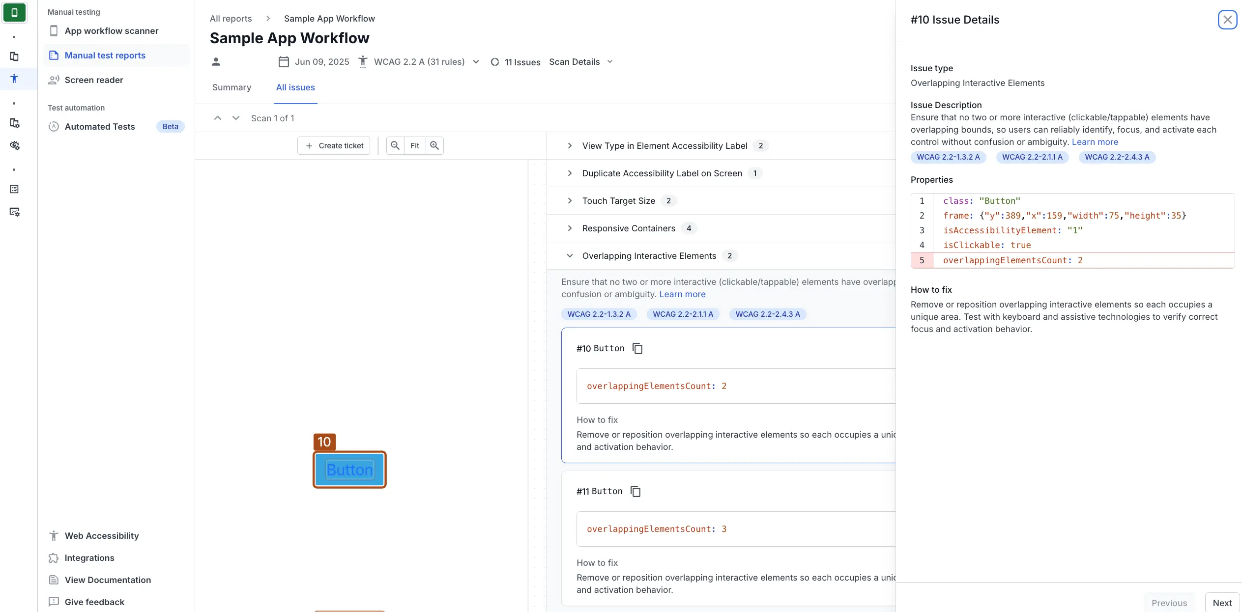
Fix
To correct this violation:
- Identify the overlapping elements and their respective frames.
- Fix the layout to ensure that the
UIButtondoes not overlap with other interactive elements.- If you are using Auto Layout, adjust the button’s
leadingAnchor,trailingAnchor,topAnchor, orbottomAnchorconstraints (and potentiallywidthAnchor/heightAnchor) to resolve the overlap. For example, to shift it left to clear an overlap on its right, decrease theconstantof itsleadingAnchor. To shift it up from an overlap below, decrease theconstantof itstopAnchor. - If you are setting the frames programmatically, adjust the
button.frame.origin.xorbutton.frame.origin.yproperties to shift its position. For example, to move the button 10 points to the right, setbutton.frame.origin.x = 169. To move it 10 points down, setbutton.frame.origin.y = 399.
- If you are using Auto Layout, adjust the button’s
References
- 1.3.2 Meaningful Sequence (Level A): WCAG 2.1 · WCAG 2.2
- 1.4.10 Reflow (Level AA): WCAG 2.1 · WCAG 2.2
- 2.1.1 Keyboard (Level A): WCAG 2.1 · WCAG 2.2
- 2.4.3 Focus Order (Level A): WCAG 2.1 · WCAG 2.2
- 2.4.11 Focus Not Obscured (Minimum) (Level AA): WCAG 2.2
- 2.5.8 Target Size (Minimum) (Level AA): WCAG 2.2
We're sorry to hear that. Please share your feedback so we can do better
Contact our Support team for immediate help while we work on improving our docs.
We're continuously improving our docs. We'd love to know what you liked
We're sorry to hear that. Please share your feedback so we can do better
Contact our Support team for immediate help while we work on improving our docs.
We're continuously improving our docs. We'd love to know what you liked
Thank you for your valuable feedback!