
 Join our Discord
Fix accessibility issues automatically or add annotations for developers
Fix accessibility issues automatically across your web and mobile designs, or add annotations for developers to follow.
BrowserStack’s Accessibility Design Toolkit helps you resolve accessibility issues in your designs. You can apply some of the fixes automatically using the toolkit. In other cases, add annotations for developers to fix the issues.
The toolkit covers the following types of issues in layout scans and component scans:
Color contrast on text elements
This check supports WCAG 2.1 Success Criterion 1.4.3 (Contrast Minimum).
To check color contrast on text, follow these steps:
- Click Text Contrast to view issues related to color contrast. Layers with the same contrast issue are grouped together on the right.
-
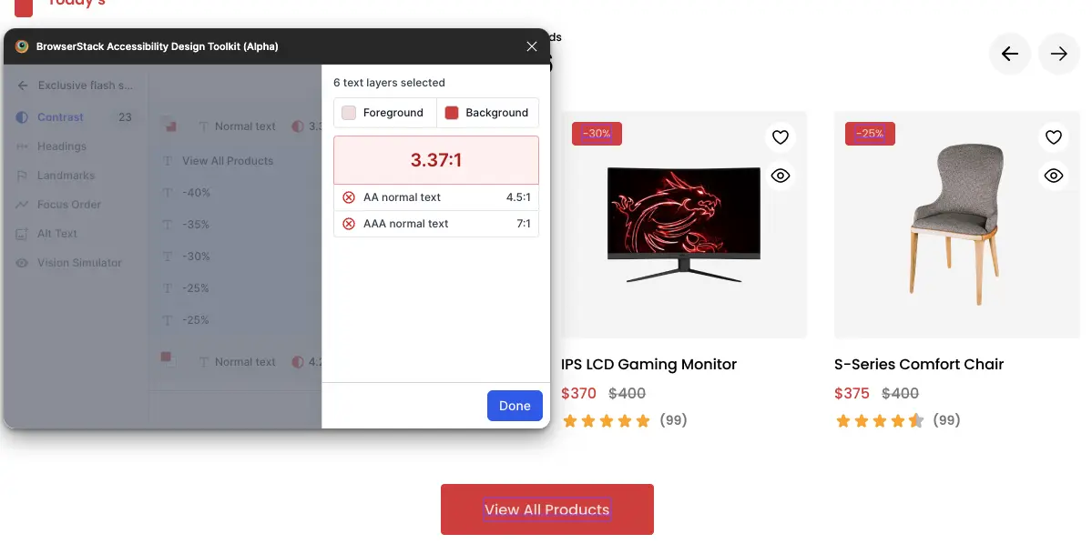
Click a group to view the layers where the issue is flagged. The results pane displays the precise contrast ratio, considering the opacity of the layers, and updates as you change colors.
For example, in this screen, the toolkit has identified six layers with the same contrast issue.
-
If the toolkit detects a color contrast issue, apply one of its suggested accessible color combinations without leaving the toolkit.
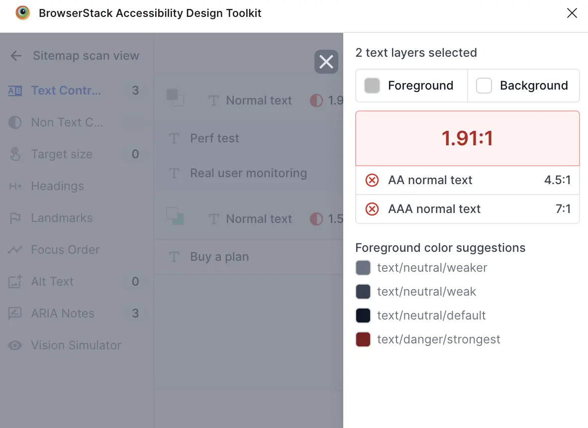
- Click Done when you’ve fixed the issue.
- Click Mark as done after you’ve addressed all color contrast issues.
In summary, the toolkit allows you to:
- Group similar contrast issues automatically.
- Display precise contrast ratios, taking into account the opacity of layers.
- Show WCAG AA and AAA pass or fail status.
Color contrast on non-text elements
This check supports WCAG 2.1 Success Criterion 1.4.11 (Non-text Contrast).
To check for contrast issues in non-text layers, follow these steps:
- Select the non-text element you want to check.
-
On the toolkit, select Non Text Contrast. On selection, the toolkit immediately highlights the WCAG AA pass or fail status for color contrast on the selected layer.
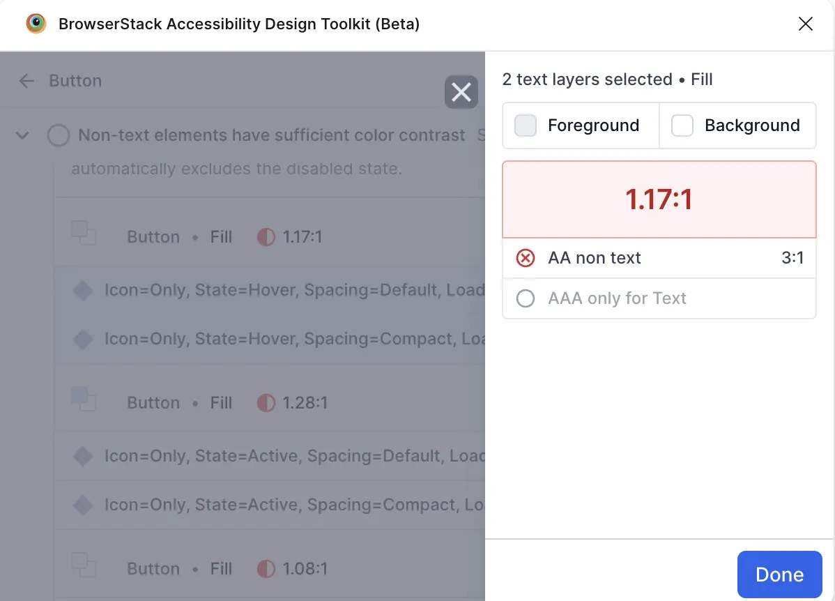
The toolkit automatically detects contrast issues for the UI elements.
- Click Done.
Headings
To annotate headings, follow these steps:
- Click Headings to view issues related to headings.
- Specify the heading levels using either method:
- To manually specify headings, select one or more text layers, click Add Headings, and choose the heading level.
- Alternatively, use the headings the toolkit detected and specify their levels inside the Review & Add popup.
-
Click Done to annotate the headings.
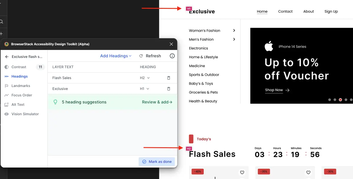
For example, in this screen, two headings are annotated and the toolkit has identified another five potential headings.
- Click Mark as done after you’ve identified all headings.
Heading annotations help developers when they consume the design files.
In summary, the toolkit allows you to:
- Detect potential headings automatically.
- Annotate headings manually.
- Suggest best practices for heading hierarchy, such as avoiding multiple first-level headings or a missing first-level heading.
- Add visible annotations for developer reference.
The developer handoff frame contains static instructions for developers to keep the headings accessible.
Landmarks (Web only)
To annotate landmarks, follow these steps:
- Click Landmarks to specify the landmarks.
- Select the layers on your frame.
-
Click Add Landmarks to select the landmark type.
For example, in this screen, the toolkit helps demarcate the Header and Nav on the frame.
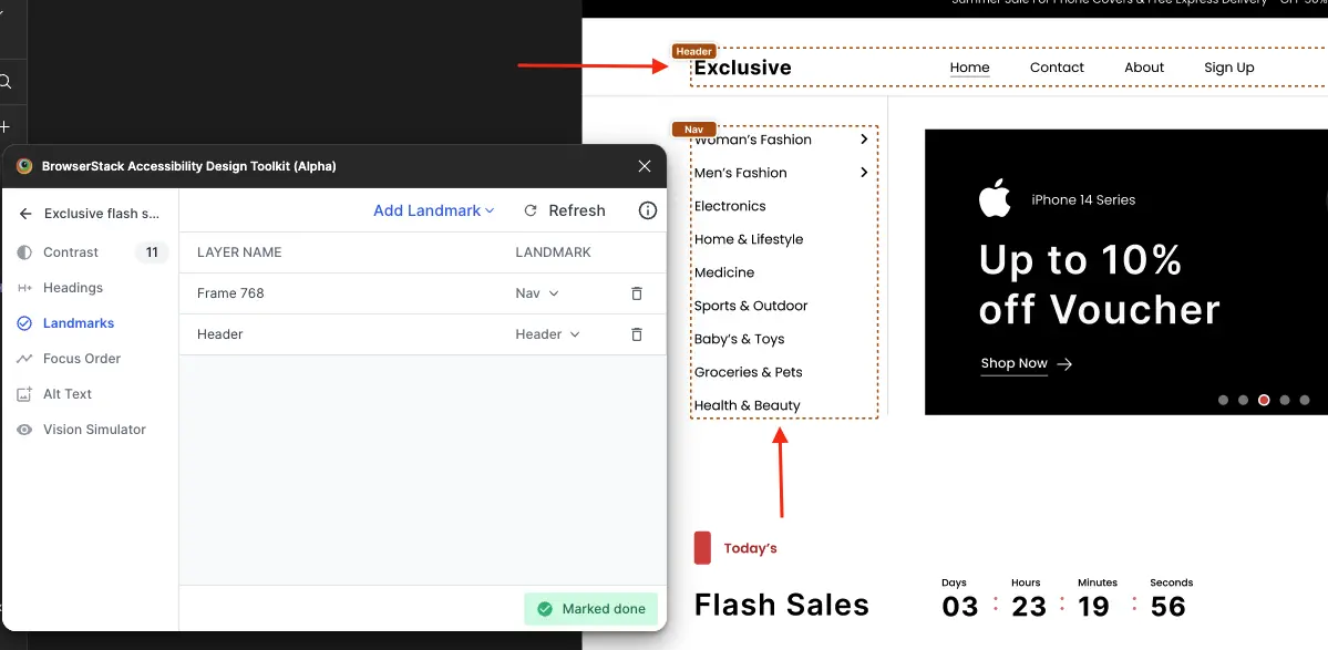
- Click Done to annotate the landmarks on the frame, which helps developers when they consume the design files.
- Click Mark as done after you’ve identified all landmarks.
In summary, the toolkit allows you to:
- Support seven standard HTML landmark types for structuring webpages.
- Manually annotate any layer in the frame to demarcate regions on the page.
- Provide clear annotations for development handoff.
iOS containers (Mobile only)
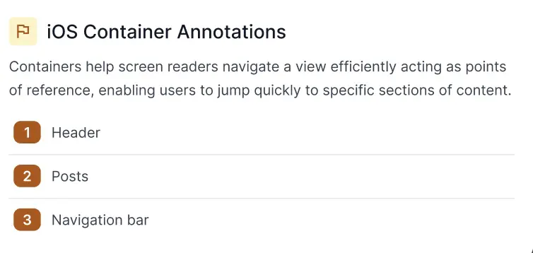
Containers in iOS help screen readers navigate a view efficiently. They act as points of reference, enabling users to jump quickly to specific sections of content.
Click iOS Containers to specify the containers. Select one or more layers and click Add Container. For example, in this screen, the toolkit has identified three iOS containers.
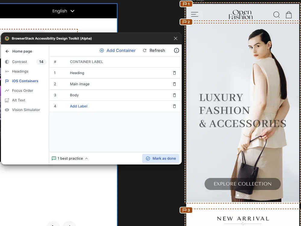
Label each container and click Mark as done when you’ve completed this step.
In summary, the toolkit allows you to:
- Manually annotate any layer in the frame to define meaningful container labels.
- Provide clear annotations for development handoff.
The developer handoff frame contains static instructions for developers to keep the containers accessible.
Focus and reading order
Focus order specifies the sequence in which elements receive keyboard focus. Reading order defines the sequence in which screen readers read out elements on the screen. Align the two in most cases to avoid confusing users who rely on assistive technologies.
You can assign a focus order and reading order to any UI element and update the sequence at any time. Numbers appear next to elements in the specified sequence so you can verify the order visually. To speed up the process on large or repetitive sets of elements, select multiple elements at once to auto-assign a reading order, then review it afterward to confirm it matches your intended flow.
To add focus order, follow these steps:
-
Select all the layers you want users to navigate to when using the keyboard and then click Add Focus Order.
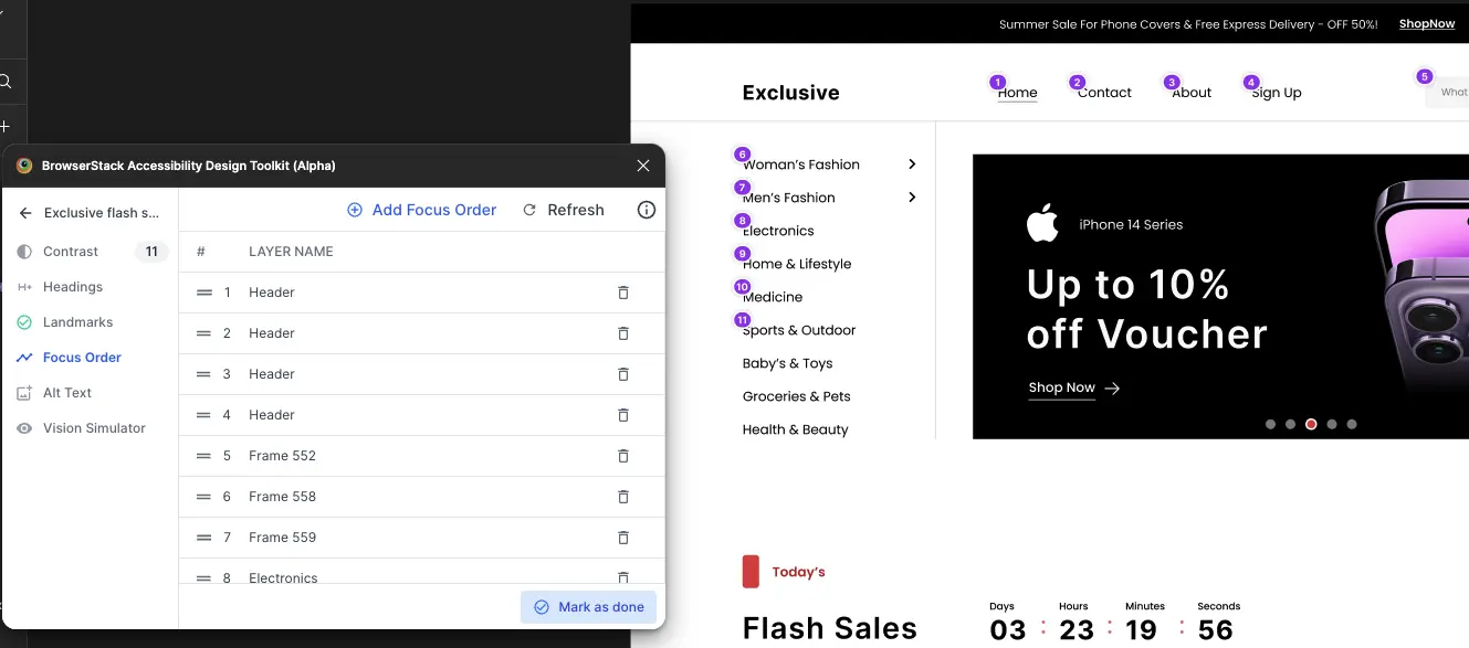
The toolkit identifies the layers you selected and applies the left-to-right and top-to-bottom logic to automatically suggest and annotate the order.
-
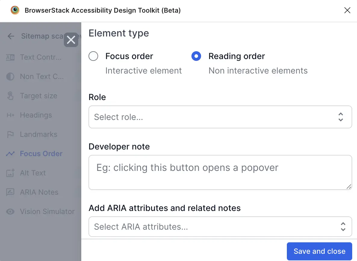
Click Add role and attributes beside the element to set Role, add Developer note, or Add ARIA attributes and related notes.
-
Click Save and close.
-
Drag and drop the layers on the toolkit to change the order.
For example, in this screen, the toolkit calls out the focus order.
-
Click Mark as done after you’ve defined the focus order and reading order.
In summary, the toolkit allows you to:
- Bulk select interactive elements to annotate in one click.
- Generate sequential numbering automatically in a meaningful order.
- Reorder focus ordering easily.
- Provide a developer handoff frame for clear annotations.
The developer handoff frame contains static instructions to explain the focus order annotations on the design.
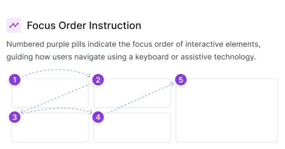
This section only appears if at least one focus order annotation is defined on-screen.
Image alt text annotations
The toolkit helps you provide text alternatives for images, icons, charts, and other visual elements on your page.
To annotate alt text, follow these steps:
-
Click Alt Text on the toolkit to identify images that don’t have alt text.
For example, in this screen, the toolkit has identified a few images that don’t have alt text defined.
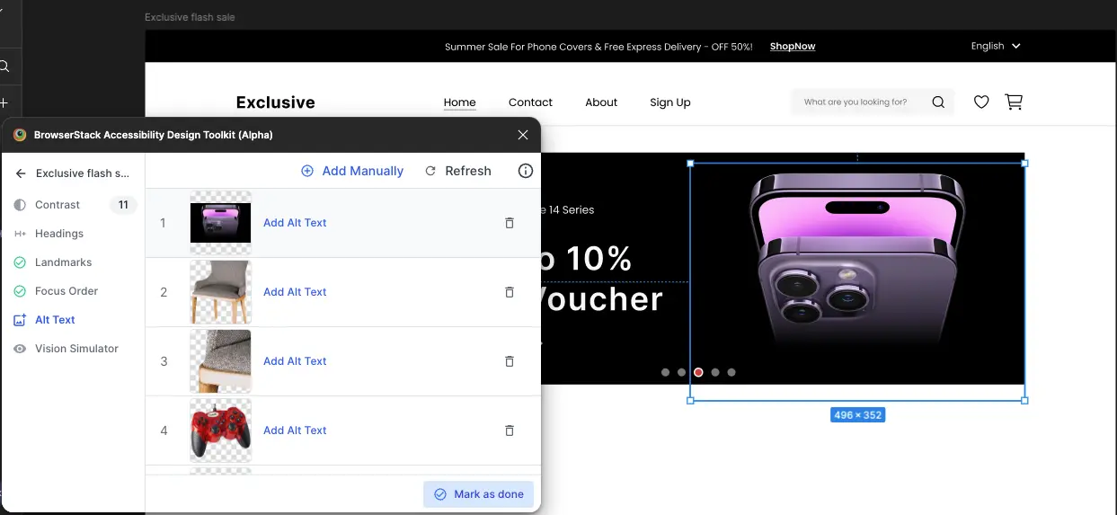
- Use the Add Alt Text link to define the alt text for each visual element. This alt text acts as a handoff note for developers.
- Click Mark as done after you’ve defined the alt text for all visual elements.
In summary, the toolkit allows you to:
- Automatically detect JPG and PNG images on the frame.
- Manually annotate any layer with alt text or mark it as decorative.
- Tag images as complex for additional context.
- Auto-generate developer handoff notes tailored for Web, Android, and iOS.
The developer handoff frame contains different alternatives for adding alt text to an image.
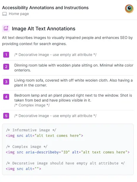
AI image alt text annotations
The toolkit provides AI-generated alt text suggestions for meaningful images on the scanned frame. To do this, follow these steps:
- Click Alt Text on the toolkit to identify images that don’t have alt text.
- Click Generate Alt Text.
-
Select the images you want to generate alt text for and click Generate Alt Text.
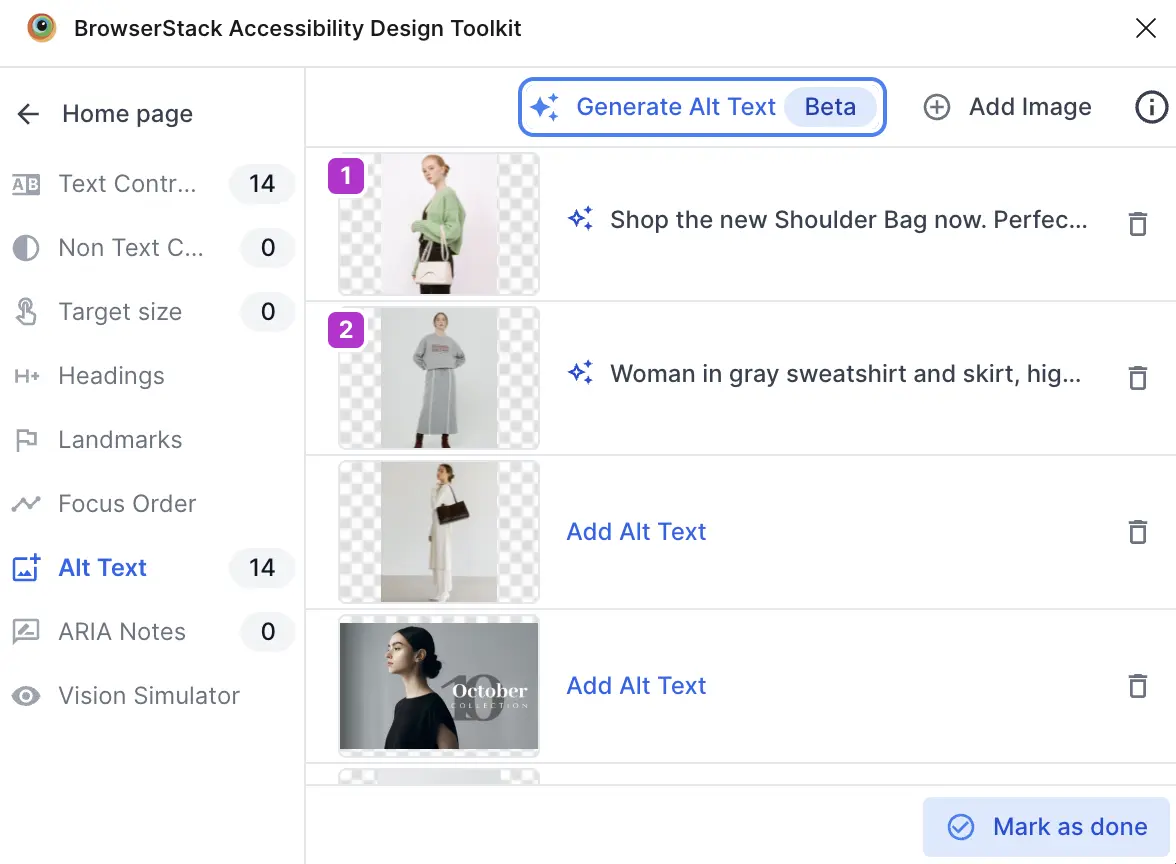
- Click Mark as done.
Vision simulator
There are several types of color deficiencies. The toolkit simulates how your design appears to people with different color vision deficiencies.
Click Vision Simulator to simulate different types of deficiencies. Click a simulated thumbnail to see how the frame appears to a person with the selected deficiency. For example, in this screen, the toolkit shows what the design looks like to a person with Achromatopsia.
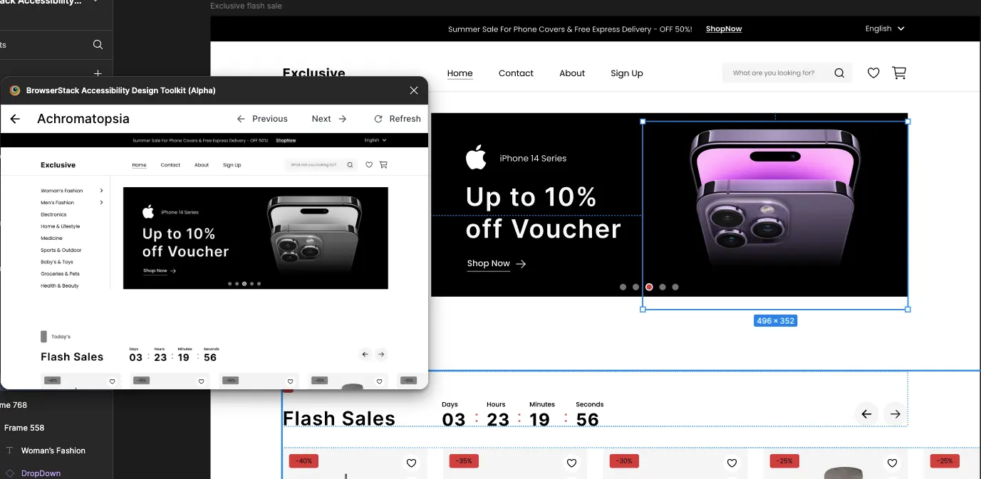
In summary, the toolkit allows you to:
- Simulate eight types of color blindness and weakness.
- Identify potential color-based confusion points.
ARIA annotations
Use the toolkit to annotate ARIA roles and attributes in your designs to improve accessibility and screen reader support.
The toolkit automatically identifies the UI elements in a scanned frame. For each identified element, the toolkit suggests a suitable role and relevant ARIA attribute-value pairs. These suggestions help you quickly add accessible metadata to your UI. If the toolkit doesn’t detect a UI element, you can annotate it manually.
To annotate ARIA attributes, follow these steps:
- On the toolkit, click Layout Scanner or Component Scanner.
- Select a frame or component in your Figma file and click Scan Frame.
- Click ARIA notes.
-
Select a specific layer on the Figma file and then click Add Element.
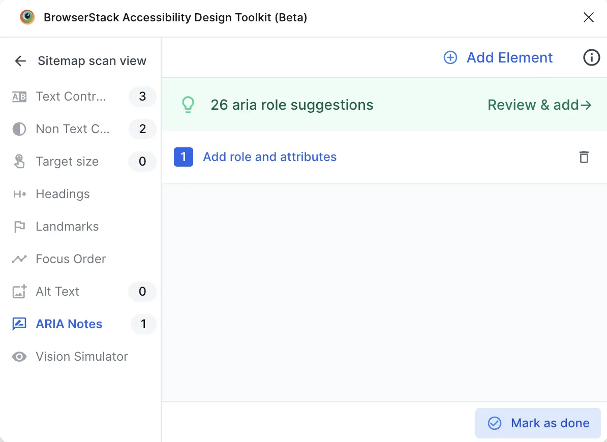
- Click Add role and attributes.
-
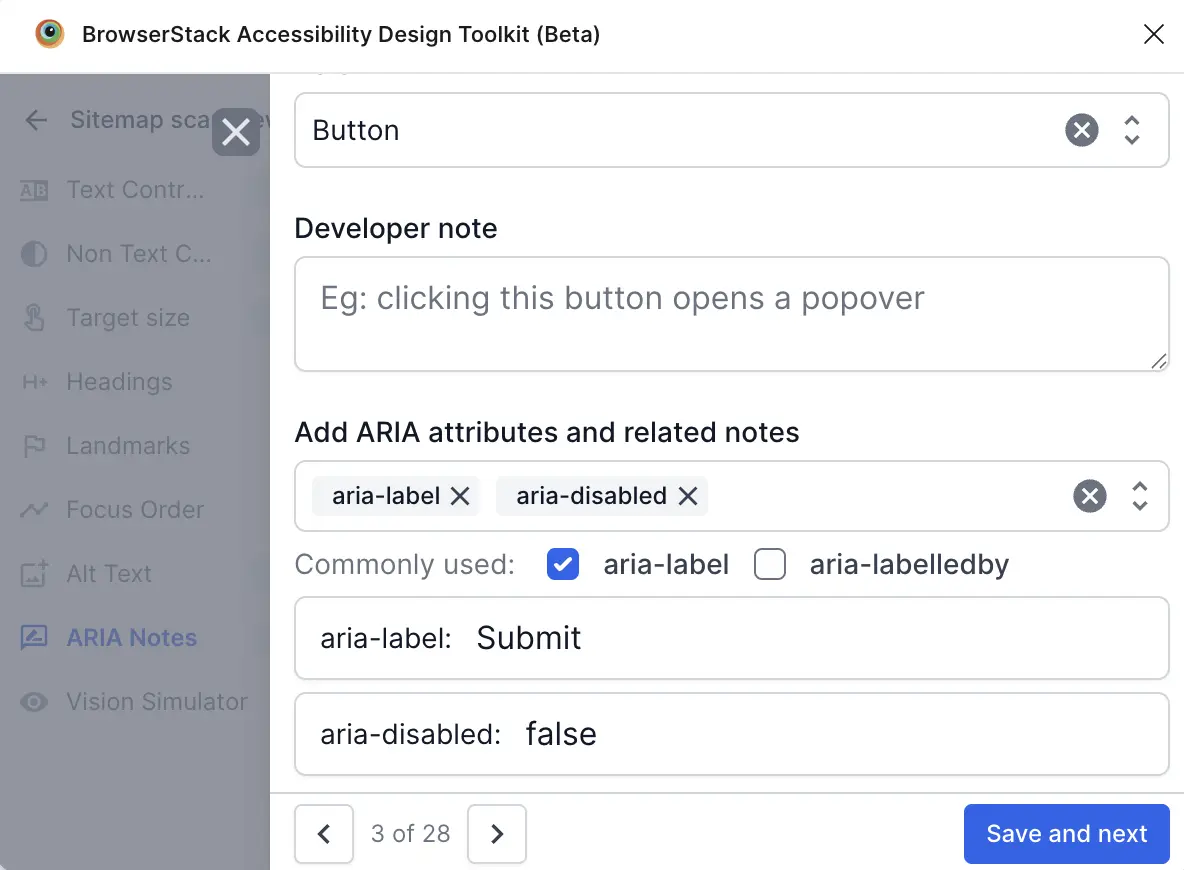
Set Role, add Developer note, and select ARIA attributes to Add ARIA attributes and related notes.
-
Click Save and next. The attribute is listed on the toolkit.
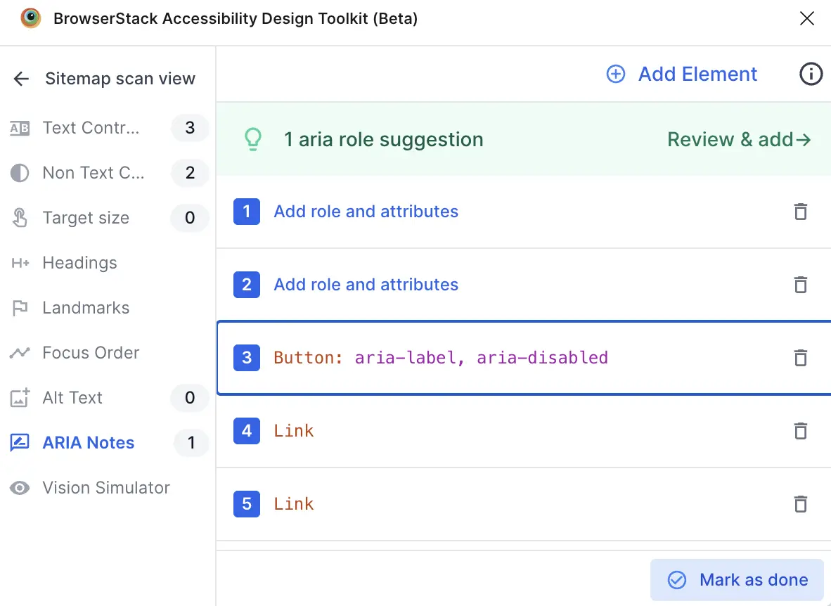
- Click Mark as done.
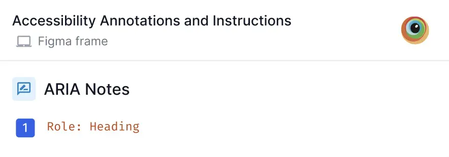
The toolkit creates a developer handoff frame that contains static instructions to explain the ARIA annotations on the design.
Reflow
Use the toolkit to verify that your design adapts smoothly across common breakpoints without forcing two-dimensional scrolling or hiding content.
Use this feature to ensure users can read and operate the interface when the viewport shrinks to 320px width, mobile portrait.
To test reflow, follow these steps:
- On the toolkit, click Layout Scanner or Component Scanner and scan the frame or component you want to validate.
- Click Reflow. You’ll see two options:
- Link existing
- Generate

Link existing
If you’ve already designed a 320px wide frame, choose this option to link that frame instead of generating a new one. This lets the toolkit evaluate your authored responsive variant without duplication.
To test reflow using the Link existing option, follow these steps:
- Select an existing 320px frame, and click Link existing. The toolkit displays all the issues under the Issues tab.
-
Review the issues and make necessary adjustments to your design to ensure it adapts smoothly at 320px width. Click the bulb icon for tips to fix specific issues.
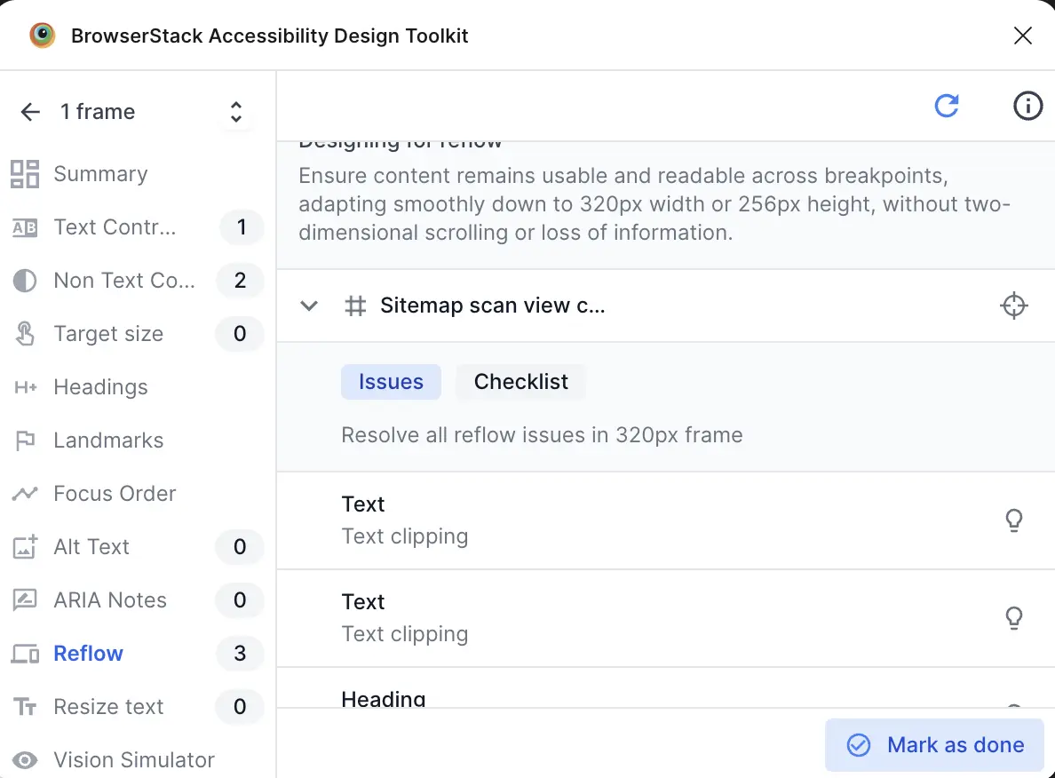
- Optionally, select the Checklist tab to view best practices for responsive design and ensure your design adheres to them.
- Click Mark as done after you’ve validated all frames at the smallest required breakpoints.
Generate
The toolkit automatically creates a test frame at the smallest supported breakpoint, 320px width, if you don’t already have one. Use this to quickly produce a narrow version of your design and inspect how components stack, wrap, and resize.
To test reflow using the Generate option, follow these steps:
- Click Generate. The toolkit creates a new frame at 320px width and displays all the issues under the Issues tab.
- Review the issues and make necessary adjustments to your design to ensure it adapts smoothly at 320px width. Click the bulb icon for tips to fix specific issues.
- Optionally, select the Checklist tab to view best practices for responsive design and ensure your design adheres to them.
- Click Mark as done after you’ve validated all frames at the smallest required breakpoints.
Resize text
Use the toolkit to verify that users can enlarge text up to 200% without losing content or functionality. This supports WCAG 2.1 Success Criterion 1.4.4, Resize Text.
The feature helps you spot containers that clip, overlap, or truncate when type scales, and encourages flexible line height, wrapping, and responsive spacing.
- On the toolkit, click Layout Scanner or Component Scanner and scan the frame or component you want to validate.
- Click Resize text. You’ll see two options:
- Link existing
- Generate
Link existing
If you already have a frame designed for enlarged text, up to 200% per WCAG 1.4.4, select the Link existing option. This reuses the existing frame instead of generating a new one, letting the toolkit evaluate your authored responsive variant without duplication.
To test resize text using the Link existing option, follow these steps:
- Select the existing frame with text already scaled to 200%, and then click Link existing. The toolkit displays all the issues under the Issues tab.
- Review the issues and adjust the design so text scaled to 200% remains readable without clipping, overlap, truncation, or loss of functionality. Click the bulb icon for tips to fix specific issues.
- Optionally, select the Checklist tab to view best practices for responsive design and ensure your design adheres to them.
- Click Mark as done after you’ve validated all frames.
Generate
The toolkit automatically generates a test frame with text enlarged to 200%, per WCAG 1.4.4, if you don’t already have one, so you can quickly inspect how scaled typography wraps, reflows, and avoids clipping or truncation.
To test resize text using the Generate option, follow these steps:
- Click Generate. The toolkit generates a new test frame with all text scaled to 200% for WCAG 1.4.4 evaluation and displays all the issues under the Issues tab.
- Review the issues and adjust the design so text scaled to 200% remains readable without clipping, overlap, truncation, or loss of functionality. Click the bulb icon for tips to fix specific issues.
- Optionally, select the Checklist tab to view best practices for responsive design and ensure your design adheres to them.
- Click Mark as done after you’ve validated that text scaled to 200% remains readable across all frames.
Target size
Use the toolkit to verify that interactive controls in your designs are large enough for users who rely on touch or have motor disabilities to operate easily. This aligns with WCAG 2.1 (AAA) Success Criterion 2.5.5, Target Size, and WCAG 2.2 (AA) Success Criterion 2.5.8, Target Size (Minimum).
The feature helps you spot insufficient target sizes in a frame.
- On the toolkit, click Layout Scanner or Component Scanner and scan the frame or component you want to check.
-
Click Target size.
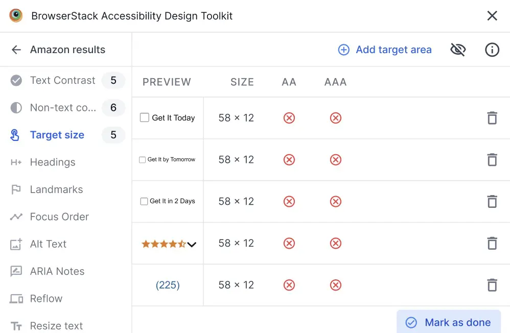
The toolkit scans all the interactive elements for inadequate target sizes. The toolkit lists all the violations along with their existing dimensions on the Figma design. Targets that meet the criteria are highlighted in green, and violations are highlighted in red.
- If the toolkit skips any interactive element of a page or a frame, click Add target area and scan that element.
- Click an interactive element with a violation to fix the size.
- After fixing all the insufficient target sizes, click Mark as done.
We're sorry to hear that. Please share your feedback so we can do better
Contact our Support team for immediate help while we work on improving our docs.
We're continuously improving our docs. We'd love to know what you liked
We're sorry to hear that. Please share your feedback so we can do better
Contact our Support team for immediate help while we work on improving our docs.
We're continuously improving our docs. We'd love to know what you liked
Thank you for your valuable feedback!