 Ask the Community
Responsive containers
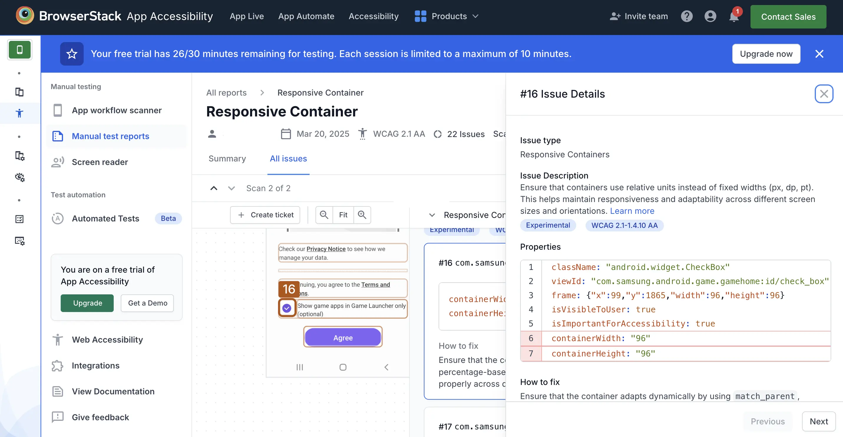
The Responsive Containers rule ensures that UI elements scale and adapt across different screen sizes and orientations. Using fixed-width units like px, dp, or pt can make layouts inflexible, leading to accessibility issues such as content clipping, overflow, or excessive scrolling. This can make it difficult for users with different screen sizes, zoom settings, or larger text preferences to interact with the app.
Instead, use relative units such as percentages (%) for layout sizing, em or rem for scalable text, or platform-specific flexible layout properties. Maintaining this design criteria ensures app usability and readability across different devices, screen sizes, and screen orientations.
- Rule Category :
Readable Text and Layout - WCAG 2.1 & 2.2 SC :
1.4.10 (AA) - Rule Severity :
Serious - Supported Platforms :
Android, iOS
Success Criteria
The specific criterion for success is:
- UI containers should adapt to various screen sizes and maintain visibility and usability of text and interactive elements by resizing dynamically based on screen width and height.
How to fix
- Avoid using fixed height or width values to maintain responsiveness and adaptability.
- Use relative units to allow containers to scale dynamically.
Platform-specific implementation:
To fix responsive container violations:
- Use
match_parent,wrap_content, or weight-based layouts (for example,layout_width="0dp"withlayout_weight) to allow content to scale dynamically and adapt to different screen sizes and orientations. - Avoid hardcoded
pxordpvalues for widths and heights whenever possible to promote flexibility and responsiveness in your layouts.
- Use
UIScrollViewwith Auto Layout to support flexible content that adjusts to various screen sizes and orientations. - Avoid hardcoded width or height constraints. Use
UITableVieworUICollectionViewto present dynamic lists or grid-based content that scales responsively.
- Use
ScrollViewwith flex-based styles to create scrollable, responsive layouts that adapt to different screen sizes and orientations. - For dynamic lists, use
FlatListinstead of hardcoded layouts to ensure proper scaling and performance.
- Use
ScrollViewto enable scrolling for content that may exceed the visible screen area, allowing flexible vertical or horizontal layouts. - Use
ListViewfor efficiently displaying vertically scrolling lists of items that adapt to various screen sizes. - Use
GridViewto present items in a grid format that can dynamically adjust the number of columns or rows based on screen size and orientation.
Example
Consider the following example:
Error
- The container uses fixed-width instead of relative units.
Fix
-
To fix the violation:
- Use
match_parent,wrap_content, or percentage units with weight instead of fixeddpvalues. - Alternatively, define flexible UI elements using
layoutSize.
- Use
References
We're sorry to hear that. Please share your feedback so we can do better
Contact our Support team for immediate help while we work on improving our docs.
We're continuously improving our docs. We'd love to know what you liked
We're sorry to hear that. Please share your feedback so we can do better
Contact our Support team for immediate help while we work on improving our docs.
We're continuously improving our docs. We'd love to know what you liked
Thank you for your valuable feedback!