Connect and get help from 7,000+ developers on our Discord community.
 Ask the Community
Ask the Community
Test with screen resolutions
Know how to test websites on different screen resolutions.
A responsive web design ensures that your website automatically readjusts to different screen resolutions, giving users a consistent experience across devices. You can select from the wide-range of screen resolutions available on Live to test whether your website renders correctly on different screen resolutions.
Supported devices
BrowserStack Live supports desktop devices running the following operating systems:
- Windows
- macOS
Test with different screen resolutions
To test on different screen resolutions, follow these steps:
- Log in to the Live dashboard.
- Select the device-browser combination to launch your test session.
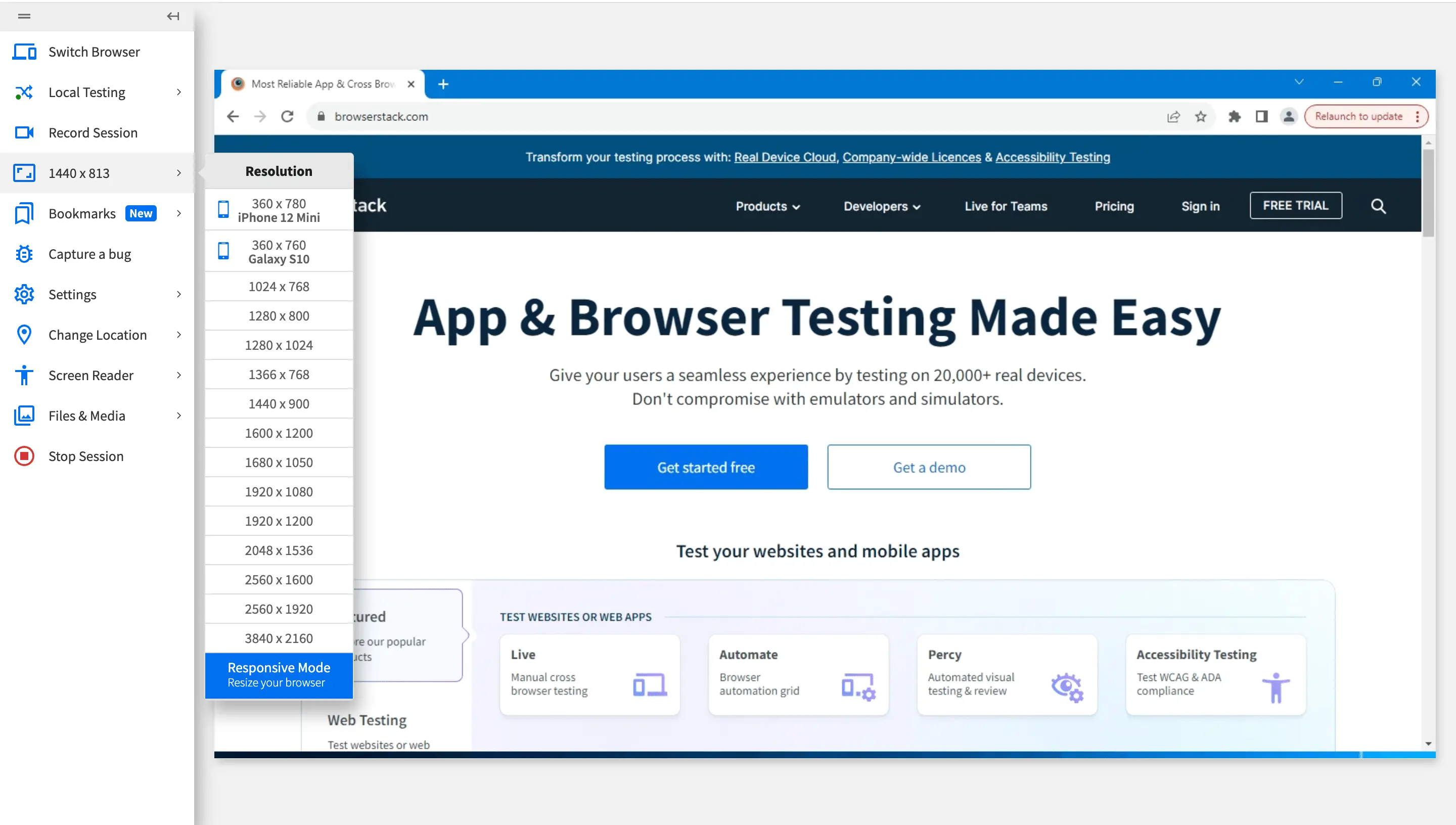
- On the Live vertical toolbar, click 1440 X 83.
The Resolution prompt is displayed that lists the available screen resolutions.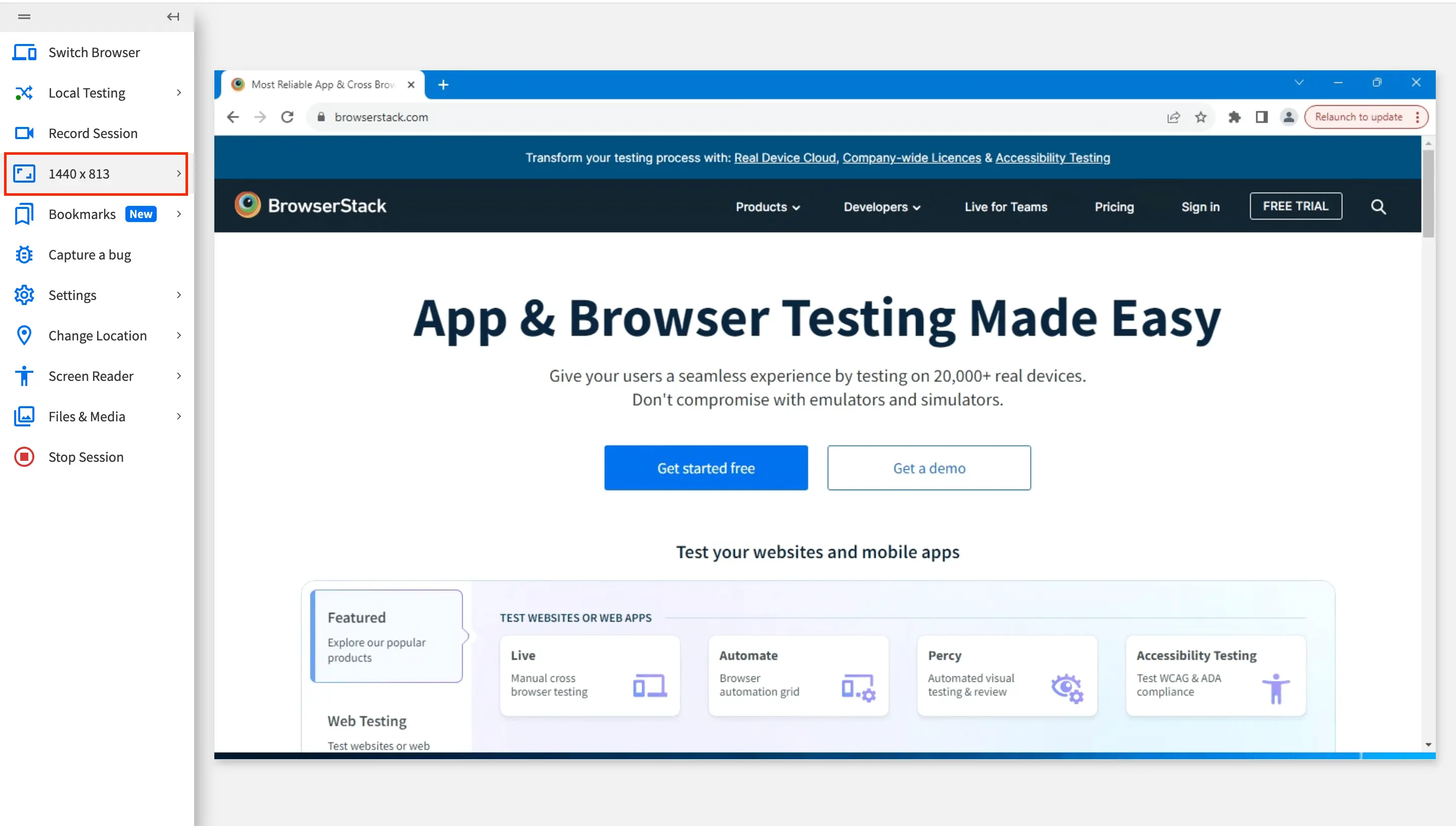
- On the Resolution prompt, select the screen resolution you want to test your website on.
 Your Live session switches to the screen resolution you selected.
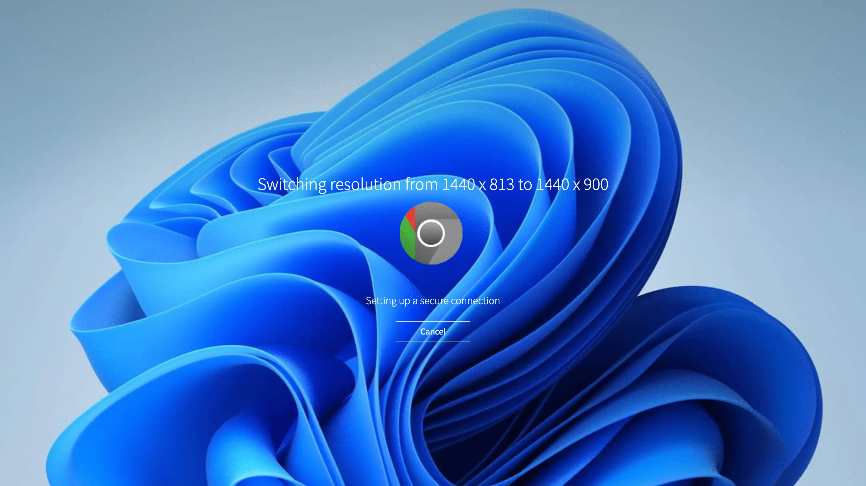 You can now test your website on the selected screen resolution.
We're sorry to hear that. Please share your feedback so we can do better
Contact our Support team for immediate help while we work on improving our docs.
We're continuously improving our docs. We'd love to know what you liked
We're sorry to hear that. Please share your feedback so we can do better
Contact our Support team for immediate help while we work on improving our docs.
We're continuously improving our docs. We'd love to know what you liked
Thank you for your valuable feedback!