 Ask the Community
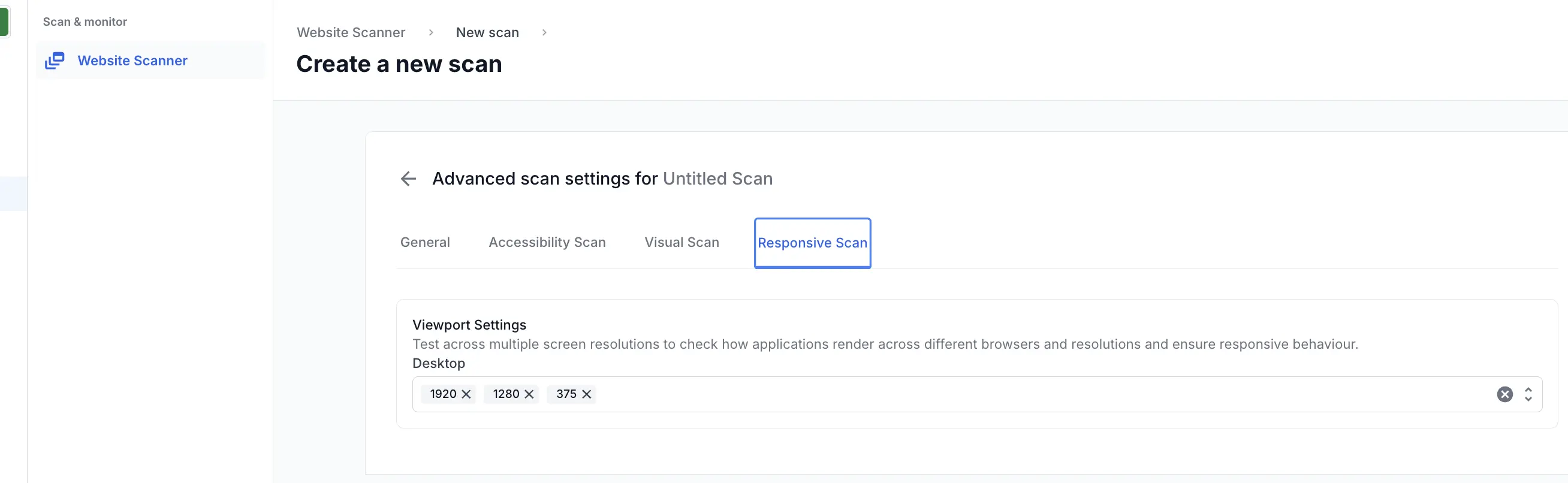
Responsive scan settings
Learn about the configurable settings for Responsive scan.
You can specify the required resolutions for your scan under Settings > Responsive Scan. This lets you test how your application renders across multiple screen sizes and browsers, helping you ensure consistent and responsive behavior.
Responsive scan supports integration with the Percy Visual Review Agent to enhance your visual testing workflow using AI-driven insights.
By default, the following width resolutions are selected for desktop:
- 1920px
- 1280px
- 375px
You can add up to two more resolutions to this list.
Mobile browser support
Mobile browser testing in Responsive scan is limited to Chrome on Android. When setting up a scan, select Chrome on Android from the mobile browser options in the Create a scan settings panel.
The following Android devices are supported:
| Device | OS version |
|---|---|
| Samsung Galaxy S24 | Android 14 |
| Samsung Galaxy S23 | Android 13 |
| Samsung Galaxy S22 | Android 12 |
| Google Pixel 8 | Android 14 |
| Google Pixel 7 | Android 13 |
| Google Pixel 6 | Android 12 |
| OnePlus 11R | Android 13 |
We're sorry to hear that. Please share your feedback so we can do better
Contact our Support team for immediate help while we work on improving our docs.
We're continuously improving our docs. We'd love to know what you liked
We're sorry to hear that. Please share your feedback so we can do better
Contact our Support team for immediate help while we work on improving our docs.
We're continuously improving our docs. We'd love to know what you liked
Thank you for your valuable feedback!