Custom dashboards
Build a dashboard for your project, arrange the charts that matter, compare metrics, share it through a public link, and export it as a PDF.
After a load test runs, you often pull the story together from several screens: the summary, trends, engine health, and run comparisons. Then you paste screenshots into a deck for your team. A custom dashboard brings the charts you care about onto one page, so you can read the result of a run at a glance and share it without rebuilding the same view every week.
Every member of a project can open, create, and edit dashboards.
With custom dashboards, you can:
- Arrange the charts that matter on a single page.
- Choose which metrics to show and how each chart looks.
- Compare two metrics on one chart to show cause and effect, such as response time against virtual users.
- Add headings and commentary so the dashboard reads as a story, not just a set of charts.
- Save a dashboard for the whole project instead of keeping personal copies.
- Share a dashboard through a public link or export it as a PDF for stakeholders who don’t use BrowserStack.
Open your dashboards
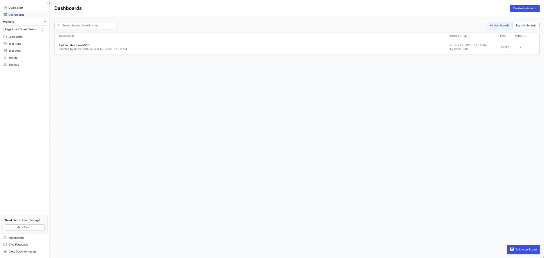
To work with dashboards, select Dashboards from the main navigation in the Load Testing app. The Dashboards page lists every dashboard in the active project, with its name, owner, last modified date, type, and widget count. Use the All dashboards and My dashboards tabs to switch between the project’s dashboards and your own, and search by name to find a specific one. From here you can open a dashboard, or select Create dashboard to build a new one.
Create a dashboard
Select Create dashboard and choose how to start:
- Start from a template: begin with a ready-made layout, such as Performance Overview, then adjust it.
- Clone: copy a dashboard in the project and change the copy without affecting the original.
- Start blank: build a dashboard from scratch.
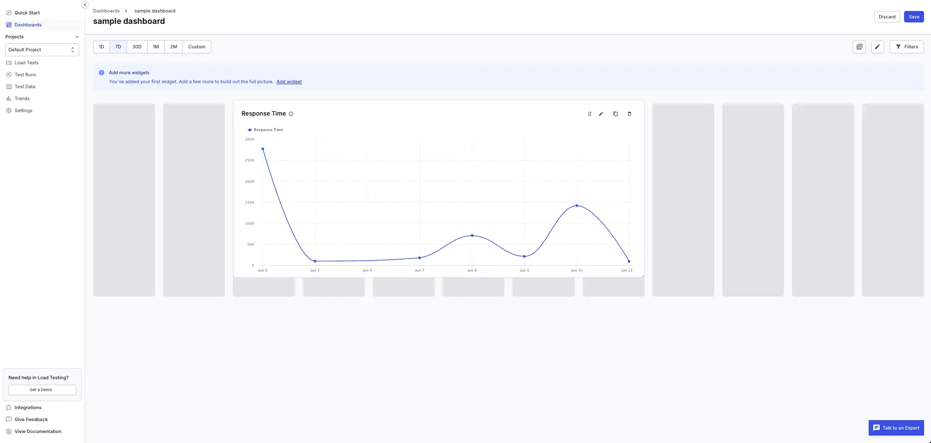
Give the dashboard a name, then add the widgets you want.
Add and configure widgets
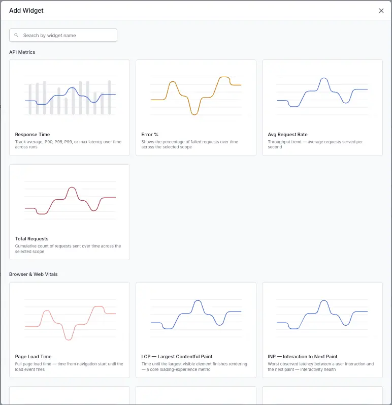
A widget is a single chart, number, or table on the dashboard. To add one, select Add widget and follow two steps:
- Choose a widget. Widgets are grouped by category, and each card shows a chart preview and a short description. Search by name to find one quickly.
- Configure the widget. Pick the chart type, choose the metric to plot, and set a title.
The catalog covers the following categories:
| Category | What it covers |
|---|---|
| API metrics | Response time percentiles, error rate, average request rate, and total requests. |
| Browser and Web Vitals | Core Web Vitals such as LCP, INP, CLS, and FCP, plus page load time and page-load phases, for browser and hybrid tests. |
| Engine Health | CPU and memory usage of the load engines, and healthy or unhealthy engine counts. |
| Test activity | Test runs created, run status, and threshold results. |
| Load and VU | Virtual users over time, VU distribution by load zone, and run trigger source. |
| Network | Per-URL call count, response size, bytes transferred, and error percentage. |
| Narrative | Heading and text widgets for commentary. |
Depending on the metric, you can show a widget as a line, area, column, stacked column, bar, donut, or single number. Load Testing offers only the chart types that suit each metric, so you can’t pick one that won’t render. It also sets series colors, tooltips, and axis scaling for you, so your charts stay readable.
Web Vitals and page-load phase widgets return data only for browser and hybrid tests. If you add one to a dashboard built on API tests, it shows a Not supported on this test type message, so you can swap it for a widget that fits.
Compare two metrics on one chart
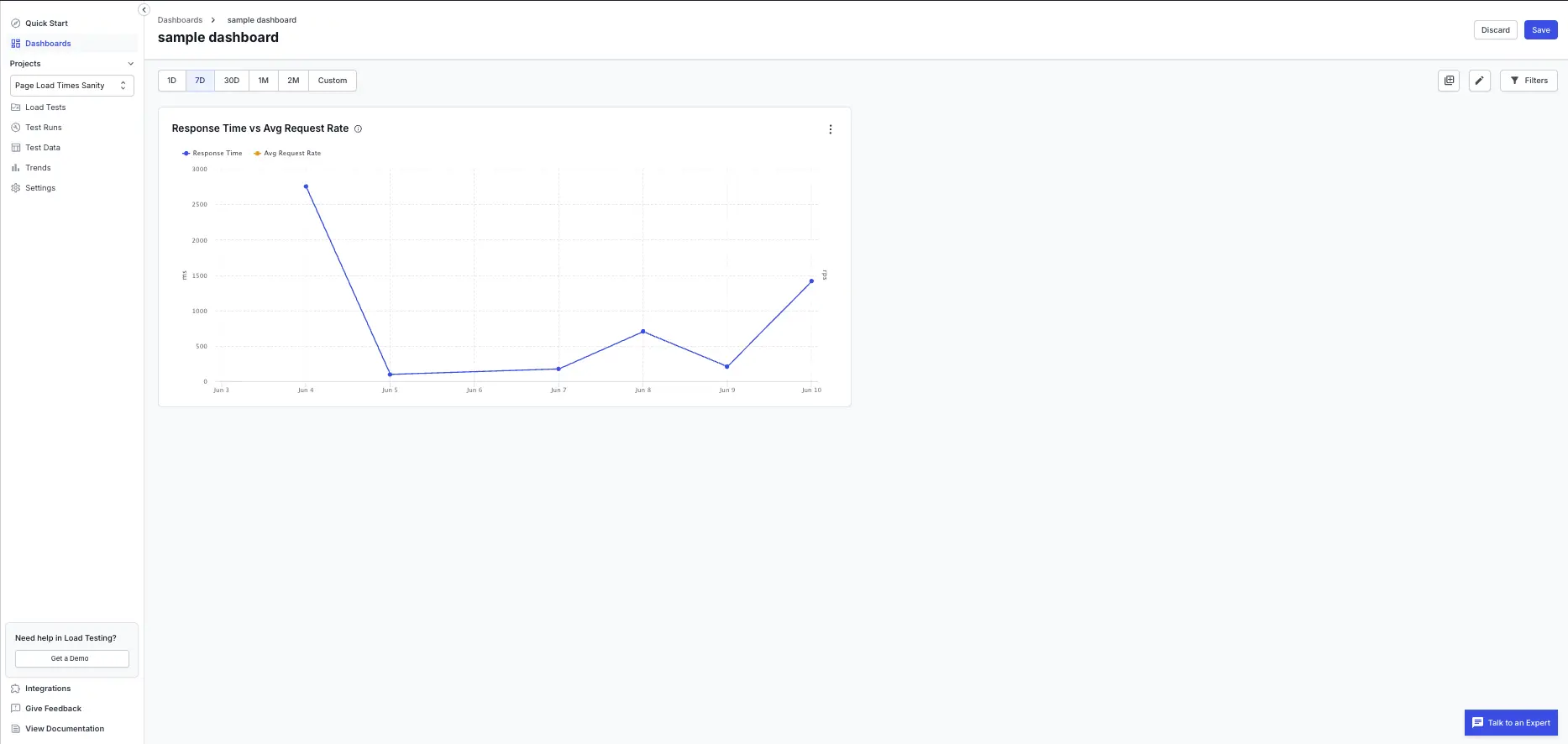
To show cause and effect on a single chart, configure a line, area, or column widget and turn on Compare with a second metric, then pick the second metric. The second metric draws as its own series with a separate axis on the right, so you can read two different units side by side.
Useful pairings include:
- Response time against virtual users.
- Error rate against engine CPU or memory.
- Throughput against p95 response time.
Add headings and commentary
Use the Heading and Text widgets to explain what the charts show:
- A heading widget splits the dashboard into labeled sections.
- A text widget holds commentary with basic formatting, such as bold, italic, lists, and links.
Commentary travels with the dashboard, so everyone gets the context, not just the charts.
Arrange the layout
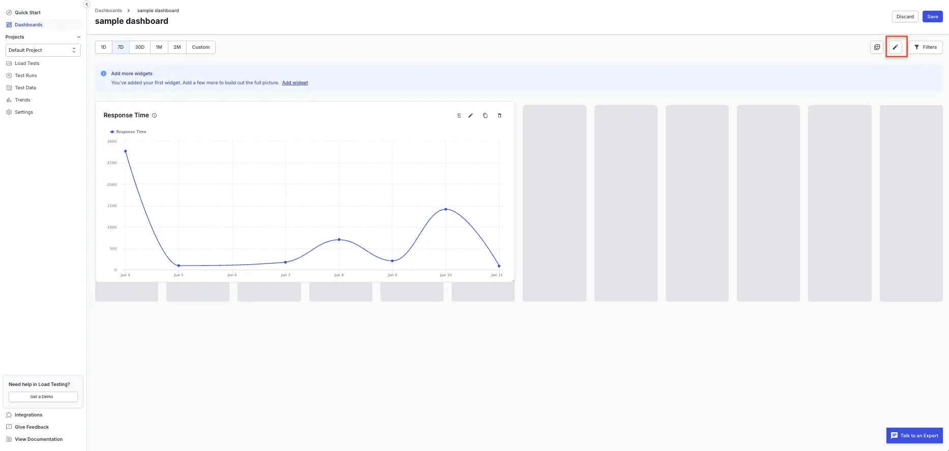
Open a dashboard and select Edit to change its layout:
- Drag a widget to move it, and drag its edge to resize it.
- Use the widget icons to edit, duplicate, or delete a widget.
- Select Save to keep your changes, or Discard to revert.
In view mode, the layout is locked, but you can still hover over charts for tooltips and explore the legends.
Dashboards save on a last-write-wins basis. If a teammate saves the same dashboard while you’re editing it, a banner warns you before your changes overwrite theirs.
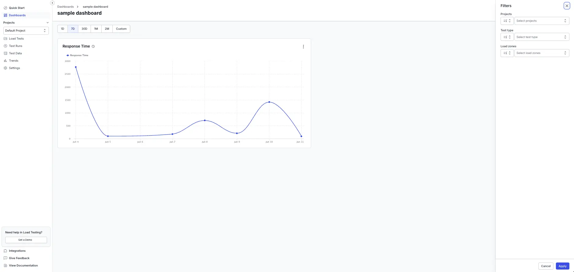
Filter the data on a dashboard
A dashboard has one set of filters that apply to every widget on it. Set the date range from the pill row at the top of the dashboard, such as 1D, 7D, 30D, 1M, 2M, or a custom range.
Select Filters to open the filter panel, where you can narrow the data by:
- Projects.
- Test type, such as browser, API, or hybrid.
- Load zones.
Select Apply to update every widget. Active filters appear as pills below the dashboard header, each with a clear option.
Share a dashboard
Open a dashboard and select Share. The share dialog has two tabs:
- Share report: copy a link that only people in your organization can open. Use this to share with teammates who have a BrowserStack account.
- Share via public link: turn on a link that anyone can open without a BrowserStack account. Use this for stakeholders outside your organization, such as a release sign-off. The viewer sees a read-only snapshot of the dashboard.
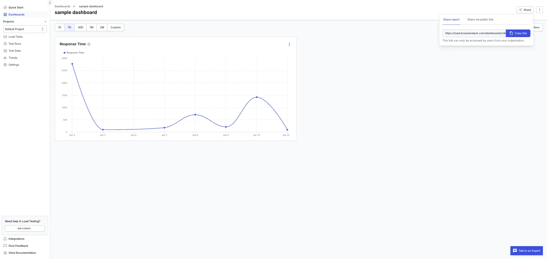
Turning off public sharing permanently deletes the link. The old URL stops working and you can’t restore it. Turn sharing on again to create a new link.
The Type column on the Dashboards list shows whether each dashboard is public or private.
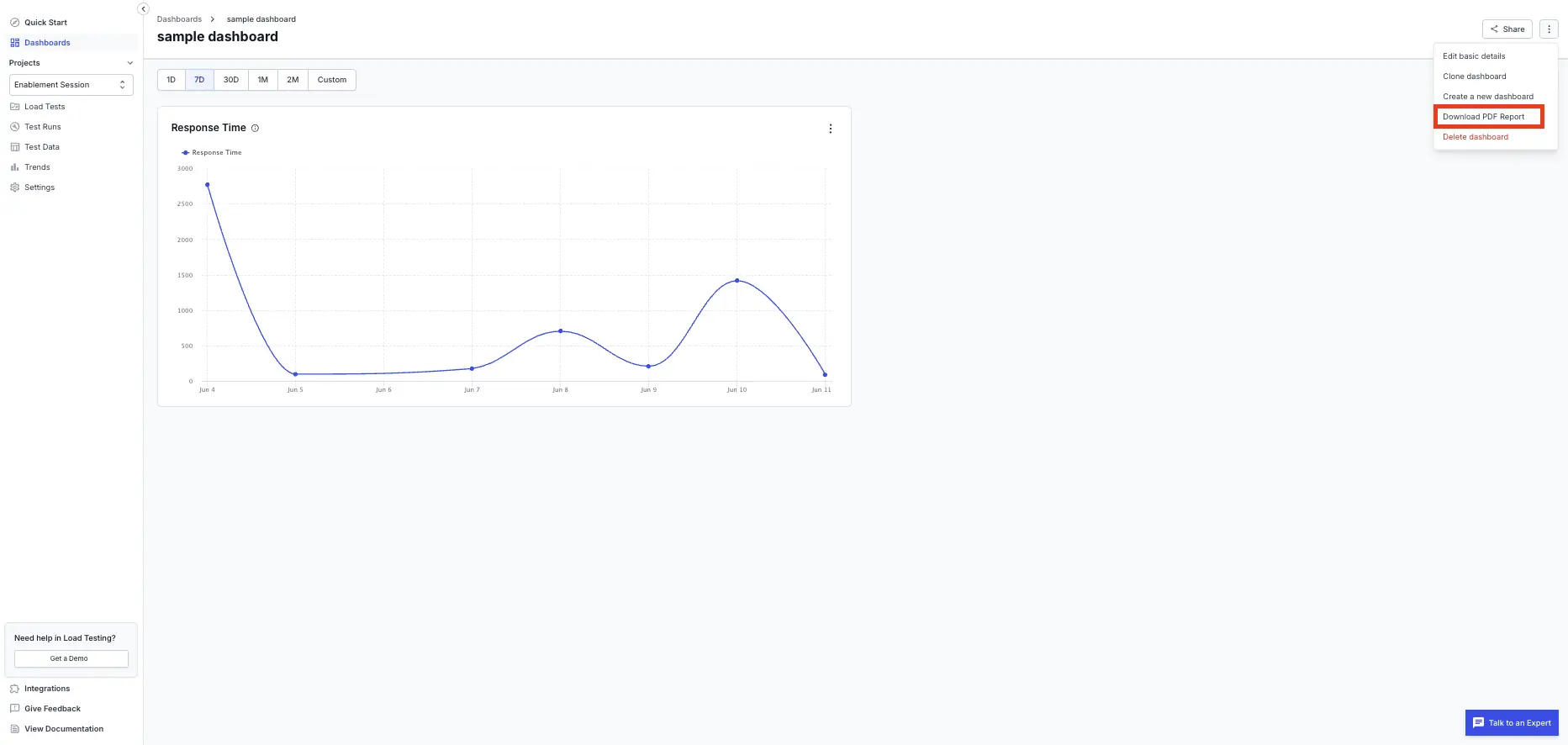
Export a dashboard as a PDF
To export a dashboard, open the kebab menu ⋮ in the top-right corner and select Download PDF Report. The PDF includes every widget in its saved layout, with your current filters applied, and any headings and text you added. The download starts when the file is ready. A large dashboard can take up to a minute.
Things to know
Note the following when you work with dashboards:
- Every member of a project can view, create, edit, and delete any dashboard in that project. This version has no separate edit roles.
- Web Vitals and page-load phase widgets return data only for browser and hybrid tests.
- A widget whose metric or test run is no longer available shows a placeholder message instead of breaking the rest of the dashboard.
- The dashboard list shows 25 dashboards per page and supports search and sorting by last modified date.
- Dashboards are built for the desktop web app.
Related resources
- Work with load test reports: read, compare, and collaborate on a single run’s report.
- Compare load test reports: measure a run against a baseline or against another run.
- AI Insights: get a plain-language summary of what happened in a run.
We're sorry to hear that. Please share your feedback so we can do better
Contact our Support team for immediate help while we work on improving our docs.
We're continuously improving our docs. We'd love to know what you liked
We're sorry to hear that. Please share your feedback so we can do better
Contact our Support team for immediate help while we work on improving our docs.
We're continuously improving our docs. We'd love to know what you liked
Thank you for your valuable feedback!