Use the Requests tab to drill into how each API endpoint (or flow label) performed during the run. Start with the latency trend to see where spikes occur, review the response code distribution for health, then scan the performance table for outliers in tail percentiles.
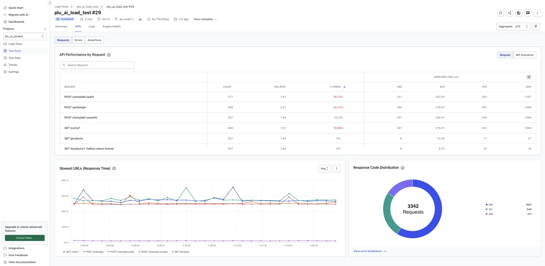
Slowest labels (response time)
This time-series chart compares latency trends across your selected labels. It helps you identify which flows degrade under load and when.
What you see:
- Lines per label: Each color maps to a label (for example, Checkout Flow, Add to Cart Flow).
- Aggregation dropdown, with Avg, P90, P95, and P99 options: Switch to higher percentiles to expose tail latency spikes that averages hide.
- Hover values (UI): Reveal precise response time at a given timestamp for each label.
How to use it:
- Begin on Avg to establish the baseline.
- Switch to P90 or P99 if users report slowness. Tail percentiles show the worst experiences.
- Note spike timestamps and correlate with system events (autoscaling, deployments) or error bursts in the Errors tab.
Edge cases:
- A single label spiking while others remain flat often indicates a dependency unique to that flow.
- Uniform spikes across all labels suggest shared infrastructure saturation (DB, cache, network).
Response code distribution
The donut chart summarizes total requests by broad response categories (successful compared to error codes). It provides a quick health snapshot.
What it shows:
- Total requests count in the center (for example, 45,764).
- Colored segments for major code groups or specific codes, such as 200, 404, and 500.
- Legend with counts per code.
Usage tips:
- A large 4xx segment: Validate script paths, query params, and authentication.
- Presence of 5xx codes: Investigate backend stability or scaling limits.
- Click or follow View error breakdown (if available) to jump directly to detailed errors.
The table gives per-label throughput, error rate, and latency statistics so you can prioritize optimization.
Columns defined:
- Count: Total number of requests executed for the label.
- Req rate: Average requests per second for that label.
- % error: Percentage of requests returning error codes.
- Min: Fastest observed successful response.
- Avg: Mean response time.
- P90 / P95 / P99: 90th, 95th, and 99th percentile latencies. Focus here for user experience issues.
- Max: Slowest observed response.
How to interpret:
- Sort by % error to surface completely broken flows before tuning performance.
- Compare Avg to P99. A large gap means high variance, which points to intermittent bottlenecks.
- High Max with stable percentiles often indicates a single pathological request. Investigate logs for anomalies.
Tail analysis example:
- If Avg = 40 ms but P99 = 750 ms, 1% of users see roughly 19x slower responses. Prioritize reducing tail latency.
Drill into label details
Click on any label row to view granular performance metrics for that specific request.
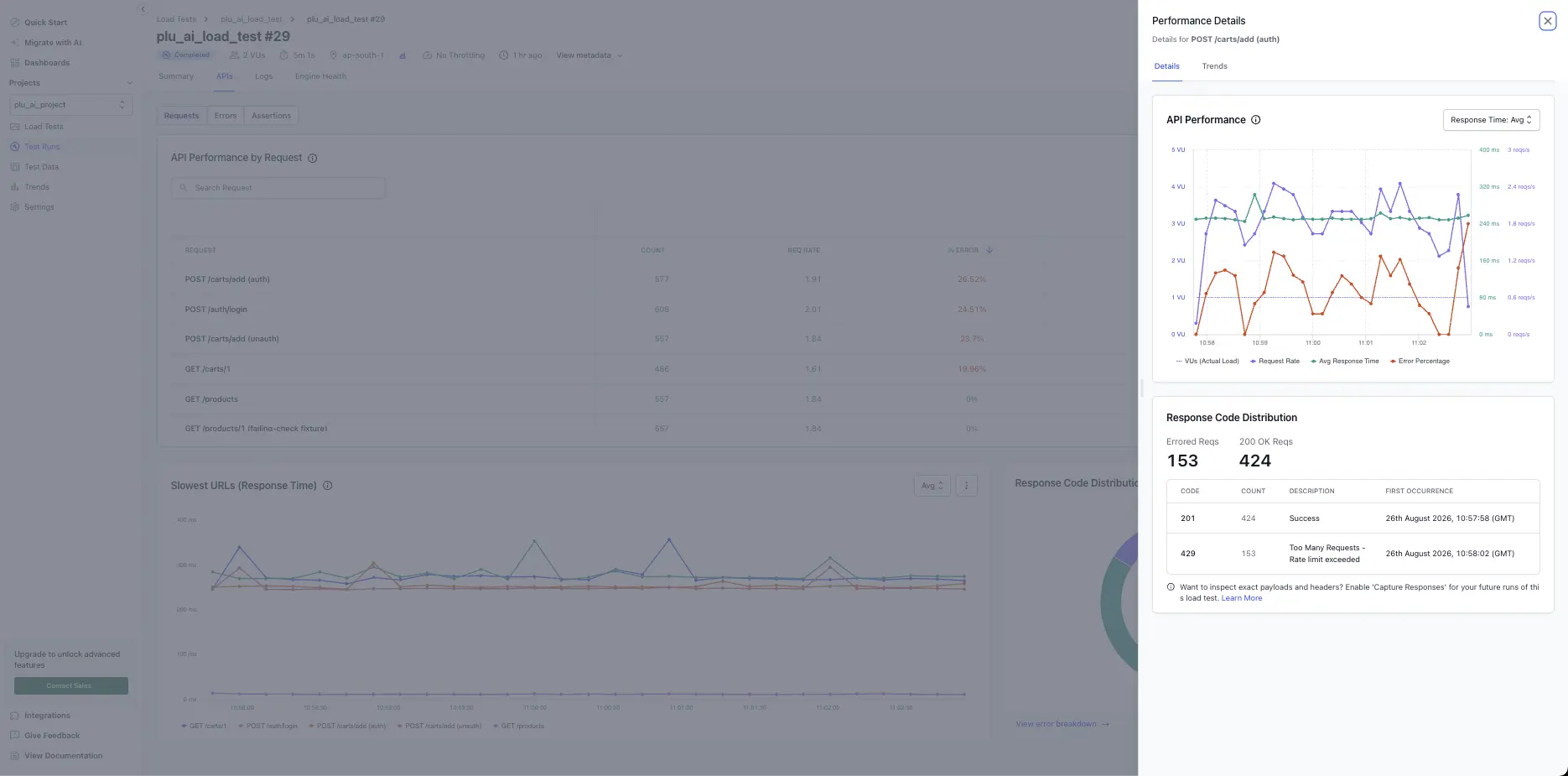
The detailed view shows:
-
API Performance chart: A time-series breakdown of latency trends, request rate, and response time percentiles (Avg, P90, P95, P99) across the test duration.
-
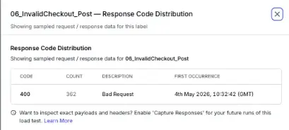
Response Code Distribution: All response codes encountered for that label, with counts and error percentages.
-
Trend data: Identify patterns, whether slowness is sustained, spiky, or concentrated in specific time windows.
Use this to isolate bottlenecks: a label with stable Avg but spiking P99 may reveal intermittent backend issues, while a degrading trend line suggests resource contention as load increases.
Best practices
Apply these practices when you analyze request performance:
- Track percentiles, not just averages. Tail latency drives perceived performance.
- Keep label names meaningful (include action + context) for faster diagnosis: Checkout API, Inventory Query.
- Use consistent data sets (avoid mixing cached and cold-start requests when comparing runs).
- Pair this tab with infrastructure metrics (CPU, memory, DB connections) to avoid guesswork.
- Export the table after major releases to build a historical performance baseline.
Use the Errors tab during and after a test run to pinpoint failing requests, see which user flows are most impacted, and drill into first occurrence timings. Start at the distribution to gauge overall severity, then move into flow-level detail to decide the next debugging step.
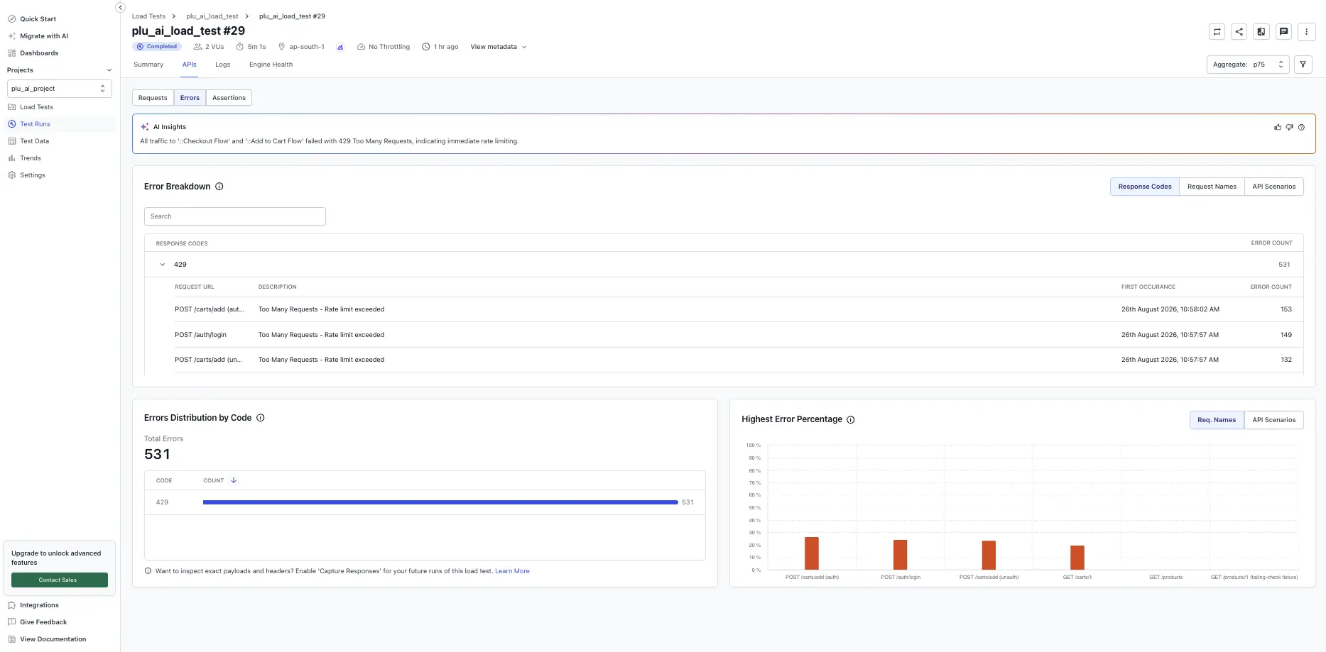
Errors distribution by code
This section aggregates every failed request by HTTP status or protocol response code. It shows:
- Total errors: The sum of all failed requests (for example, 30,505). Use this to quickly judge test health. A rapid climb often signals misconfiguration or an outage.
- Bar list of codes: Each bar represents a code, such as 404, 500, or 503, with a numeric count. A single dominant code usually means a structural issue, for example a missing endpoint, bad path, or auth failure, rather than random instability.
How to use it:
- Scan for unexpected codes (for example, large 404 counts mean your script might be requesting a removed resource).
- Prioritize fixing the highest volume code before lower-frequency issues. Reducing one widespread root cause typically resolves many symptoms.
- Correlate the spike timestamp with your Logs or Requests tab to find exact request examples.
Edge cases:
- If you see only 4xx codes, validate test data (payloads, IDs) and authentication headers.
- If you see mixed 5xx codes, investigate backend service stability (infrastructure saturation, downstream dependency failures).
- If counts look inflated relative to virtual users, confirm your script is not retrying aggressively.
Highest error percentage
This bar chart ranks labels (user flows or thread groups) by the percentage of their requests that resulted in errors. High percentage does not always equal highest raw count, so use it to catch smaller flows that are completely broken.
Displayed metrics:
- Label or thread group mode: Toggle between logical flow labels and underlying thread groups to isolate whether the script grouping or the infrastructure segment causes errors.
- Percentage bars: Show error rate (errors / total requests for that label). A 100% bar means the flow never succeeded.
How to act:
- Sort visually: Identify 100% or near-100% flows first. They tend to be configuration issues (wrong endpoint, missing auth) rather than performance bottlenecks.
- Compare relative percentages: A flow with 20% errors in a checkout process is more urgent than a utility call with 5% errors.
- Switch to thread group view if all labels look healthy but overall errors remain high. This may reveal an isolated misconfigured group.
Error breakdown
The breakdown table lists each label with its first occurrence timestamp plus total error count, making it easy to trace when a failure began.
Columns:
- Label: The scripted flow name (for example, Add to Cart Flow).
- Response body (when captured): Helps validate whether the error is an HTML not found page, JSON error object, or empty response.
- Description: A summarized interpretation (for example, Not Found - Resource does not exist) to save time parsing raw payloads.
- First occurrence: Timestamp, test-relative, when the first error for that label appeared. Align this with deployment events or load increases.
- Error count: Total number of failed requests for the label.
Troubleshooting guidance
Follow these steps to move from symptom to root cause:
- Identify dominant error code in distribution panel.
- Locate flows with highest percentage to see if issue is localized or global.
- Open the breakdown row. Inspect the first occurrence timestamp and cross-check application logs.
- Drill into individual requests (via Requests tab) to confirm request path, headers, and payload.
- Re-run a small subset (using a reduced virtual user test) after applying a fix to validate improvement.
Watch for these common scenarios:
- Large 404 counts: Verify URL paths in your script. Ensure environment base URL matches deployment stage.
- Sudden 500 spike after ramp-up: Backend capacity limits. Scale service or add caching.
- High percentage errors only in one region: Possible CDN edge misconfiguration or geo-based routing issue.
- Persistent 401/403: Token expiry or missing scope. Refresh credentials and retest.
Best practices
Apply these practices to keep error analysis actionable:
- Keep scripts resilient. Add assertions to fail fast on unexpected redirect chains or blank responses.
- Version your test data. Outdated IDs often produce cascading 404s.
- Tag thread groups with environment or feature flags so you can filter quickly during incidents.
- Export or snapshot the errors view immediately after a test for audit and regression tracking.
- Combine error analysis with latency trends. Performance degradation often precedes certain classes of 5xx errors.
Next steps
After prioritizing and fixing high-volume errors, re-run the test focusing on previously failing flows. Target an error rate approaching zero for critical transactional paths (checkout, authentication) before scaling user counts.
If you continue to see unexplained errors, contact BrowserStack Support with the test run link and timestamps for deeper investigation.
Use the Assertions tab to inspect script-defined assertions evaluated during your run. Assertions verify that your API behaved as expected, for example, that a response code was 200, a JSON field existed, or response time stayed under a threshold, and let you spot regressions without combing through raw logs.
Assertions are auto-detected from your script, so no project setting changes are required.
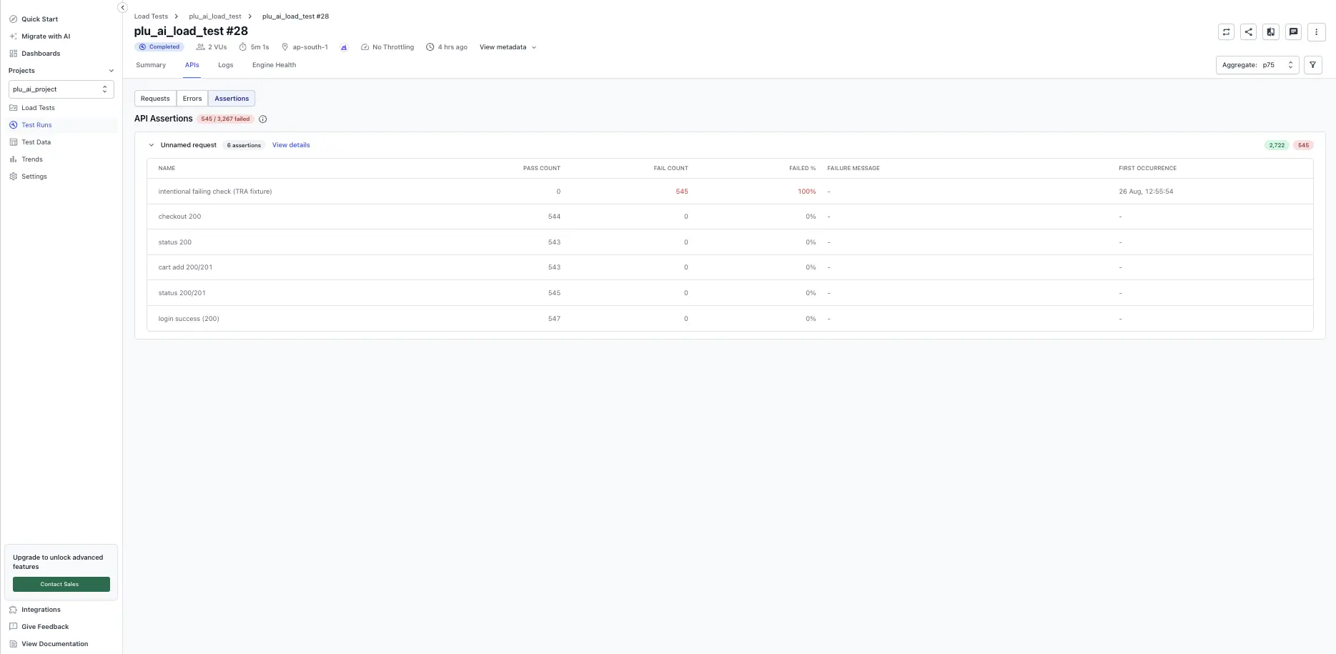
Assertion fields
Each row on the Assertions sub-tab includes the following fields:
| Field |
Description |
| Name |
The assertion label from your script. |
| Pass Count / Fail Count |
Execution counts across all virtual users. |
| Failed % |
Percentage of executions that failed. |
| Failure Message |
Summary of the failure. |
| First Occurrence |
Timestamp of the first failure. |
Use assertions to debug a run
The Assertions tab is the fastest way to identify which assertion failed and at what load level:
-
Quick failure overview: scan the Failed % column to identify which assertions had the highest failure rates.
-
Failure context: read the Failure Message to see why the assertion failed (for example, “expected status 200, got 404”).
-
Correlation with load: compare the First Occurrence timestamp across assertions to see if failures clustered at a specific point in the test, correlating with load spikes.
-
Failure drill-down: click View details on a failed assertion to inspect the Response Code Distribution and Response Body to understand what the API returned.
Drill into an assertion
Select any row or click View details to open the per-assertion drill-in view. This view shows:
-
Response Code Distribution: a breakdown of HTTP response codes received for this assertion, including the code, count, description, and first occurrence timestamp.
-
Response Body (when enabled): the captured response body for requests, when Capture response details is enabled on the test. This helps you understand what the API returned and why the assertion failed.
Use assertions to set test thresholds
You can use assertion outcomes as a pass or fail gate for the overall test. For example, you can set a threshold that fails the run if total assertion failures exceed a limit. To configure this, see Set thresholds.

 Join our Discord