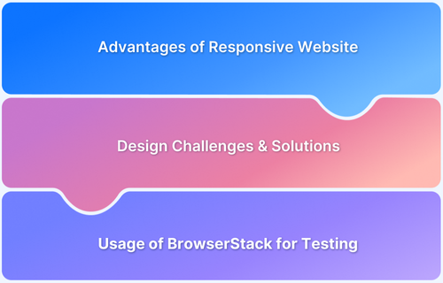
What is a Mobile Responsive Website?
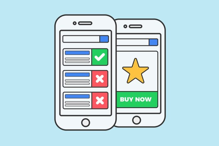
A mobile responsive website is a website that is capable of adapting its content based on the device it is being viewed on. The layout and design of a website are generally created for desktop users. However, as the number of users who prefer to browse on a tablet or mobile phone grows, it’s essential for the web design also to become more versatile to ensure that all users have an equally positive experience.
As of January 2025, the Mobile market share is far greater than the desktop or tablet market shares combined. With over 62.71% of consumers using mobiles, it’s very important to ensure that user experience remains consistent across different devices.
This is why responsive design is highly important in today’s day and age.
Responsive design entails designing a website so that a web application provides a good user experience across various devices. Mobile Responsive design includes scaling the page components and content of the website according to the screen size of the device and reformatting the contents to be more user-friendly as the screen size is reduced.
Why is Mobile Responsiveness Important?
Web applications are created in order to address existing user demand. Hence, it is important to understand the consumers and then create a product that caters to their needs for better retention.
According to global statistics data, the mobile market share is 62.71% as of January 2025. On adding the tablet market share to this statistic, around 65% of the market share belongs to devices other than desktop devices.
If a product is unable to evolve and adapt, it will become extinct and will get replaced by other products which are able to meet consumer demands. On the same note, if a web application is not designed well, and is unable to function and appear aesthetically pleasing on mobile and tablet devices, then it will be alienating a significant portion of its potential consumer base.
There is also the problem of device fragmentation. Other than the varying screen size of the tablet and mobile devices, there is also a multitude of device configurations with different browsers and OS. All of these factors need to be taken into account so that all users, regardless of the device they are browsing on, have a positive experience.
Therefore, when designing any web application, it’s very important to ensure that it’s mobile responsive.
How to make a Mobile Responsive Website
When creating a mobile responsive website, the general layout of the website and its content both need to be transformed in order to reproduce the desktop experience on a smaller screen.
In order to create a mobile-responsive website, there needs to be a plan in place from the get-go. While designing the website, research and take into consideration the requirements to create a responsive web application. Sketch out the layouts for the site, addressing the difference in screen sizes between different devices.
Additionally, take the style and formatting into consideration. Lastly, think through possible issues that may surface at a later time regarding responsiveness and try to preemptively address these issues early in the design process. One of the most essential factors when designing a website to be more mobile-responsive is pondering over what a potential user would want from the web application.
For example, Mobile users are often very impatient and want the content to load quickly. This makes them prone to abandoning a website if it takes too long to load, while desktop users are more likely to wait. This means that a fast loading time would be beneficial when creating a mobile responsive web application.
Essential Features a Mobile Responsive Website should have
Features a Mobile Responsive Website:
- Readability
- Image and Button Formatting
- View Orientation
- Lighter Web Design
For a mobile responsive design, here are four features that you should consider:
- Readability
Very often, instead of creating a truly responsive website, the developers simply decrease the size of the web page to fit the mobile or tablet screen. This leads to a very annoying user experience since the text is often extremely small and out of place, leading the user to have to zoom in and out in order to make sense of the website’s contents. It’s important to enlarge the text where needed and format the content so that it’s aesthetically pleasing while still fitting the smaller screen size.
- Image and Button Formatting
Similar to the other contents of a webpage, it’s important to ensure that buttons are visible and accessible to the user. It can be very frustrating trying to click a tiny and badly formatted login next item/page button. Users can often give up on using the website altogether out of annoyance at out-of-place buttons. Therefore developers should make large, visible, and easy-to-click buttons when designing a mobile-responsive website.
- View Orientation
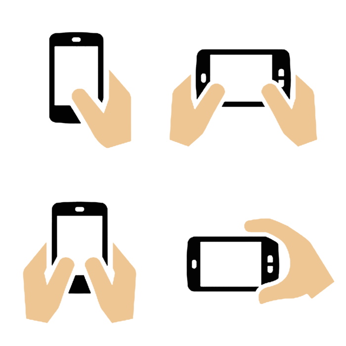
Mobile users will frequently switch between landscape and vertical views as they look at web content. The switch between views can result in missing images or issues regarding functionality which could frustrate users. It would be best to ensure that the website’s content and layout are not butchered when a user switches views.
- Lighter Web Design
Mobile users are impatient and are quick to switch from website to website in search of entertainment. Therefore when trying to create a responsive web application, the developers should attempt to make the website light so that it loads quickly and smoothly. First impressions are important, and a fast-loading website will lend to making the user a more favorable view of the application.
Test if your website design is light enough to have a faster loading time. This will help improve the overall mobile experience.
Check Speed Scores for your Website Now
Testing for Mobile Responsiveness
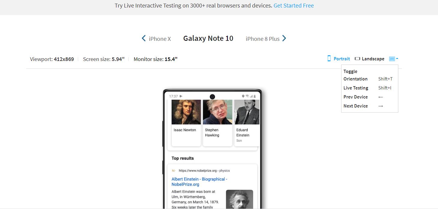
During the development of a website, it would be prudent to check whether the website is behaving as predicted across different devices. To test mobile responsiveness across different device/browser combinations, tools such as Browserstack’s Responsive Tool can be highly useful.
Browserstack Responsive Checker Tool offers interactive testing across 3500+ real browsers and devices. In essence, a responsive checker tool aids in the user’s testing of responsive web design. The tool enables the user to check whether a website is being shown correctly across a variety of platforms. This entails considering a wide range of screen sizes, device configurations, and additional elements. Prior to deployment, it is imperative to check whether the website is responsive and functional across a variety of devices using a responsive tester tool.
Although testing the application on a variety of devices is important, depending on the application in question, it could be unnecessarily exhaustive to test it on 3500+ device/browser combinations. Developers can make Mobile responsiveness testing more efficient by testing on the right devices.
So, how to identify the right mobile devices?
If the application has already been released to the public, then data can be collected regarding user devices, and the devices on which the application is most frequently used can be identified. However, survivorship bias could occur if this method is used.
For unreleased applications, a reference application can be utilized, and an estimate of what the target audience looks like can be obtained. Unfortunately, it can be difficult to obtain such data, and in many cases, there are very few applications that can act as a reference.
The best method to ensure that there is sufficient device coverage for a web application is utilizing market data. Websites such as statista.com and https://gs.statcounter.com/ provide extensive data regarding device popularity, browser popularity, and various other relevant statistics.
Market data is unbiased, and there’s often a large pool of it available. Additionally, the data is frequently updated and provides an almost real-time perspective. This makes market data one of the most relevant sources of information when attempting to test mobile responsiveness across various device/browser combinations since it can be used to quickly identify the most popular combinations at a given moment in time. By ensuring that the application is responsive to these popular combinations, the developers can be assured that the majority of their user base is covered.
Best Practices for Mobile Responsive Design
Here are the best practices for Mobile Responsive Design:
- Ensure that the content is readable. The font and size of the text shouldn’t make the user have to squint to read and understand what is being conveyed.
- Make the design compact and prioritize the content that will draw the user’s attention.
- Keep in mind the small screen size, and design the page so that it is functional for a compact touch screen. Difficult-to-click buttons often leave the user feeling annoyed. Therefore, design the page with spaced-out and easily clickable buttons.
- Make the interactable elements easy to reach. People use their thumbs when interacting with websites on their phones. It is vital to keep this in mind while sketching out the layout of the web application.
- Make Images responsive and adjust the size of images depending on the screen size. Prioritize images vital to catching the user’s attention.
- Use svg images so that the image quality isn’t compromised while resizing.
- Make the design minimalistic.


