Android UI layouts allow you to structure your app’s visual elements and control how they appear on different screen sizes. They also define how views are arranged and interact within the user interface.
Overview
What is an Android UI Layout?
An Android UI layout is a container that defines the structure and positioning of UI components on the screen. It helps organize views like buttons, text fields, and images into a functional interface that adapts to various device configurations.
Types of Android UI Layouts
Android provides several layout classes to help you design flexible and responsive user interfaces. Each layout type serves a specific purpose:
- LinearLayout: Arranges elements in a single row or column
- RelativeLayout: Positions elements relative to each other or the parent
- FrameLayout: Displays a single view or stacks multiple views
- ConstraintLayout: Offers a flat view hierarchy with flexible constraints
- TableLayout: Organizes elements into rows and columns like a table
This article explains what Android UI layouts are, their different types, and how to create them.
What are Android Layouts
Android layouts define the structure of an app’s user interface. They act as containers that hold and arrange views like buttons, images, and text fields on the screen. Layouts determine how these elements are displayed, sized, and positioned relative to each other and the screen.
They’re categorized into two main components: View and ViewGroup.
1. View
A View is the smallest building block of an Android UI. It represents a single UI element that users can see and interact with. However, views cannot contain other views as they are self-contained UI elements. Views include widgets like:
- TextView for displaying text
- Button for user actions
- ImageView for showing images
- EditText for user input
Each View handles its own layout, drawing, and interaction behavior. For example, a Button knows how to display itself and respond when tapped.
2. ViewGroup
A ViewGroup is an invisible container that holds other Views (or even other ViewGroups) and defines how those children are arranged on the screen. It acts as the layout manager for its children. Common ViewGroups include:
- LinearLayout: Aligns children in a single row or column
- RelativeLayout: Positions children relative to each other
- ConstraintLayout: Positions elements based on constraints
- FrameLayout: Stacks children on top of each other
- TableLayout: Organizes children into rows and columns
ViewGroups can nest other ViewGroups to support complex UI hierarchies. For example, a LinearLayout might contain a RelativeLayout, which in turn holds multiple Views.
Types of UI Layouts in Android
Here are the five primary types of layouts in Android.
1. Linear Layout
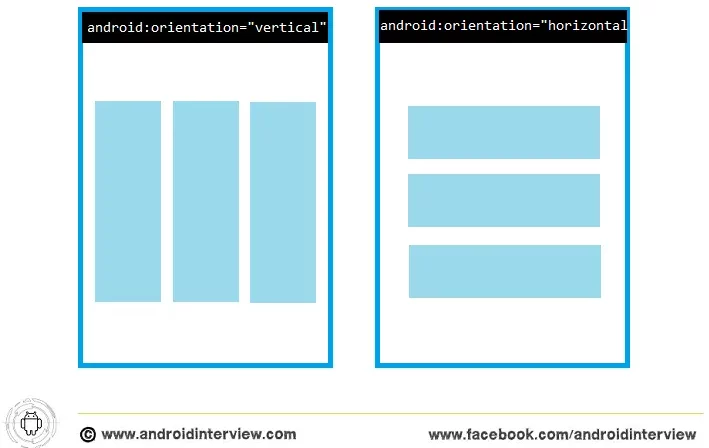
This view group aligns all of its children in a single direction, either vertically or horizontally. The android:orientation attribute specifies the layout’s direction.
The below code snippet demonstrates the inclusion of a Linear Layout in the XML file.
<LinearLayout xmlns:android="http://schemas.android.com/apk/res/android"
android:layout_width="match_parent"
android:layout_height="match_parent"
android:orientation="horizontal">
<!-- Include other widget or layout tags here. These are considered
"child views" or "children" of the linear layout -->
</LinearLayout>
Setting android:orientation helps specify if the child views are displayed in row or column format
Android Linear Layout
2. Relative Layout
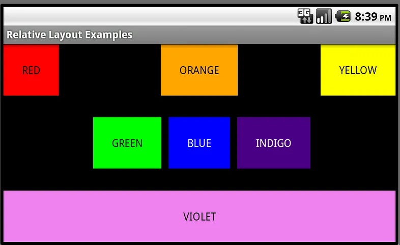
RelativeLayout is a view group that places its child views relative to one another. Each view’s location can be set relative to sibling components (such as to the left or below another view) or relative to the RelativeLayout area of its parent (such as aligned to the bottom, left or center).
Android Relative Layout
3. Frame Layout
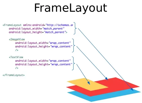
FrameLayout is designed to display a single object in a section of the screen. In general, FrameLayout should only be used to host a single child view, as it can be difficult to organize child views in a manner that is scalable to various screen sizes without the children overlapping. Nevertheless, you may add several children to a FrameLayout and manage their position by providing gravity to each child using the android:layout gravity feature.
Android Frame Layout
4. Constraint Layout
ConstraintLayout permits the creation of complicated layouts with a flat view hierarchy (no nested view groups). It is similar to RelativeLayout in that all views are set up according to the relationships between sibling views and the parent layout, but it is more flexible than RelativeLayout and easier to use with the Layout Editor in Android Studio.
Because the layout API and the Layout Editor were purpose-built for one another, all the power of ConstraintLayout is accessible immediately from the Layout Editor’s visual tools. So, developers may construct the layout with ConstraintLayout using only drag-and-drop instead of XML.
Android Constraint Layout
5. Android Table Layout
TableLayout is a ViewGroup that presents its children in rows and columns. TableLayout arranges its children into columns and rows. TableLayout containers do not display row, column, and cell border lines. The table will have the same number of columns as the row with the most cells. A table can leave cells vacant. As in HTML, cells can span multiple columns in Tableau. Developers can span columns using the TableRow’s span field. Class layout parameters.
Android Table Layout
Different Attributes of Android Layouts
Android layouts contain various attributes that control UI components’ positioning, size, and appearance. These attributes allow you to manage the placement, spacing, and alignment of elements inside a layout.
Here are the most common attributes of Android layouts.
| Attribute | Description |
|---|---|
| android:id | Specifies a unique identifier for the view. |
| android:layout_width | Declares the width of a view. Can be wrap_content or match_parent. |
| android:layout_height | Declares the height of a view. Can be wrap_content or match_parent. |
| android:layout_marginLeft | Adds space on the left side of the view. |
| android:layout_marginRight | Adds space on the right side of the view. |
| android:layout_marginTop | Adds space on the top side of the view. |
| android:layout_marginBottom | Adds space on the bottom side of the view. |
| android:layout_gravity | Defines how the view is positioned relative to its parent layout. |
How to Create Layouts in Android?
Android provides XML-based layout files to describe the layout. Follow these steps to create layouts in Android.
1. Create a New Layout File
To start designing your layout, create a new XML file that will define the structure of your user interface. This file will be stored in the res/layout directory.
- Open your Android project in Android Studio.
- Go to the res folder > layout directory.
- Right-click on the layout directory and select New > Layout Resource File.
- Name your layout file (e.g., activity_main.xml).
- Click OK to create the file.
Read More: XMLTest in Java: A Detailed Guide
2. Choose a Layout Type
Choose a layout type based on how you want to structure your UI. Common layout types include:
- LinearLayout: Aligns child views in a single direction (horizontal or vertical).
- RelativeLayout: Positions child views relative to each other.
- ConstraintLayout: Offers flexible positioning with a flat hierarchy, making it efficient for complex layouts.
- FrameLayout: Stacks child views on top of each other.
- GridLayout: Organizes child views in a grid format.
Example of LinearLayout as root:
<LinearLayout xmlns:android="http://schemas.android.com/apk/res/android"

    android:layout_width="match_parent"

    android:layout_height="match_parent"

    android:orientation="vertical">

    <!-- Child views here -->

</LinearLayout>
Consider using Jetpack Compose or View Binding for newer apps for cleaner UI logic and interaction.
3. Add UI Components (Views)
Add UI elements like buttons, text fields, images, etc., inside your layout.
Example of a TextView and Button inside a LinearLayout:
<TextView

    android:id="@+id/textView"

    android:layout_width="wrap_content"

    android:layout_height="wrap_content"

    android:text="Hello, Android!"

    android:layout_gravity="center"/>


<Button

    android:id="@+id/button"

    android:layout_width="wrap_content"

    android:layout_height="wrap_content"

    android:text="Click Me"

    android:layout_gravity="center"/>
Also Read: How to test UI components?
4. Set Layout Attributes
Use attributes to define the appearance, positioning, and behavior of views.
- android:layout_width and android:layout_height: Define the size of the view.
- android:layout_margin: Adds space around the view.
- android:padding: Adds space inside the view.
- android:gravity: Aligns content within the view (e.g., center, left).
- android:text: Sets text in a TextView or Button.
For example:
<TextView

    android:id="@+id/textView"

    android:layout_width="wrap_content"

    android:layout_height="wrap_content"

    android:text="Welcome!"

    android:layout_margin="16dp"

    android:gravity="center"/>
5. Nest Views for Complex Layouts
Use nesting to create more complex layouts. You can add one layout inside another to organize your views. For example, a LinearLayout inside a RelativeLayout:
<RelativeLayout xmlns:android="http://schemas.android.com/apk/res/android"

    android:layout_width="match_parent"

    android:layout_height="match_parent">


    <LinearLayout

        android:layout_width="wrap_content"

        android:layout_height="wrap_content"

        android:orientation="vertical"

        android:layout_centerInParent="true">


        <TextView

            android:id="@+id/textView"

            android:layout_width="wrap_content"

            android:layout_height="wrap_content"

            android:text="Nested Layout Example"/>


        <Button

            android:id="@+id/button"

            android:layout_width="wrap_content"

            android:layout_height="wrap_content"

            android:text="Click Me"/>

    </LinearLayout>

</RelativeLayout>
6. Use Style and Themes
Apply styles and themes to your views for a consistent look and feel. You can define styles in res/values/styles.xml and reference them in your layout.
Example:
<TextView

    android:id="@+id/textView"

    style="@style/CustomTextStyle"

    android:layout_width="wrap_content"

    android:layout_height="wrap_content"/>
And in styles.xml:
<style name="CustomTextStyle">

    <item name="android:textColor">#FF0000</item>

    <item name="android:textSize">18sp</item>

</style>
7. Test the Layout
Once your layout is created, test it on different screen sizes and orientations to ensure it works as expected. You can use the Preview window in Android Studio or run the app on BrowserStack to test under real user conditions.
8. Connect Layout to Activity
In your activity’s Java or Kotlin file, reference the layout and bind UI elements.
Example in MainActivity.java:
setContentView(R.layout.activity_main);

TextView textView = findViewById(R.id.textView);

Button button = findViewById(R.id.button);
9. Optimize Layout Performance
Once your layout is created, ensure it’s optimized for performance, especially for large or complex UIs. Here’s how:
- Avoid deep nesting of layouts. Deep hierarchies can affect performance. Use ConstraintLayout for more flexible and efficient designs.
- Use tools:ignore=”MissingConstraints” in ConstraintLayout only during design time to prevent warnings. Ensure you add proper constraints when moving to production.
- Minimize unnecessary views. Reuse elements or combine views to reduce overhead.
Read More: Guide to UI Performance Testing
Testing Android UI Layouts on Real Devices with BrowserStack
Real devices reflect user experiences more accurately than simulators or emulators, which can overlook device-specific issues like screen size, resolution, and performance. Testing across different models also helps identify problems arising from varying hardware, OS versions, and device capabilities.
Read More: What is Android UI Testing?
BrowserStack App Percy provides access to over 3,500 real Android devices and OS versions. This extensive device coverage allows you to test your Android UI layouts on a wide range of devices to ensure consistent performance and design.
Here are some key features of BrowserStack App Percy.
- AI-powered Visual Engine: Highlights only the most important visual changes and eliminates the false positives due to anti-aliasing.
- Parallel Testing: Run visual regression tests on multiple devices simultaneously to identify device-specific issues and accelerate testing.
- Dynamic Content Testing: Percy automatically disables dynamic page elements, such as dates and times, to ensure test results are highly reliable.
- Build Review and Approval: Request changes or approve screenshots and builds directly from the dashboard.
- Visual Diff Modes: Customize differential sensitivity with three modes: Strict for exact pixel match, Recommended for balanced detection, and Relaxed for major visual changes.
Best Practices for Creating Android UI Layouts
Follow these proven practices to build efficient, scalable, and maintainable UI layouts in Android.
- Use ConstraintLayout for Flat Hierarchies: Avoid deep nesting and use ConstraintLayout to keep layouts efficient and easier to manage.
- Adapt Layouts for Screen Sizes: Use dp units, match_parent, or wrap_content for responsive design, and test on multiple screen sizes.
- Apply Styles and Themes Consistently: Define text sizes, colors, and padding in styles.xml for a unified and maintainable UI.
- Split and Reuse Layouts: Use <include> and <merge> to break complex UIs into smaller reusable parts for better structure.
- Use View Binding Instead of findViewById: Reduce boilerplate and prevent null pointer exceptions with type-safe view access.
- Avoid Hardcoded Values: Store all strings in strings.xml and dimensions in dimens.xml to support localization and screen scaling.
- Use Material Design Components: Follow Material Design guidelines with official components for consistent and modern visuals.
- Provide Layout Variants for Devices: Use layout qualifiers like layout-land or layout-sw600dp to handle tablets and orientation changes.
- Optimize for Accessibility: Set contentDescription for images, maintain text contrast, and meet minimum touch target sizes.
Conclusion
An Android layout defines the visual structure of the app’s screen, specifying how views (such as buttons, text fields, images, etc.) are positioned and arranged. Layouts in Android are typically defined in XML files, where developers can choose from different layout types like LinearLayout, RelativeLayout, ConstraintLayout, and others to organize and display content.
After creating your Android layout, test it on real devices with BrowserStack’s App Percy. Percy automates visual testing with AI-driven workflows and compares screenshots to baseline images to catch visual inconsistencies. It also allows you to test app screens with dynamic visual elements across devices and Android versions.


