Web Developers build websites with rich aesthetics for better engagement and user delight. One such visual aspect that developers incorporate while developing any webpage is positioning text over an image. Keeping responsiveness into consideration, it is important to ensure that the text remains consistent even when the image resizes itself due to its responsive behavior.
This article discusses the step by step methods to Position Text over Image for all Orientations, the method to Position Text over Image for Responsive Images, and how to Test the Responsiveness of the resulting image with text.
How to position Text over an Image using CSS (All the Orientations)
An easy and straightforward way to position text over an image is by using CSS. The idea behind its implementation is to put all the elements, including the image and the text element, inside the same container div in the HTML file. After that, you have to apply the CSS on each element in the CSS section of the project.
Step 1: Create an HTML file and put image and text elements in one parent container div, as seen below.
photo.jpg
<html>
<head>
<title> text over image css </title>
<link rel="stylesheet" href="style.css">
</head>
<body>
<div class="parentContainer">
<img src="photo.jpg" alt="Landscape">
<div class="centered">Centered</div>
<div class="bottom-left">Bottom Left</div>
<div class="top-left">Top Left</div>
<div class="top-right">Top Right</div>
<div class="bottom-right">Bottom Right</div>
</div>
</body>
</html>
Step 2: Positioning text on the image using CSS
Once all the elements are placed, you just have to apply CSS on the elements to align them as intended. In this step, applying CSS for the elements to position them in several orientations over the image, such as bottom-left, bottom-right, and more.
img{
height: 100%;
width: 100%;
}

.parentContainer {
position: relative;
text-align: center;
color: white;
}

.bottom-left {
position: absolute;
bottom: 10px;
left: 15px;
}

.top-left {
position: absolute;
top: 10px;
left: 15px;
}

.top-right {
position: absolute;
top: 10px;
right: 15px;
}

.bottom-right {
position: absolute;
bottom: 10px;
right: 15px;
}

.centered {
position: absolute;
top: 50%;
left: 50%;
}
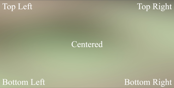
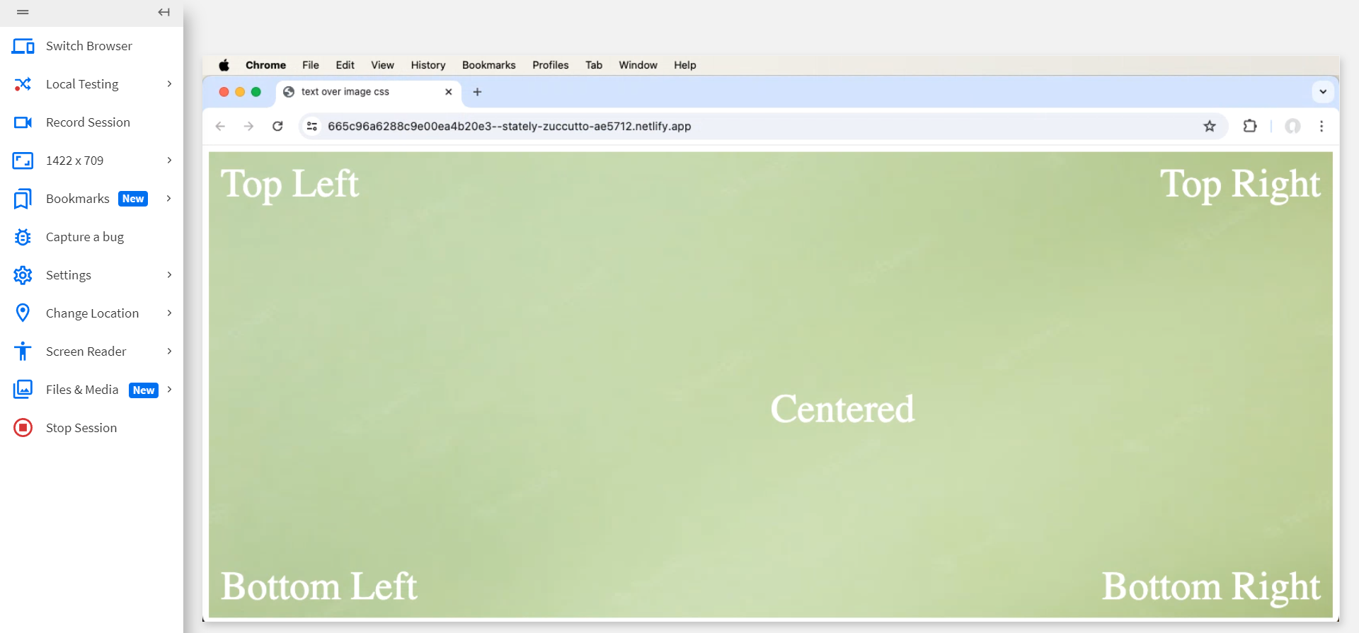
The resulting image photo.jpg looks like the below after positioning text over it in different orientations.
How to test position Text over Image using Real Devices
To showcase browser compatibility of different text positions over an Image, let’s test the above website on multiple devices and operating systems using BrowserStack Live.
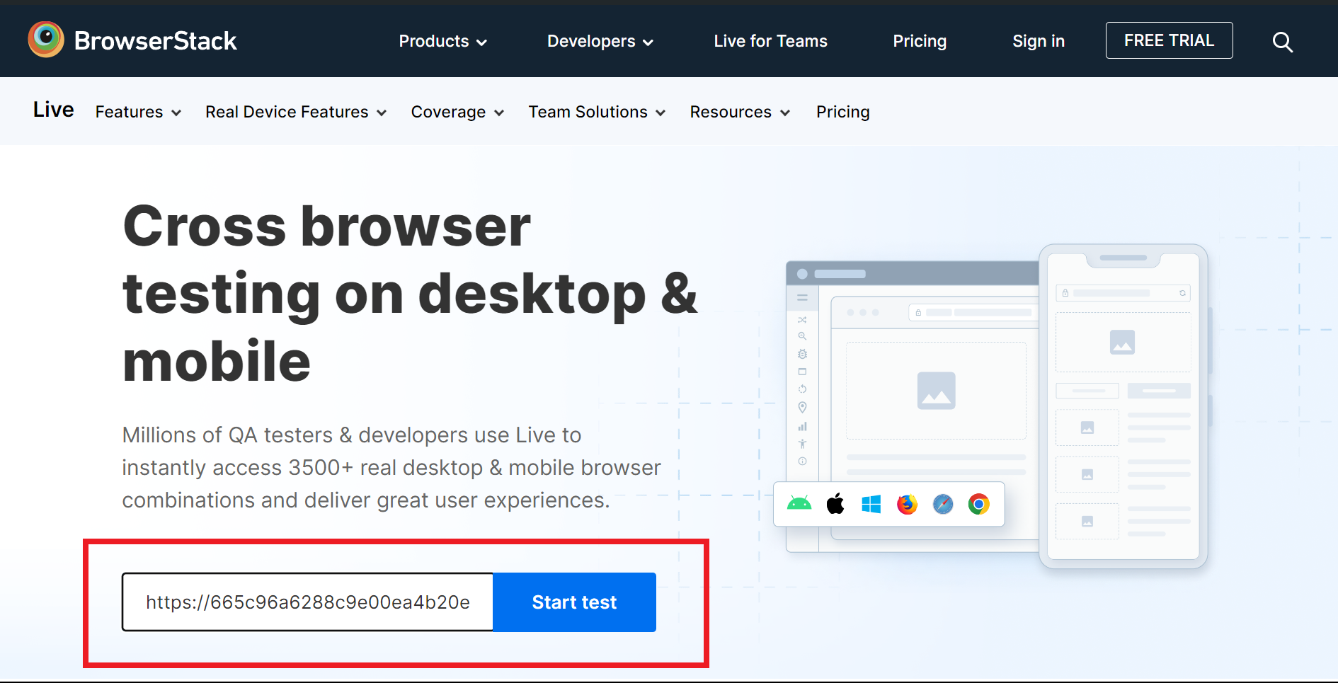
Step 1 – Deploy the website on the internet and copy its URL.
Step 2 – Enter the URL in the required placeholder upon opening BrowserStack Live and click on ‘Start Test’.
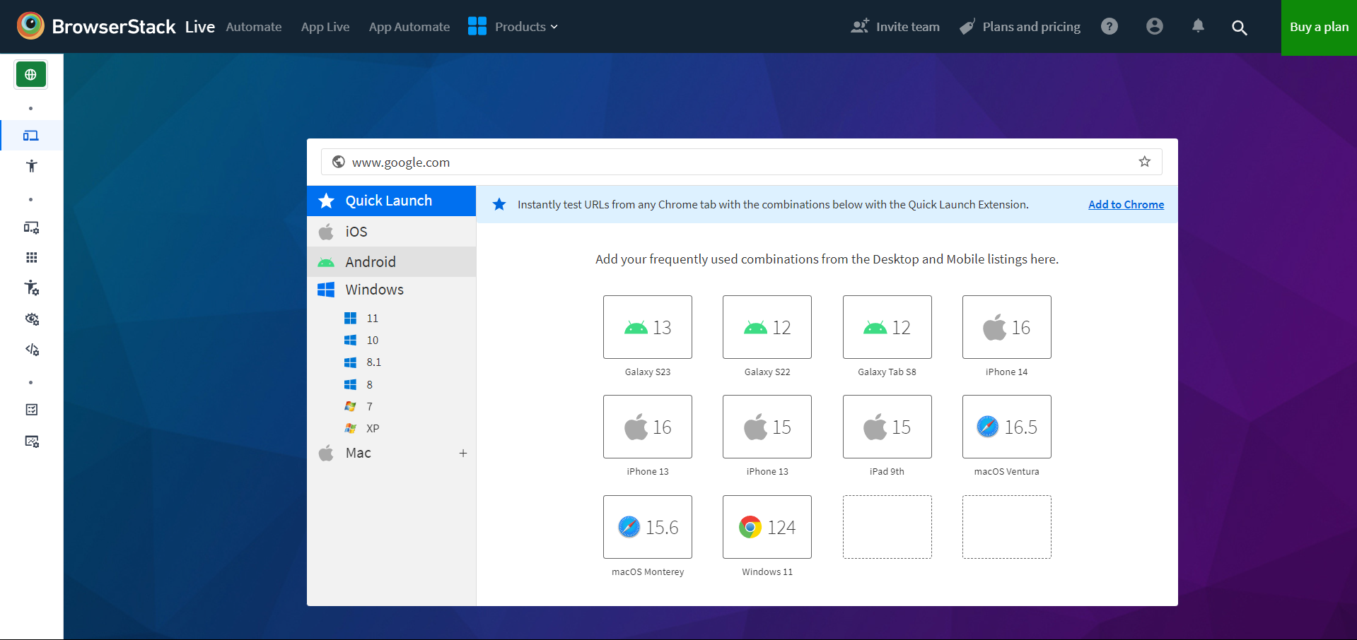
Step 3 – Select the Device-Browser Combination for testing.
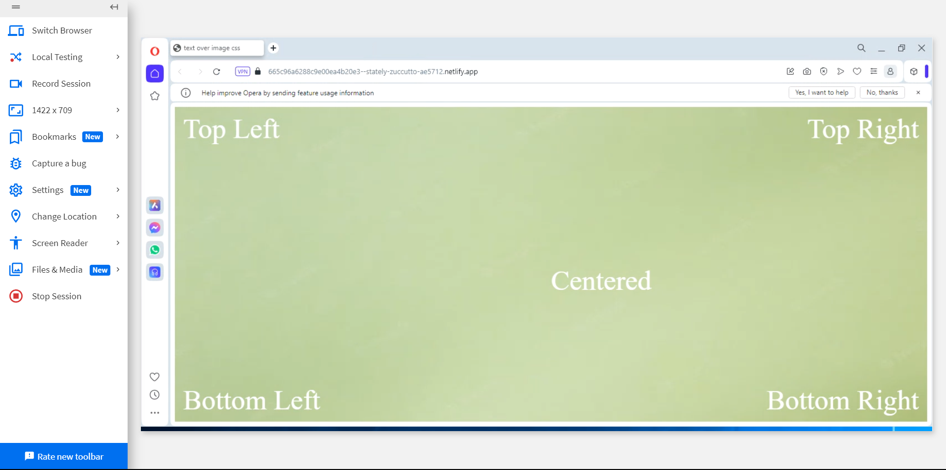
Here are some cross-browser compatibility tests of the same website conducted on different browser-device combinations using BrowserStack Live
1. Opera 110 on Windows 11
2. Chrome 125 on Mac OS Sonoma
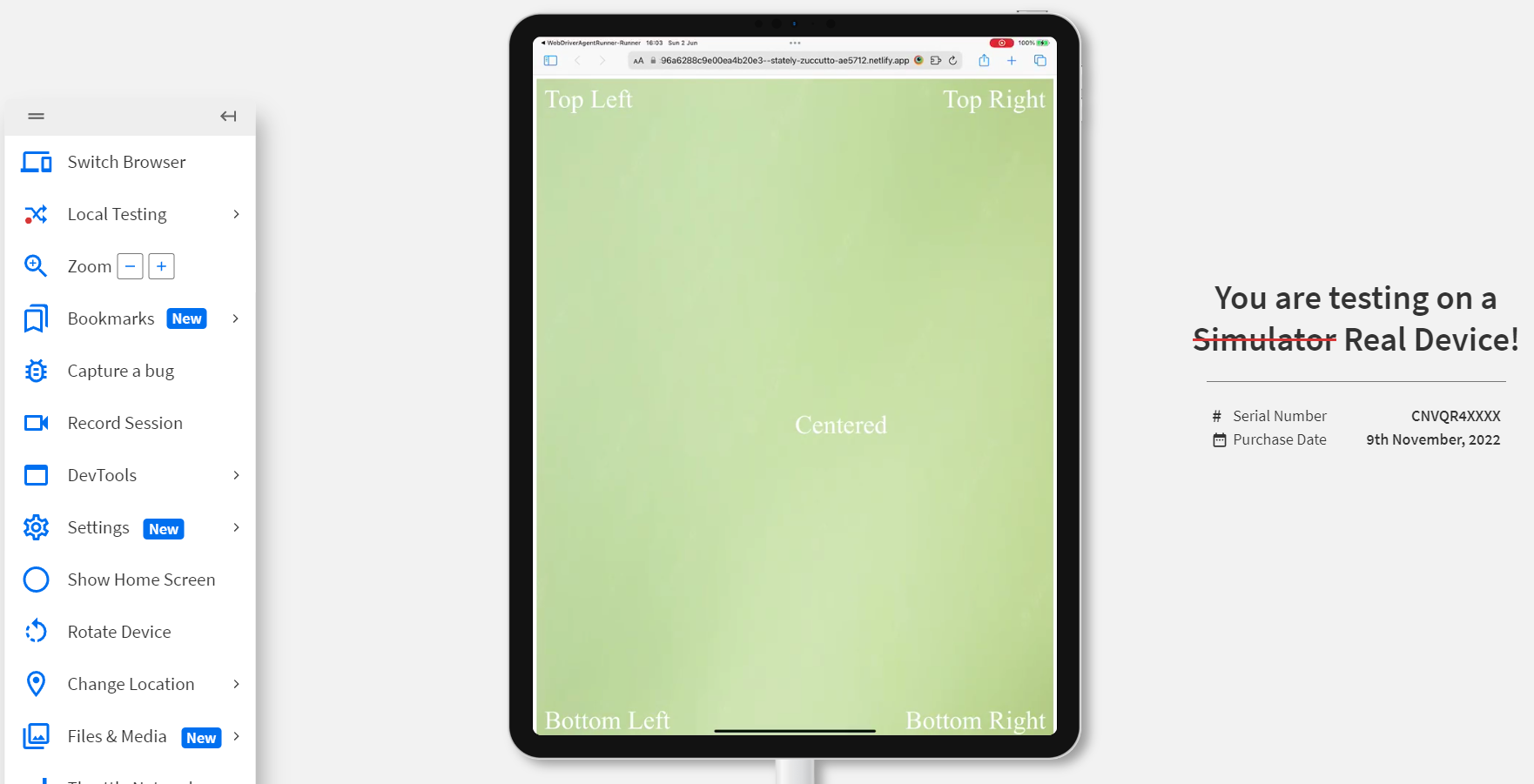
3. Safari on iPad Pro 12.9 2022
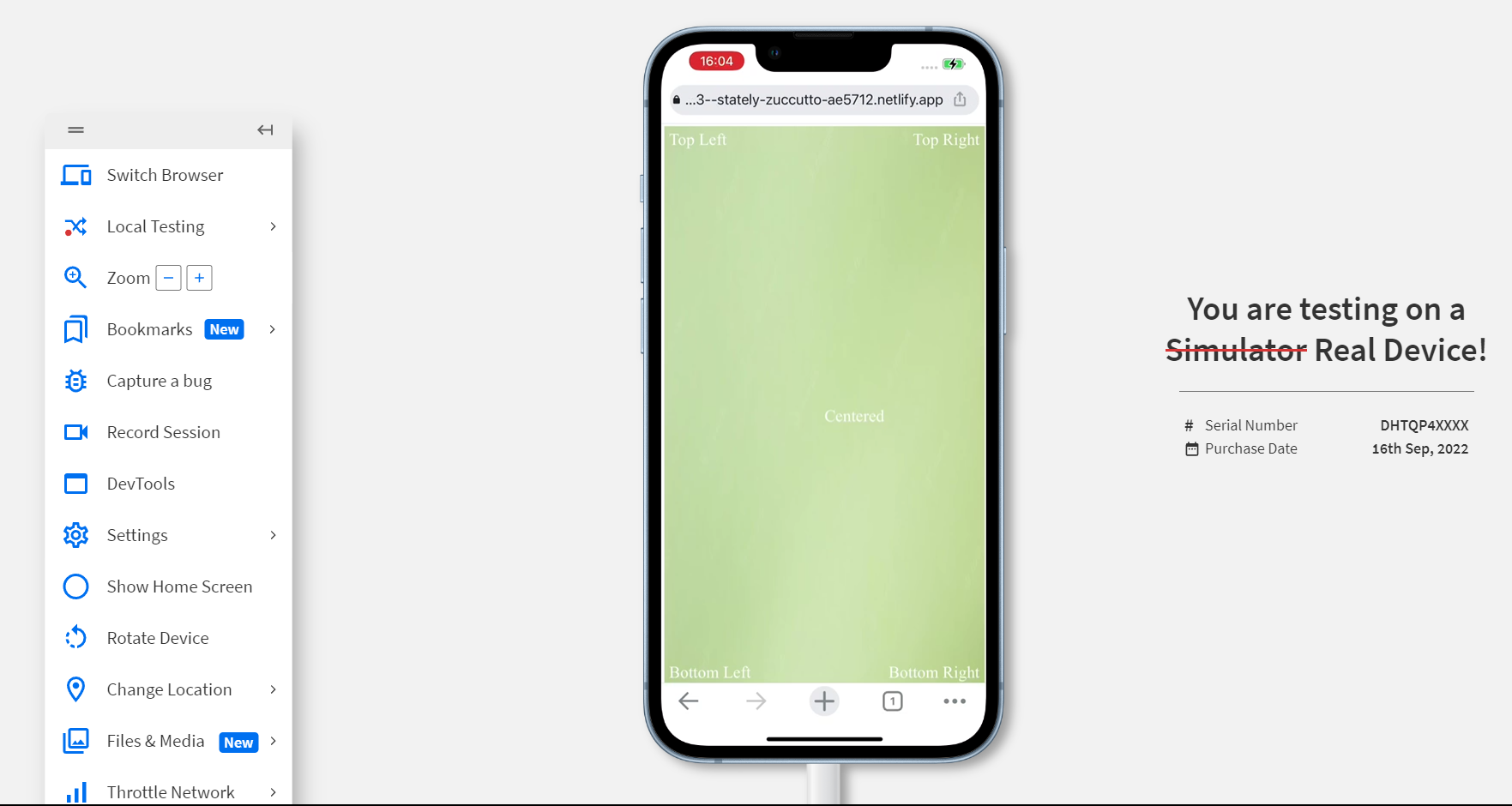
4. Chrome on iPhone 14
5. Chrome on Pixel 6 Pro
How to position text over a Responsive Image
Responsive webpages are necessary from a user experience standpoint. It also improves the overall SEO and enhances content visibility on the web. Responsive images are vital for a responsive website, and while positioning text over a Responsive Image, it is essential to ensure that the text alignment remains intact without impacting the responsiveness of the image.
Step 1: Create an HTML file
In the HTML file, use the figure tag to initialize the photo in the document. The reason behind implementing the figure and figcaption tags in the HTML is to leverage the Search Engine Optimization (SEO) of the document.
picture.jpg
<html>
<head>
<title> text over image css </title>
<link rel="stylesheet" href="style.css">
</head>
<body>
<figure class="image">
<img src="picture.jpg" alt="background">
<figcaption>This is the text over image</figcaption>
</figure>
</body>
</html>
Step 2: Positioning text on the image using CSS
To solve the issue of responsiveness, width is added as 100%. Moreover, setting the position of the figcaption as absolute will keep the text to the nearest positioned parent element. Also, you can apply more CSS to further enhance your text while positioning it over the image.
.image img {
width: 100%;
height: 100%;
}

.image {
position: relative;
}

.image figcaption{
position: absolute;
top: 50%;
bottom: 50%;
left: 40%;
}
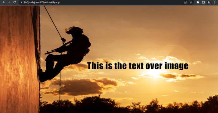
The resulting responsive image picture.jpg looks like the below after positioning text over it.
How to Test the Responsiveness of Images with Text
Now that you have created images that contain text over it, it is necessary that the images being used in the webpage are responsive. This means that text and images do not break their connection even if the webpage is rendered on several devices. Hence, it is always advisable to test the responsive images before making them live.
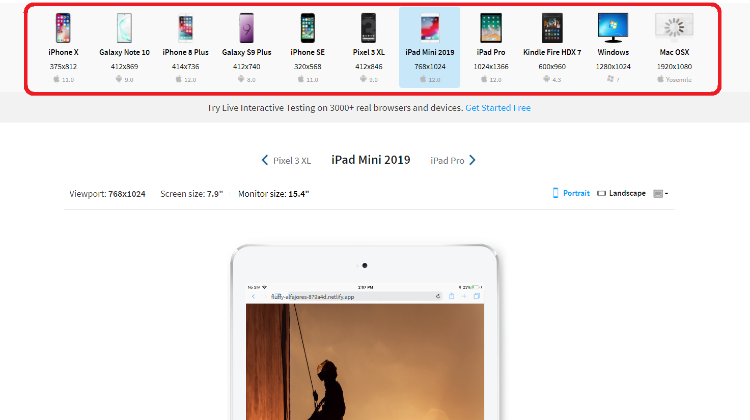
Using BrowserStack Responsive to check the responsiveness of images with text on several devices.
Follow the easy steps below to test your responsive image on BrowserStack Responsive:
Step 1: Open BrowserStack Responsive Dashboard and enter the URL of the webpage containing the responsive image. If you have created a website on your local machine, you must host your website to test its responsiveness on BrowserStack Responsive.

Step 3: The user can check how the site appears on a certain device after choosing it.
Why use BrowserStack to test websites?
Testing your application on BrowserStack gives you an edge by simultaneously testing upon numerous range of devices and operating systems in the cloud without having to have these devices physically. It not only saves the cost of setting up a physical lab but also saves a lot of time.
It creates an ideal situation where an application is thoroughly tested before rolling it out to the public. Therefore, an application reaches a wider spectrum of devices and hence more users.
Let’s discuss some of the additional features that BrowserStack offers for testing:
BrowserStack Live provides a 3500+ combination of devices, browsers, and operating systems that ensures testing on a wide range of latest and legacy devices. BrowserStack Live offers some additional features such as
- Geo Location Testing to observe how the application performs in different parts of the world.
- Real Device Network Testing offers physical SIM card features to test network-dependent functionalities such as SMS verification and more.
- Network Simulation offers real-user conditions for testing by creating real-world internet environments to detect any performance issue.
- Built-in Screen Readers allow testing accessibility on screen readers such as VoiceOver or TalkBack thus boosting the scope of testing.
- Mobile Testing: Test Website on Mobile devices to check user experience across mobile devices of different screen sizes and OS Platforms.
- Consistency and Reliability: Testing your applications locally on your machine can lead to inconsistent results due to the limited availability of devices and operating systems, which does not take into account the full spectrum of devices used in the real-world scenario. BrowserStack offers a huge range of devices and operating systems to ensure the application is working as intended across all devices.
- Real-time debugging: A distinct feature of BrowserStack, allows live inspection of web elements, network requests, and console logs to catch bugs. It also allows testers to capture rich artifacts like screenshots and videos of bugs, for better documentation of the issues.
Conclusion
Positioning text over an image using CSS is an easy yet necessary approach one should keep in mind during development to keep the responsiveness of the image intact. This can be easily achieved with the help of several CSS properties. CSS properties to position text over an image in several locations of the image, such as the center, and bottom, are useful for positioning text images. While. HTML features such as using Figure and Figcaption are further useful in maintaining the SEO and overall structure of the webpage.
However, it is essential to test the responsiveness of the image after positioning text over it. There’s no way easier than BrowserStack’s Free Responsive Checker Tool, which allows testing the webpage on multiple real devices of choice spanning across different screen sizes and resolutions.


