Why is it important to test websites in different screen sizes?
Internet users across the world access websites from numerous devices like laptops, desktops, tablets, smartphones, etc. Needless to say, every device has its unique screen size and resolutions.
There are more than 3.5 billion smartphones in use and the number continues to grow. Naturally, it is not feasible for QAs to test websites on every single device or screen size.
An effective way to deal with this issue is to test and optimize sites for the most commonly used device screen sizes. One can refer to this guide on ideal screen sizes for responsive design that highlights the most popular or standard screen sizes teams must consider for testing. This will help QA teams optimize their website’s layout for the majority of web users and will help assure better test coverage.
This article aims to explain two easy methods using which teams can instantly run a responsive test for their websites across the most popular screen sizes.
Method 1: Using BrowserStack’s Free Responsive Checker Tool
This is one of the easiest ways to get the actual view of a particular website across real devices with unique screen sizes. It allows users to instantly perform responsive testing across popular device types like smartphones, tablets (including Kindle), and desktops.
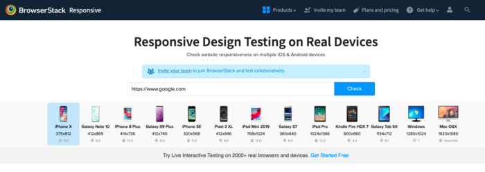
Check out the image below to better understand this tool.
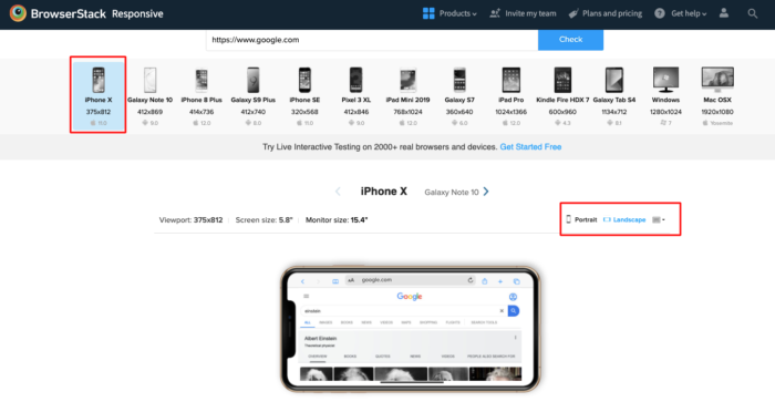
Simply enter the URL of a particular website and click on the Check button. The website will be loaded across multiple devices as shown in the image above. Now users can select the device they wish to view their website on. For example, let’s consider the iPhone X. The result will be as follows:
Run a Free Responsive Website Test Now
Once the user selects the desired device, the website will be displayed on that particular device with larger, clearer dimensions. Additionally, users can also choose to view the website in Portrait and Landscape mode similar to the feature used in the real world. In the example shown above, Google is viewed in Landscape mode on a real iPhone X.
Note: This tool only allows users to check how their website appears on particular devices having different screen sizes and viewports. One can not interact with the web elements appearing in the device. Users willing to view and interact with websites on real mobile devices are advised to follow the second method.
Although the tool proves to be quite handy for instant responsive checks, a key limitation of this tool is users can only view their websites on a few popular devices. This also means that users won’t be able to perform comprehensive responsive testing.
The second method addresses this limitation. It allows developers and testers to perform interactive responsive tests as well as cross browser testing on real mobile devices.
Method 2: Using BrowserStack Live for Interactive Web Testing on Real Devices
One of the most convenient and effective ways to perform interactive responsive testing is by testing websites on real devices with unique screen sizes. However, it’s not feasible for all teams to purchase different types of devices for the sake of testing as it demands enormous investments and high maintenance.
BrowserStack’s real device cloud provides users with 2000+ real devices and browsers that are available 24×7 for on-demand testing. As the infrastructure is purely cloud-based, all the devices and browsers can be accessed from anywhere in the world directly from a web browser.
Get started by following three simple steps listed below:
- Sign up on BrowserStack Live for a free trial or purchase a plan.
- Navigate to the Live Dashboard after successful sign-up.
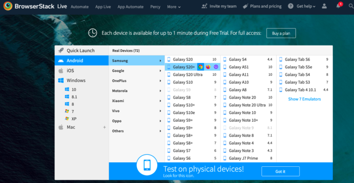
- Select the desired OS (Android, iOS, Windows, etc) and the device-browser combination (For example Samsung S20+ – Chrome) and get started with web testing on a real device.
The first image below represents the Live dashboard where users can select the device-browser-OS combination of their choice.
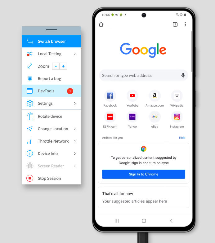
Once the user selects the desired device-browser-OS combination, a new session is initiated on that specific device. (Chrome on Samsung S20+ in this case).
Once the session begins, users can start interacting with the website on that particular real device. Users can scroll through the website, interact with specific web elements and verify whether there are any rendering issues.
Try Live Testing on Real Devices for Free
Pro Tip: You can test mobile apps in different screen sizes using BrowserStack App Live offering thousands of real iOS, Android, Windows, and other mobile devices. The process is quite similar to using BrowserStack Live.
As users access numerous devices from popular vendors like Apple, Samsung, Google, OnePlus, Motorola, etc, they can perform interactive testing on desired devices. Additionally, users can also choose to test on desktop environments like Windows and MacOS (including their latest and legacy versions).
Apart from interactive responsive testing, developers and QAs also get access to advanced features for mobile testing. Listed below are a few:
- Upfront access to DevTools for inspecting particular web elements in mobile view.
- Network throttling feature to test the performance of websites in poor network connectivity.
- Integrations with bug reporting tools like Jira and Slack to aid bug identification.
- Geolocation testing to test location specific behavior of a website.
Apart from interactive responsive testing, the method above also allows teams to perform cross browser testing across mobile browsers. This is very beneficial for teams as the web is accessed by multiple mobile browsers like Safari, Chrome, Firefox, etc.
Testing on real mobile browsers allows teams to optimize their websites’ performance for popular mobile browsers. Consequently, this helps in delivering a flawless mobile experience for online users.
Businesses must bear in mind that the web is a highly fragmented space. Optimizing a website for a specific device type, screen size or browser won’t suffice in a world where the web is accessed from 9000+ distinct devices and several browsers.
The methods illustrated above will help developers or teams to instantly test their websites across real devices having different screen sizes. Moreover, it will also help QAs debug rendering issues appearing for a particular device or browser by performing cross browser testing on real devices.

