I thought testing Safari’s mobile view was straightforward—just resize the desktop browser or toggle responsive mode in DevTools.
That changed when a navigation menu that looked perfect on my Mac completely broke on a real iPhone, showing overlaps, shifted icons, and misaligned tap areas that no simulation revealed.
No matter how much I resized or switched device presets, nothing matched the real iPhone’s behavior.
That gap between desktop previews and actual iOS rendering pushed me to master Safari DevTools and Web Inspector for accurate mobile debugging.
Overview
Safari’s mobile view lets you preview how your website appears on iPhones and iPads, helping you catch layout issues, touch behavior problems, and responsive design quirks early in development.
Methods to Test Safari Mobile View Using DevTools
Here are two reliable ways to test Safari’s mobile view:
Method 1: Responsive Design Mode Using Web Inspector
- Enable the Develop menu in Safari.
- Open Responsive Design Mode to simulate different iPhone/iPad screens.
- Inspect elements, test layouts, and debug using Web Inspector.
Method 2: BrowserStack’s Real Device Cloud for Live Safari Testing
- Test on real iPhones and iPads without needing physical devices.
- Validate actual Safari rendering, touch interactions, and network behavior.
- Debug UI issues using screenshots, video logs, and live inspection tools.
This article illustrates how to use Safari DevTools to view the mobile version of a particular web page with three different methods.
Why test Safari Mobile View of a Website?
Testing a website’s mobile view on Safari is crucial because iPhones account for a significant share of global browsing activity. Safari alone makes up over 14% of worldwide web usage as of late 2025, which means a large portion of your visitors will view your site through iOS devices.
Safari on mobile doesn’t always behave like desktop Safari or other mobile browsers. Its rendering rules, viewport handling, touch interactions, and device-specific constraints can cause elements to shift, overlap, or respond differently on real iPhones and iPads.
Reviewing your site in Safari’s mobile view helps you:
- Detect layout issues that only appear on iOS
- Validate tap targets, gestures, and scrolling behaviors
- Catch Safari-specific CSS and JavaScript inconsistencies
- Ensure responsive breakpoints behave correctly on different iPhone sizes
- Confirm UI stability across real mobile conditions
Ultimately, testing Safari’s mobile view ensures a seamless experience for a sizable and important segment of your audience.
To confidently validate how your site behaves on real iPhones and iPads, platforms like BrowserStack offer instant access to a real device cloud so you can catch issues early and deliver a consistent mobile experience.
How to use DevTools to test Safari Mobile View?
As a developer, it’s essential to check Safari’s mobile view to understand how your website behaves across different screen sizes and device types. With mobile usage continuing to rise, relying only on desktop previews is no longer enough.
You can use the following methods to test Safari’s mobile view effectively:
Method 1: Safari Developer Settings
Safari includes built-in Developer tools—disabled by default—that allow you to simulate various iPhone and iPad screen sizes.
Once enabled, you can use Responsive Design Mode to preview layouts and the Web Inspector to debug UI issues such as missing elements, misaligned text, or layout shifts.
This method is helpful for initial checks, local development, or testing non-production environments.
Method 2: BrowserStack Real Device Cloud
For more accurate testing, BrowserStack Live provides access to a real device cloud with thousands of browser–device combinations, including multiple iPhone and iPad models.
Beyond checking responsiveness, you can test real-world conditions by simulating networks, validating behavior on physical SIMs, debugging directly on real Safari versions, capturing screenshots or videos, and identifying issues that desktop DevTools cannot replicate.
This method is ideal for production-level validation and catching device-specific bugs early.
Now let’s explore each method in detail to see how you can use them to test and debug Safari’s mobile view effectively.
Read More: How to Debug Websites on iPhone Safari
Method 1: Responsive Design Mode Using Web Inspector for Debugging in Safari
First, note that the Develop menu in Safari is disabled by default. To access Responsive Design Mode, you’ll need to enable the Develop menu in Safari’s preferences.
Enable the Develop Menu in Safari
Follow the steps below to enable the Develop Menu:
Step 1. Launch Safari browser
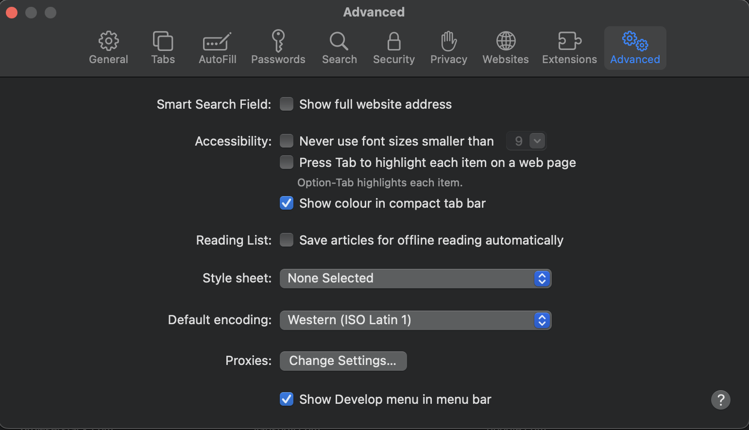
Step 2. Click on Safari -> Settings -> Advanced
Step 3. Select the checkbox -> Show Develop menu in menu bar
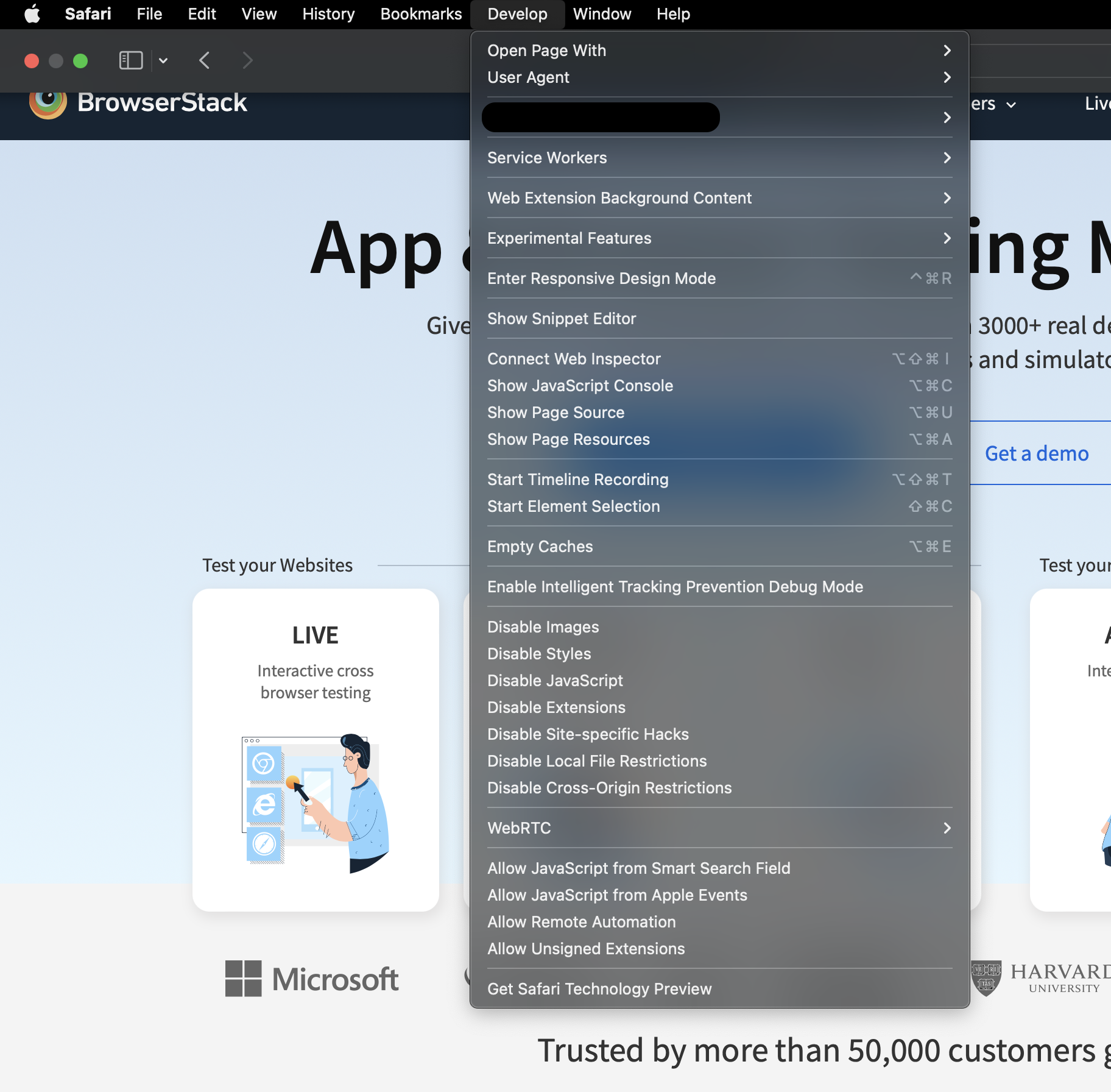
Once the Develop menu is enabled, it’ll show up in the menu bar as shown in the image below:
Note: Fundamentally, this feature is built to check responsive design in Safari. When it comes to actually verifying the features, functions, and offerings of a website, it is best to utilize the second method – a real device cloud.
View mobile version using Safari DevTools
Now follow the steps below to view the mobile version of a web page using Safari DevTools:
Step 1. Launch Safari and navigate to the desired URL that needs to be loaded in mobile view.
Step 2. Click on the Develop menu and select Enter Responsive Design Mode.
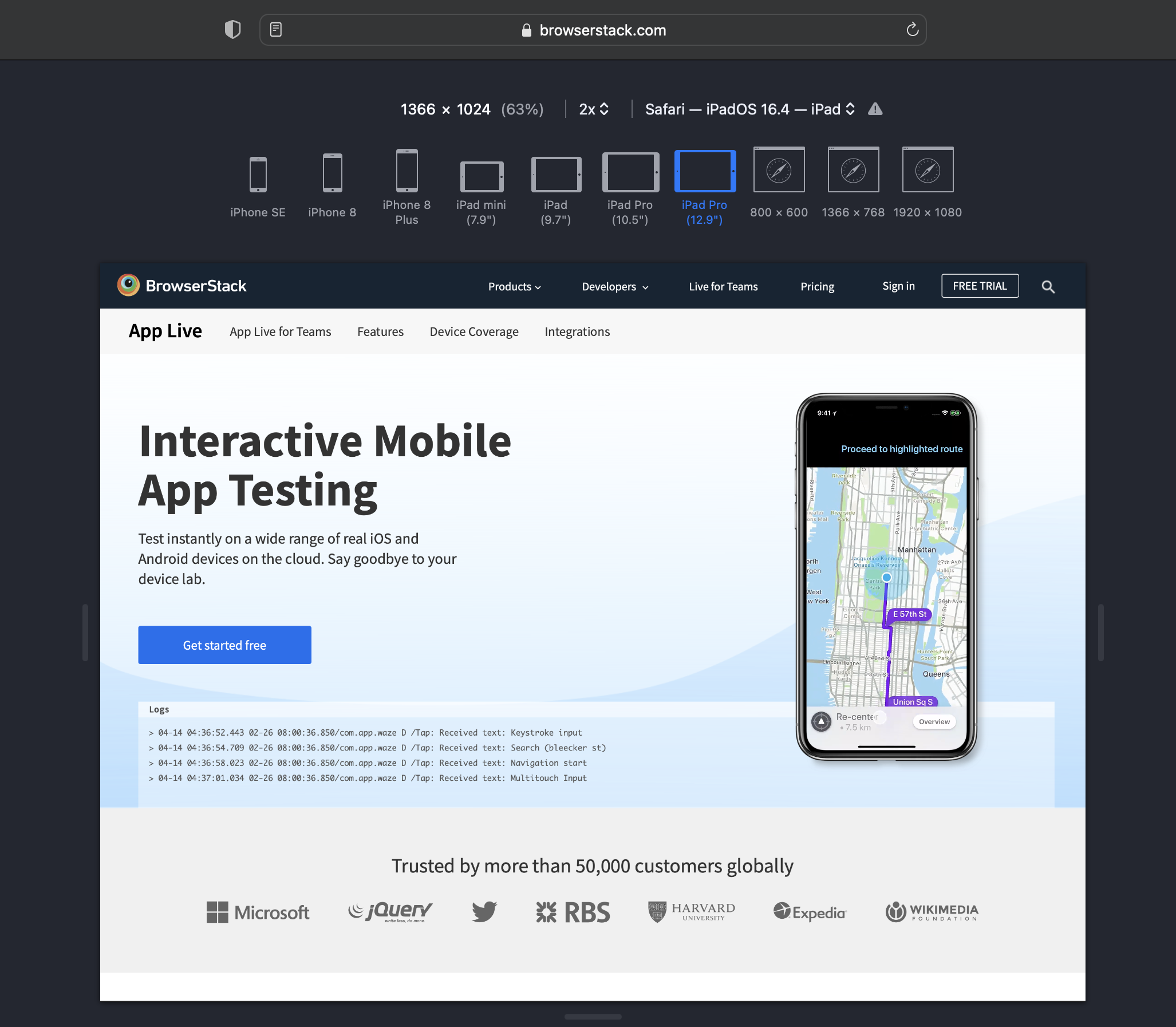
Step 3. The target URL (BrowserStack App Live in this example) can be viewed on the desired iPhone or iPad.
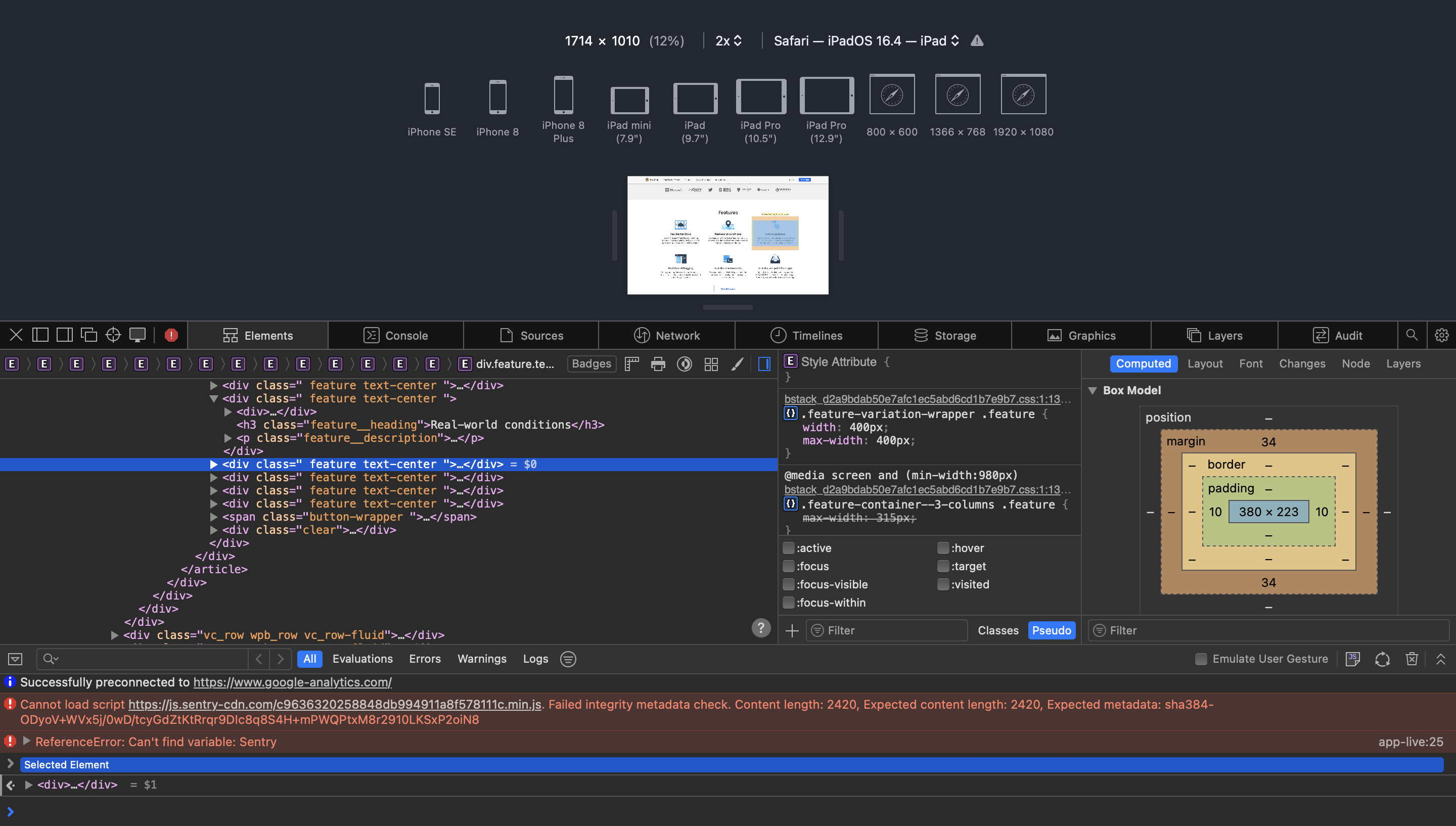
Devs or testers can locate it in the development view and use the element selector to inspect specific Safari mobile web elements after activating the inspector.
Follow-Up Read: How to Debug Websites on iPhone Safari
Mobile View in Safari using Web Inspector
Furthermore, developers can leverage the Web Inspector to inspect any particular element and debug a specific issue for a specific screen size. One can find the web inspector in the Develop menu. Once the web inspector is active, inspect a particular element using the element selector.
Note: This approach allows the simulation of different viewports on a desktop browser. However, this is not the most accurate or simple way to test the mobile version of a website on Safari, as it is just a device simulation using development tools. It cannot simulate all aspects of a real mobile device under real user conditions.
Method 2: BrowserStack’s Real Device Cloud for Live Safari Testing
To test your website for responsiveness, do the following:
Step 1. Log in or Sign Up for free BrowserStack account. An operating system and browser selection menu is displayed.
Step 2. You can either directly view your website on different devices, such as Safari on iPhone 15, iPhone 15 Pro, etc, or you can view your website on Mac OS and play around with resolutions.
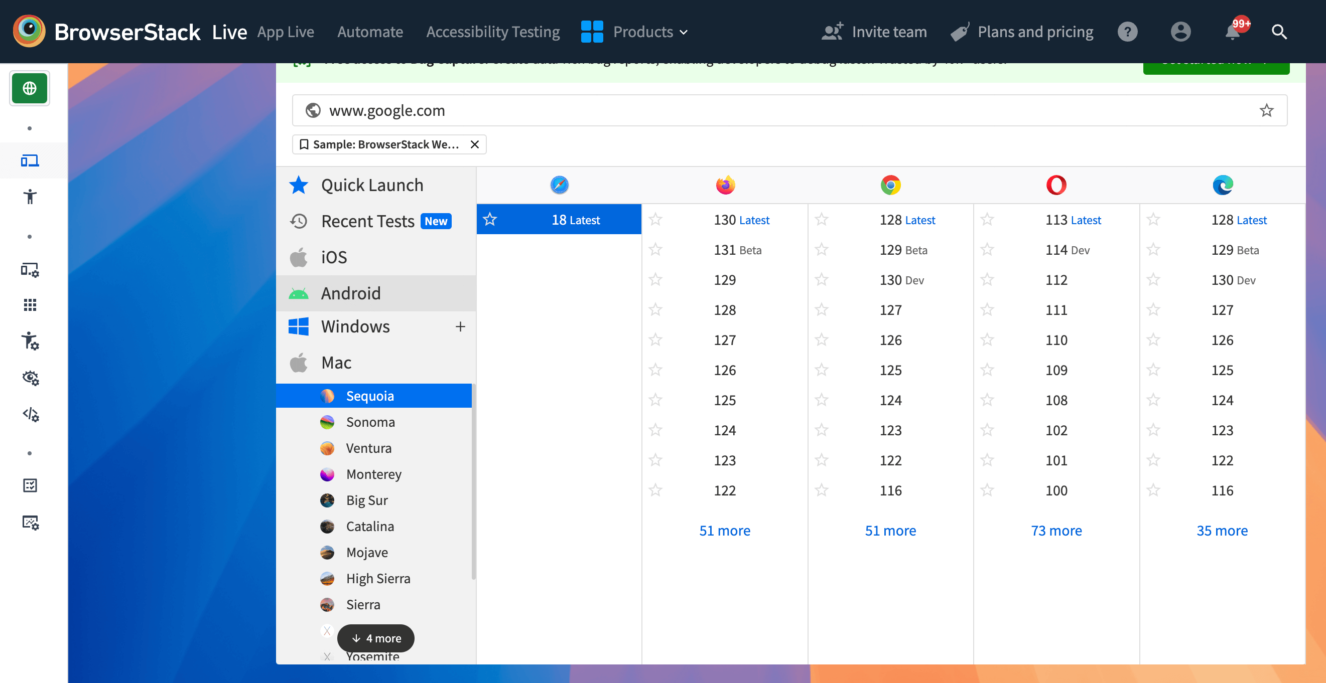
Step 3. Select the device-browser combination on which you want to perform the test. Since we are testing on the macOS operating system, click Mac > Sequoia.
Step 4. Under the Safari column, click 18.
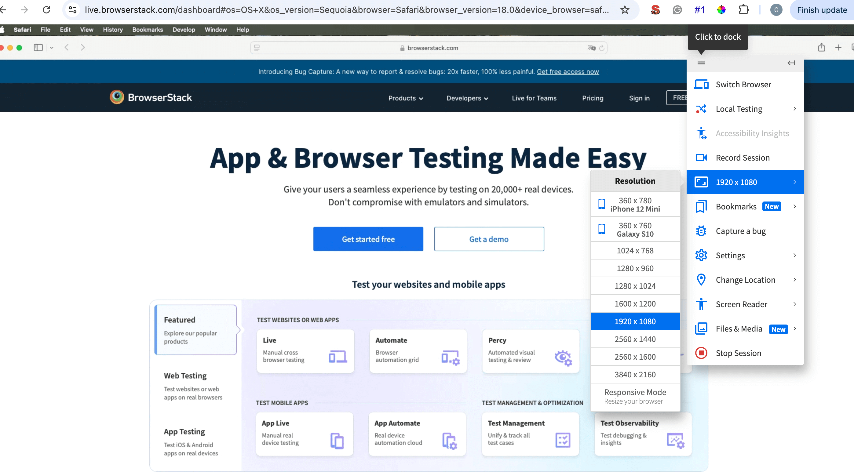
Step 5. On your current session, from the Live toolbar, click 1920 x 1080 and select 1280 x 1024.
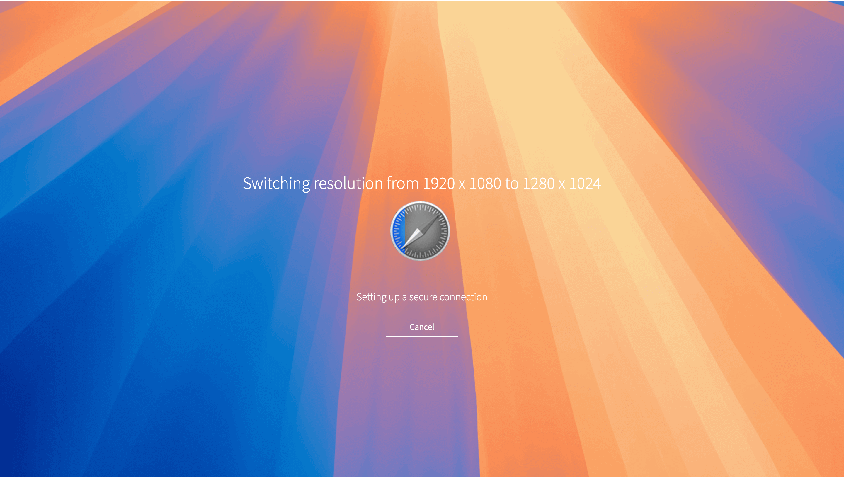
The screen refreshes to display the website in this resolution as follows:
Step 6. To simulate the Web inspector tool, select and right-click an element on your website that you want to inspect.
Step 7. Click Inspect element to start inspecting.
Debug Websites on Safari with BrowserStack
Why run Mobile Tests on Real Devices?
Inspecting using the Safari Developer tools limits your ability to identify and debug issues that might be beyond the scope of just identifying UI issues. For example, real world issues such as hardware issues, network issues, etc might also influence how your website is served. Using a real device cloud gives you access to these features along with better observability and debugging.
Some of the benefits of using BrowserStack Live are:
- Access a wider range of configurations: Test your applications across versions of Mac OS, Safari versions, or directly use the real devices such as iPhone, iPad instead of varying resolutions.
- Streamline debugging: BrowserStack Live integrates with popular debugging tools, enabling you to inspect elements, capture screenshots and videos of bugs, and troubleshoot issues efficiently during testing.
- Ensure consistency and reliability: BrowserStack Live gives you access to simulating a local environment along with network connectivity. You can test holistically so that users’ experience isn’t compromised. You can test for differences in local setups due to varying software versions, hardware limitations, or setup differences.
- Accelerate testing: Run tests simultaneously on multiple Mac/Safari configurations on BrowserStack, significantly reducing testing time compared to sequential testing on a local machine.
Conclusion
Using the default Safari Developer tools along with the Web Inspector tool can be efficient for non-productions setups, but even then you want to ensure that the user experience that you deliver through your website finally isn’t compromised.
With access to more than 3500+ browser combinations, a real device cloud can empower your developers to test your applications expansively. You can also use the free responsive design checker that BrowserStack offers to see how your applications perform on most popular devices.


