Users can abandon an app if it is poorly designed for mobile usage. Therefore, a web app must be compatible with various devices, browsers, and OS combinations and, hence, be responsive to deliver a quality experience across multiple devices.
Overview
What Are Responsive Apps?
Responsive apps are web applications that automatically adjust their layout, functionality and content etc. depending on the user device and screen size.
Benefits of Responsive Apps
- Improved User Experience
- Ease of Use
- Increased Mobile Traffic
- Better SEO Performance
- Faster Load Times
- Cost-Effective
Learn in detail about responsive apps, how to build them, why to build them, best practices, and how they differ from Progressive Web Apps.
What Are Responsive Apps?
Responsive apps refer to creating a website that can be accessed from a desktop, mobile, or any interface.
A responsive app enables users to have a better experience irrespective of the device, OS, screen size, orientation, and browser platform. These apps are styled using an inline style, different layouts, and flexible images to ensure consistent UX.
Building responsive apps makes the website more accessible from different devices.
Why Build Responsive Apps?
Building responsive apps helps businesses have a higher retention rate and attract more customers. Also, it helps make a user-friendly website that has good user interference. Here are the various benefits of building responsive apps.
- Improved User Experience: Responsive apps provide easy navigation and readable content on all devices.
- Ease of Use: Scale your content and page components automatically across multiple devices of different screen sizes and resolutions like tablets, mobiles, and desktops using a responsive design.
- Increased Mobile Traffic: Captures users on smartphones and tablets, which account for more than half of web traffic.
- Better SEO Performance: Meets Google’s mobile-friendly requirements, boosting rankings in search results.
- Faster Load Times: Ensures quicker performance, keeping users engaged and reducing bounce rates.
- Cost-Effective: Reduces the need for separate mobile and desktop sites, saving time and maintenance costs.
- Future-Proof: Adapts to new devices as technology evolves, ensuring long-term accessibility.
Types of Responsive Web Applications
Responsive web applications comes in differenty types to ensure an optimal experience for your users. Here are the main types:
- Fluid Layouts: Fluid layouts utilize relative units like percentages in place of fixed pixels. With this elements can resize dynamically as per the screen size.
- Adaptive Layouts: Adaptive layouts depend on predefined breakpoints so as to adjust design for specific screen sizes. Such layout switches between specific designs at set widths, providing better control over the design but may not be very flexible.
- Hybrid Layouts: Hybrid layouts is a combination of fluid grids and adaptive breakpoints. Here, the elements can resize to an extent, within a range but will have to switch to new layouts at specific screen widths. Hybrid Layouts provide consistency and flexibility at the same time.
- Mobile-first Designs: In such an approach, the design is optimized for small screens first and then further improved for bigger devices. This is to ensure enhanced usability and performance on mobile devices.
How to Build Responsive Apps?
58.3% of web developers say “not being responsive to different devices” is the core reason a website should be redesigned.
So, you need to build responsive websites in the first place. Building responsive apps involves multiple important steps, like:
- Set up appropriate responsive breakpoints
- Start with a fluid grid
- Consider a touchscreen with keyboard functions.
- Define typography
- Using a pre-designed theme or layout to save time
- Test responsiveness on real devices
For more details you can refer to this article on building responsive apps.
Best Practices for Creating Responsive Apps
Let’s talk about the responsive best practices that will provide users with a better user experience while exploring websites or apps onany device on any screen resolution.
- Flexibility and adaptivity
Every website is accessed through devices with different screen sizes and resolutions. Content or images cannot be distorted, cropped out, or obscured. So it’s good to have flexibility in font and layout and adaptability in screen size and resolution.
- Breakpoints
A breakpoint is the specific point at which a website’s or app’s content and design will adapt precisely to give the best user experience.
- Topography
Responsive websites need responsive font sizes, styles, and layouts. Making typography adjustments to screen size is necessary and will ease reading on multiple devices.
- Responsive Design Elements
Having a crystal clear understanding of user requirements is vital in making design better. You must ensure that the design is soothing and delivers a great user experience. Elements such as Images, Videos, CTA Buttons, should comply with the responsive design. But while making a website responsive, the necessity of testing on real devices is often overlooked.
Also Read: How to make images responsive
How to Test a Responsive App?
While implementing and defining responsive design, checking how your website appears on different devices is important. You must avoid choosing a simulator or emulator and instead test responsive design on real devices to verify the design visible to the end-users.
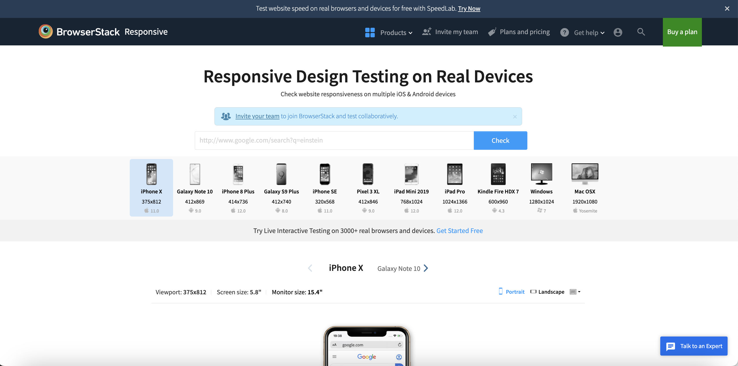
Creating real user conditions in an on-site physical lab can be expensive, so you can choose a cloud platform like BrowserStack to access the latest real devices to check your web app’s responsiveness.
You can enter the URL of your website to check its responsiveness on multiple devices, OS, and browsers within no time.
BrowserStack offers a real device cloud of over 3500+ browsers and devices. You can sign up for free, select a browser-OS-device combination, and check how it renders on that device’s resolution.
Apart from responsive web apps, you can also test progressive and native apps using BrowserStack.
But what’s the major difference between these types of apps?
Difference Between Responsive Web, Progressive Web, and Native Apps
Each type of app offers its disadvantages and advantages under different circumstances. We have finalized a few major factors we understand to be the core difference of these apps.
| Factor | Progressive Web App | Responsive Web App | Native App |
|---|---|---|---|
| Business case | If you are targeting a large audience and looking for a quick market, then a progressive web app is great for you. | As progressive web apps are only limited to websites, RWA is available on desktops and mobile devices. | Reaching out to a larger audience can be costly for you with a native app. |
| Cost | Progressive web apps are cost-effective because of the limited use of resources. | Web apps are the most cost-effective, as they require limited resources. | Native apps require dedicated teams to handle compatibility with different platforms, which can be costly. |
| User experience | It provides a good user experience but cannot leverage the advanced functionality of a smartphone, like geo-fencing or a camera. | It provides a decent user experience similar to progressive web apps. | It provides the best user experience because native apps are built for a specific platform. |
| Security | Low-security compared to native apps. | Low-security compared to progressive and native apps. | Security is high because it’s easier to use multi-factor authentication (MFA), which is vital if an app has login functionality. |
| Local device access | Not good if your app requires local features | Cannot leverage the use of local device features. | If your app requires local device features, then native apps are great. |
Now that you have a basic understanding of native, web, and progressive apps, you must understand the importance of testing these apps before their official release.
Real Browsers and Devices for Responsive App Testing
Although responsive web apps are in high demand compared to other types of apps, you must test your apps on multiple real browsers and devices to validate theirresponsiveness.
Choose a responsive design checker like BrowserStack, which offers a real device cloud with instant, on-demand access to over 3500+ real browsers and devices. Once you get your accurate and precise responsive test results, you can ensure that your end-user gets the best user experience, irrespective of their browser-OS-device combination.
Conclusion
By adapting seamlessly to different screen sizes and devices, Responsive apps enhances usability and performance, proving to be crucial for modern web development. That being said, it. is important to test your responsive design across various devices and browsers. With tools like BrowserStack you can test your responsive app across 3500+ real-device-browser-OS combinations.


