Responsive web design is essential for delivering consistent experiences across screen sizes and devices. Breakpoints help ensure that these layouts adjust smoothly as the viewport changes.
Overview
What is a Breakpoint?
A breakpoint is a defined viewport width at which the layout or styling of a webpage changes to better fit the screen. Breakpoints are typically used in media queries to control how content is displayed on different devices.
Different Types of Breakpoints
Breakpoints can be categorized based on how and where they are applied during the design and development. Here are the main types:
- Device-Based Breakpoints: Based on standard screen sizes of phones, tablets, and desktops.
- Content-Based Breakpoints: Set where the layout visually breaks or becomes misaligned, regardless of specific device widths.
- Layout Breakpoints: Trigger changes to primary structural elements like grids, navigation, or columns.
- Component Breakpoints: Applied within individual components to adjust their layout or size independently of the whole layout.
- Orientation Breakpoints: Target changes when switching between portrait and landscape modes.
- Interaction-Based Breakpoints: Adapt UI based on input method or user behavior, such as hover vs. touch.
This article covers what breakpoints are in responsive design, the different types used in development, commonly used breakpoint values, and how to test them effectively.
What is a Breakpoint?
CSS Breakpoint is a “defined width” that is used in the webpage style to make the content and design responsive. It helps enhance user experience by delivering consistent experience on different devices. Breakpoint solves the device fragmentation issue as it helps render the webpage uniformly across different screen sizes.
What is a Breakpoint in Responsive Design?
A breakpoint in responsive design refers to specific screen widths or device dimensions at which the layout of a website or web application changes to provide an optimal viewing experience.
These breakpoints are defined using CSS media queries, which apply different styles depending on the screen size or device type (e.g., mobile, tablet, desktop). In essence, breakpoints ensure that a website is flexible and adaptable, providing a seamless user experience across a wide range of devices and screen sizes.
Essentially, breakpoints are pixel values that a developer/designer can define in CSS. When a responsive website reaches those pixel values, a transformation (such as the one detailed above) occurs so that the website offers an optimal user experience.
- For developers, a common breaking point is a media query.
- For designers, a common breaking point is the juncture at which a change is made to how the website content or design appears to the viewer.
Also Read: How to create a Responsive Website
Example of Breakpoints in Responsive Design
For instance, on the Amazon website, the layout changes significantly when switching from a desktop to a mobile view.
On a desktop, Amazon’s navigation menu is displayed as a horizontal bar across the top of the screen, allowing easy access to various categories and features. The content, including product listings, is organized into multiple columns, allowing users to view more items simultaneously.
However, when viewed on a mobile device, the layout shifts to a more streamlined, mobile-friendly version. The horizontal navigation bar transforms into a collapsible “hamburger” menu, which users can tap to reveal the categories and options.
Additionally, the content columns stack vertically, ensuring that each product is displayed clearly and accessible within the narrower screen width. This responsive design approach ensures that users have a seamless and intuitive shopping experience, regardless of the device they are using.
Media Query in Responsive Design
Choosing an approach to add a breakpoint can be quite tricky. There is no one rule or syntax that applies to all frameworks. However, you can use a media query to ensure responsiveness. A media query is a rule included in the CSS property and executed if a said condition is true. The common syntax for a CSS media query is
@media media type and (condition: breakpoint) {
// CSS rules
}
The following code demonstrates how this syntax works by changing the background to light blue when the screen size is less than 500 pixels.
@media only screen and (max-width: 500px) {
body {
background-color: lightblue;
}
}Standard Breakpoints For Responsive Design
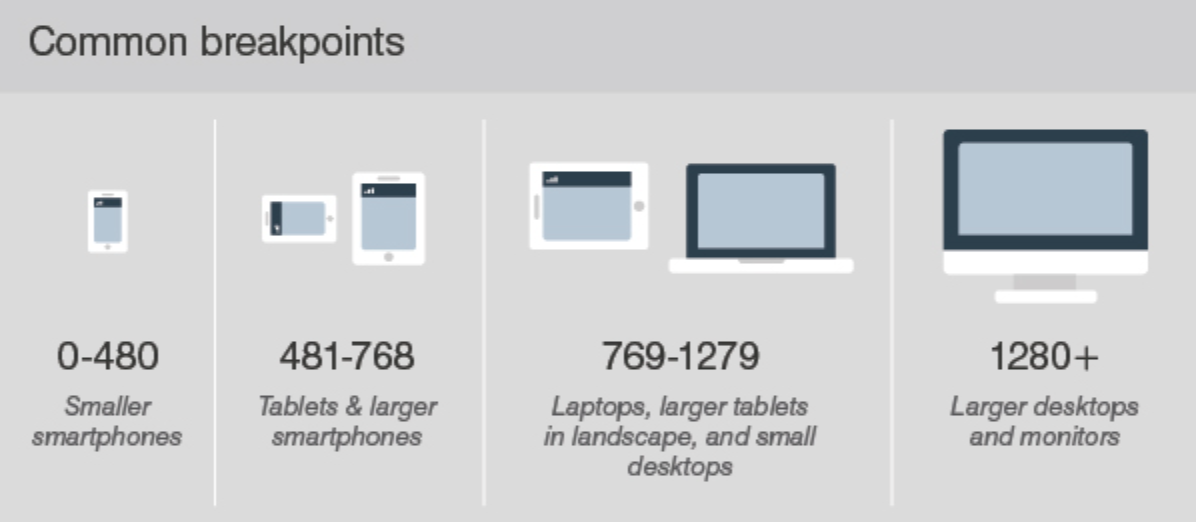
There are different types of breakpoints, including:
- Mobile Devices
- Tablets
- Laptops and Small Desktops
- Large Desktops
- Extra-Large Screens
Below is a detailed explanation of these responsive design breakpoints.
1. Mobile Devices
Used for the smallest smartphones, where content is stacked vertically, and navigation is typically collapsed into a hamburger menu.
Extra Small Mobile (Portrait): 320px – 480px
For slightly larger mobile screens in landscape mode, the layout may adjust to fit more content side by side.
Small Mobile (Landscape): 481px – 600px
Also Read: How to create an ultimate mobile experience
2. Tablets
Typically used for tablets like the iPad Mini in portrait mode, where a two-column layout might be introduced, and navigation elements become more accessible.
Small Tablets (Portrait): 601px – 768px
This breakpoint is suitable for larger tablets like the iPad in landscape mode. It might introduce a three-column layout, with more content displayed horizontally.
Large Tablets (Landscape): 769px – 1024px
3. Laptops and Small Desktops
A standard multi-column layout is often employed for smaller laptops or desktops. Navigation menus are fully expanded, and content is displayed side by side in multiple columns.
Small Desktops and Laptops: 1025px – 1280px
4. Large Desktops
Designed for large desktop monitors and high-resolution screens, this breakpoint maximizes screen real estate with spacious layouts, potentially using more advanced features like sidebars or large navigation panels.
Large Desktops and High-Resolution Screens: 1281px – 1440px
5. Extra-Large Screens
Ultra-wide or high-definition monitors allow for complex, multi-column layouts, more expansive content displays, and possibly interactive elements that use the extra space.
Extra-Large Desktops: 1441px and up
That said, you can always create standard responsive breakpoints for screen sizes that are extensively used among your audiences. Listed below are the screen sizes that were most used in 2025.
- 1920×1080
- 360×800
- 390×844
- 393×873
- 1366×768
- 1536×864
Common Layout Changes in Responsive Design
In responsive design, layout changes are essential to ensure a seamless and user-friendly experience across different devices. Here are some common layout changes that occur in responsive design:
1. Navigation Menu Adjustments
- Desktop: Navigation menus are typically displayed as horizontal bars with multiple items visible at once.
- Mobile: Menus often transform into a collapsible “hamburger” menu or a slide-out drawer to conserve screen space and simplify navigation.
2. Column Reorganization
- Desktop: Content is often arranged in multiple columns, allowing for a rich and detailed layout.
- Mobile: Columns stack vertically to fit the narrower screen width, providing a single-column layout that is easier to scroll through.
3. Font and Text Size Adjustments
- Desktop: Larger font sizes and more spacing are used to enhance readability on bigger screens.
- Mobile: Text sizes are reduced, and spacing is adjusted to fit the smaller screen while maintaining readability.
4. Image and Media Resizing
- Desktop: Images and media are displayed at larger sizes and can be arranged in a grid or gallery format.
- Mobile: Images are resized to fit the screen width, and media elements might be displayed in a stacked format or with a focus on optimizing load times.
5. Content Prioritization
- Desktop: Full content is often visible, with sidebars and additional sections providing extra information.
- Mobile: Key content is prioritized, with less critical information hidden or moved to secondary screens. This helps users focus on the most important information.
6. Grid and Flexbox Adjustments
- Desktop: Complex grid layouts with multiple rows and columns are used to maximize screen space.
- Mobile: Grid and flexbox layouts are simplified to ensure that content remains accessible and easy to interact with on smaller screens.
7. Button and Link Sizing
- Desktop: Buttons and links are often smaller and more closely spaced.
- Mobile: Buttons and links are enlarged and spaced out to accommodate touch interactions and reduce the likelihood of accidental clicks.
8. Forms and Input Fields
- Desktop: Forms may be displayed with multiple input fields visible at once, often in a side-by-side format.
- Mobile: Forms are redesigned to fit a single-column layout, with larger input fields and buttons to enhance usability on touch screens.
What is a Mobile Breakpoint?
A mobile breakpoint refers to the screen width at which a website or application should adapt its layout and design to ensure optimal user experience. Since mobile screens come in various sizes and resolutions, breakpoints define the points at which the content and layout should adjust to accommodate smaller screens.
When should a Standard Responsive Breakpoint be Added?
A good rule is adding standard responsive breakpoints when the content looks misaligned.
Visualize a paragraph of text. As the screen gets smaller, it starts to become distorted, thus hindering readability. Adding a mobile breakpoint here would prevent this from happening. The point of adding any breakpoint is to make content easy to read. This applies to both increasing and decreasing screen width. Adding a standard responsive breakpoint is recommended whenever the content becomes harder to read because of changing screen size.
Best Practices for Adding Standard Responsive Breakpoints
Follow these best practices to define and implement breakpoints effectively:
- Identify layout breakage: Resize your design in the browser or a design tool and pinpoint exact widths where elements overflow, misalign, or collapse. Use those widths as candidates for breakpoints.
Read More: Building Responsive Layouts with CSS
- Prefer content-driven breakpoints: Avoid rigidly using device-specific widths. Focus on when your layout fails, not on matching an iPad mini.
- Use consistent breakpoint values: Common tiers include min-width: 480px, 768px, 1024px, and 1280px. Customize these based on your design system’s grid and component behavior.
- Maintain scale hierarchy: Space your breakpoints based on meaningful differences in layout needs. Avoid setting breakpoints too close together unless component behavior changes significantly.
- Define breakpoints as variables: Store breakpoint values in a centralized place (CSS custom properties, SCSS variables, or JavaScript config) to ensure consistency across codebases.
Also Read: Bootstrap Breakpoints and Media Queries
- Use mobile-first media queries: Structure your CSS using min-width queries to layer enhancements. This results in smaller initial payloads and better performance on mobile devices.
- Segment breakpoints by layout vs. component: Use global breakpoints for page structure changes, and local (component-scoped) breakpoints within utility classes or component stylesheets for responsive components.
- Avoid fixed pixel assumptions: Don’t style components assuming the presence of a specific screen width. Instead, use fluid layouts with flexbox or grid and adapt only when the content needs reflowing.
- Use developer tools for live tuning: Chrome DevTools and Firefox Inspector allow dynamic resizing and inspection of breakpoints. Fine-tune breakpoints visually before hardcoding them.
- Annotate breakpoints clearly: Include comments or use naming conventions like $breakpoint-md or –bp-tablet to make the purpose of each breakpoint immediately obvious to future maintainers.
How to run Responsive Tests on Real Browsers and Devices?
Testing on real devices and browsers reveals layout shifts, rendering quirks, performance issues, and touch or hardware-specific bugs that simulators can’t catch.
BrowserStack is a real-device cloud platform offering access to over 3,500 real devices and browsers. It allows teams to instantly run manual tests, debug in real time, and replicate complex user workflows without maintaining a physical device lab.
Here are the key features of BrowserStack Live:
- Real Device Cloud: Run manual tests on real Android, iOS, Windows, and macOS devices hosted in secure data centers.
- Local Testing: Preview and debug your local development or staging environments without deploying code to production.
- Multi-Device Testing: Open multiple device-browser sessions side by side to compare responsive behavior across breakpoints.
- Built-in DevTools: Use native browser developer tools for real-time debugging, inspecting elements, and monitoring performance.
- Real Device Features: Simulate geolocation, network conditions, device orientation, and real-world features like camera access or file upload.
Conclusion
Defining clear, content-driven responsive breakpoints is essential for building layouts that adapt seamlessly across different screen sizes. Instead of relying on arbitrary widths or device-specific targets, breakpoints should be based on where your design naturally needs to shift. This ensures a more fluid and consistent user experience, regardless of the device being used.
Once breakpoints are defined and implemented, they must be validated in real-world conditions. This is where BrowserStack proves invaluable. With access to 3,500+ real devices and browsers, it enables teams to test responsive behavior accurately across a wide range of environments.


