It is estimated that about 90 % of website viewers read the Call to Action (CTA).
Suppose you own an e-commerce website; the goal should not be just attracting more traffic. The ultimate goal should be increasing sales which depends on the number of visitors buying the product on your website.
Hence, you need to understand the difference between visiting a website and buying something. This difference is all that matters when it comes to sales. And this is where a CTA comes into the picture.
What is Call to Action (CTA)?
A Call to Action (CTA) is a small web content that persuades viewers to perform a specific task. The web content is generally in the form of actionable buttons, images, or text. CTA is an acronym for Call to Action.
In digital marketing, CTAs convert a visitor into a lead that might ultimately convert into a sale. You must have seen these call-to-action examples on various websites: Subscribe, Request Quote, Try now, etc.
Also Read: How to Make a Website User Friendly
When to Use CTA
A Call to Action (CTA) should guide your visitors towards a specific action or goal. Here are instances when you have to use a CTA:
- Landing Page Creation: Create a landing page that is designed to convert visitors to leads and customers. Now, this could be a signup, buy now, or download CTA.
- Blog Optimization: Engage your blog readers and convert them into subscribers or customers. Ensure the CTA matches the context of the post.
- Reduce Cart Abandonment: Encourage customers to clear the checkout process to reduce cart abandonment. Use prominent CTAs like ‘Confirm order’, ‘Continue shopping’, and ‘Proceed to Checkout’ etc.
- Pop-ups: Capture email sign-ups or promote your products through Pop-ups.
- Navigation Bars: Use CTAs on navigation bars, such as ‘Contact us’ and ‘Free Trial,’ to lead users to important pages.
How to write a CTA?
Some of the tips and guidelines that can help you design some of the best call-to-action buttons are as follow:
- Making them stand out: It would be best if you placed your CTAs in a spot that is easy to locate. Ideally, the CTA should be the first thing the viewer sees after entering the webpage. For example, CTAs are generally placed at the bottom center of a popup.
- Usage of Action keywords: The text in the CTA should point toward the action you want the viewer to perform. You can use action keywords like Sign up now, Shop now, Get Quote, etc.
- Usage of text in first-person: Writing the CTA text in the first person is recommended to make it informal and personalized. For example, the CTA button for the online reservation app should be designed as ‘Make my reservation’ rather than ‘Make your reservation’.
- Creation of a sense of urgency: If you do not create a sense of urgency with your CTA, the viewers might procrastinate in completing the task or forget to do it altogether. This doesn’t mean that the CTA should cause panic amongst viewers. For example, you can incorporate incentives or discounts for a limited time.
- Elimination of Roadblocks: You should try and make the requested action very easy for the viewer to perform. For instance, if you want the viewers to share the information with their peers, you can add another CTA that encourages viewers to complete the action without friction.
CTA Design: Psychology of Colours
Each color and shape stimulates our brain in a different manner and kindles different senses and emotions. For example, medical professionals wear white scrubs because it signifies sterility.
When it comes to CTAs, it is recommended to use contrasting colors to showcase the unique propositions. Colors like blue, green, and light purple are cool colors, and other colors such as yellow, orange, and red are warm. Using cool colors reminds us of something relaxing, natural, and calming. And warm colors dignify happiness, energy, and optimism.
Listed below are the most used CTA colors and what they denote:
- Red: Using red helps stand out. It resembles excitement, urgency, and passion.
- Green: It acts as a motivator.
- Orange: It depicts warmth.
Black, white and brown are the least used colors for CTA as they do not align with the background and have no major significance.
20 Best CTA Design Examples To Boost Conversion
Below are some of the best call-to-action examples, and CTA button examples to boost the conversion of views into leads and sales.
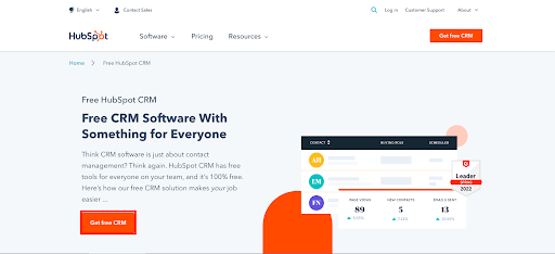
1. HubSpot – Get Free CRM
This CTA encourages the viewers to install the free CRM software developed by HubSpot. The contrasting orange colors of the buttons get the attention of the viewer to the action words, and the text explaining the CRM software is spot on.
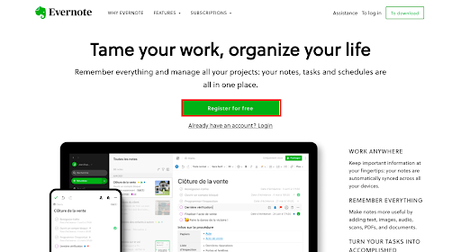
2. Evernote – Register for Free
Evernote is an online note-taking platform. This CTA is a simple button with the action phrase. It is curated to invite the viewers to register on the application for free and use the trial version. Green is part of the brand color and encourages the user to click.
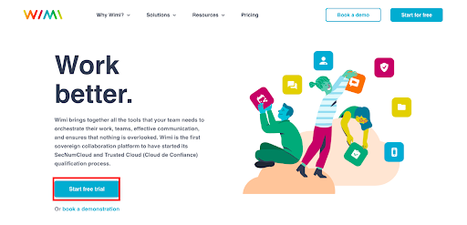
3. Wimi – Start a free trial
Wimi is a workforce management tool that helps managers allocate budgets and resources. Here, the CTA requests the audience to sign up and register for a free trial. The CTA is a simple button, and the phrase ‘Work Better’ is smartly put to create a sense that your team will function more efficiently with Wimi.
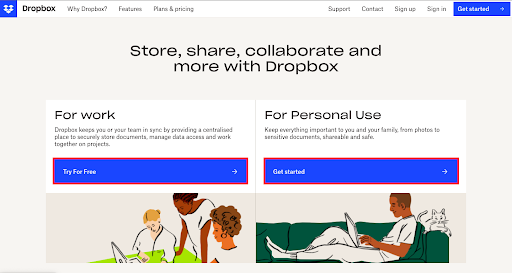
4. Dropbox – Try for free; get started
Dropbox is an online data storage platform that can be used for work or personal use. The first CTA encourages the professional audience to sign up on their web app and try it for free. The other asks the user to start their storage facility with Dropbox if they plan to use it for personal use. The CTA is a simple button, and the text right above gives relevant details to the visitors.
5. BookMyShow – Shop Now
BookMyShow is an Indian e-commerce platform that sells tickets for movies, concerts, theatres, etc. This CTA is curated to invite the audience to buy official movie merchandise from a different website. The banner indicates a movie poster, and the CTA button’s red color makes it stand out.
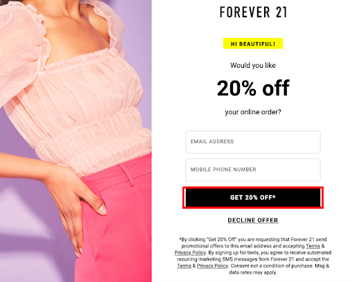
6. Forever 21 – Get 20% Off*
Forever 21 CTA encourages the viewers to sign up for their mailing list, and in return, the brand will provide you with a discount code of 20 % on online orders. The inverted text color of the CTA makes it stand out. The text also creates a sense of personal touch. Although black is not a recommended color for the CTA, having it on a plain white background makes it stand out and encourages the users to click.
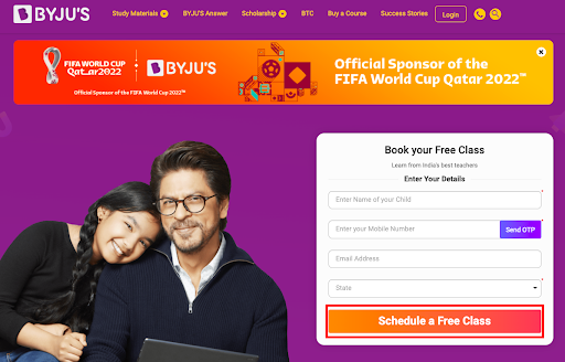
7. Byjus – Schedule a Free Class
The CTA in Byju’s landing page is aimed at the viewers signing up and scheduling a free class with their platform. This will give them leads that could turn into potential sales. The color of the CTA matches the advertisement on the top of the page to bring the attention of the viewer to both of these elements.
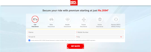
8. HDFC ERGO – Get Quote
HDFC ERGO CTA drives the viewer to fill in the details and get a personalized quote for insuring your car. Here the color of the CTA matched with the company logo and important details on the website to lure the customers into interacting with it.
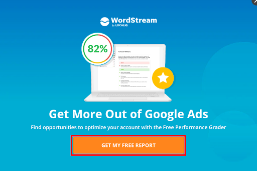
9. Wordstream – Get my Free Report
This Wordstream CTA persuades the viewer to receive a free assessment report to discover how their digital marketing tools suite can help you realize your business objectives. The contrasting color of the CTA makes it stand out from the rest of the elements in the popup.
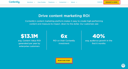
10. Contently – Request a Demo, Read a Case Study
These CTAs on Contently’s landing page encourage the audience to
- Sign up and request a demo
- Read a case study that will be the extended version of the critical numbers mentioned on the landing page.
These CTAs are designed with distinct colors to attract customers’ attention.
11. Jobseeker – Create a Resume
This Jobseeker CTA is aimed at viewers to sign up and create a professional resume. The text showcases a brief outlook of how the resume will be curated using their service. The CTA’s color matches the brand’s color and stands out as everything else is in black.
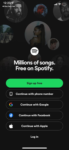
12. Spotify – Get Spotify Free
The CTA on Spotify’s app is aimed at audiences signing up and using it for free. The color green not only stands out in the app but also acts as a motivator and encourages the users to sign up.
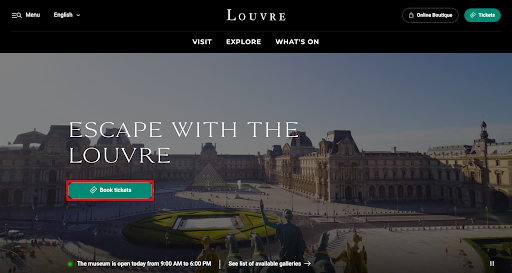
13. Louvre
The Louvre is the most loved museum in the world. The banner on its landing page gives a panoramic view of the museum and encourages the audience to book tickets online. The CTA has a shade of bluish green, which depicts calmness and grabs the attention of the website visitors.
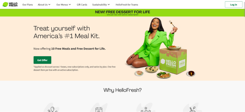
14. HelloFresh – Get Offer
HelloFresh is a ready-to-cook meal kit delivery service that customers can subscribe to. Here, they use contrasting colors to grab the attention of the visitors to the call to action button. Furthermore, the headline and content entice the visitors and encourage them to subscribe and get an offer of 10 free meals and desserts.
15. Flipkart – Limited Period Offer
Flipkart is a popular Indian e-commerce shopping site. Here, the CTA cleverly creates a sense of urgency by using words like ‘Limited Period Offer’ and ‘Don’t Miss Out’. Furthermore, the colors make it stand out.
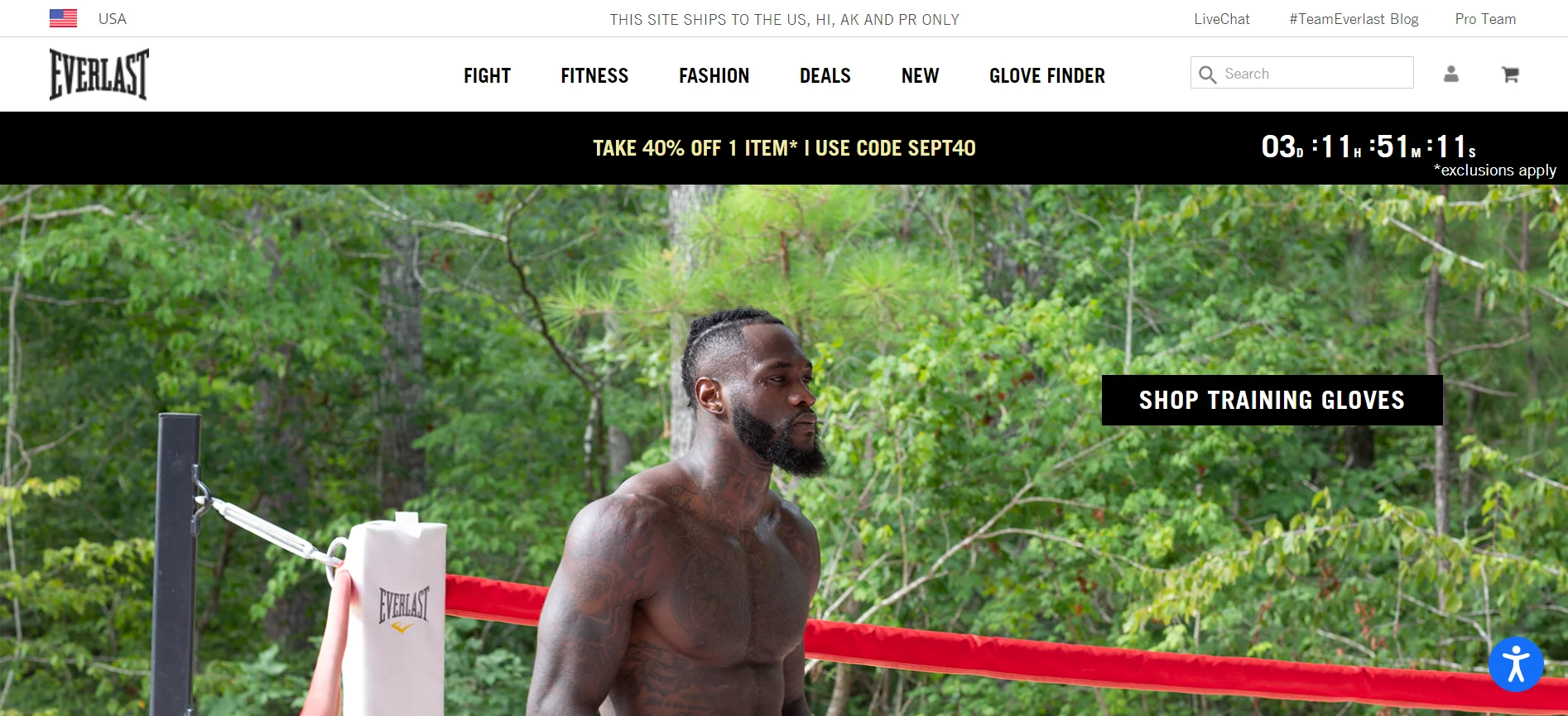
16. Everlast – Take 40% Off
Everlast, an American e-commerce platform for fitness products, makes its CTA irresistible with the help of compelling content, CTA, and placement. They have content describing a good offer and place a timer beside it. This clever approach creates a sense of urgency and longing, encouraging the visitors to click on the CTA ‘shop training gloves’.
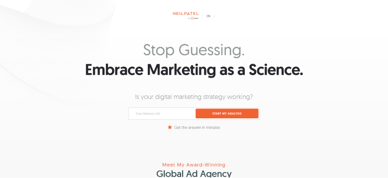
17. Neil Patel – Start My Analysis
Neil Patel, a popular digital marketing agency, tries to create personalized interaction for users through its CTA here. The content directly addresses the user with first-person reference, which can attract their attention. The content, along with the color of the CTA makes it definitely makes it an inspiring design to contribute to your CTA ideas.
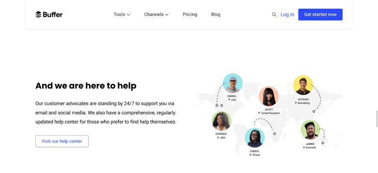
18. Buffer – And we are here to help
Buffer, a social media management platform, effectively uses the power of compelling content and design. The CTA has been highlighted with borders and shadows to add depth and emphasis to the visual. Additionally, the content above the CTA creates a sense of assurance, which can go a long way in terms of conversion.
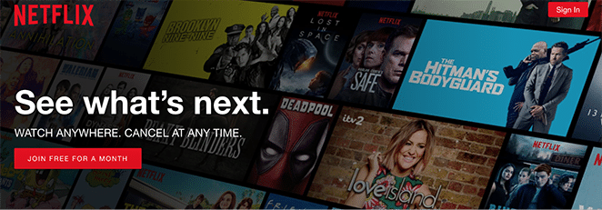
19. Netflix – Join Free for a Month
Netflix has a compelling CTA with contrasting colors and persuasive content. The brand emphasizes its quality and boosts trust with its content ‘cancel anytime’ and ‘join free for a month’. The word ‘free’ makes it even more enticing for the customers as it guarantees no loss for them.
20. Brooklinen – Shop Now
Brooklinen is a brand that deals with bedding products. Here, they have created a minimalistic design for the CTA, with effective content within it and supporting it. ‘Get 20% before the party’s over’ supports and enhances the CTA with the actionable content ‘Shop Now’, and compels the visitors to click on it.
How to A/B Test your CTA
The CTA button is arguably the most important element on your website that drives conversions. It is, therefore, very important to ensure that your CTA is built to maximize conversion.
Here are some steps to A/B test your Call to Action (CTA) button.
1. Track Metrics and Interactions
Use Google Analytics and heat mapping tools like Hotjar to get an idea of how your CTA is faring. Set up goals for Google Analytics to track the number of clicks, segment the users, and analyze the conversion rates. You can then visualize the interactions with your buttons with heatmaps and session recordings of tools like Hotjar.
2. Test One Element at a Time
Once you’ve made a hypothesis about what could improve your click-through rates, select one element at a time to test, such as color, font type, font size, icon, etc. When you do that, you will be able to improve every small aspect of your CTA design.
3. Ensure the working consistency of your CTA button
It is very important to test that your CTA button appears and works the same across all devices, OSs, and browsers. The best approach here would be to go for real-device testing using tools like BrowserStack. The platform gives you access to 3500+ real devices, OS, and browsers via a vast real device cloud. This way, you don’t have to maintain a physical device lab, but at the same time, you can ensure your CTA design and button looks and works the same across all devices.
4. Monitor the CTA button after your A/B Test
Keep monitoring your A/B test and compare it with your existing conversion rates and other metrics to see how it is faring.
CTA Design Mistakes to Avoid
Here are some mistakes you should avoid while designing your CTA:
- Adding too many CTAs on a Page: A lot of CTAs on a webpage can overwhelm the users and affect their experience. So, be very careful with the number of CTAs you add to a page. Ideally, add a primary CTA and a few others depending on the length of the content and the context.
- Wrong Placement: Place the CTA strategically so that it is prominent on your page. You should not place them in a background of the same color as the button.
- Overlooking CTA Content: Do not neglect the CTA content/copy. Make sure you take the time to create compelling copies that align with your brand voice and context.
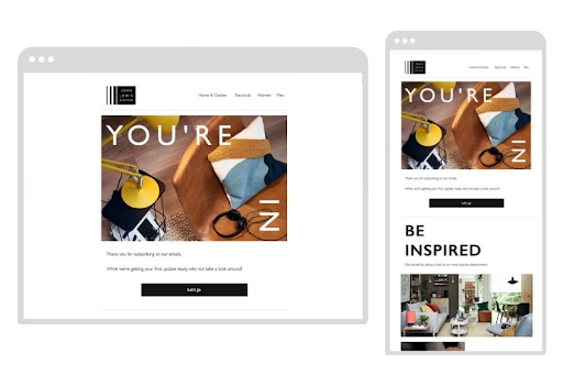
- Neglecting Mobile Optimization: CTAs optimized for the desktop can be difficult to read or click on mobile devices. This can impact user experience negatively. Therefore, make sure your CTA buttons are tested on various mobile devices and browsers through real-device and cross-browser testing.
Best Practices to Design High-Converting CTAs
Here are some best practices to follow while designing CTAs:
- Choose your Colors Strategically: The most important aspect of designing your CTA is the color. It should be prominent and stand out from the rest of the elements on the page. As mentioned earlier, use colors like red to create a sense of urgency and excitement, green to motivate your users to take action, etc.
- Actionable Content: Do away with lifeless copies like ‘enter your name’ or ‘submit’. They will not motivate users to click the button. The content should be actionable and encourage readers to take a specific action. You can use action-oriented words like ’Try’, ’Start’, ‘Join’ etc. Also, ensure that the CTA copy is short and is between 3 and 6 words.
- Create a Sense of Urgency: Emotion drives purchase decisions and nothing’s better than creating a sense of urgency or missing out in the minds of potential customers. You can back your CTA with a limited time offer and combine it with an undeniable benefit.
- Personalize your CTAs: Add CTA content in first and second-person. Use words like ‘I’, ‘my’, ‘you’ etc, to make the customers feel the offer is specially designed for them. This can bring a significant boost in conversions.
- Test your CTAs: Make sure you test the working and appearance of your CTA to deliver a consistant experience to your users. Use BrowserStack Live to efficiently test your CTAs across various devices, OS and browsers.
Importance of Testing CTAs
- It is crucial to test the CTAs because you need to ensure that interacting with the CTA leads to the completion of the action.
- CTAs should be tested on different types of devices to ensure that the CTAs are functioning as expected in all the devices.
- CTAs should undergo cross-browser testing to evaluate their functionality on different browsers for different consumer devices. Perform a quick cross-browser test for Free.
- You also need to monitor and analyze your CTA performance to evaluate its efficiency of the CTA. You need to change your CTA design if the results are not up to the mark.
In short, testing CTA helps improve product features and establishes relationships with users by delivering the best quality products.
Conclusion
A Call to Action is actionable web content placed on websites to encourage visitors to complete a task. This blog covers some of the best CTA designs that can help you boost the conversion of view into leads and sales. It is also important to test your CTA designs on multiple browsers and devices to ensure their proper functioning across all browsers and devices.
BrowserStack’s Live and App Live can be used to test these call-to-action designs on a range of browsers and devices. It provides various other features like Geolocation testing, Responsive testing, Local Testing, Bug Reporting, etc.

