Are mobile users getting the experience they expect on your website? Nearly half of all web traffic, 48.92 percent, comes from smartphones. If your site was built for desktops first and later adapted for smaller screens, it may create friction for mobile users with crowded layouts, hard-to-tap buttons, and slow load times.
Mobile-first design solves these challenges by starting with the constraints of small screens. Designing for mobile first forces teams to prioritize essential content, streamline layouts, and optimize performance. The result is a faster, cleaner, and more user-friendly experience across all devices.
This guide explores mobile-first design, why it matters, how to implement it, and real-world examples of companies doing it effectively.
What is Mobile-First Design?
Mobile-first design or Mobile-first approach enables web designers to start product design for mobile devices first. This can be done by sketching or prototyping the web app’s design for the smallest screen first and gradually working up to larger screen sizes.
Prioritizing design for mobiles makes sense as there are space limitations in devices with smaller screen sizes, and teams need to ensure that the key elements of the website are prominently displayed for anyone using those screens.
Designing and developing for small screens compels designers to remove anything that isn’t necessary for seamless website rendering and navigation.
Recommended Read: How to Make Websites Mobile-Friendly
How Mobile-First Design Strategy Came To Be?
Earlier, websites were often developed with the assumption that they would be primarily accessed from desktops. Eventually, developers made an attempt to modify these websites by cutting down some functions to enhance browsing on mobile or tablet devices.
This approach of scaling down the websites is popularly known as Graceful Degradation or Desktop-First approach.
- A downside to this approach is that several web elements do not adapt well to smaller screen sizes. Consequently, this degrades the visual appearance of websites on smaller devices.
To address this problem, developers came up with another approach – Progressive Advancement or Mobile-First Design.
- A mobile-first approach encouraged designers to begin the website designing process for the smallest devices first and then add more functionalities for bigger screen sizes.
Why is Mobile-First Design Critical?
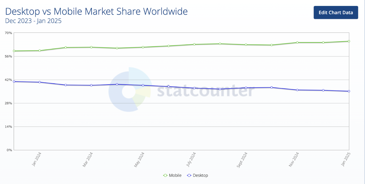
Mobile devices have become an integral part of the present web landscape and will continue to be vital for the future as well. As mentioned in the beginning, mobile contributes to approximately half of the overall web traffic.
One must also bear in mind that the number of mobile users has surpassed desktop users. As per Statcounter GlobalStats, overall mobile users continue to grow with a leading market share of 64.25% as compared to desktop users.

Smartphone Usage Statistics addresses a few stats to reconsider the mobile-first approach:
- Smartphone users tend to spend an average of 3 hours and 15 minutes on their phones.
- Millennials spend more than 5.7 hours on their smartphones per day
- People check their phones 58 times a day on average
The stats above clearly reveal how users across the globe are slowly shifting from desktops to mobile devices. Naturally, it would make sense for web designers to prioritize their efforts and follow the “mobile-first” rule in product design.
Designing for mobile-first experiences requires a clear strategy that balances usability, performance, and accessibility. BrowserStack’s UX and QA specialists can help you validate responsive designs, optimize layouts for real devices, and ensure consistent performance across mobile platforms.
Get Expert QA Guidance Today
Schedule a call with BrowserStack QA specialists to discuss your testing challenges, automation strategies, and tool integrations. Gain actionable insights tailored to your projects and ensure faster, more reliable software delivery.
Must-Read: What is Responsive Design?
Key Mobile-first Design Principles
Here are the main principles of mobile-first principles that you should be mindful of:
1. Prioritize Content Optimization
Identify and display only the most relevant information and actions. Mobile users are often on the go, so every element on the screen should serve a clear purpose and support their goals.
2. Progressive Enhancement
Design with the smallest screen in mind first, then slowly improve the experience for tablets and desktops. This ensures a strong, focused foundation that gracefully adapts as more screen space becomes available.
3. Responsive Layout
Use fluid grids, flexible images, and media queries to adapt your design to various screen sizes. A well-structured responsive layout ensures consistency and usability across all devices, from phones to desktops.
4. Touch-Friendly UI
Design for touch, not cursors. Interactive elements like buttons and links should be large enough to tap easily and spaced enough to prevent accidental clicks. This improves usability and accessibility on mobile devices.
Advantages of a Mobile-First Approach
Here are some of the notable advantages of having a mobile-first approach for web development:
- Improved User Experience: Prioritizes essential features and functionality for mobile users, leading to a streamlined and intuitive design.
- Better SEO Performance: Mobile-first designs align with search engines’ mobile-first indexing policies, improving rankings.
- Faster Load Times: Optimized designs reduce file sizes and improve performance on slower mobile networks.
- Broader Accessibility: Ensures usability across diverse devices, enhancing reach to a larger audience.
- Cost Efficiency: Reduces the need for costly redesigns by addressing mobile constraints from the outset.
- Future-Readiness: Prepares websites for the increasing dominance of mobile traffic and emerging mobile technologies.
- Focus on Core Content: Encourages prioritization of essential content and functionality, reducing clutter.
- Seamless Scalability: This makes it easier to progressively enhance the design for larger screens.
Link between Mobile-First Design and Accessibility
Mobile-first design simplifies interfaces, prioritizes essential content, and enhances readability with legible fonts and high contrast, making it easier for users with disabilities to navigate and interact. Touch-friendly elements like larger buttons improve accessibility for those with motor impairments.
Google’s Chrome User Experience Report (CrUX) and Core Web Vitals play a vital role by measuring real-world user performance, focusing on metrics like loading speed, interactivity, and visual stability. These insights ensure mobile-first designs are fast, responsive, and accessible, aligning with WCAG standards and enhancing usability across all devices.
How to Implement Mobile-First Approach in Product Design?
Now let’s understand how designers can bring mobile-first responsive design into practice.
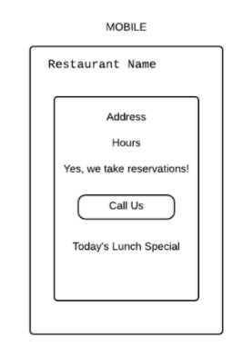
Let’s assume a web designer needs to work on a website for a restaurant. Since the designer needs to follow the mobile-first approach, they must think about what a user will expect from a restaurant website on a mobile device.
Designers must identify the primary things that an end-user is looking for while accessing a restaurant website on a mobile device. Given the user is on mobile, it would be safe to assume that they are mainly searching for – operating hours, exact location, and contact details (or click to call button given it’s mobile). On the basis of these assumptions, the page can be designed precisely as follows.
Source: UX Booth
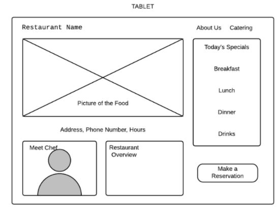
In the case of tablets, users have more space and probably more time to explore the website. Designers can leverage this by adding more functionalities or information regarding the food menu (images), or chef details as displayed below:
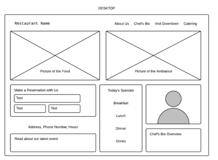
When it comes to desktops, web designers have all the required space to showcase more details. These details can include blog posts, images of party events recently hosted, the ambiance, or contact forms to promote the restaurant better.
Following the approach above will help designers build websites keeping the mobile audience in mind. Additionally, expanding functionalities for larger screen sizes will also be easy to accomplish for teams.
Learn More: Ideal Screen Size for Responsive Design
Steps to Create a Mobile-First Design
Here is the step-by-step process to create a mobile-first design:
Step 1. Understand User Needs on Mobile
Identify what your mobile users want to accomplish. Focus on their goals, behavior, and context (e.g., on-the-go usage, limited attention span, slower networks, etc.).
Step 2. Sketch the Smallest Screen First
Begin your design process with the smallest screen size, usually smartphones. This will help you prioritize key content and eliminate non-essential elements from the start.
Step 3. Define a Clear Content Hierarchy
Organize content to support mobile-first consumption. Important elements should be placed prominently, and a clear visual hierarchy should guide user flow.
Step 4. Design a Touch-Friendly Interface
Ensure buttons, menus, and interactive elements are large enough to be tapped easily. Use ample spacing to avoid accidental clicks and maintain a smooth user experience.
Step 5. Use a Responsive Framework or Grid
Build your layout using a responsive grid system that can scale up gracefully. This allows your design to adjust automatically across tablets and desktops without breaking.
Step 6. Apply Progressive Enhancement
Once the mobile design is solid, enhance it with additional features, interactions, and layouts for larger screens. Add hover effects, sidebar content, or more detailed visuals as space allows.
Step 7. Optimize for Performance
Use compressed images, minimal scripts, and efficient CSS to keep load times fast. Performance is critical on mobile, where bandwidth and data speed may be limited.
Read More: How to position Text Over an Image using CSS
Step 8. Test Across Devices
Validate your design on various real devices and browsers to ensure it looks and functions correctly across all screen sizes and conditions.
Note: Opting for real-device clouds to test across devices is always recommended rather than setting up a physical infrastructure due to cost and time constraints.
Top Examples of Mobile-first Website Designs
Here are some of the best examples of mobile-first website designs:
1. Airbnb
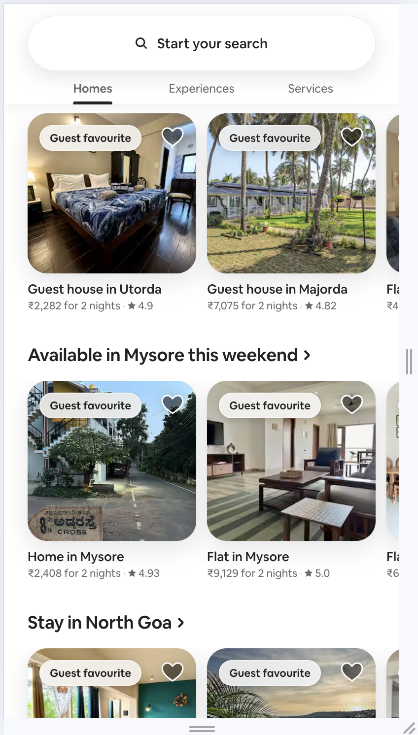
Airbnb’s mobile site is clean, fast, and intuitive. It focuses on core user actions like search and booking, with large visuals and easy-to-tap filters, making it perfect for travel planning.
2. Dropbox
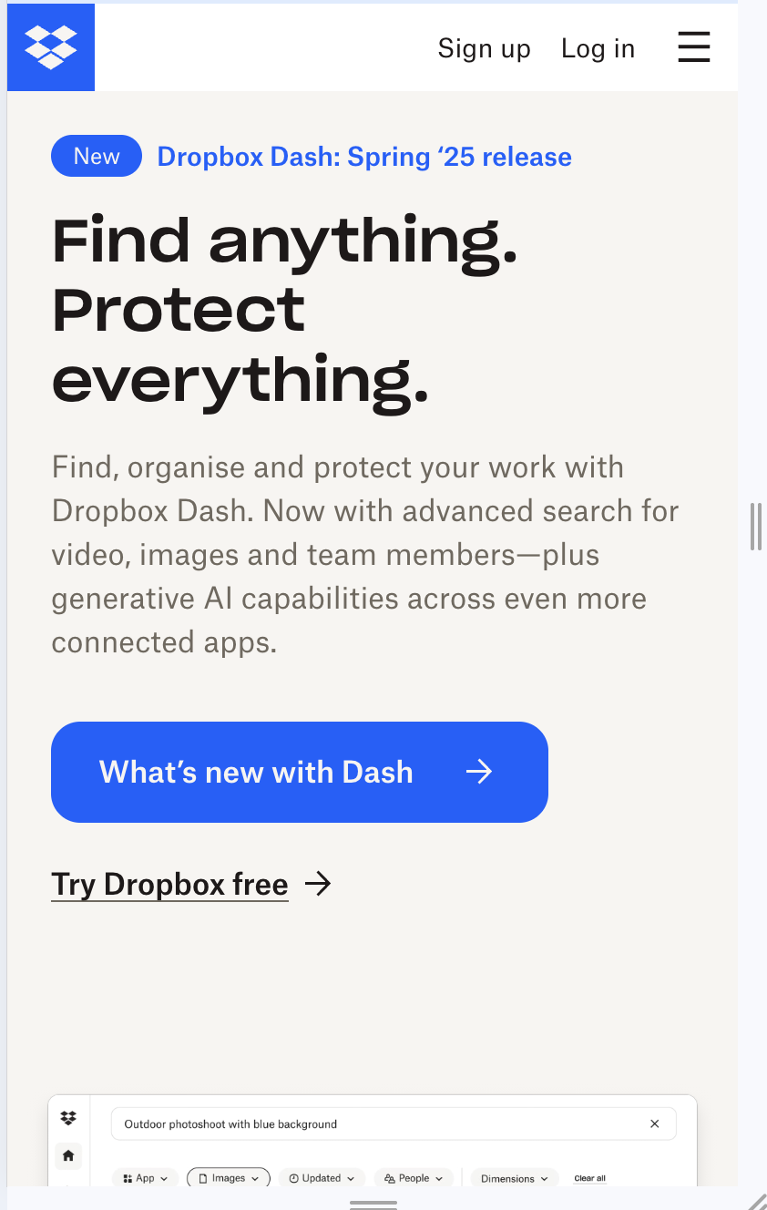
Dropbox’s mobile web UI is highly optimized, with a clutter-free layout, clear CTAs, and responsive file previews. The design ensures productivity tools are easily accessible even on smaller screens.
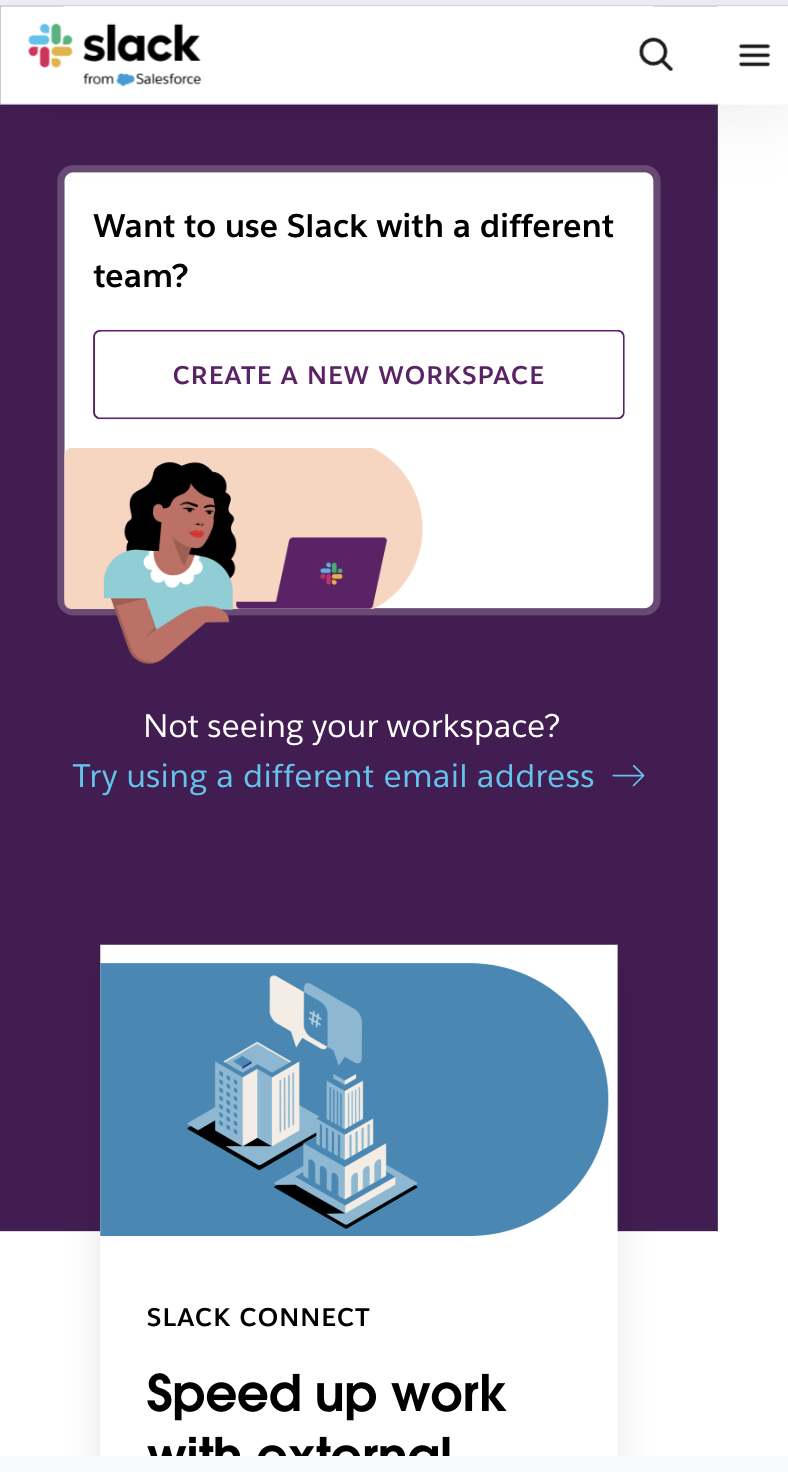
3. Slack
Slack’s mobile site focuses on actions like logging in, signing up, or exploring features. The layout is lightweight and straightforward, with responsive elements customized for mobile performance.
Read More: How to use Slack Bug Reporting while Testing
Difference Between Mobile-first and Responsive Web Design
The table below highlights the key differences between Mobile-First Design and Responsive Web Design to help you understand their unique approaches and applications.
| Aspect | Mobile-First Design | Responsive Web Design |
|---|---|---|
| Design Approach | Starts with mobile design and progressively enhances for larger screens. | Creates a flexible layout that adapts to all screen sizes, often starting with desktop. |
| Focus | Prioritizes essential content and functionality for mobile users. | Ensures the design works well across all device types. |
| Development Process | Emphasizes simplicity and performance, adding complexity for larger devices. | Uses fluid grids and media queries to adjust layouts dynamically. |
| Performance | Optimized for mobile speed and usability. | Balances performance across all devices. |
| Use Cases | Best for mobile-first audiences or mobile-dominated projects. | Ideal for mixed device audiences with varying usage patterns. |
Best Tools for Mobile-First Design
Here is a list of tools that help you accomplish a successful mobile-first design:
- Sketch: A vector-based design tool for creating mobile-first UI and UX mockups.
- Figma: A collaborative design platform ideal for prototyping and mobile-first workflows.
- Adobe XD: A versatile tool for wireframing and prototyping mobile and web applications.
- Bootstrap: A CSS framework for building responsive, mobile-first websites.
- Chrome DevTools: A browser-based debugging tool for testing and optimizing mobile designs.
- Google Mobile-Friendly Test: A tool to check if your site meets mobile usability standards.
- Google PageSpeed Insights: Analyzes and improves the performance of mobile-first websites.
- BrowserStack (for testing): Provides cross-browser and device testing for mobile compatibility.
- Foundation by Zurb: A responsive front-end framework optimized for mobile-first designs.
- Webflow: A no-code platform for designing responsive, mobile-first websites.
Best Practices for The Mobile-First Approach
For complex and layered designs, web designers UI/UX experts must bear in mind the following best practices to ensure a mobile-first approach effectively:
1. Prioritize Page Content
When it comes to mobile-first design, designers must bear in mind the fact that content is the key. As there are space restrictions on smaller screens, web designers must ensure that the most critical elements are prominently displayed since those are the ones users will actively look for.
2. Deliver Intuitive Navigation
Intuitive navigation is of utmost importance when it comes to delivering a neat and clean user experience on mobile devices. Web designers can leverage features like navigation drawers (using Hamburger menus) to display secondary elements of the website. This will help users to find the necessary information easily.
Speed and intuitiveness go hand in hand. SpeedLab by BrowserStack instantly provides you Page Speed Score out of 100 for both Desktop and Mobile platforms. With these insights, your design team can optimize for a mobile-friendly interface across different mobile devices and browsers.
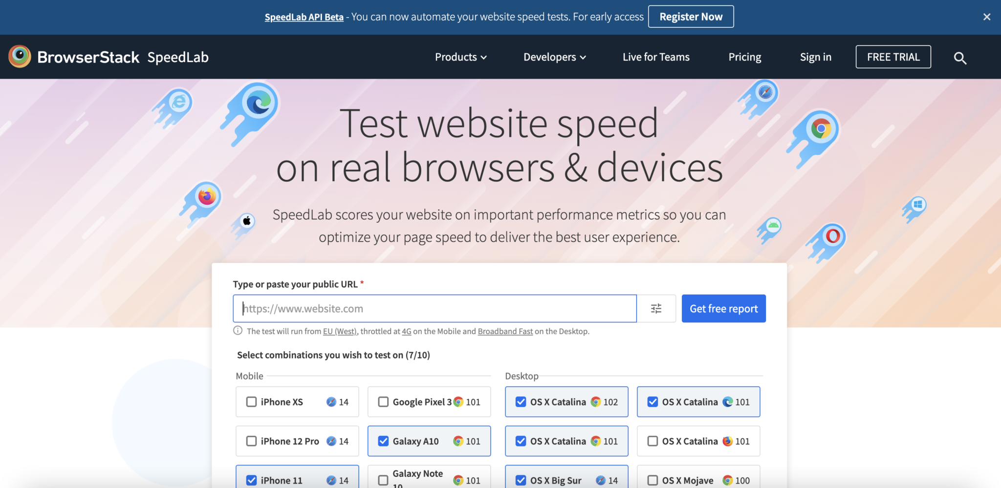
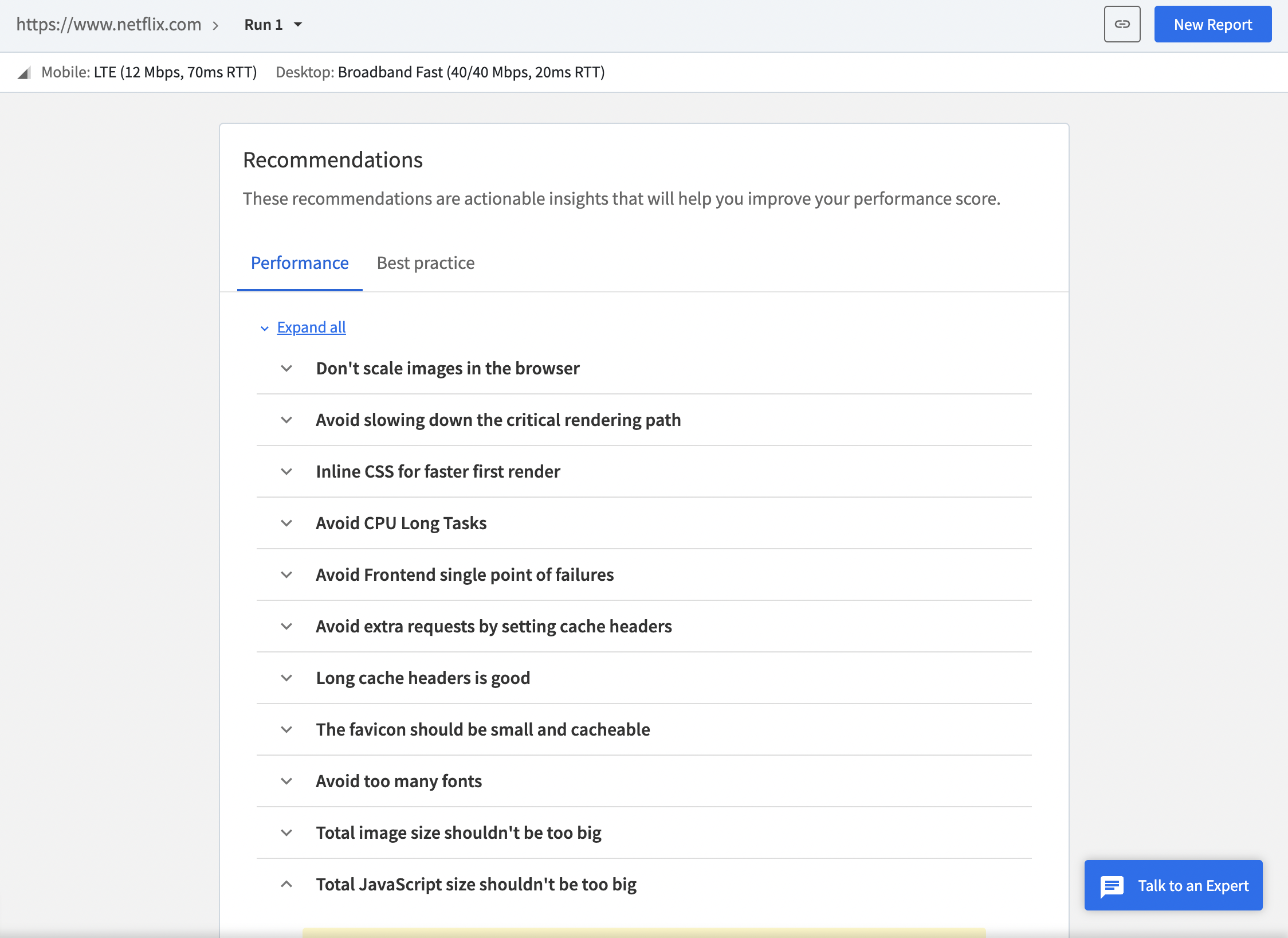
With BrowserStack, you also get actionable recommendations and insights to improve your overall design and website layout.
The report generates accurate mobile and desktop scores along with key metrics like Navigation Timing API, Page Resource Summary, and more, to help you align your mobile-first design approach with actual performance.
3. Avoid Disruptive Pop-ups
As mentioned frequently, mobile devices have space constraints and no user likes to be accosted with sudden pop-ups or advertisements taking over the screen. Website owners or designers must only focus on what’s important for users and provide them with the things they are looking for in the first place.
4. Test on Real Devices Under Real Conditions
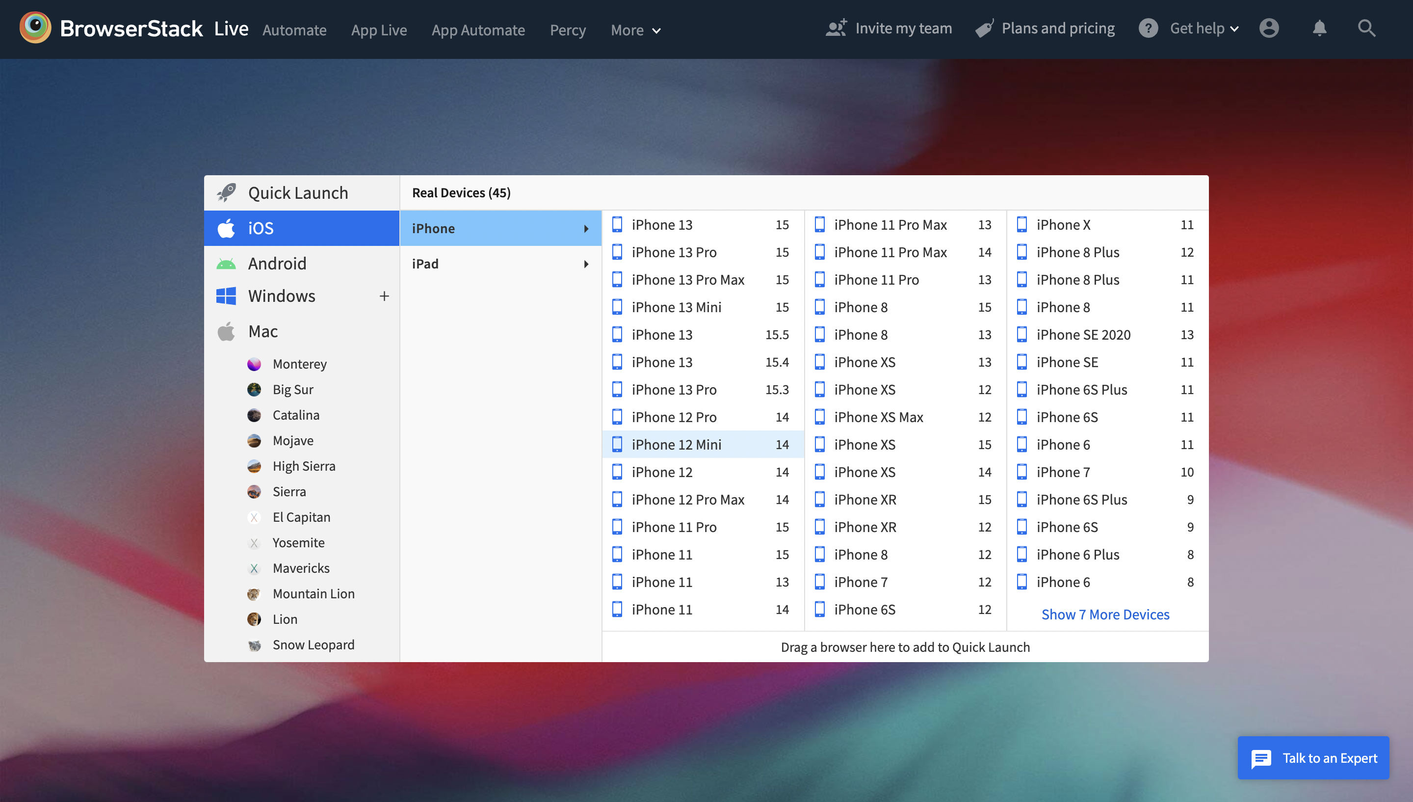
The most effective way of ensuring that a website delivers optimal user experiences across devices is by testing them on real devices. This helps designers verify whether the website renders as expected across mobiles, tablets, and desktops. BrowserStack’s real device cloud provides teams and individual testers with 3000+ real devices and browsers for instant testing in real user conditions.
You can opt for both BrowserStack Live and App Live to conduct extensive cross-browser testing and interactive app testing to satisfy mobile-first design implementation.
BrowserStack also offers individual users or teams an intuitive Responsive Checker tool. This tool allows users to instantly view their websites across different device types like mobiles, tablets, and desktops. This enables users to verify whether their websites render correctly as expected on specific devices.
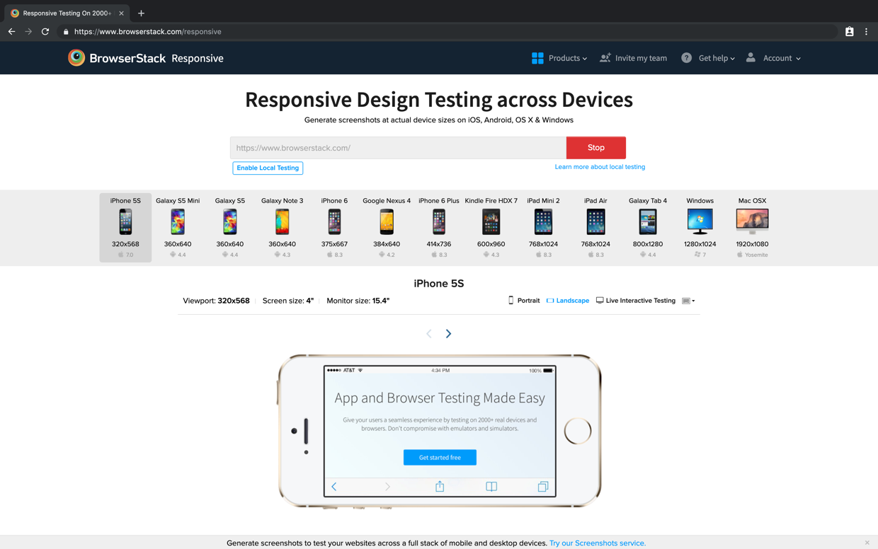
How to run a responsive test on BrowserStack?
- Enter the URL of the website that is being tested.
- Once you sign in, you can enter the website URL and click Check to test responsiveness.
- When a particular device is selected, the user will get a view of what the site looks like on it.
Conclusion
Increasing numbers of web users across the globe have shifted from desktop to mobile devices for accessing the web and the trend shows no sign of stopping. Consequently, it makes sense for designers to develop websites keeping the mobile audience as a priority.
Incorporating a mobile-first design will not only help businesses reap the rewards of mobile growth today but will also prepare them for the explosive growth that is predicted in the coming years.
Review Case Study: Leaf Design Agency Cuts Build Time by 50% Using BrowserStack
Frequently Asked Questions
1. Does mobile friendliness affect SEO?
Yes, mobile-friendliness directly affects SEO. Google uses mobile-first indexing, which evaluates a site’s mobile version for ranking. Since a mobile-friendly design enhances user experience, it reduces bounce rates and improves visibility in search results.
2. What are the disadvantages of building a mobile-first design?
Though it comes with some strong benefits, mobile-first design also has a few drawbacks:
- Limited Space Means Limited Creativity: Designing for small screens first can restrict layout flexibility and visual richness early in the process.
- More Planning Required: Requires proper content prioritization and planning, which can be time-consuming upfront.
- Complex for Feature-Rich Websites: Websites with complex functionality or large content may face challenges fitting everything into a mobile-friendly structure.
- May Overlook Desktop Experience: Stressing too much on mobile could lead to a less-optimized or underwhelming desktop experience if not carefully scaled up.


