Flutter is an open-source framework created by Google. It enables to create complex UIs on multiple devices regardless of the operating system using a single code base.
Overview
Ways to create a Responsive Flutter App:
- MediaQuery: Access screen size and orientation to adapt UI elements dynamically.
- LayoutBuilder: Build widgets based on parent constraints for adaptive layout behavior.
- OrientationBuilder: Adjust layout and components based on portrait or landscape mode.
- Expanded and Flexible Widgets: Distribute available space proportionally in rows or columns.
- AspectRatio Widget: Maintain consistent width-to-height ratios across devices.
- FractionallySizedBox Widgets: Size widgets as a fraction of their parent’s dimensions.
- Custom MultiChild Layout Class: Build complex, fine-tuned layouts with full control over positioning.
This guide describes the significance of responsive apps, how to create a responsive Flutter app, and how to test it.
What is Responsive Design?
Responsive Design is a development and design technique that allows websites or applications to ‘adapt’ to different screen sizes, without affecting user experience or usability.
Responsive Design even optimizes the user’s browsing experience by making an application responsive according to the device.
The concept of Responsive Design emphasizes using the same set of code to adapt to different screens and layout changes depending on different devices, be it smartphones, tablets, laptops, or computers. It allows developers to write a single code in HTML, CSS, and Javascript for different devices, browsers, etc.
However, it can be challenging to make an existing site responsive, but the benefits of making an app responsive can prove to be much more beneficial.
Goals of Responsive Design
- Wider Audience – The more flexible and responsive your app is, the more audience it will attract.
- Improved SEO – Flexible and Responsive web design helps in enhancing search engine optimization.
- Improved browsing experience – Responsive and flexible web app designs lead to an overall improved browsing experience and even lead to increased buyers.
- Brand visibility – A breakthrough, fast, and beautiful app design improves the overall brand visibility.
Why should your Flutter app be Responsive?
A Flutter application can run on any mobile device, tablet, or TV screen. Today, Mobile Devices have so many different screen sizes and resolutions, and the apps must cater to all such screen sizes. And this doesn’t end here; users can rotate their phones, and the applications should adjust when viewing or testing on landscape or portrait modes. Catering to so many user requirements is not an easy task, so the apps should be Responsive enough to meet all such needs and ensure a seamless user experience.
Flutter Responsive App Examples
Some of the responsive web apps made using Flutter that are widely used in the market are:
- Google Ads – It is a mobile application that allows managing Google ad campaigns directly from smartphones.
- Reflectly – It is an AI-powered personal journaling application that helps users in coping up with daily stress and negative thoughts by combining cognitive behavioral therapy and positive psychology.
- Lunching – It is a smartphone app that makes it easier to order delivery food. It is one of the most successful food delivery apps running today.
- Watermaniac – It is a lightweight water monitoring application made using the Flutter framework. It assists consumers in keeping an eye on their daily water consumption.
- Cryptograph – This Flutter app helps in monitoring and tracking the latest updates on over 1600+ global cryptocurrencies such as Bitcoin, Ripple, Ethereum, etc.
Is Flutter Responsive By Default?
Flutter apps are not responsive by default. However, Flutter allows developers to make their apps either Adaptive or Responsive.
When it comes to designing mobile apps with Flutter, there are two popular design approaches: adaptive design and responsive design.
Adaptive design is a design approach that involves creating separate interfaces for different screen sizes and device types. In other words, an adaptive design would create different layouts for a smartphone and a tablet. With adaptive design, the app will detect the device’s screen size and then load the appropriate layout. This approach can create a tailored experience for users on different devices, but it can also be time-consuming to design and maintain.
Responsive design, on the other hand, is a design approach that involves creating a single layout that can adjust to different screen sizes and device types. In other words, the app will adjust the layout to fit the available screen space.
This approach can create a more consistent experience across different devices, and it can be more efficient to design and maintain. However, it may not offer the same level of customization as adaptive design.
In Flutter, it is possible to use either adaptive or responsive design. The choice between the two approaches depends on the specific requirements of your app and the preferences of your users. For example, if your app is targeted towards a specific device type or screen size, adaptive design may be the better choice.
On the other hand, if you want your app to be accessible to a wide range of devices and screen sizes, responsive design may be the way to go. Ultimately, the choice between adaptive design and responsive design will depend on your specific needs and the preferences of your target audience.
Principles of Responsive Design in Flutter
Responsive design ensures your app looks and functions well across various screen sizes, orientations, and devices. In Flutter, this is achieved through flexible layouts, adaptive widgets, and proportional sizing.
- Use Relative Sizing: Avoid hardcoded pixel values. Instead, use MediaQuery, LayoutBuilder, or percentage-based sizing to adapt to different screens.
- Flexible Layouts: Use layout widgets like Flexible, Expanded, and Spacer to create flexible UIs that stretch or shrink based on available space.
- 3. Adaptive Widgets: Leverage widgets that automatically adapt to the device like SafeArea, OrientationBuilder, and FittedBox.
- Breakpoints and Conditions: Handle layout changes with breakpoints. For example, show a drawer on mobile and a side menu on tablets.
- Scalable Text and UI Elements: Use MediaQuery.textScaleFactor and relative font sizes to ensure readability on all devices.
- Consistent Aspect Ratios: Maintain element proportions using AspectRatio to prevent stretched or squished content.
Read More: Flutter vs Android Studio: Core Differences
How To Create A Responsive Flutter App?
Let us now learn how to make a Flutter app responsive.
1. Media Query
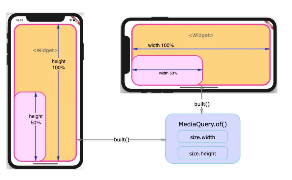
Media Query can be used to get the real-time size (width/height) and orientation (portrait/landscape) of the window screen. It suggests the orientation and size of the app.
Media Query is useful if you need to decide based on the complete context rather than just the size of a particular widget. You can take a look at the below example:
class HomePage extends StatelessWidget {
@override
Widget build(BuildContext context) {
Size screenSize = MediaQuery.of(context).size;
Orientation orientation = MediaQuery.of(context).orientation;

return Scaffold(
body: Container(
color: CustomColors.android,
child: Center(
child: Text(
'View\n\n' +
'[MediaQuery width]: ${screenSize.width.toStringAsFixed(3)}\n\n' +
'[MediaQuery orientation]: $orientation',
style: TextStyle(color: Colors.white, fontSize: 20),
),
),
),
);
}
}
2. Layout Builder
Layout Builder is just a simplified version of Media Query. The main difference between Media Query and Layout Builder is that Media Query is based on the full context of the screen rather than just the size of a particular widget; on the other hand, Layout Builder determines the maximum width and height of a specific widget only.
Layout Builder class provides the Box Constraints object that can be used for determining the maxWidth and maxHeight of the widget.
LayoutBuilder(
builder:(context, constraints) {
if (constraints.maxWidth > 500) {
getWidelayout();
} else {
getNormalLayout();
}
}
);
3. Orientation Builder
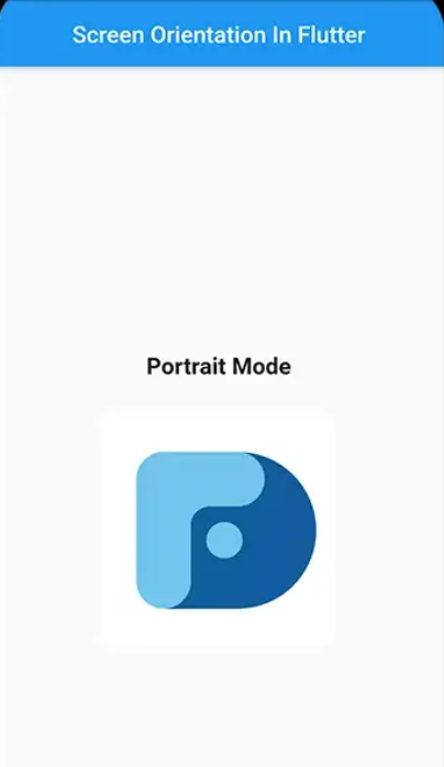
Orientation Builder class can be used to determine a widget’s current orientation.
The Orientation Builder widget is similar to the Layout Builder class. One can get the Orientation object using the builder property of OrientationBuilder class. For example, you can use the OrientationBuilder class to change the number of columns of GridView.
body: OrientationBuilder(
builder: (context, orientation){
if(orientation == Orientation.portrait){
return portraitMode();
}else{
return landscapeMode();
}
},
),
4. Expanded and Flexible Widgets
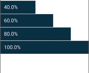
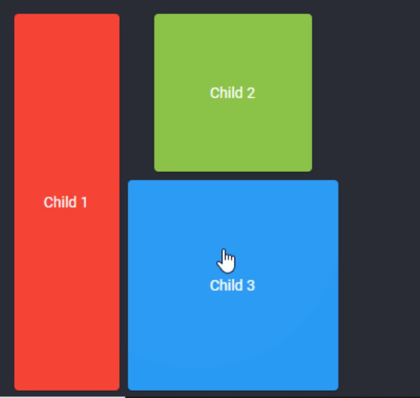
Expanded and Flexible Widgets are two widgets that can be used inside Row, Column, or Flex to give their children the flexibility in order to expand to fill the available space. The only difference is that the Expanded widget requires the child to fill all the available space, whereas Flexible does not. Also, Expanded and Flexible widgets can be used to get a responsive Flutter UI that works with percentages instead of hardcoded values.
Column(


children:<Widget>[
Row(
children:<Widget>[
buildExpanded(),
buildFlexible(),
]
),
Row(
children:<Widget>[
buildExpanded(),
buildExpanded(),
]
),
],


);
5. Aspect Ratio Widget
The Aspect Ratio widget can be used to size the child to a specific aspect ratio. When developing an app, one can neglect its size but must consider the aspect ratio. The AspectRatio widget thus assists you at this point by sizing the child value to a specific aspect ratio and ensures responsive design in Flutter.
An example of using Aspect Rati
Container(
width: 200.0,
height: 200.0,
color: Colors.grey,
alignment: Alignment.topCenter,
child: AspectRatio(
aspectRatio: 2 / 1,
child: Container(
color: Colors.teal,
),
),
)
Here, the argument aspectRatio is of type double. The value to be passed here is basically the width: height ratio that needs to be applied to the widget.
6. Fractionally Sized Box Widgets
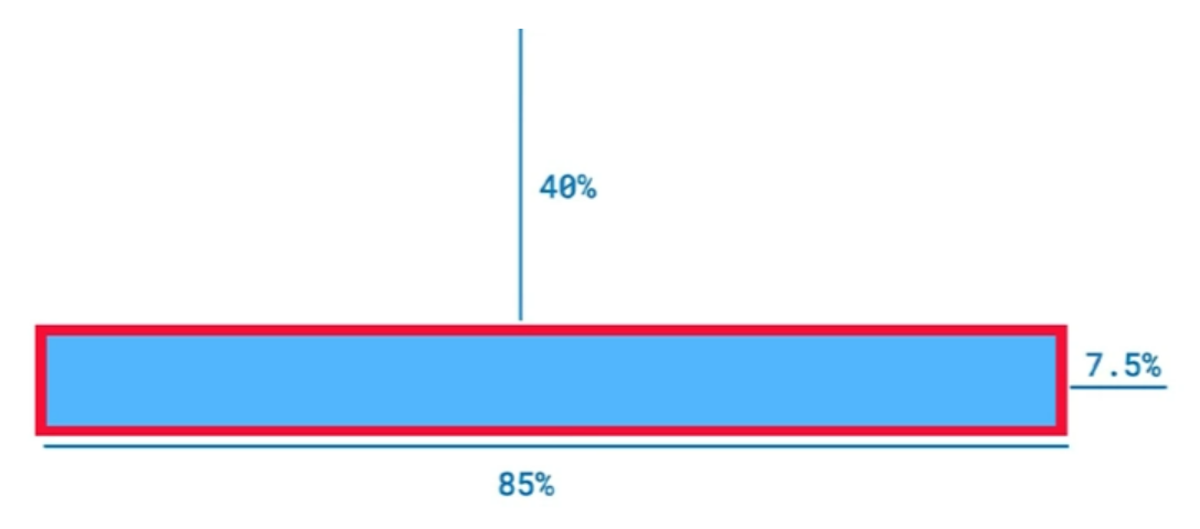
Fractionally Sized Widgets are useful when the designs are calling for dimensions that are relative. For example, when a button is occupying 80% of the app’s width whereas the margin takes only 10%, fractionally sized box Widgets can help with that.
You can even wrap this Fractionally Sized Box in a flexible widget so that it can play well with a row or a column.
The below example illustrates how you can use Fractionally Sized Box widgets.
 child: Container(
width: 200.0,
height: 100.0,
child: FractionallySizedBox(
widthFactor: 0.5,
child: RaisedButton(
child: Text('Click'),
color: Colors.green,
textColor: Colors.white,
onPressed: () {
},
),
),
),
In this case, you have a container of size 200 x 100. Inside the container, there is a Raised Button whose size is needed to be set relative to the size of the container. In such cases, you just need to wrap the button inside a Fractionally Sized Box.
7. Custom MutiChild Layout Class
CustomMultiChildLayout is a widget that utilizes a delegate to specify the size and position of multiple children within it. This delegate is responsible for defining the layout constraints of each child and determining their positioning within the parent widget. While the delegate can define the size of the parent, it cannot be dependent on the size of its children.
CustomMultiChildLayout is a suitable choice when there are intricate connections between the positioning and size of various widgets.
Using the below constructor, you can use CustomMultiChildLayout
const CustomSingleChildLayout({
Key key,
@required this.delegate,
Widget child,
})
Here, you need to pass the delegate argument of type Single Child Layout Delegate which is use for setting the layout and constraints of the child. Since Single Child Layout Delegate is an abstract class, you need to create a Custom Class that will extend the Single Child Layout Delegate class.
How to Test Responsive Flutter Apps
UI is essential for creating a great user experience. It is important to perform tests on real devices and browsers for ensuring that the apps are working seamlessly across different browsers and devices, and as a result, ensure consistent user experience.
Read More: How to Test Flutter Apps on Real iOS Devices
For Web Apps
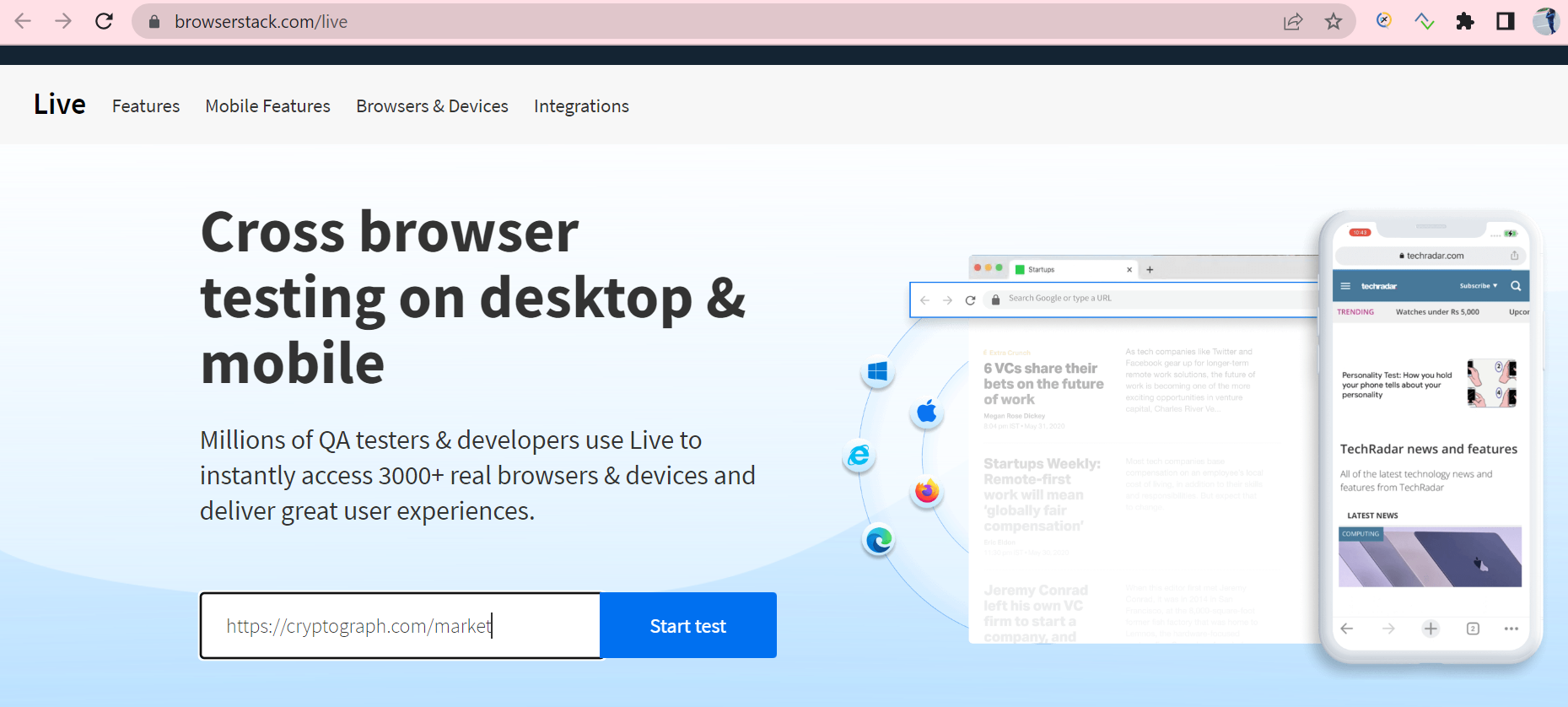
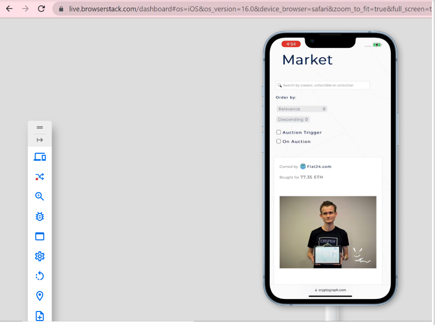
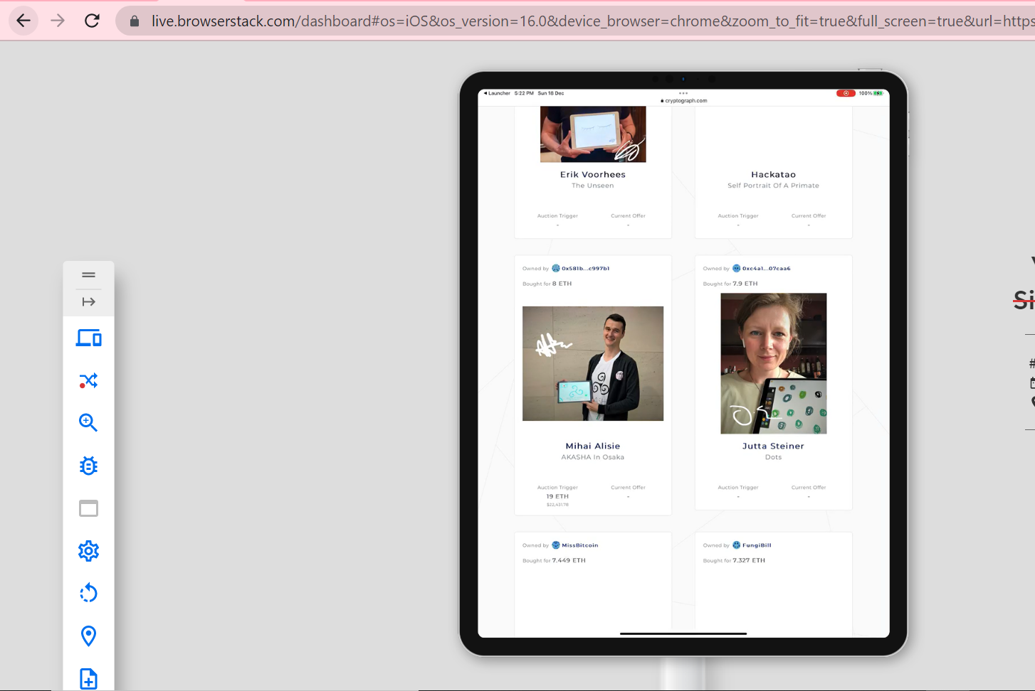
Understand how to perform UI testing of Responsive Flutter Apps by testing a real flutter web app – CryptoGraph. To ensure a seamless user experience across different devices and browsers, testing the Flutter App across different real device-browser combinations using BrowserStack Live.
Using BrowserStack Real Device Cloud, you can access 3500+ browser-device combinations offering a wide coverage, allowing you to test end to end under real user conditions.
Step 1: Enter the CryptoGraph URL that is under test upon opening BrowserStack Live.
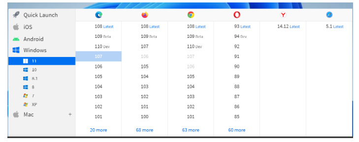
Step 2: Select the Device-Browser Combination for testing the Flutter Application.
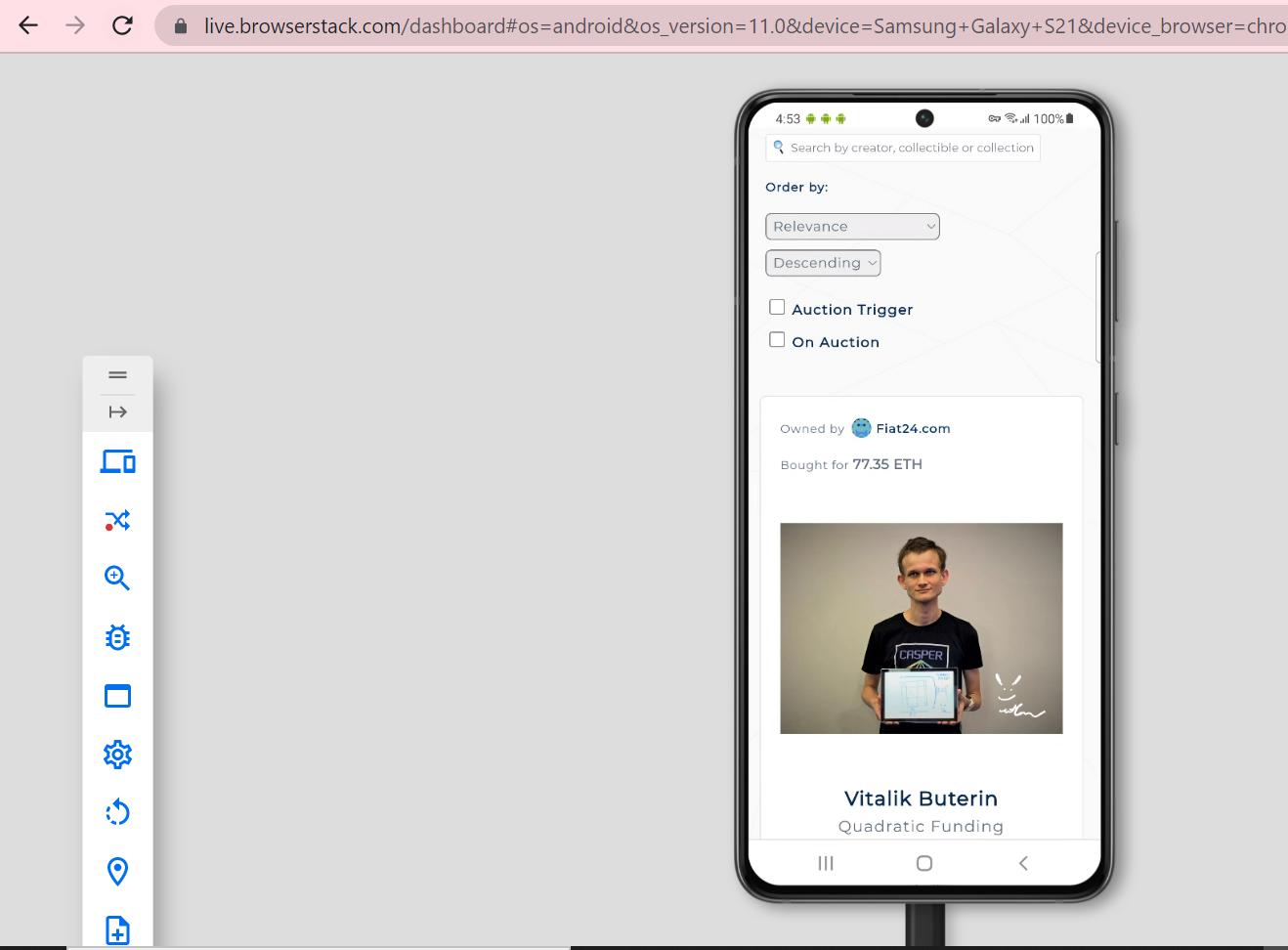
Step 3: Choose the desired OS and browser combination. Some examples of cross-browser + iOS/Android combinations are shown below.
Samsung Galaxy S21 With Chrome
iPhone 14 Pro with Safari
iPad with iOS 16 and Chrome Browser
For Mobile Apps
Use BrowserStack App Live to test the responsiveness of mobile apps (Android and iOS) across different devices and browsers.
iOS App Testing Steps:
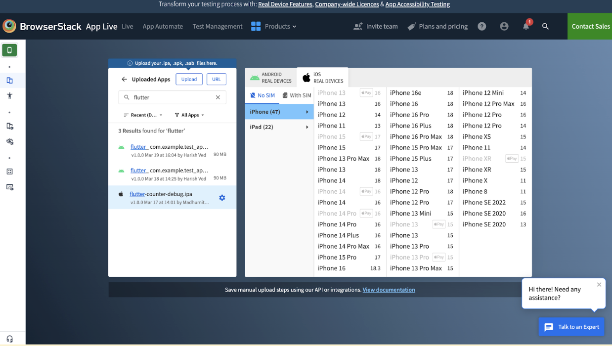
1. Sign up / Sign in to your BrowserStack account and navigate to App Live product.
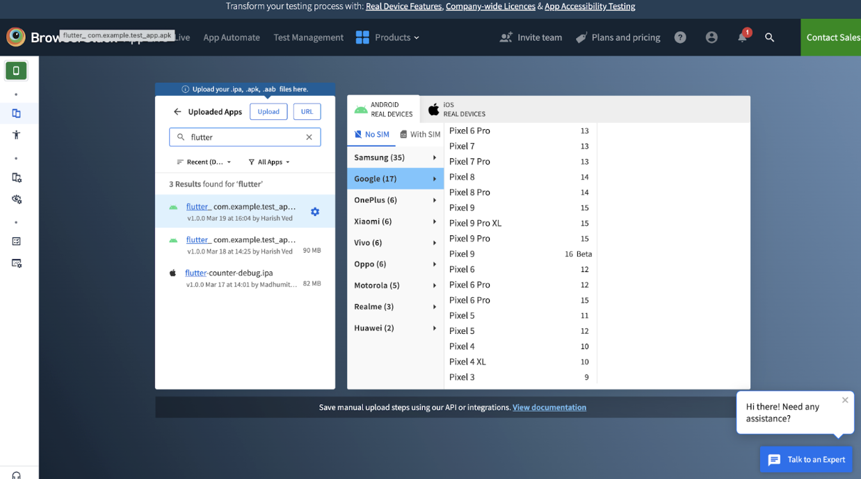
2. Click on the “Upload” button in the App Live dashboard.
3. Upload your iOS app’s .ipa file.
4. After the upload is complete, the app will appear in your uploaded apps list.
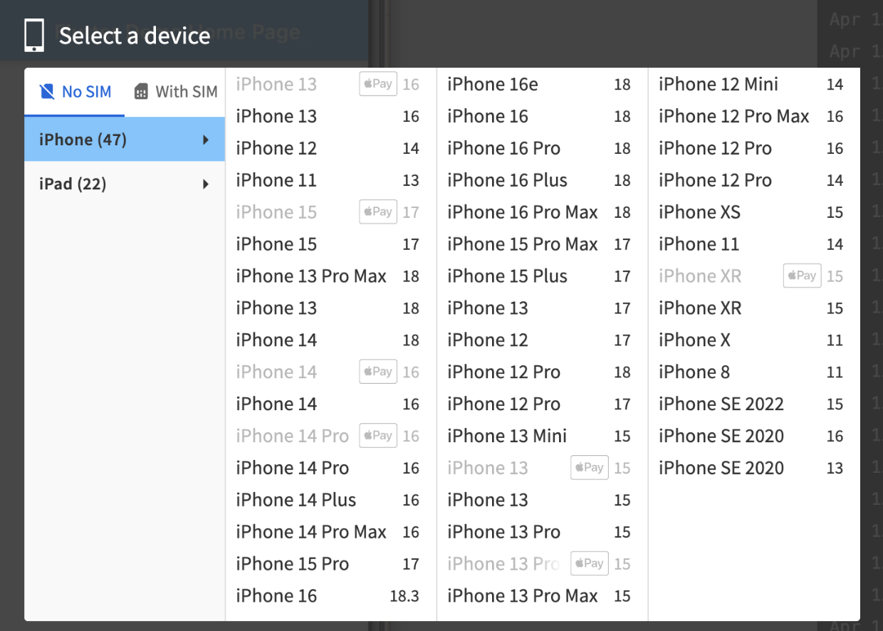
5. Select a real iOS device (for example, iPhone 13, iPhone 14, etc.) from the device list.
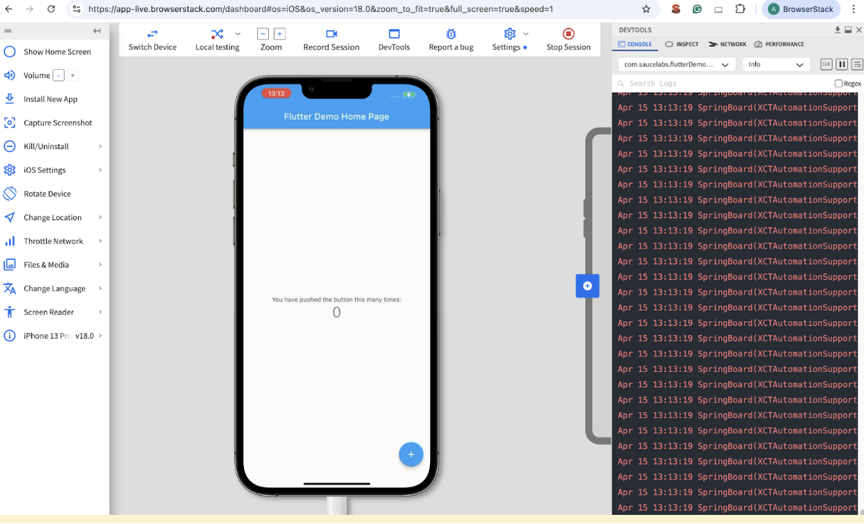
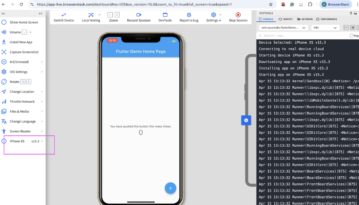
6. The app installs automatically on the selected device and launches in a live testing session.
7. Interact with your app in real time to test layout, functionality, and responsiveness.
8. To test responsiveness on different screen sizes and iOS versions, click the “Switch Device” option in the BrowserStack toolbar or exit the current session.
9. Select another iOS device from the device list, like iPhone 16 where the screen size and specifications are different.
10. The same uploaded app will automatically be available, and you can launch it instantly on the new device.
11. Interact with the app again and observe how UI elements, text, images, and layouts adapt across different screen dimensions and resolutions.
Read More: How to Test Flutter Apps on Real iOS Devices
Android App Testing Steps
Similarly, you can check the responsiveness of Flutter apps for Android.
1. Upload your Android app’s .apk file to BrowserStack App Live.
2. Select a real Android device from the device list and launch the app.
3. Interact with the app and check its responsiveness across different screen sizes and resolutions.
4. Switch to another Android device directly from the dashboard.
5. Relaunch the same app and verify the layout, UI, and functionality on the new device.
6. Repeat the process on multiple devices to ensure a consistent user experience.
Read More: How to test Flutter Apps on Android Devices?
Best Practices for Responsive Design in Flutter
Follow these best practices to build Flutter apps that look great and work well across all screen sizes and devices:
1. Use MediaQuery: Get device width, height, and orientation dynamically for responsive layouts.
2. Prefer LayoutBuilder: Build adaptive UIs based on available space in parent widgets.
3. Avoid Hardcoded Sizes: Use flexible sizing like double.infinity, percentage-based dimensions, or relative padding and margins.
4. Use Flexible & Expanded Widgets: Manage dynamic spacing within Row and Column widgets for scalable layouts.
5. Implement Breakpoints: Define screen width ranges (mobile, tablet, desktop) and create different layouts accordingly.
Read More: Breakpoints for Responsive Web Design
6. Handle Orientation Changes: Use OrientationBuilder to adjust UI for portrait and landscape modes.
7. Use SafeArea: Ensure content doesn’t overlap with system UI like notches, status bars, or navigation bars.
8. Scale Text Responsively: Use MediaQuery.textScaleFactor or responsive text packages for readability.
9. Optimize Images & Media: Use FittedBox, BoxFit, or responsive assets to prevent image overflow or distortion.
10. Use Responsive Design Packages: Leverage Flutter libraries like:
- flutter_screenutil
- responsive_builder
- sizer
11. Test Across Multiple Devices: Use Flutter DevTools, device simulators, or real devices to verify responsiveness.
12. Avoid Using Too Many Nested Widgets: Keep layouts simple and clean for better performance and easier responsiveness.
13. Build Adaptive Navigation: Show bottom navigation for mobile and side menu for tablets or desktops.
Read More: A Complete Guide to CSS Media Query
Conclusion
A responsive Flutter app improves user experience and ensures your app looks and performs consistently across all devices and screen sizes.
However, building is just half the job. Testing on real devices is what makes your responsive design truly reliable.
With BrowserStack Live and App Live, you can interactively test your Flutter web and mobile apps on 3,500+ real devices and browsers. You can instantly check how your app looks and behaves across multiple screen resolutions without writing a single line of code.

