According to Statista, the number of mobile devices is projected to hit 18.22 billion by 2025, an increase of 4.2 billion mobile devices compared to 2020 levels. The number of smartphone subscriptions globally at present surpasses 6 billion and is projected to grow further by 100 million in the next few decades. India, the United States, and China have the greatest number of smartphone users.
Forecast number of mobile devices worldwide from 2020 to 2025 (in billions)*- Source
Why is it important to be Mobile Friendly?
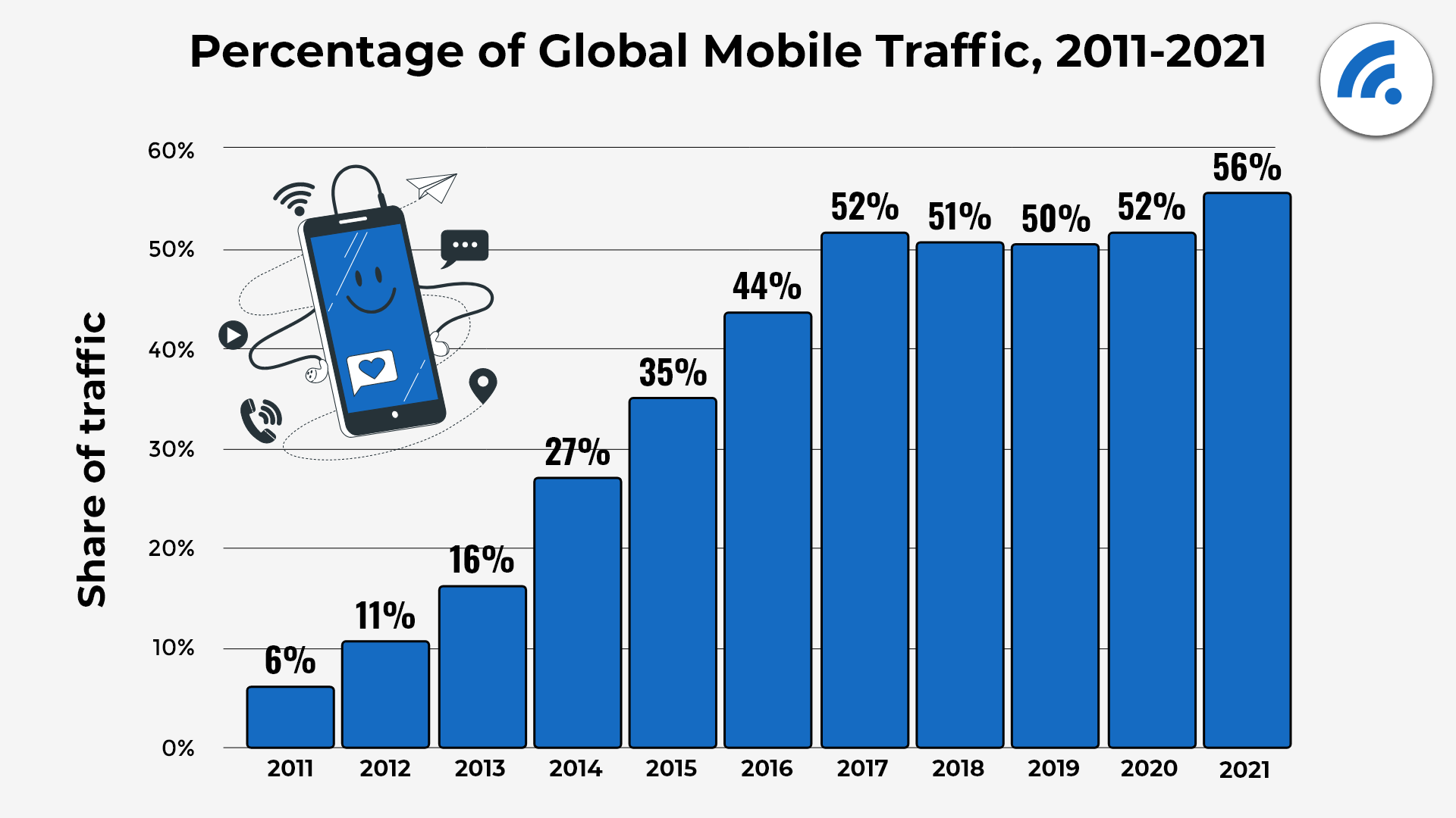
The percentage of global mobile traffic has increased drastically over the decade. This is a key indicator for organizations to consider mobile friendly apps and websites.
In the United Kingdom, smartphones has over-countered traditional desktops or PCs as the popular means to access the internet. Tech giants like Apple and Samsung have used their smartphone hardware as a platform to push the usage of their mobile browsers. Devices come with a default internet browser, and consumers using the device become comfortable with the platform and refuse to switch.
These two statistics clearly show the significance of having mobile-friendly apps in today’s generation. Given this significant mobile usage, developers and designers should focus on delivering seamless website UI/ UX on mobile gadgets. People won’t miss a chance to leave a bad review, be it a poor user interface or crashing, faster connection speeds, and lower latency and performance problems.
Hence, it’s high time to design your application in a mobile friendly way and help your brand stand out by opting for mobile app testing. Testing mobile applications could unexpectedly help verify whether the mobile applications meet the expected business and technical requirements.
Also Read: How to make Website Mobile Friendly?
The first impression is extremely crucial for the success of any business or mobile app; therefore, developing excellent apps for mobile devices has become increasingly vital for organizations. If mobile apps aren’t scrupulously tested, there is a high time users encounter critical bugs on their mobile device that may lead to a poor user experience, chiefly for new users. In fact, any unexpected functionality bug or app crash can lead to immediate uninstallation of that application. This also results in the loss of esteemed clients and revenue. App crashing, freezing, and slow responsiveness is the prime bugbears when it comes to application issues.
While this explains why one should perform mobile app testing. There are still a huge number of people who access web apps on mobile browsers. This could be due to a lot of reasons, such as privacy concerns, storage space, etc. One major issue that users face when accessing a web app on a mobile browser is responsiveness. Most often than not, companies ignore making the app responsive for a mobile browser.
How to be Mobile Friendly?
Now that you have understood the importance of being mobile friendly, let us look at the different options. You can either create a native app that can be downloaded from the App Store or Play Store or make your web apps compatible with different mobile browsers. It is recommended that you do both to ensure that you reach a larger audience. No matter which path you choose, it is critical that you test them. Listed below are a few best practices that one must follow when it comes to mobile app and mobile browser testing.
- Screen size and Resolution
Mobile devices generally come in predefined screen sizes. It is considered a primary step in mobile web app testing as it is a major concern for testers. This helps the app manufacturers create a reference end for their next purchase. The next step is to test the resolution of the mobile device. The better resolution a gadget has, the more refined its screen is and, eventually, a better experience for the user. As a tester, you should always do your research on the screen size and resolutions that you must test on before you start the test. BrowserStack has curated a list of popular and most used devices that you can test on. Check out our test on right mobile devices page to know more.
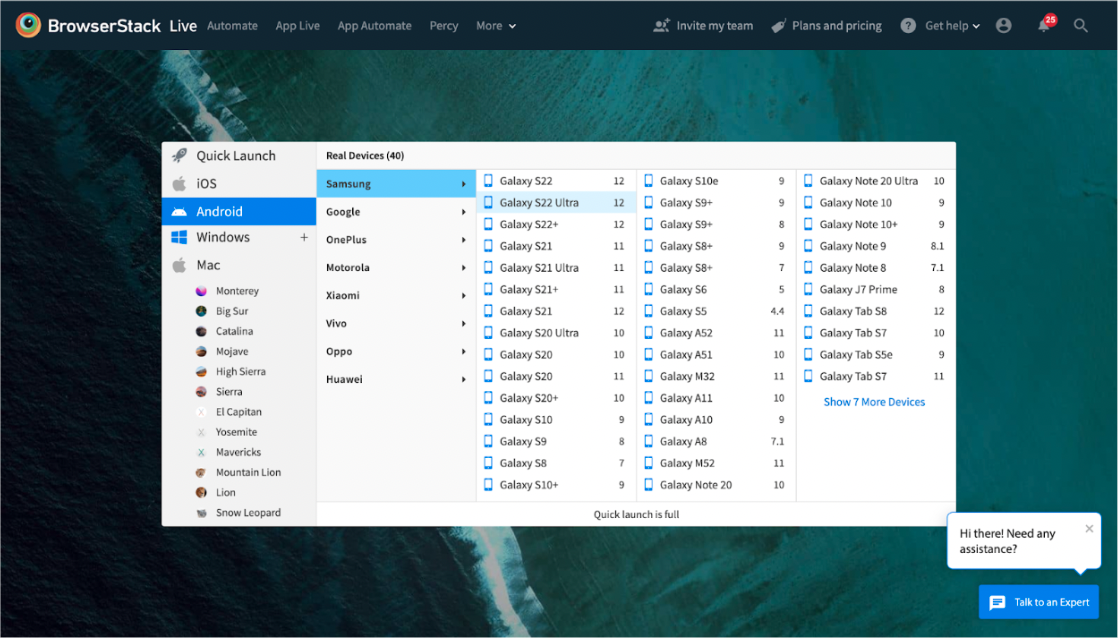
BrowserStack offers a real device cloud of 3000+ devices, OS, and browsers that you can leverage in your journey to make apps mobile friendly. Once you signup, you get instant access to all these devices.
- Mobile Responsive Layout Is A Must
You also need to concentrate on making your application mobile responsive. This makes the website adapt to varied screen sizes with negligible rendering issues. Responsive web design works well for both desktop and mobile platforms as the site realigns its appearance accordingly. Various popular site builders platforms come with beautiful and mobile friendly templates for your websites, such as Squarespace, WordPress, ThemeForest, Wix, and many more. If you’re still wondering how to scrutinize your responsive web design, you can go for BrowserStack’s Responsive Checker Tool.
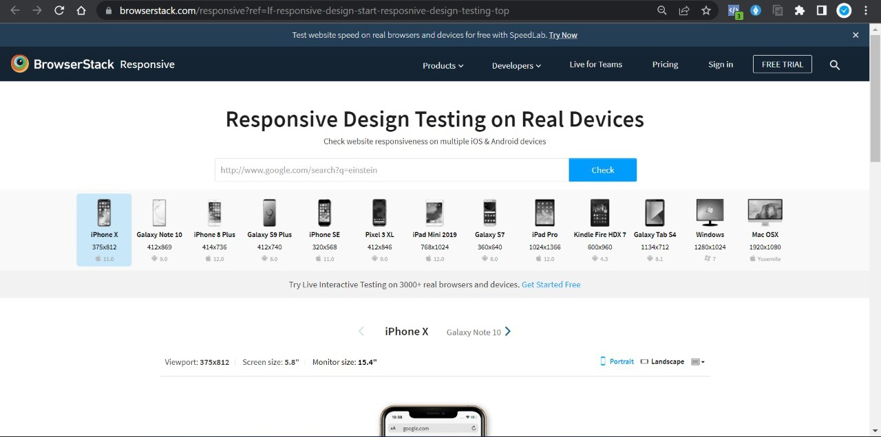
This incredible tool enables you to rapidly test your website responsiveness. The BrowserStack’s responsive checker runs responsive tests on real-world device-browser combinations; thus, users get accurate test insights.
Try BrowserStack’s Responsive Tool Checker
QA experts simply need to enter your website URL and click “Check,” and you can find recommendations of real browsers and devices, counting Samsung Note 10, iPad Pro, iPhone X, etc. They can check how a website appears on distinct devices and begin optimizing accordingly to make mobile friendly app or website.
- Focus on Optimizing Web App Speed
Speed is the greatest factor in any website. The standard website load time for any mobile website is 1-2 seconds. As per the statistics, 53% of mobile site visits are abandoned if web pages take more than 3 seconds to load. Besides, slow load times are the prime reason visitors abandon a checkout procedure. In short, your website must load as quickly as possible!
To enhance your website loading speed, you can easily compress your files like CSS & images as light as possible. So it will be easy to load and takes lesser time. Additionally, keeping the user interface simple and clean is also significant, as it assists users to run the app without any glitches and load easily and rapidly.
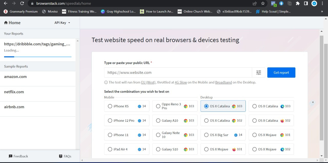
BrowserStack’s SpeedLab is a better-fit platform to estimate your website speed. Enter the site URL and click on start to get a thorough report that tells your website speed and score on multiple browsers and devices. To assess a web app or site’s loading time, run its speed test on BrowserStack SpeedLab. This open-source tool verifies speed on numerous real browser-device combinations and demonstrates a score out of 100 for both desktop and mobile platforms.
- Clean Web Design
Web developers should ensure they aren’t cluttering the site by providing all functionality on similar page. This creates confusion, making it hard for visitors to navigate a web page with various elements. For flawless user experience, prioritize an orderly, clean, minimalist design that makes navigation intuitive. Offer only the crucial functions upfront as those are the ones users will actively seek.
What’s the solution? Developers can incorporate the core elements of modern web design – the Hamburger button on any site. Mobile phone users can easily open the complete menu with a single click if executed. This makes navigation simpler and fosters a heavy visual appeal.
Additional-Tip: Once complete, consider implementing again to make your website appealing and mobile friendly.
- Easy-to-use Navigation Interface
One of the top mobile friendly app tips comprises developing a simple navigation interface. Whenever visitors land on your app, a user should understand your app, take desired actions, and end up with an easy buying process without being distracted anywhere. In mobile app development, a popular model, i.e., the Keep it simple stupid (KISS) model, is used to better build an app with a user-friendly interface, easy navigation features, and least tasks. It also requires a focus on themes, backgrounds, and colors that need to be smoother for a smooth end-user experience.
- Web Browsers
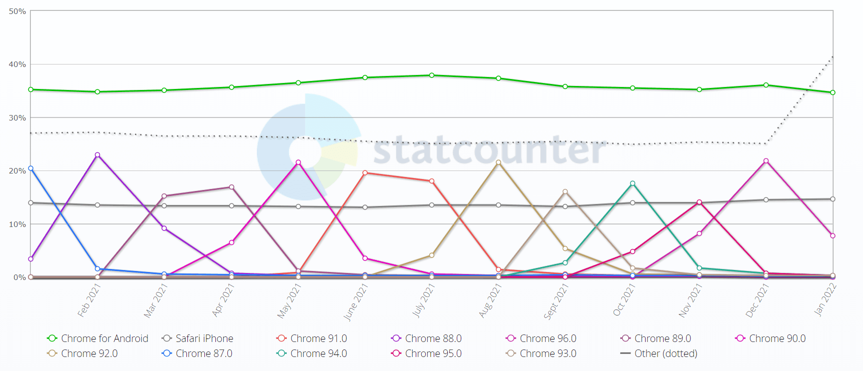
The most time-consuming section is to test on web browsers. Unlike OS (operating system) versions, browser versions are launched very often, with an average cycle of 4 weeks. Besides, there doesn’t exist a couple of browsers in the marketplace. Even though you take out Chrome which has more than 60 percent of the market share, other browsers also hold a substantial market under their reach.
Regarding market share, web browser fragmentation is highly concerning than the OS. With a 63 percent share in the market, the image shows how chrome’s version competes with the visitors.
With every browser version, you can expect fresh features to be introduced and a few deprecated. This portion is similar to Operating systems. Testers need to be careful about testing the mobile web application in these browsers. The key thing we are searching for here is property support removal. For instance, a CSS function filter () is supported only in the Firefox web browser. If the software developers have kept Firefox as their prime browser for app development, you may expect a few surprises whilst testing.
With Browserstack, you can test your web app loopholes in the face of real-time situations and straight implement testing in real user conditions a.k.a real browsers and devices. Using BrowserStack Live you can cross-browser tests on mobile browsers using the pre-installed developer tools.
- Update Content Carefully
With a mobile-first app design approach taking priority, it is vital to craft and updates your website’s mobile content with a pinpointed approach. Developers should consider the space restrictions on small screens to make sure only critical content components are notably displayed. Developers can evade this by opting for a visual comparison test that will mitigate any sort of web design error to show up in production.
Choose Real Device Cloud to Accelerate Your Mobile Friendly Journey
Once you have done all the changes as per the above tips, it’s time to test your apps and websites to see if the improvements you have made are worthy for users or require extra effort.
Cloud-based cross-browser testing platforms like Browserstack Live is a one-stop solution to run mobile browser testing on the cloud as it comes with 3000+ real mobile devices & browsers. You can effortlessly test your website interface, speed, performance, and navigation system. You can easily determine whether your app functions accurately regardless of OS, device, screen size, or browser.
BrowserStack Live also includes mobile-specific features such as push notifications, geolocation testing, location testing, network simulation, etc. Real device cloud is, therefore, an ideal solution, both for developers to fix bugs and for testers to find bugs with ease while keeping costs low. If you would like to test your native apps, then you can sign up for BrowserStack’s App Live platform. With App Live you can upload your local, and staging Android and iOS apps and start testing them instantly.


