Fonts are specific styles and sizes of texts comprising characters like letters, numbers, symbols, and punctuation. However, they are not to be confused with typefaces, which are underlying visual designs that exist in many different typesetting technologies.
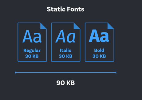
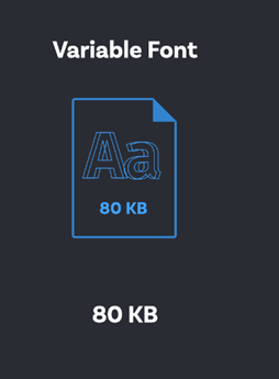
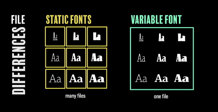
There are two types of fonts: static and variable. While static fonts maintain different files for each variation, variable fonts have a single file with all possible variations.
This guide further explores the differences between static and variable fonts.
What are Static Fonts?
Static fonts are fonts that require a different file for each font variation that needs to be used on the website. The characters are designed and digitized in Fonts and later stored in font files.
What Are Variable Fonts?
A variable font is an OpenType format based on a new technology called OpenType Font Variations. Contrary to Static fonts, which require a different file for each variation, Variable Fonts comprise all their variations in a single file.
In simple words, the concept of Variable Fonts refers to a technology that allows typography with several variations in one file. This enables the designers to use one single font family with all the weights.
Static vs Variable Fonts : Differences
Now that you know about Static and Variable Fonts, let’s understand the significant differences.
| Static Fonts | Variable Fonts |
|---|---|
| Static Fonts maintain a different file for each variation. | Variable fonts maintain a single file having all the possible variations. |
| Static Fonts do not support any CSS transition or animation. | Variable fonts support CSS transition and animation. |
| Static Fonts are bound with fixed design limitations. | Variable Fonts offer multiple typographic variations. |
| Static Fonts cannot create a custom font style. | Variable Fonts offer the ability to create a custom font style. |
| Static Fonts do not improve a website’s performance. | Variable Fonts enhance the website’s performance, responsiveness, and readability. |
Advantages of Static Fonts?
Here are a few advantages of static fonts
- Simple and Compatible: Static fonts are compatible across all platforms, design tools, and browsers. It is, therefore, suitable for projects that demand compatibility without complex technical requirements.
- Predefined Design: Since each style and weight is predefined in static fonts, it can be rendered easily across various environments.
- Easy to use: Static fonts require no specific configuration.
- Low Complexity: It has a file structure that is easy to understand. Therefore, it avoids confusion and aids teams who are not familiar with variable fonts. It is best for less complex projects with limited font needs.
How do Static Fonts Work?
Static fonts use separate, predefined font files for each style and weight. Each file will have fixed glyph designs. These glyph designs finalize fixed shapes and dimensions for every character as per their style or weight.
They are scaled for size but are prevented from dynamically changing attributes like weight or width. This direct approach makes static fonts compatible across all platforms. However, it is less flexible when compared to variable fonts.
Advantages of Variable Fonts
- Variable Fonts have a single font file that controls all axes. As a result, there is no need to copy each style separately.
- Variable Fonts offer the designer much more control over the font due to the availability of many font options.
- Variable Fonts offer the ability to create a custom font style that creates unique branding and logo designs.
- Variable Fonts support CSS transition and animation properties that achieve a fluid and smooth shifting of animations between different font styles.
- In Variable Fonts, with the help of CSS @font-face and style rules, a lot of different font-weight, width, and style permutations can be created.
- Variable Fonts improve a website’s accessibility, readability, flexibility, performance, and responsiveness.
- Variable fonts help a developer fully utilize the potential of RWD(responsive web design) by modifying or animating the typeface based on device type, viewport or orientation, etc.
Also Read: 9 Core Elements of Modern Web Design
How Do Variable Fonts Work?
The major concept behind Variable Fonts is the “Axes of Variations”. Axes, in variable font technology, can be considered as variables that are the most common parameters linking the different typefaces within a single typeface family, eg. Width, Weight, etc. These axes can control the different aspects of the font style – for example, how wide or narrow the fonts are, or how bold or light they are and etc.
There are two different types of Axis of variations:
- Standard Axes of variation
- Custom Axes of Variation.
Standard Axes of Variation
There are Five standard axes of variations, each of which is represented by four-character long tags comprising small case letters.
- Width wdth Axis: This value is controlled using the font-stretch CSS property and is used to control the variable font’s width. The value is denoted in % and usually varies from 0% to 100%(or even higher).
- Weight wgth Axis: This value is controlled using the font-weight CSS property and is used to control the variable font’s weight. The value can range from 1 to 999.
- Italics ital Axis: This value is controlled using the font-style CSS property and checks whether the variable font is italic or not.
- Slant slnt Axis : This value is also controlled by the font-style CSS property and controls the variable font’s slant. The value is measured in degrees and can vary from -90deg to 90deg. It is set to 20deg by default.
- Optical-Sizing opsz Axis: This value is controlled using the font-optical-sizing CSS property and controls the variable font’s optical sizing. This is set to either ‘auto’ or ‘none’ This is used whenever there is a need to increase or decrease the stroke thickness of letters based on their font size.
Custom Axes of Variation
There is no limit to the number of custom axis of variations that can be defined, it entirely depends on the designer. The significant difference however between Standard and Custom Axes is unlike Standard axes of variations that are defined using four characters with long tags of small case letters, the Custom axes of variations are defined using capital letters.
For example, a variable font ‘Decovar’ has the below custom axes of variations –
- SKLD: Stripes
- SKLA: Inline Skeleton
- TRMA: Rounded
- BLDA: Inline
How to set these axes of variations?
There are two different methods to define these axes of variations.
1. Using CSS properties: In this case, you can use the CSS properties like font-weight, font-style, etc which are associated with each axis. Standard axes of variations can be set using this method.
heading {
font-weight: 600;
font-style: oblique 70deg;
font-stretch: 80%;
font-optical-sizing: auto;
}
2. Using font-variation-settings property: In this case, you can use the font-variation-settings property of W3C and set the values as shown below. This method can be used for both Standard and Custom axes of variation.
.heading {
font-variation-settings: "wght" 550, “slnt” 75, "wdth" 60, "opsz" 70;
}Must-Read: How to Create Browser-Specific CSS Code
Browser Compatibility for Variable Fonts
Browser compatibility is essential to ensure that users have a consistent experience as they use the websites across different browsers, devices, and platforms.
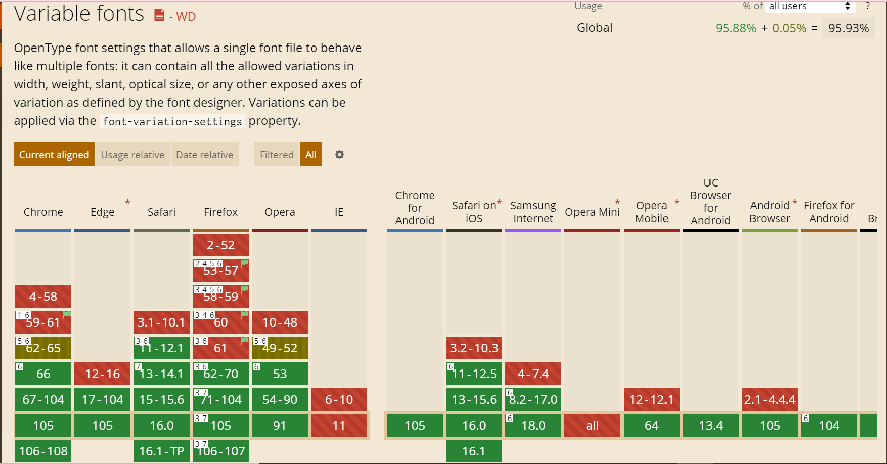
The browser versions’ support for Variable Fonts can be analyzed as shown below:
As we can observe, Variable Fonts enjoy good browser compatibility with Chrome, Edge, Firefox, Safari, Opera Mobile, and UC Browsers. As for Firefox 105-106, it is fully compatible only when the requirements – Require macOS 10.13 High Sierra or later or Windows 10 1709 “Fall Creators Update” or later – are fulfilled with the exception that it doesn’t support OpenType-CFF2 fonts.
Hence, it is recommended to perform diligent cross-browser compatibility tests on these browsers in order to identify any underlying bottlenecks. These limitations can be overcome by tweaking the code to match the overall user experience across browsers.
BrowserStack for Browser Compatibility Tests
The above images clearly emphasize the need for Browser Compatibility tests for websites using Variable fonts. But, maintaining a lot of devices and browsers is not a cakewalk and can cost a lot of time and effort. Buying a subscription to real device cloud like BrowserStack can help you eliminate the task of maintaining those devices and can focus on the testing cycle.
- BrowserStack gives you access to 3500+ browsers and real devices (mobile and desktop), providing comprehensive coverage for Cross Browser & Platform Testing.
- QAs can also leverage the power of automation testing to check cross-browser compatibility as it integrates with most test automation frameworks.
- Save time by using parallel testing to run tests on different browser-device combinations simultaneously.
- This allows devs and testers to build applications to retain and delight users through its seamless user experience.
Conclusion
Choosing the right font would depend on your objectives and the type of systems you use.
Variable fonts are more flexible than static fonts. They provide different styles and weights in a single file, making them suitable for responsive designs.
Static fonts are rigid, single-style fonts that are less complex, making them ideal for older systems or projects with limited requirements.
Now, if you are using variable fonts, make it a point to conduct browser compatibility tests with tools like BrowserStack that gives you access to a vast real device cloud.


