As of 2022, there are 6.5 billion smartphone users in the world, which is projected to cross 7,6 billion by 2027. People access the internet with distinct mobile and desktop devices making device fragmentation a real concern. Every user expects that every website they access will render perfectly on their mobile device. This means website developers have to design websites that are displayed on a multitude of screen sizes across the world.

Source: Statista
In other words, they need a responsive design.
But as every designer knows, executing responsive design has to begin with knowing which screen sizes to design for. This article explores this question and discusses the best screen sizes for responsive design.
What is Responsive Design?
Responsive web design refers to a design strategy that creates websites that work well for mobile, tablet, and desktop devices. Websites without responsive design risk alienating a significant number of users – 80% of users have claimed that they will reject websites that don’t work well on their device.
Additionally, Google looks at “mobile-friendliness” as a parameter for ranking. To quote the Google Webmaster Central Blog,
“Starting April 21 (2015), we will be expanding our use of mobile-friendliness as a ranking signal. This change will affect mobile searches in all languages worldwide and will have a significant impact in our search results. Consequently, users will find it easier to get relevant, high-quality search results that are optimized for their devices.”
How to find the ideal screen size for Responsive Design?
Note: To understand why responsive design is integral to website success, one must understand the vast and ever-increasing nature of device fragmentation. Download our E-Book on device fragmentation to get the latest information on this phenomenon.
Mobile Screen Resolution Stats Worldwide: Sept 2021 – Sept 2022
Common screen resolutions for Mobile:
- 360×800 (8.56%)
- 414×896 (6.95%)
- 360×640 (6.45%)
- 412×915 (4.77%)
- 390×844 (4.75%)
- 360×780 (4.56%)
- 375×667 (4.43%)
- 375×812 (4.35%)
- 360×760 (3.84%)
- 393×851 (3.56%)
- 393×873 (3.13%)
- 412×892 (2.74%)
- 428×926 (2.4%)
- 360×720 (2.23%)
- 385×854 (2.14%)
- 412×869 (2.14%)
- 414×736 (1.94%)
- 412×846 (1.78%)
- 360×740 (1.64%)
- 384×854 (1.3%)
Note, the shift of users from smaller screen sizes (393 *373) has droped. Even though there is a drop, it’s a very critical mobile screen size to cater to, a majority of the audience still persists there. Want to check how your website looks on this resolution? Test now.
Screen Resolution Stats Worldwide: Sept 2021 – Sept 2022
What are the commonly used screen sizes for a Responsive Website?
According to the Worldwide Screen Resolution Stats (Sept 2021 – Sept 2022), the most common screen resolutions across mobile, desktop, and tablet are:
- 1920×1080 (9.94%)
- 1366×768 (6.22%)
- 360×640 (5.88%)
- 414×896 (4.21%)
- 1536×864 (3.94%)
- 375×667 (3.74%)
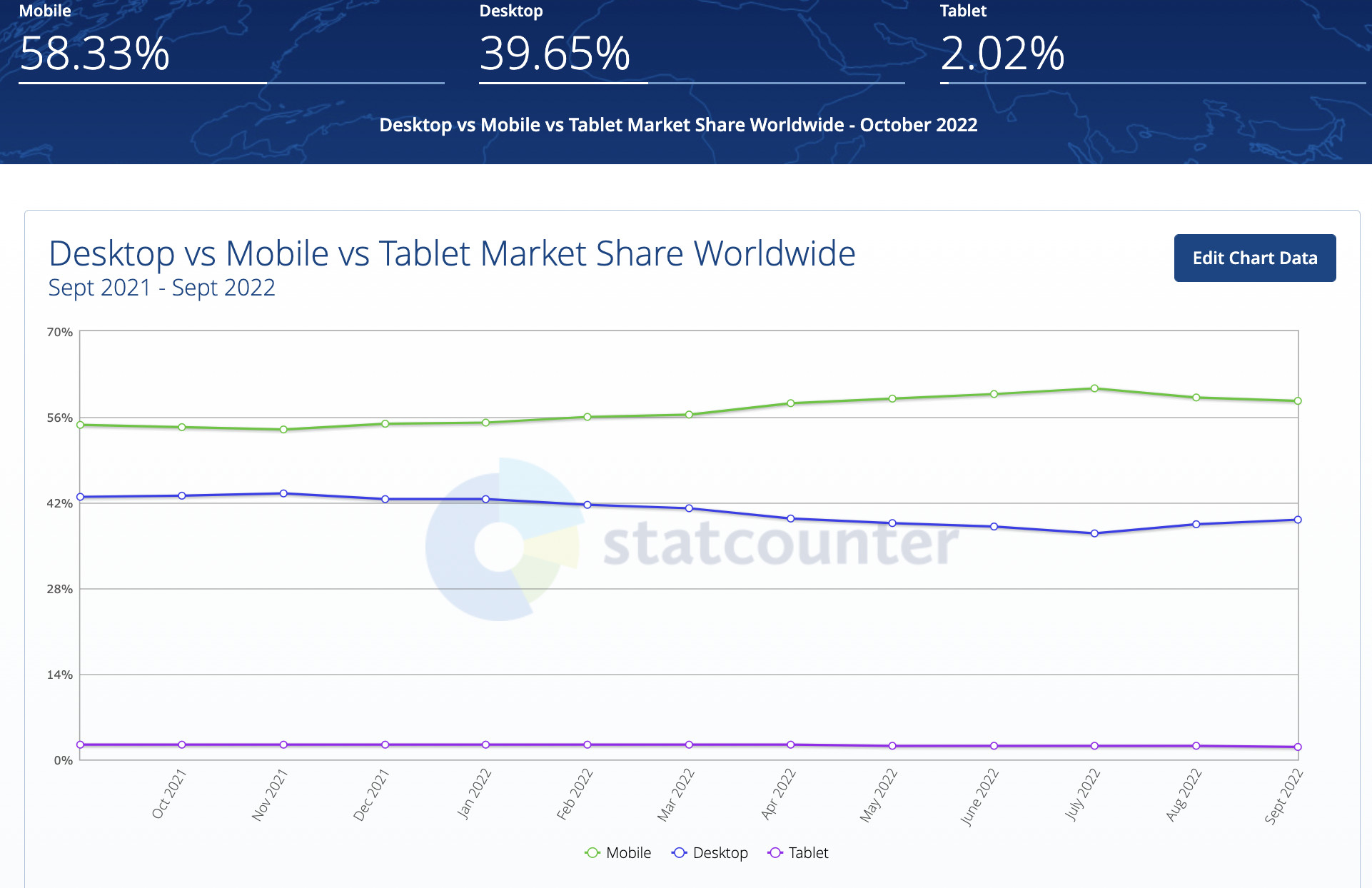
Of course, emphasis on mobile-friendliness does not mean that one abandons desktop devices. As the chart below will demonstrate, desktop devices still make up a sizable portion of internet usage.
Also Read: Breakpoints for Responsive Web Design
Desktop vs Mobile vs Tablet Market Share Worldwide: Sep 2021 – Sep 2022
According to Microsoft’s documentation,
With a huge number of device targets and screen sizes across the Windows 10 ecosystem, rather than optimizing your UI for each device, we recommended designing for a few key width categories (also called “breakpoints“):
- Small (smaller than 640px)
- Medium (641px to 1007px)
- Large (1008px and larger)
Despite this information, remember that there is no standard screen size for web design. Depending on the nature of the website, users might use certain devices that do not offer the screen sizes and resolutions mentioned above. To identify the right screen sizes for web design, invest in analytics. Find out what your target audience is most likely to use. If those devices don’t adhere to the aforementioned resolution, then include them in the mix.
Check Website Responsiveness for Free
Best Practices for Implementing Responsive Design
It becomes a lot easier to design a website for multiple screen sizes with the following guidelines:
- Know your breakpoints: In responsive design, a breakpoint is the “point” at which a website’s content and design will adapt in a certain way in order to provide the best possible user experience. To make a website responsive, designers must add a breakpoint when the content looks misaligned. Depending on the number of devices the site is being aligned to, multiple breakpoints have to be set to ensure its responsiveness. Refer to this article on responsive breakpoints to learn about them and their effectiveness in detail.
- Create Fluid Designs: Fluid design refers to a design layout that can shift (expand and contract) to fit the device viewport it is running on. A fixed design layout will undesirably distort on every viewport that they are not aligned to. Work on design layouts by using % units as well as max-widths to ensure that the layout fits mobile device viewports without becoming too wide on desktop device viewports.
- Decrease Friction: This basically means that the design must be easy to use on multiple devices. Responsive design doesn’t just include what a website looks like, but also how it performs in terms of accessibility and usability. Focus particularly on small-screen friction, because as screen sizes decrease, web elements have less space to render and become more likely to scramble and distort.
- Design Mobile-First: Since friction is more likely to occur on smaller screens, design with a mobile-first approach. It is harder to narrow a desktop layout for a mobile viewport while doing the reverse is easier. When designing mobile-first, the designer includes what is absolutely necessary for providing the optimal user experience.
Here are a few ways to go about with mobile-first design to adapt to more screen sizes:
- Prioritize important menu options
- Remove all visual distractions
- Optimize design for tapability – make everything easy to tap
- Eliminate unnecessary forms and information fields
- Highlight the main CTA
- Prominently offer search and filter functions
- More functionality, less typing: Obviously, typing is harder on mobile devices than it is on desktop devices. So it makes sense to minimize the need for typing on mobile versions of websites. Replace typing with consciously leveraging device functions such as GPS, QR code reading, biometric ID, and the like. Make it easier for users to share, email, or call relevant numbers by placing links that launch the necessary functions. Keep in mind that the best responsive design involves simplifying and eliminating inconvenient mobile interactions.
While a responsive design may seem difficult to execute, the information in this article seeks to simplify this process for developers and designers. By doing what has been outlined above, it becomes much easier to create websites that please its audience, irrespective of the device they use to access that website.
How to test responsive design on real browsers and devices
Once a developer or designer knows the best screen sizes for responsive design, they do the work and create a responsive website. However, to ensure that the website actually renders the way it is meant to on the devices it has been built for, it needs to be tested for exactly that.
An easy way to do this is to use a responsive design checker. Instead of running the website through individual devices with different viewports, enter the URL into the checker and see how it appears on a variety of the latest devices at different, frequently used device resolutions. The checker linked above offers responsive checking on the latest mobile devices such as iPhone X, Galaxy Note 10, iPhone 8 Plus, and more.
Additionally, use the BrowserStack cloud to check how a website renders on 3000+ mobile and desktop devices. Simply sign up for free, select the required device, navigate to the website and check how it appears in real user conditions.

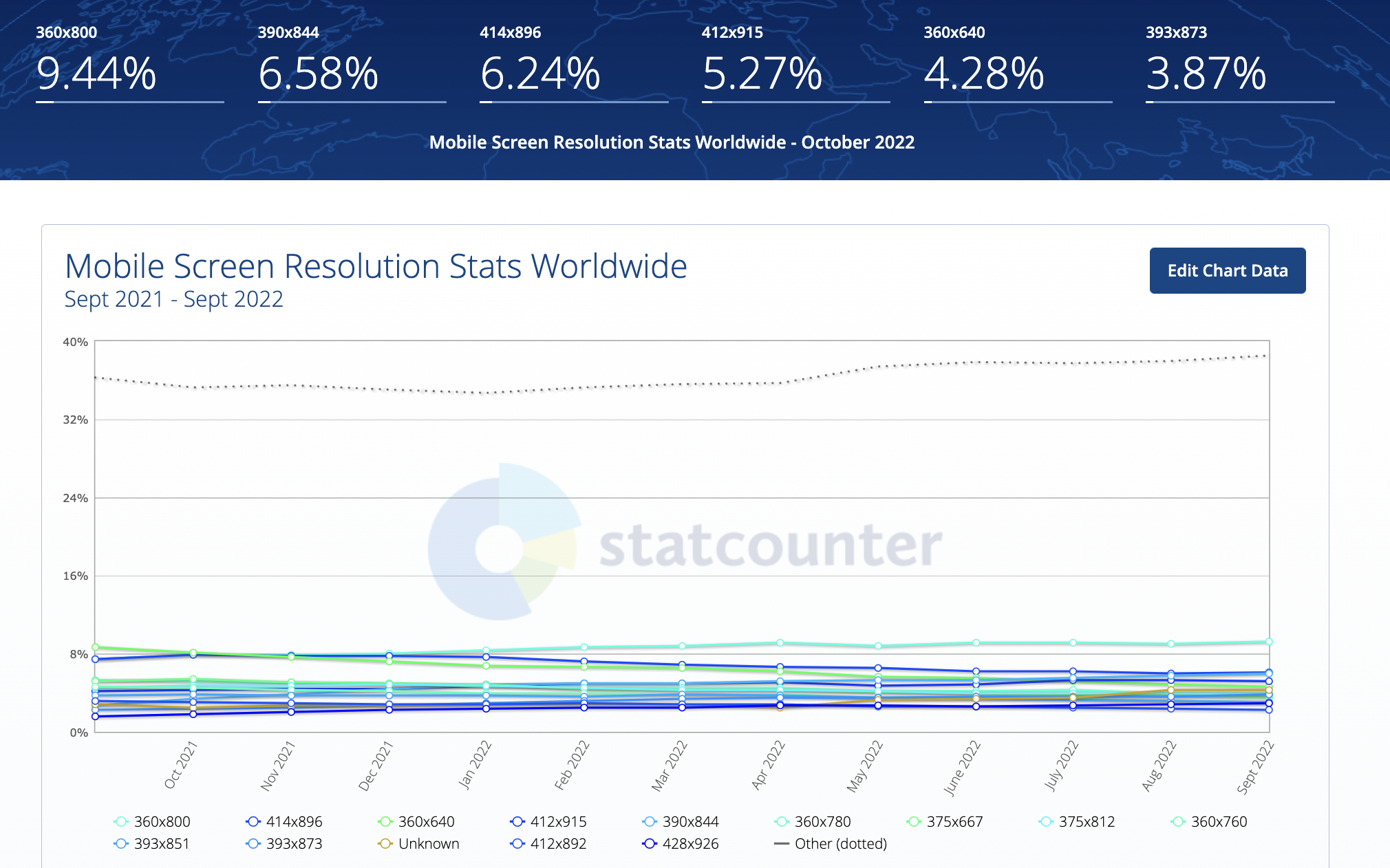
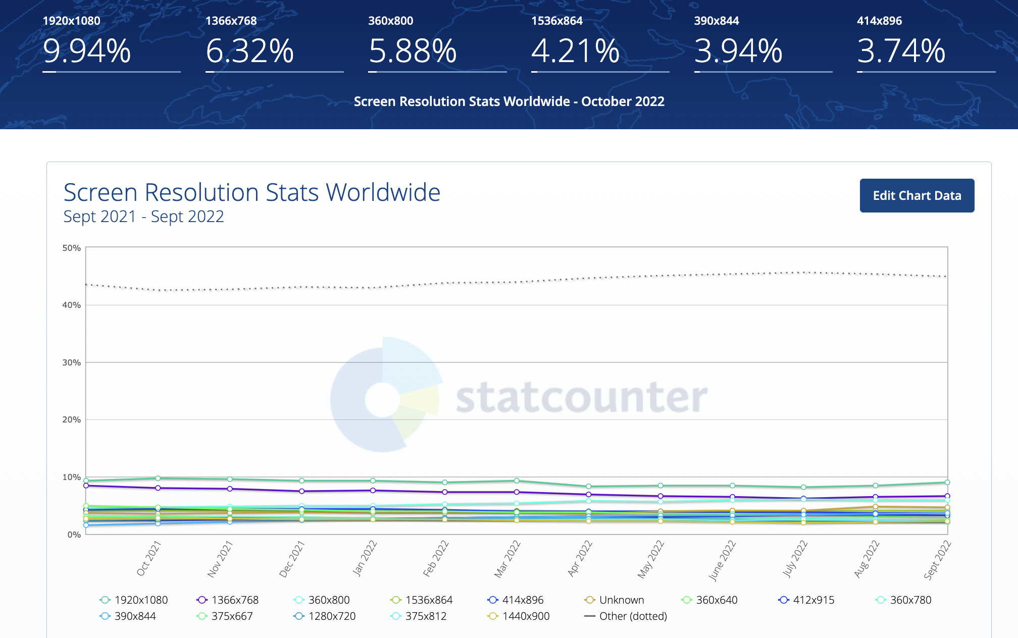 Image Source