
They won’t let me sleep!
It is 1 AM. Just hours after pushing a release, your phone starts buzzing with notifications. It’s your team trying to get through. Apparently, there is a serious compatibility issue in IE 11 and Android 7.0, and customer complaints have started flowing in. While scrambling over to your laptop, you can’t help but wonder, “What the $#%* went wrong? I thought we tested this!”
Sound familiar? Most of us have heard a version of this anecdote, if not lived through it. It leaves us with an important lesson—a website needs to be optimized for the devices customers are using.
But there are too many devices!
Today’s global online marketplace consists of 4 billion users, accessing the net from combinations of:
- 9,000+ distinct devices, shipped with
- 21 different operating systems, along with
- 8 major browser engines that power hundreds of browsers.
Combined, this makes at least 63,000 possible browser-platform-device combinations. And these are just the ones we know of, at this time.
Of course, your target audience might only be a slice of that pie, based on varying user demographics. Even so, any slice of the market is fragmented enough that bugs of all kinds can break your code and trigger frenzy at 1 AM.
The problem of fragmentation gets even bigger when you’re developing for mobile, because now you have to account for different screen sizes and resolutions too. Mobile users expect brilliant visual displays that leave no room for low-res images or janky animation.

While it is possible to build the perfect test strategy for mobile devices, you still need to keep up with all the changing marketplace and device trends.
But does this mean you need to test on each new device released?
Test on the right devices
Developers, designers and testers came to us with this problem several years back, right around when mobile users overtook desktop users on the Web.
We came up with a framework to identify the minimal number of devices to test on while accounting for variations in devices and markets.
Every few months, we use this framework to update our list of device recommendations.
So what’s the magic formula?
We look at global trends in mobile usage, device popularity and BrowserStack data across 2M+ users. After multiple rounds of optimization, we arrive at the minimum number of devices that give you maximum coverage of the market. Since the device market varies based on geography, we also offer country-specific device recommendations.
We have 3 main categories of device recommendations, tailored to the volume of traffic a website gets—the larger an audience, the more variations in devices introduced.
Listed below are the 6 best devices to test on for a small website that gets <15,000 unique visitors per month. For websites that get greater volumes of traffic, check out the full list of recommendations.
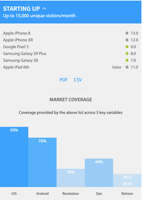
By testing on these 6 devices, you cover 93% of the iOS market, 76% of Android, and 44% of all screen sizes.
Hopefully, this list helps prevent 1 AM emergencies. Don't forget to check out the full list of recommendations.
That's all for today, folks. Stay tuned for updates!
Happy testing 👋