A website’s requirements have changed dramatically since it was relatively new. Considering nearly everyone owns a mobile device today, it is an unsaid rule to build a responsive website, no matter what the client specifies in the requirements.
Nowadays, with numerous JavaScript frameworks and many devices for viewing webpages, the demand for a front-end website goes way beyond simple functionality. Building a website that functions well on users’ devices is essential to capture a broader audience.
To achieve a simple but effective responsive design, it is necessary to ensure the layout does not change when the screen size changes. In this article, we shall understand how to make Angular Project responsive.
What is Angular?
Angular is a component-based development platform built upon typescript and is employed by developers worldwide to create aesthetically appealing front-end websites. It is a free and open-source application built and maintained by the Angular team at Google.
Angular is the third-most-popular JavaScript framework which is highly efficient in creating SPAs (single-page applications). Angular uses HTML and TypeScript; however, it is made in TypeScript. Moreover, it is a cross-platform language, supporting different languages.
Why use Angular?
Here are three key benefits that come in handy while using Angular, which justifies our Angular usage for responsiveness.
- You can quickly build progressive web applications with Angular. These are the type of applications that enhance the user experience of the website made with the help of Angular. Additionally, it brings this aesthetic user experience to your desktop and mobile phone.
- One of the most compelling features of Angular is the two-way bindings of the framework, which is used to display information to the user and allow them to change the data directly from the UI of the application. This builds a compelling connection between the user and the template, offering them a better interaction with the website.
- Angular is believed to be the fastest front-end framework in the industry. It has the fastest loading time. Moreover, it splits the code automatically per the user’s and project’s requirements.
Also Read: How to perform End-to-End Testing in Angular
Best Practices while using Angular
Follow these practices to improve the efficiency of the project while writing the project code.
- Always use the Angular CLI (command line interface) to perform basic operations such as initialization, development, maintenance, testing, and debugging. Some basic commands are ng –new for creating a new Angular responsive app, ng serves to start the application in the browser, and more.
- Incorporate ES6 (ECMAScript 6) features in your code to make JavaScript programming easier. Some ES6 features include Let and Const, Arrow functions, and more.
- Use lazy loading to increase the application’s load time to a greater extent. It is a process of loading different modules like documents, SCSS, videos, images, etc. It is essential in a large application, which helps increase the loading time by breaking it into multiple packets and loading them only when requested.
- Maintain proper folder structure, especially in large-scale project cases, for easy navigation and maintenance of code.
- The nomenclature of the files must be done correctly as it provides ease while gradually developing the project. This practice saves developers much time, especially when collaborating on a single project.
How to make an Angular project responsive?
After looking at the word ‘responsive’, our mind co-relates it with ‘media queries’. Media queries are the foremost solution in making our project responsive. However, it becomes quite problematic to use media queries in our project. Although it makes the work done, it creates a mess.
Therefore, in this article, we shall learn how to make Angular projects responsive with and without using media queries.
Method 1: Writing CSS (using Media Queries)
Writing media queries in the CSS file is among the most conventional and easiest way to implement responsiveness in the project. Although CSS media query is the fastest way to implement responsiveness, the codebase becomes hard to maintain, and the flow becomes messy.
Here’s how you can implement media queries in CSS.
@media only screen and (min-width: 599.98px) {
.div{
border:red;
}
}
Method 2: Using MediaMatcher
MediaMatcher lets you listen to media query changes in TypeScript, so you can run logic based on viewport size. Here’s how you can set it up:
npm install @angular/cdk
In Component
import { ChangeDetectorRef, Component, OnDestroy } from '@angular/core';

import { MediaMatcher } from '@angular/cdk/layout';


@Component({

  selector: 'app-responsive',

  templateUrl: './responsive.component.html',

})

export class ResponsiveComponent implements OnDestroy {

  mobileQuery: MediaQueryList;

  private _mobileQueryListener: () => void;


  constructor(changeDetectorRef: ChangeDetectorRef, media: MediaMatcher) {

    this.mobileQuery = media.matchMedia('(max-width: 768px)');

    this._mobileQueryListener = () => changeDetectorRef.detectChanges();

    this.mobileQuery.addEventListener('change', this._mobileQueryListener);

  }


  ngOnDestroy(): void {

    this.mobileQuery.removeEventListener('change', this._mobileQueryListener);

  }

}
Use in Template
<div *ngIf="mobileQuery.matches">Mobile Layout</div>

<div *ngIf="!mobileQuery.matches">Desktop Layout</div>
Read More: How to perform End to End Testing in Angular
Method 3: The BreakpointObserver Service
The BreakpointObserver is an API service available in the Angular Component Development Kit that notifies its subscribers of the current dimensions and orientation of the screen. Moreover, the service also emits new values when the screen size changes.
It already comes with several pre-built CSS breakpoints for different types of screen sizes. You may refer to the official documentation for more details about the pre-built CSS breakpoints.
Let’s learn how to use the BreakpointObserver service in our Angular project.
Setting up Project
Firstly, install Angular CLI to create projects in Angular
npm install -g @angular/cli
Create a project
ng new my-app
Install Angular CDK to use the layout module in your project.
Cd my-app
npm install @angular/cdk
Using BreakPoints
Open src/app/app.module.ts and subscribe to the BreakpointObserver API service. Also, use the Breakpoint value in the template.
import { Component, OnInit } from '@angular/core';
import { BreakpointObserver,Breakpoints, BreakpointState } from '@angular/cdk/layout';

@Component({
selector: 'app-root',
templateUrl: './app.component.html',
styleUrls: ['./app.component.css']
})
export class AppComponent implements OnInit {
title = 'my-app';
constructor(public responsive: BreakpointObserver) {}

ngOnInit() {
this.responsive
.observe([Breakpoints.HandsetPortrait])
.subscribe((state: BreakpointState) => {
if (state.matches) {
console.log(
'This is the Handset Portrait point at max-width: 599.98 px and portrait orientation.'
);
}
});
}
}
Method 4: Writing CSS (without using Media Queries)
Writing media queries in our CSS file had made our project not only complex but also, hard to maintain. Therefore, let’s learn how to make our project responsive, writing CSS, but not using any media queries.
It is achieved by creating layout-specific boolean members in the component. For instance, when viewed on mobile devices, you want to eliminate some margin or padding from the component.
In this example, we add a boolean flag, isPhoneviewed to the component.

import { Component, OnInit } from '@angular/core';
import { BreakpointObserver,Breakpoints, BreakpointState } from '@angular/cdk/layout';

@Component({
selector: 'app-root',
templateUrl: './app.component.html',
styleUrls: ['./app.component.css']
})
export class AppComponent implements OnInit {
title = 'my-app';

isPhoneviewed = false;

constructor(public responsive: BreakpointObserver) {}

ngOnInit() {

this.responsive.observe(Breakpoints.HandsetPortrait)
.subscribe(result => {

this.isPhoneviewed = false;

if (result.matches) {
this.isPhoneviewed = true;
} {
console.log(
'HandsetPortrait is on'
);
}

});
}
}
Method 5: Using Angular Flex Layout
Angular Flex Layout is a robust layout engine built on CSS Flexbox and mediaQuery. It offers responsive layout directives in your templates using HTML attributes. You don’t have to write media queries or complex CSS. Here’s how you can set it up:
npm install @angular/flex-layout
Import in your AppModule:
import { FlexLayoutModule } from '@angular/flex-layout';


@NgModule({

  imports: [FlexLayoutModule],

})
Example
<div fxLayout="row" fxLayout.xs="column">

  <div fxFlex="70%" fxFlex.xs="100%">Main Content</div>

  <div fxFlex="30%" fxFlex.xs="100%">Sidebar</div>

</div>
Read More: Angular vs AngularJS
Method 6: Using Tailwind CSS
Tailwind CSS is a utility-first CSS framework that enables you to build custom user interfaces directly in your HTML templates using low-level utility classes. To make your Angular project responsive with Tailwind:
Firstly, you need to set up Tailwind in Angular:
npm install -D tailwindcss postcss autoprefixer

npx tailwindcss init
Update tailwind.config.js:
content: [

  "./src/**/*.{html,ts}",

],
In src/styles.css:
@tailwind base;

@tailwind components;

@tailwind utilities;
Responsive Design with Tailwind
<div class="flex flex-row flex-wrap md:flex-nowrap">

  <div class="w-full md:w-3/4 p-2">Main Content</div>

  <div class="w-full md:w-1/4 p-2">Sidebar</div>

</div>
Read More: The Ultimate AngularJS Testing Guide
How to test Angular Responsive App?
Testing Angular websites on different screen sizes allows you to check the compatibility and consistency of the website across different devices of varying resolutions and screen sizes.
Methods to Test Angular Responsive App:
- Using BrowserStack Responsive Tool
- Using BrowserStack Live
- Using BrowserStack’s Free Responsive Checker Tool: This free tool from BrowserStack is handy for testing web applications hosted publicly across multiple device types and screen sizes. The limitation of this tool is the number of devices you can test responsiveness across and its lack of support for non-production apps.
- Using BrowserStack Live: BrowserStack Live provides access to more than 3500 real devices with an array of features in addition to the availability of these devices 24/7 from your web browser. You get access not just to device types but different resolutions within the devices that you can use.
Method 1: Using BrowserStack Responsive Tool
BrowserStack is a cloud testing infrastructure that allows users to test their website in numerous operating systems and web browsers before releasing it to real-world users.
Now, let’s learn how to test the website’s responsiveness using BrowserStack in three easy steps.
Step 1: Sign up/Login on BrowserStack
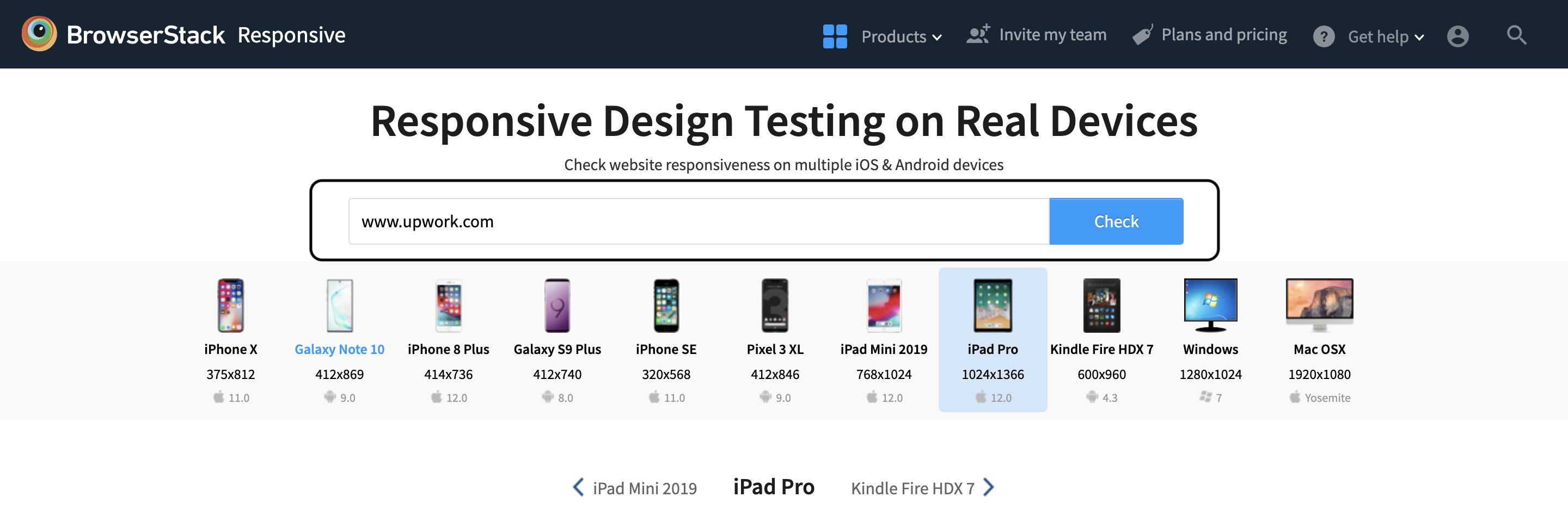
Get started free by opening up BrowserStack Responsive Design Testing.
Step 2: Enter the Website
For example, let’s enter any popular website made using Angular.
Step 3: Select the device for the test
Select from the wide range of devices in which you want to run the test. After that, hit the check button to run the testing and see the result.
Method 2: Using BrowserStack Live for Interactive Web Testing on Real Devices
Out of the two methods, this comes across as the most efficient option due to the large infrastructure of cloud-based real devices that it gives access to. You can leverage these devices without the overhead of maintaining the devices for upgrades and other tasks.
Get started by following three simple steps listed below:
Step 1: Sign up on BrowserStack Live or Login
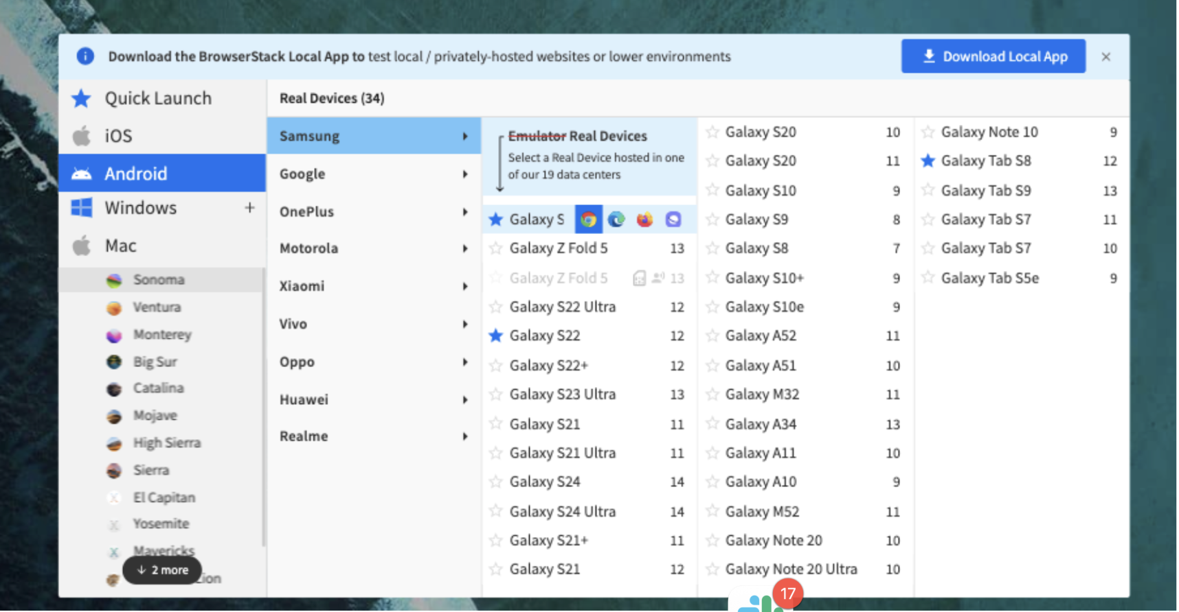
Step 2: Select the desired OS (Android, iOS, Windows, etc) and the device-browser combination (For example Samsung S23 – Chrome) and get started with web testing on a real device.
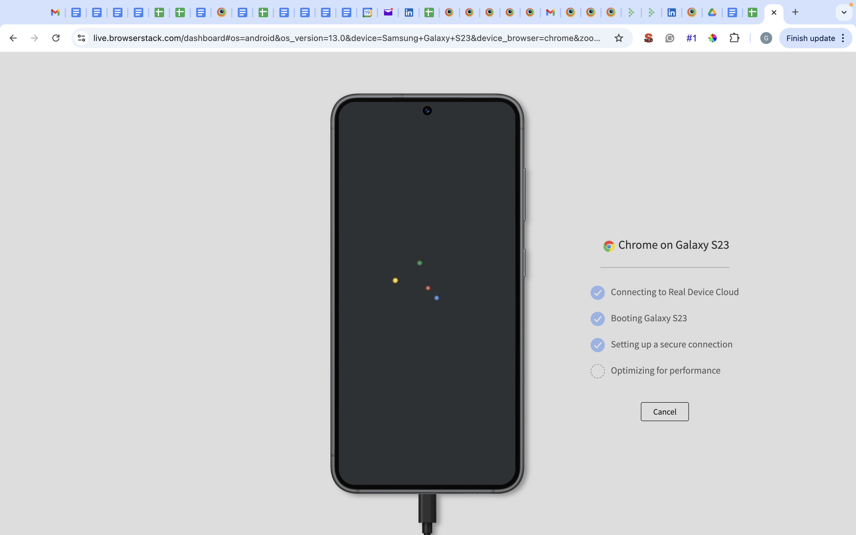
Step 3: The device and browser start booting.
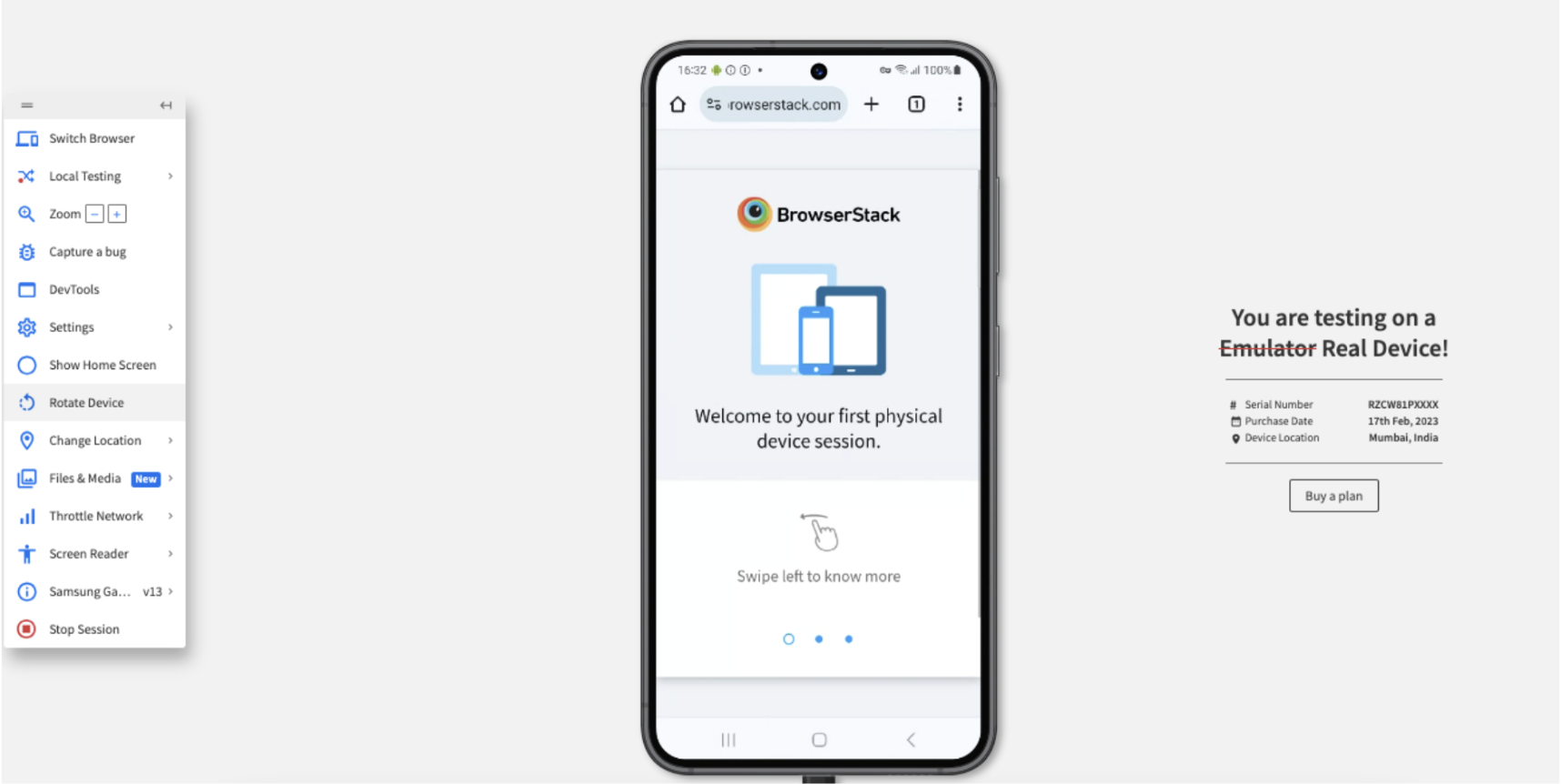
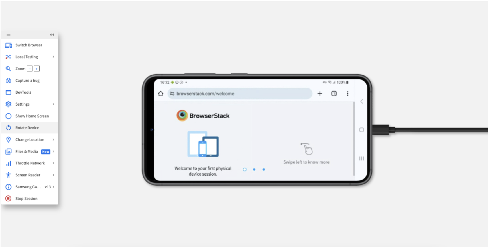
Step 4: View the device along with the Live menu. After you open your application, click Rotate.
Step 5: View the responsiveness of your application after the device rotates.
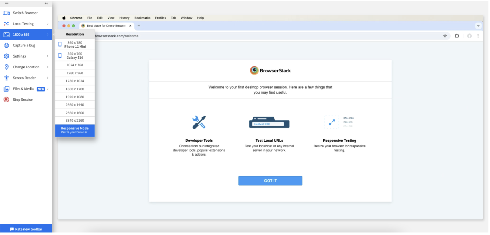
Step 6: Click Switch Browser and select Mac > Sonoma > Chrome version 125. When you open the same web site, the following is seen:
Step 7: Click Switch Browser, click iOS > iPhone > iPhone 15 with Chrome browser. When you open the same web site, the following is seen:
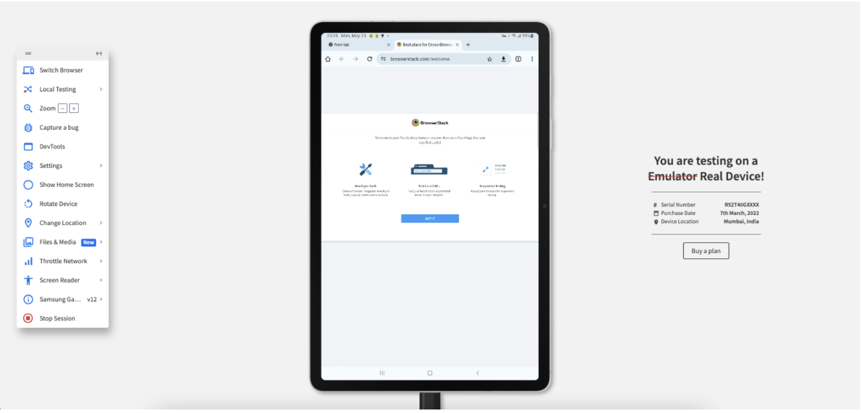
Step 8: Click Switch Browser, click Android > Samsung > Galaxy Tab S8 with Chrome browser. When you open the same web site, the following is seen:
Apart from interactive responsive testing, developers and QAs also get access to advanced features for mobile testing. Listed below are a few:
- Upfront access to DevTools for inspecting particular web elements in mobile view.
- Network throttling feature to test the performance of websites in poor network connectivity.
- Integrations with bug reporting tools like Jira and Slack to aid bug identification.
- Geolocation testing to test location specific behavior of a website.
Tips for Building a Responsive Angular Application
Here some best practices and tips you can follow to build a responsive angular application:
- Use a Mobile-First Design Approach: Design for small screens first and then scale up. This helps your app remain clean and functional on mobile devices before enhancing it for tablets and desktops.
- Leverage Angular Flex Layout or Tailwind CSS: Both frameworks simplify responsive design. Angular Flex Layout offers HTML-based layout control using directives, while Tailwind CSS provides utility classes with responsive variants like md: and lg:.
- Use MediaMatcher for Responsive Logic in TypeScript: For dynamic behavior based on screen size (like toggling menus or components), MediaMatcher allows you to apply responsive logic directly in your components.
- Use Relative Units Over Fixed Sizes: Replace fixed px values with responsive units like %, vw, or em. This lets your layout and typography scale naturally with the viewport.
- Test Across Real Devices: Use solutions like BrowserStack for real device testing. This ensures your layout and interactions work consistently across screen sizes.
Why Test Angular Responsive Websites on Real Device Cloud?
Here are some of the reasons for using a real device cloud to test Angular Responsive websites:
- Real-world testing: Access to a larger set of devices where you can test how your website behaves on screen sizes.
- Uncover hidden issues: Catch layout problems, responsiveness glitches, and bugs that might not show up with limited devices.
- Improved user experience: Ensure a smooth experience for all users, regardless of their device, leading to higher satisfaction and engagement.
- Wider browser coverage: Test on a variety of browsers running on real devices to guarantee consistent functionality across platforms.
- Faster testing: Run tests on multiple devices simultaneously, saving you time and resources compared to manual testing.
- Future-proof your site: Some providers, such as BrowserStack, release devices the same day as the product launch. You can stay ahead of the curve by testing on the latest devices and screen sizes as they emerge.
Conclusion
There are several ways to make an Angular project responsive, from traditional CSS media queries to built-in Angular tools like MediaMatcher and BreakpointObserver.
However, the right method depends on your project size and needs, and often, a combination of these approaches works best.
To ensure your app functions well across all devices and to test responsiveness, you can use tools like BrowserStack.


