Elementor’s visual builder helps you create designs that adapt to every screen while breakpoints control how your layout changes for different devices, so your site always looks great.
Overview
What are Breakpoints in Elementor?
Breakpoints in Elementor are specific points that let you define how your design looks on different screen sizes. They help you create a responsive website that adjusts seamlessly for desktops, tablets, and smartphones.
Why are Breakpoints in Elementor Necessary?
Breakpoints play a crucial role in creating a flexible and user-friendly website. Here’s why:
- Better User Experience: Ensures visitors get an optimal layout no matter what device they use.
- Enhanced Design Control: Lets you fine-tune your design for various screens without starting from scratch.
- Faster Load Times: Allows you to adapt and optimize images and content for each device, improving site performance.
- SEO Benefits: Search engines favor responsive designs, and breakpoints help make your site mobile-friendly and SEO-ready.
Examples of Breakpoint Ranges
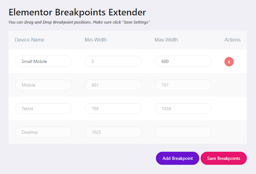
Elementor comes with default breakpoints that cover the most common device widths. However, you can also customize these ranges to fit your project’s needs better.
- Desktop: 1025px and above
- Tablet: 768px to 1024px
- Mobile: Up to 767px
This article explains what Elementor breakpoints are, why they’re important, how to add them, and how to test a website created using Elementor.
What are Web Design Breakpoints?
Web design breakpoints are specific pixel widths where your website layout adjusts to provide the best experience for different screen sizes. They’re the points at which your design switches from one layout to another while ensuring everything stays readable and visually appealing.
For example, a website usually has breakpoints for desktops, tablets, and phones. When a user’s browser matches a breakpoint, the CSS styles adjust to fit that device’s screen. This allows you to tailor your layout, font sizes, images, and other elements to create a smooth browsing experience across all devices.
What are Elementor Breakpoints?
Elementor breakpoints are specific screen widths within the Elementor page builder that let you control how your layout looks on different devices. Unlike general web design breakpoints you’d set in your CSS or theme, Elementor breakpoints are built into its visual editor.
This means you can set and adjust these breakpoints directly in Elementor without writing custom CSS. When you switch between device views in Elementor’s editor, you see how your design will respond to these breakpoints, making it easier to fine-tune the look and feel of your website on desktops, tablets, and smartphones.
Read More: Breakpoints for Responsive Web Design
Elementor Breakpoints
The default Elementor breakpoint have been redefined as:
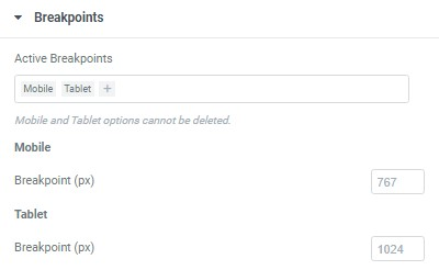
- Mobile: less than 767px
- Tablet: 767px < 1024px
- Desktop: 1024px and above
In their latest version, Elementor has added an additional custom breakpoint feature that now allows users to add up to 4 new custom breakpoint ranges:
- Mobile Extra (breakpoint value between mobile and tablet)
- Tablet Extra (breakpoint value above tablet, below laptop and widescreen)
- Laptop (breakpoint value above tablet and, if added, also above tablet extra)
- Widescreen (a min-width breakpoint for extra-large screens)
Widescreen Breakpoint
To adapt to constantly evolving technologies like 8K screens and extra wide displays, Elementor 3.4.0 added a new breakpoint value that exceeded their previous min-width value for desktops.
What is a Mobile Breakpoint in Elementor?
A mobile breakpoint in Elementor is the width at which your design switches to a mobile-friendly layout. By default, the mobile breakpoint in Elementor is set at 767 pixels or less.
Elementor’s editor lets you preview and edit these changes separately from the desktop layout. You can then adjust how your content, images, and typography look on mobile to ensure a smooth browsing experience.
Why Should You Add Breakpoints in Elementor?
Breakpoints let you control how your layout adjusts, so you can deliver a better experience for everyone. Here’s why breakpoints should be added to Elementor.
- User Experience: Visitors won’t have to pinch or zoom. Instead, your layout adapts to fit their screen size perfectly.
- Better Design Flexibility: You can tweak every detail of your design for different devices without affecting other views.
- Performance Improvements: Optimizing images and content for each breakpoint can help your site load faster, especially on mobile.
Read More: Top 15 Ways to Improve Website Performance
- Consistency Across Devices: Breakpoints keep your design consistent, so your brand looks professional on every screen.
- Future-Proofing: With more devices and screen sizes appearing all the time, breakpoints ensure your site stays ready for new ones.
- Custom User Journeys: You can create tailored experiences for visitors on different devices to improve engagement and conversions.
How to Add Elementor Breakpoints?
Follow these instructions to add default breakpoints in Elementor:
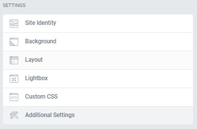
1. Log on to your WordPress site as an admin user. Go to pages in the dashboard and click Edit with Elementor. Navigate to the Layout option under Site Settings.
2. Navigate to the Breakpoint tab under the Layout menu and select from the three default options.
How to Edit Elementor Breakpoints?
Follow the instructions below to edit Elementor breakpoints:
- Navigate to your WordPress dashboard. Click Elementor Page or Post Editor.
- Click the hamburger menu on the top left of the panel.
- Click Site Settings > Layout > Breakpoints. Modify the values according to each device. Save changes.
- Navigate back to Elementor > Tools > General Tab and click Regenerate CSS.
How to Add Custom Breakpoints?
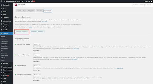
To add custom breakpoints to your site, you must activate the Additional Custom Breakpoints feature in the Elementor plugin. Follow the steps below to activate this feature:
1. Navigate to your WordPress dashboard. In the sidebar menu, click Elementor and navigate to the Settings menu.
2. Go to Experiments under the Settings tab. Scroll down to Additional Custom Breakpoints.
3. Change the status to ‘Active’ and save your settings.
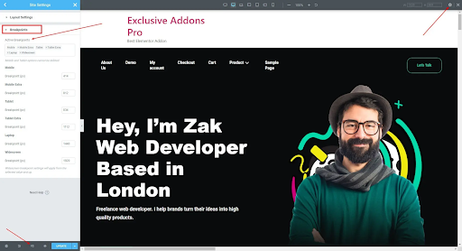
4. Go back to the Elementor Editor and select ‘Responsive mode’ from the panel above. At the top left bar, select the Settings icon. Navigate to Site Settings. Click on Breakpoints and add additional custom breakpoints.
Pro tip:
Elementor follows a cascading flow for its breakpoints. So if you set changes in larger breakpoints, it will subsequently change the pixels of the smaller breakpoints. However, vice versa is not possible.
Updated Programmatic Breakpoints System
Elementor introduced an updated way to handle breakpoints in version 3.4, which was released in August 2021. These changes modernized how developers work with responsive design in custom widgets or extensions. Here’s what’s new and how to adapt your workflows:
1. New Breakpoints Manager class
The new Breakpoints Manager class (Elementor\Core\Breakpoints\Manager) provides a centralized way to retrieve and manage breakpoint data programmatically. It replaces the older, scattered approach of hardcoding breakpoints or using internal arrays.
Use the following to get the default breakpoints:
$breakpoints_manager = \Elementor\Core\Breakpoints\Manager::get_instance();

$breakpoints = $breakpoints_manager->get_breakpoints();
Each breakpoint is represented as an object with properties like value (the pixel width) and label (like “Tablet” or “Mobile”). This class also allows you to work with custom breakpoints if users have defined them in Elementor’s settings.
Moreover, you can now find the file location at elementor/core/breakpoints/manager.php
2. Deprecated Programmatic Access to Responsive Controls
Before version 3.4, developers could directly manipulate responsive control values programmatically in widgets or custom controls (like accessing _tablet or _mobile suffixes directly).
This has been deprecated and removed to ensure a more stable and maintainable API. Instead of directly modifying these values, use Elementor’s responsive control structure in your widgets to provide device-specific settings.
How to work with it:
Use add_responsive_control() when defining controls in your custom widgets. Elementor will handle the device-specific data automatically.
Example:
$this->add_responsive_control(

  'my_control',

  [

    'label' => __( 'Margin', 'plugin-domain' ),

    'type' => \Elementor\Controls_Manager::DIMENSIONS,

    'selectors' => [

      '{{WRAPPER}}' => 'margin: {{TOP}}{{UNIT}} {{RIGHT}}{{UNIT}} {{BOTTOM}}{{UNIT}} {{LEFT}}{{UNIT}};',

    ],

  ]

);
Elementor manages the responsive values in the editor; your widget doesn’t need to programmatically access them anymore.
3. Deprecated Conditioning Controls on Responsive Values
Previously, developers could use responsive data directly in conditional logic to show/hide controls based on device-specific states (like adjusting a control’s visibility for mobile only).
However, Elementor no longer supports conditioning controls based on responsive control values in its programmatic API. This was removed to simplify the system and avoid inconsistencies in the responsive editor.
To avoid issues and maintain a clean interface in Elementor, make your control definitions device-agnostic so they work consistently across all screen sizes in the editor. If you want different device behaviors, use CSS or JavaScript in your widgets instead of changing how controls appear in Elementor’s editor.
Read More: Top Responsive CSS Frameworks
How to Test a Website created using Elementor and WordPress using BrowserStack?
BrowserStack is a cloud-based platform for cross-browser testing. It helps you check how your website, built with Elementor, looks and works on over 3,500 real devices and browsers. Since it runs in the cloud, there’s no need to install anything, just log in and start testing in real time.
Once your website is ready, you can use BrowserStack to see how it adapts on different screens and browsers. This helps you catch issues early and ensure your design looks great everywhere.
Using BrowserStack Live
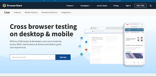
1. Log in to BrowserStack to start testing your Elementor-built WordPress site.
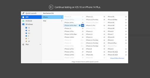
2. Choose the device and browser combination you want to test your site on.
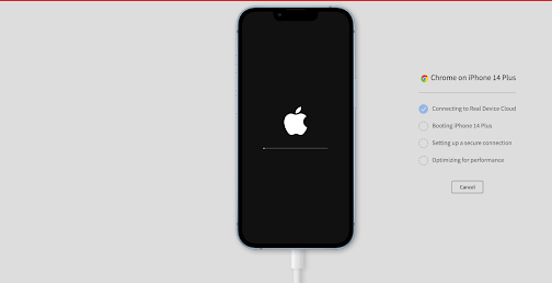
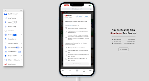
3. Once you get access to the device, enter the website’s URL to start testing.
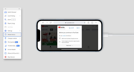
4. You can also change the orientation to landscape mode by clicking on rotate device in the right panel. To test your website on another device or a different browser, simply click on Switch Browser.
Using BrowserStack WordPress Plugin
BrowserStack also provides a WordPress plugin that integrates with your website and allows you to run a browser compatibility test in a matter of minutes.
1. Download the plugin from your WordPress dashboard and enable it.
2. Find the BrowserStack plugin in the right panel. Log in to your BrowserStack account or create a free one if you don’t have one yet.
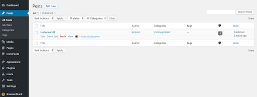
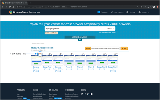
3. Once logged in, you can start testing your web pages by generating screenshots. Go to any page or post you want to check and click on the 1-click screenshot.
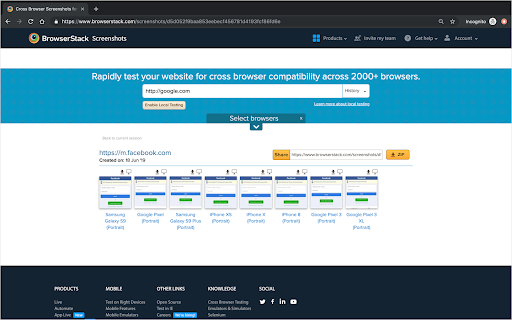
4. BrowserStack will generate screenshots of your website on ten different devices so you can see how it looks on each screen.
5. To debug any issue, click the Live button to run live testing in real-time.
Common Mistakes When Dealing with Elementor Breakpoints
Even experienced users can run into issues when working with Elementor breakpoints. Here are some common mistakes to watch out for:
- Ignoring Device-Specific Needs: Some users forget to check how their layout looks on smaller screens. Always preview and tweak each breakpoint to make sure content fits and stays readable.
- Overusing Custom Breakpoints: While custom breakpoints offer flexibility, adding too many can complicate your design and make maintenance harder.
- Not Testing Across Devices: Testing only in Elementor’s preview isn’t enough. Use real devices or tools like BrowserStack to ensure your design works in practice.
Also Read: How to Select Mobile Devices for Testing
- Forgetting About Performance: Adding too many images or animations at certain breakpoints can slow down your site. Optimize for each device.
- Skipping Consistency Checks: It’s easy to end up with different styles or spacing at various breakpoints. Make sure your branding and key elements stay consistent across all devices.
- Ignoring Elementor’s Programmatic Updates: With Elementor 3.4 and above, direct programmatic access to responsive values has been deprecated. Using old methods can cause unexpected layout issues.
- Not Using the Breakpoints Manager API: Some developers still hardcode breakpoint values in their custom widgets or themes. Using Elementor’s Breakpoints Manager API ensures your widgets align with user settings and stay up to date.
Elementor Breakpoints Best Practices
To get the most out of Elementor’s responsive features, it’s important to go beyond just adjusting layouts. These best practices ensure your site stays professional, performs well, and looks good on any screen.
- Prioritize Mobile-First Design: Mobile-first design ensures your site loads faster and stays user-friendly on small screens. In Elementor, start building your layout in the mobile view first, then move up to tablet and desktop views to adjust for larger screens.
- Optimize Images and Media: Using the right image sizes prevents slow loading and improves user experience. In Elementor, set smaller image files in the mobile view using the responsive image controls, and choose larger files only for larger screens.
Also Read: How to test Responsive Images
- Use Elementor’s Responsive-Ready Kits: Starting with responsive-ready kits saves time and reduces errors. You can find these pre-designed templates in Elementor’s library and use them as a foundation for your site.
- Typography Adjustments for Readability: Good typography keeps text clear and easily read across all devices. In Elementor’s typography settings, use the device-specific controls to adjust font sizes and line heights for each breakpoint.
- Prevent Overlapping Elements: Overlapping elements can hurt your design and confuse users. Use Elementor’s responsive margin and padding controls to ensure enough spacing for every device.
- Apply Motion Effects Mindfully: Animations can add flair, but often slow down mobile devices. In Elementor’s Motion Effects settings, apply only the necessary animations and limit them on mobile for smoother performance.
Conclusion
Elementor’s breakpoints let you control how your website adapts to different screen sizes, allowing you to create a clean, user-friendly design on desktops, tablets, and smartphones. With Elementor’s built-in responsive controls and programmatic tools like the Breakpoints Manager class, you can fine-tune your site’s layout for every device.
To ensure those changes really work in the real world, BrowserStack helps you test these breakpoints across different devices. It offers a vast library of 3,500+ real devices and browsers you can access without installation. You can take full-page screenshots, run live tests, and debug your site on the spot to ensure your design looks great and performs well everywhere.

