Developers are problem solvers; they work efficiently and they chase quality and delivery with the power of new and existing concepts in tech.
As the lead designer at BrowserStack (which is used by 2 million software engineers), our mission is to design products that solve problems—for an end-user who is a problem-solver by nature.
For those who don’t know: BrowserStack is used for testing websites and mobile apps. There are four products in the suite: Live, Automate, App Live and App Automate. They can be used on their own or together, based on what you want to test (websites or native mobile apps) and how you want to test it (manually or programmatically).
Designing for developers is somewhat different from designing for regular folks. Of course, we are still designing for humans, so the usual design principles and practices still apply. But the way a developer commands and controls their dev environment and its impact on their workflows is unique. The products must be designed to work with all the tools and frameworks used by them.
As the testing infrastructure for teams across the world, it’s important to make sure that each of our products fit into developers’ evolving workflows. Here’s how we rise to the challenge:
Know the ecosystem
Designers in any industry are required to have a deep understanding of its ecosystem. As designers in the software development and testing niche, we must have a deeper understanding of the developers’ universe.
This does not mean you have to start writing code. Instead, understand how a specific technology helps them succeed at what they do, how their environments are set up, how they debug, and so on.
Designers joining the team at BrowserStack initially felt overwhelmed by the amount of technical know-how that they needed to design for our products. We overcame this by learning the basics of development. We didn’t just put ourselves in the user’s shoes, we dove headfirst into the world of software development.
We started learning frontend development twice a week (shout outs to the UI team at BrowserStack!). Difficult as it was, some designers found motivation in the ability to prototype their ideas. Others were motivated because it helped them relate to the user.
By the end of it, the entire design team had a better understanding of even the most trivial steps in the user’s journey. For example, we now understand the difference between opening an HTML file directly on a remote browser versus opening an HTML file by first uploading it to a server or serving it via localhost.
Browsers treat local files and files served from web servers differently. The former doesn’t match the target environment while the latter does. Learning this helped us shape the Local Testing experience on BrowserStack.
Make their Proof of Concept (PoC) effortless
Every B2B product has this stage where a potential customer is evaluating the product against their needs (use-cases). This is where a prospect turns into a customer, and the journey here needs careful crafting.
Whether it’s the Live dashboard (our manual testing product) or Automate (automated testing product) dashboard, our focus has been on letting users experience our products’ value from the get-go.
As designers, it’s important for us to understand the user’s goals and motivations and what they’re trying to accomplish at various stages in their journey. Keeping complexity in mind, allowing users to discover easier tasks first and incrementally unwrapping more complex features over time will give the user small wins in consumable steps. From being able to run your first test to setting up a continuous deployment pipeline, the steps are elaborate—and unfold product value without creating information overload.
So when our potential customer takes the products for a spin, we want them to experience the product values with minimal cognitive load. We add or delete steps from the user journey by asking ourselves, “Does this feel natural in the user’s actions?”, “Is this consistent with how the user will actually use our product?” or “How easily can our products be integrated into their existing environments?''
In order to understand this better, we broke down the user’s journey into four stages and detailed the value we wished to present over time.
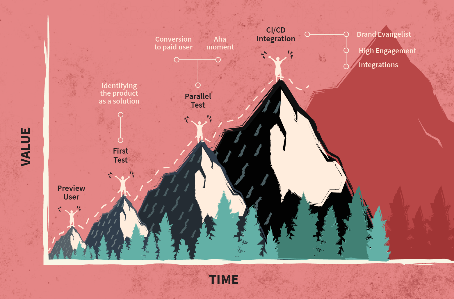
This breakdown helped us map what information is most useful at which stage, with the aim of keeping the user engaged (without making the actions overwhelming).
In our case, with the automated testing product, first-time users typically take a while to run their first test. That’s because the product needs some setting up if all the prerequisite libraries and bindings are not already present on the user’s machine.
Now here’s the thing: setting up environments can be daunting—something that the design team learned only once we did it ourselves.
In order to optimize the steps in the setup workflow, we set up IDEs, binaries and framework prerequisites on our own machines. Completing the entire setup helped us understand what users needed to know—and do—before they could start running their automated tests on BrowserStack.
Armed with those insights, we revamped our onboarding experience for better error handling (in cases of common config or simple human errors). For upcoming iterations, we are looking at making the onboarding experience more effortless—with step-by-step progression and greater emphasis on consumable, goal-critical information.
Enable users to work faster, not harder
How often do your users visit your dashboards? For most B2B and B2C products online, the answer would be, “every time they need the product”.
Our case is different. There are more than 2 million tests that are run daily on our infrastructure. And yet, our dashboard visits are nowhere close to that number. After qualitative research with in-house and external respondents, we knew why.
Instead of visiting our dashboard, our users spend time on their tools: IDEs, command line interfaces, code editors, internal dashboards, CMSs, and so on.
During research, we are tuned to look for workarounds. So imagine our excitement when we came across our users’ workarounds—custom dashboards and push notifications—that they built in order to use BrowserStack with (and within) the tools they used daily.
The ability to come up with these awesome hacks is what sets our user persona apart from non-programmers. Using some of the insights from these workarounds we were able to create Jira, Github, Trello and Slack integrations that simplified user actions and reduced the number of windows they had to toggle through.
Another important piece of the dev workflow is the CLI. When designing for command line interfaces, we should leverage it’s abilities and use them as constraints to guide how the user will use our product from a non-GUI interface. Here’s what we learned:
- Use easy commands that follow existing syntaxing protocols.
- Guide the user to install the missing libraries or prerequisites.
- Use command line colors to craft the UX.
- The help command can be really helpful if the user is stuck. Understand where the user is likely to get stuck and give relevant suggestions on how the user can proceed further.
- Tell the user what is happening in everyday language, whether it’s a loading state or some type of text-based feedback.
Your product will be judged by your documentation
Devs like themselves a meticulously crafted product documentation. Simple and easy-to-understand user documentation is a foolproof way of making developers love your product.
The navigation of a product’s documentation is deeply tied with the context of its product. The flow of the documentation should not only aid the user’s product onboarding journey, but also make it easy to debug one-off use cases. Getting started is one part of the documentation, the other is how seamless it is to navigate between use-cases.
Take it from someone who learned it the hard way, you cannot steal like an artist when designing documentation. In an attempt to “not reinvent the wheel”, you would end up taking inspiration from a bunch of different places, none of which will necessarily fit the context of your product.
Replicating another product’s documentation is the one sin we must not commit. Don’t forget, your product’s documentation is a product too.
Recently, with feedback from devs and PMs (who have solid programming background themselves), we were able to iterate the content structure, sections, and in-page navigation on our upcoming documentation redesign. The existing content structure is a rabbit-hole of pages and subtopics, there is no way to calculate the effectiveness of the content.
Don’t make any assumptions or leave topics open-ended. One of the ways to evaluate your content is by letting the reader tell you at the end of each article if it was helpful. Evaluate your reading experience against the actions your users will take. Find ways to keep your documentation up-to-date (this could also be crowdsourced).
Always be curious
The above thoughts come from simple day-to-day instances. Everyday we collaborate with engineers, understand their jargon, learn from them, and ask a lot of questions. This has been crucial to building our understanding about not just our ecosystem, but also our users.
So along with understanding your users, identify where your product fits in their journey.
Know this—if they are sold at the PoC stage, you’re already there. People doing the PoC (devs and QAs) influence purchasing decisions in both small and large organizations.
Never disrupt a workflow that’s already efficient; meld with it, make the constraints your strengths.
Design and structure your documentation to support a variety of use cases, because it’s quite frustrating for users when they hit a deadend in the documentation.
If you work alongside dev teams, connect with them often. When time is of essence (which it is 99% of the time) we conduct quick research and feedback sessions via social media, Slack or Telegram channels.
Remember that devs and QAs have one common goal, and that is to deliver quality software, faster. By enabling them to do so, our products contribute to their output (and I say that with a sense and awareness of responsibility).
At BrowserStack, the design team is presented with a variety of problems. We start by digging deeper until we find their underlying causes, list them down, and triage to tackle one or two of the most significant and compelling issues at a time.
Along with everything else I shared in this post I’ve learned this on the job: It’s not about reducing design dependency. It’s about empowering teams to reach deployment faster.
Over to you!