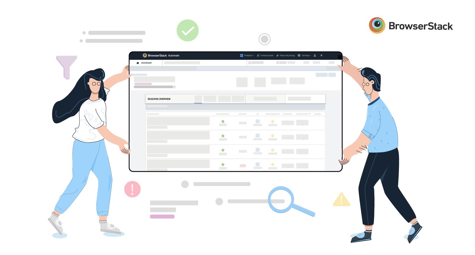
Our new redesigned dashboard for Automate and App Automate is now available to all users, in beta. It has been a wild ride, going from defining the key problems to be solved, to paper sketches, to design, engineering, testing and launch. We've added a host of new features from Search to Advanced filters and simplified Navigation, and we've re-built the backend and front-end to optimize for performance. You can try out the new dashboard here.
This post summarizes the process we followed to create the new dashboard.
Our goal
'Help developers build amazing experiences'. That is the core mission of every employee at BrowserStack. A big part of delivering an amazing experience is to release software which has (almost) no bugs and works seamlessly across different browsers and devices.
BrowserStack helps dev and QA teams deliver amazing experiences by providing a world-class test infrastructure of 2,000+ real mobile devices and browsers, enabling them to test their web and mobile apps using tools like Selenium, Cypress, Appium, Espresso, EarlGrey and XCUITest.
The Product team at BrowserStack is constantly looking for ways to help developers and QA engineers find and fix bugs quickly. The dashboard provides a unified, real-time view into every Build and Test and provides rich debugging information, including video recordings, screenshots, and text logs. Our goal with the dashboard redesign was to make it as simple as possible for QA teams to find and fix bugs quickly.
Our research process
"If you define the problem correctly, then you almost have the solution." -Steve Jobs
Before we began with the redesign, we wanted to first understand the key problems with the existing dashboard. Here's a (very) high-level summary of our research process:
- Analytics: We dug into product analytics to understand how customers were using our current dashboard. We looked at the most common paths taken by customers to debug a failed test, what information they used the most and how they navigated between tests and builds.
- Support tickets: We looked at thousands of support tickets across a 24-month window to understand what the most common pain points were.
- Feedback from Sales: Our Sales team, as part of their regular customer interactions, captures feedback around the product. We analyzed this feedback and identified common patterns.
- Customer interviews: We conducted over 20 detailed customer interviews, each lasting over 45 mins. These interviews allowed us to "look over the shoulder" of each customer as he/she used our dashboard, and capture qualitative feedback on the dashboard.
By pairing quantitative data with qualitative feedback, we were able to come up with some key insights and guiding principles for the new dashboard.
Key insights and guiding principles
We collated all of our findings and identified some key insights:
- Users are not able to quickly access information important to them.
- Users want to be able to personalize the dashboard.
- Users are not able to manipulate their tests from the dashboard.
- Users are not able to analyze their test results.
- The dashboard does not scale when users expand the number of tests they run in parallel.
These insights helped us develop the following guiding principles:
-
Ease of navigation
- Is the user able to get to the right project/build/session quickly?
- Is the user able to navigate between tests quickly?
-
Speed
- Does the information load quickly? (<=2s)
- Are interactions quick and smooth?
-
Visibility of information
- Is the relevant information presented to the user at the right time?
-
Scalability
- Does the dashboard scale to thousands of tests and hundreds of builds multiple times a day?
We used these principles to guide every decision. When we were unsure about adding a feature or changing a workflow, we asked ourselves if the change met our guiding principles.
From paper sketches to a working product
Over a period of 8 weeks, we went from paper sketches to wireframes to hi-fidelity designs, designing close to 100 different screens. A project of this size can quickly get out of control, both in terms of scope and timeline. Some of the practices we followed to ensure this didn’t happen include:
- Ruthless prioritization to ensure we didn’t have scope creep. Our timelines and our guiding principles simplified this process for us.
- Religious dogfooding across all teams at BrowserStack. At the end of every sprint, we would ship new features and screens to our internal developer and QA teams. As we used the new dashboard as part of our daily work, we were able to quickly spot issues and fix them.
- Gathering user feedback early with small groups of customers. Getting feedback from customers is the ultimate test for your product. We got feedback early and often from our customers by releasing our dashboard to small groups of customers.
Many frantic weeks later, we are excited to share with you the new dashboard for Automate and App Automate in beta.
What's new
We had one objective with the new dashboard—help users find and fix bugs quickly. With this as our north star, we developed several new features and workflows. Here are the highlights:
Optimized performance
- We put relentless focus on performance, to load every screen and complete every interaction in 1.5 seconds or less.
Search and Filter
- Global search: Search across projects, builds and sessions.
- Build and session search: Search for specific tests within a build or specific builds within a project.
- Build filters: Filter builds based on test framework (i.e. Appium, Espresso, etc.), User, Project, and Status.
- Session filters: Filter sessions based on test status (Pass/Fail), OS, browser, and device.
Debug easily with rich Build and Session details
- Build/Session overview: Get build/session status, the number of tests running and test status in a single view.
- Simplified log navigation: Jump to the top or bottom of your text logs in one click. Quickly turn on or off visual logs.
These are just some of the highlights of our new dashboard. The best way to experience the dashboard is to try it out—get started here.
I'd love your feedback! Feel free to email me at praveen@browsertack.com.
Happy Testing!