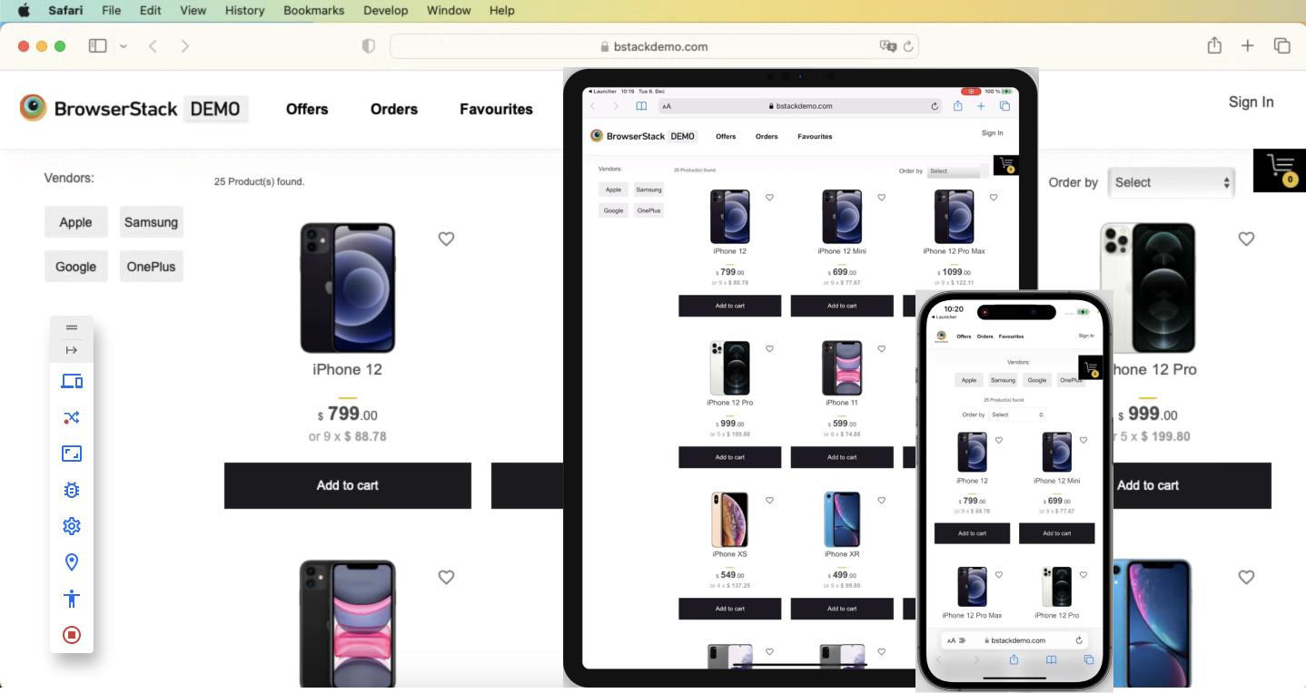
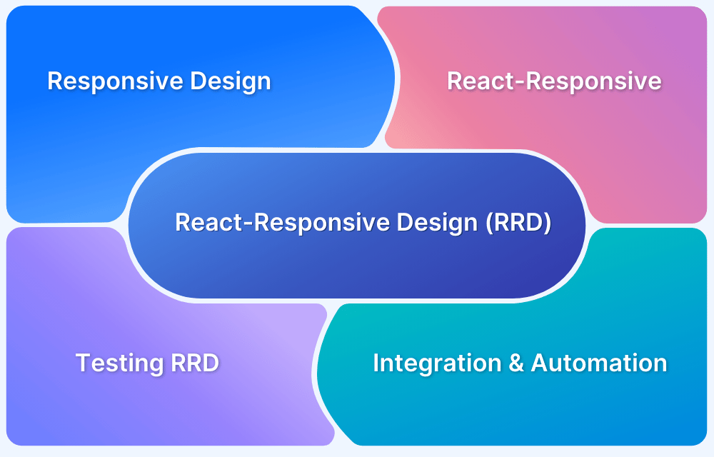
A responsive web application is designed to adapt its layout and functionality across different screen sizes to ensure a smooth and consistent user experience, no matter the device. Developers must actively plan and implement responsiveness within their React apps to ensure they perform well across all devices.
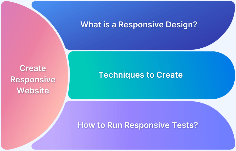
Overview
What is a Responsive Web Application?
A Responsive Web Application is a web app that automatically adjusts its layout, content, and functionality to provide a smooth and optimized experience across different devices and screen sizes.
Building Responsive Layout with CSS
- Using Media Queries
- With Responsive Grids
- Using Flexbox
This article explores key strategies, tools, and testing practices to help developers build truly responsive React applications.
Why focus on Responsiveness?
Responsive web design is an approach to web design that makes web pages render properly on a variety of devices and screen sizes. In other words, responsive design ensures that your web page looks great and works well no matter what device your users are viewing it on.
There are a few key things that go into a responsive design:
- Flexible layouts: A responsive layout is one that can adapt to any screen size. This means that your web page will look good on both large and small screens, and you won’t need to create separate versions for each.
- Media queries: Media queries are a CSS3 feature that allows you to specify different styles for different devices. This means that you can use different CSS rules for different devices, making your page more responsive.
- Flexible images and media: Another important aspect of responsive design is using flexible images and media. This means using assets that can scale to fit any screen size, and using media that can be played on both small and large screens.
- Responsive typography: When it comes to typography, it’s important to make sure that your fonts are legible and look good on all devices. This can be achieved by using responsive typography, which is a technique that allows you to use different font sizes for different devices.
- Good navigation: Navigation is one of the most important aspects of a website, and it needs to be easy to use on all devices. When creating a responsive website, it’s important to make sure that your navigation is clear and easy to use.
Responsive design is an important part of creating a website that works well on all devices. By using a responsive layout, media queries, and flexible images and media, you can create a website that looks great and is easy to use no matter what device your users are using.
Building Responsive Layout with CSS
By taking the time to learn about responsive design, you can ensure that your website looks great no matter what device it’s being viewed on.
All you need to do is make sure that your CSS is properly formatted and that your ReactJS code is written in a way that makes sense for responsive design. Formatting your CSS correctly is crucial for responsive design.
You need to make sure that your code is written in a way that will allow your website to resize and respond properly to different screen sizes. A good way to do this is to use the “reactive” design principle.
This principle states that your code should be written in a way that makes it easy to change and adapt the design of your website in response to different screen sizes. This way, you can easily change the way your website looks without having to rewrite your entire codebase.
CSS has been around for a long time and is well-supported by modern browsers. It allows you to create media queries that specify different styles for different screen sizes. Even if you’re new to web development, you can quickly get up to speed with the basics of CSS media queries and start creating responsive designs.
Here’s how you can build responsive layout with CSS:
1. Using Media Queries
Setting different styles for different screen sizes:
@media only screen and (min-width: 480px) {
/* styles for devices with a minimum screen width of 480px */
}

@media only screen and (max-width: 480px) {
/* styles for devices with a maximum screen width of 480px */
}
Hiding or showing elements based on the device’s capabilities:
@media only screen and (max-width: 480px) {
/* hide element on small screens */
.my-element {
display: none;
}
}

@media only screen and (min-width: 480px) and (max-width: 1024px) {
/* show element on medium-sized screens */
.my-element {
display: block;
}
}
Changing the layout of a page based on the orientation of the device:
@media only screen and (orientation: portrait) {
/* styles for portrait orientation */
}

@media only screen and (orientation: landscape) {
/* styles for landscape orientation */
}
2. Responsive Grids
CSS grid is a powerful layout tool that allows you to create responsive and flexible layouts for your websites. To use CSS grid, you first need to define a grid container on your page. This is typically done by setting the display property of an element to grid. For example:
.container {
display: grid;
}
Once you have defined a grid container, you can use CSS properties such as grid-template-columns and grid-template-rows to specify the number of columns and rows in your grid, and their sizes. For example:
.container {
display: grid;
grid-template-columns: repeat(3, 1fr);
grid-template-rows: 100px 200px;
}
This code will create a grid with three columns and two rows, with the first row having a height of 100 pixels and the second row having a height of 200 pixels. The ‘fr’ unit stands for “fraction” and indicates that each column should take up an equal amount of space in the container.
Once you have defined the structure of your grid, you can use CSS properties such as grid-column and grid-row to specify where each element in your grid should be placed. For example:
.item1 {
grid-column: 1 / 3;
grid-row: 1 / 2;
}

.item2 {
grid-column: 3;
grid-row: 1;
}

.item3 {
grid-column: 1;
grid-row: 2;
}
This code will place item1 in the first and second columns of the first row, item2 in the third column of the first row, and item3 in the first column of the second row.
CSS Subgrids allow you to create a grid within a grid. This is useful when you have a nested layout, where the child elements of a grid container should have a different grid structure than the parent container.
To create a nested grid system, you can use the ‘subgrid’ keyword in the grid-template-columns and grid-template-rows properties of the child element. For example:
.parent {
display: grid;
grid-template-columns: repeat(3, 1fr);
grid-template-rows: 100px 200px;
}

.child {
display: grid;
grid-template-columns: subgrid;
grid-template-rows: subgrid;
}
In this code, the child element will inherit the number of columns and rows, as well as their sizes, from the parent element. This allows you to create a nested grid structure without having to define the columns and rows of the child element explicitly.
To make your layout responsive, you can use media queries to change the grid structure at different screen sizes. For example:
@media (max-width: 768px) {
.container {
grid-template-columns: repeat(2, 1fr);
}
}
The kind of abstraction used for CSS3+ syntax provides advanced capabilities right out of the box. Additionally, because CSS is a widely-used technology, there is a wealth of online resources and tutorials available to help you along the way. Another advantage of using CSS for responsive design is that it allows you to have fine-grained control over your styles.
However, there are also some drawbacks to using CSS for responsive design.
- One of the biggest challenges is that it can be time-consuming and labor-intensive to write correct syntax for every possible screen size. This can make it difficult to create designs that are truly responsive, and you may end up with a design that doesn’t look great on certain devices.
- Also when working on a react project teams are using JSX to create modules and components with a standardized code base. If you want to make responsive design a part of your core logic and templating activity there is no clean way to achieve that with plain CSS.
Here we come to the community we talked about earlier and look for solutions in the many package extensions provided by NPM. React-responsive is one such package which is owned by Contra and has more than 50 contributors. This package allows you to declare various responsive media query big break points as variables that can be used with a layer of logic in your react components.
3. Flexbox
Flexbox (Flexible Box Layout) is a CSS layout model that helps align and distribute space among items in a single row or column. It’s ideal for creating responsive designs where elements need to adjust smoothly across different screen sizes.
Here’s a guide to using Flexbox for responsive layouts:
Step 1: Creating a Flexible Container
Start by making the parent container flexible. This activates Flexbox layout on all child elements of .flex-container.
.flex-container {

  display: flex;

}
Step 2: Allowing Items to Wrap
Enable wrapping so items don’t overflow on smaller screens. This ensures items move to the next line when space runs out.
.flex-container {

  display: flex;

  flex-wrap: wrap;

}
Step 3: Distributing Space Evenly:
You can control how items share available space:
.flex-container {

  justify-content: space-between;

}
Options include:
- flex-start: items align to the left
- center: items align in the center
- space-between: equal spacing between items
- space-around: equal spacing around items
Step 4: Making Items Flexible
Each item can grow, shrink, and have a base width:
.flex-item {

  flex: 1 1 200px;

}- 1 (grow): item can grow to fill space
- 1 (shrink): item can shrink if needed
- 200px: base size
Step 5: Aligning Items Vertically
You can align items vertically inside the container:
.flex-container {

  align-items: center;

}
Other values include flex-start, flex-end, and stretch.
Step 6: Combining with Media Queries
For full responsiveness, pair Flexbox with media queries. This switches the layout to a vertical stack on small screens.
@media only screen and (max-width: 600px) {

  .flex-container {

    flex-direction: column;

  }

}Responsive websites with React-Responsive
React-Responsive is a library that makes it easy to apply different styles to your React components based on the screen size. This is useful for creating responsive designs that automatically adjust to the size of the screen on which they are being viewed.
The library provides ways to wrap your existing React components and apply the appropriate styles based on the screen size. This can help you avoid having to manually write @media rules in your CSS, and makes it easy to create responsive designs without a lot of extra effort.
There are several advantages to using the React-Responsive library when developing websites with ReactJS:
- Simplified code: React-Responsive makes it easy to apply responsive styles to your components without having to write complex @media rules in your CSS. This can make your code more readable and easier to maintain.
- Consistency: By using the React-Responsive library, you can ensure that your responsive designs are consistent across all screen sizes. This can help you avoid having to write separate code for different screen sizes, which can save time and reduce the risk of errors.
- Reusability: The components provided by the React-Responsive library can be easily reused in different parts of your website, which can help you avoid having to duplicate code and make your designs more modular and flexible.
- Community support: React-Responsive is an established library that is widely used by the ReactJS community. This means that you can easily find help and support if you have any questions or encounter any problems when using the library.
Overall, using react-responsive is a great way to create responsive React apps. It makes the process of creating responsive layouts much easier and provides a great way to customize the look of your app for different screen sizes.
To use the react-responsive library, we first need to install it using npm.
npm install --save react-responsive
Once the library is installed, we can import it into our React component.
- Usage with Hooks:
import React from 'react'
import { useMediaQuery } from 'react-responsive'

const Example = () => {
const isDesktopOrLaptop = useMediaQuery({
query: '(min-width: 1224px)'
})
const isBigScreen = useMediaQuery({ query: '(min-width: 1824px)' })
const isTabletOrMobile = useMediaQuery({ query: '(max-width: 1224px)' })
const isPortrait = useMediaQuery({ query: '(orientation: portrait)' })
const isRetina = useMediaQuery({ query: '(min-resolution: 2dppx)' })

return <div>
<h1>Device Test!</h1>
{isDesktopOrLaptop && <p>You are a desktop or laptop</p>}
{isBigScreen && <p>You have a huge screen</p>}
{isTabletOrMobile && <p>You are a tablet or mobile phone</p>}
<p>Your are in {isPortrait ? 'portrait' : 'landscape'} orientation</p>
{isRetina && <p>You are retina</p>}
</div>
}
This React component uses the useMediaQuery hook to check the screen size and orientation of the user’s device. It then displays different messages based on the results of the media query checks.
For example, if the device has a minimum width of 1224px, it will display a message saying “You are a desktop or laptop”. If the device has a minimum resolution of 2dppx, it will display a message saying “You are retina”.
- Usage with components:
import MediaQuery from 'react-responsive'

const Example = () => (
<div>
<h1>Device Test!</h1>
<MediaQuery minWidth={1224}>
<p>You are a desktop or laptop</p>
<MediaQuery minWidth={1824}>
<p>You also have a huge screen</p>
</MediaQuery>
</MediaQuery>
<MediaQuery minResolution="2dppx">
{/* You can also use a function (render prop) as a child */}
{(matches) =>
matches
? <p>You are retina</p>
: <p>You are not retina</p>
}
</MediaQuery>
</div>
)
The code is importing the MediaQuery component from the “react-responsive” library. The Example function is using MediaQuery to check if the device has a minimum width of 1224 pixels and is retina, displaying a corresponding message for each condition.
If the minimum width is greater than or equal to 1824 pixels, an additional message will be displayed.
- Testing:
import { Context as ResponsiveContext } from 'react-responsive'
import { render } from '@testing-library/react'
import ProductsListing from './ProductsListing'

describe('ProductsListing', () => {
test('matches the snapshot', () => {
const { container: mobile } = render(
<ResponsiveContext.Provider value={{ width: 300 }}>
<ProductsListing />
</ResponsiveContext.Provider>
)
expect(mobile).toMatchSnapshot()

const { container: desktop } = render(
<ResponsiveContext.Provider value={{ width: 1000 }}>
<ProductsListing />
</ResponsiveContext.Provider>
)
expect(desktop).toMatchSnapshot()
})
})
This code is testing the “ProductsListing” component in a ReactJs application. It first imports the “Context” module from the “react-responsive” library, as well as the “render” function from the “@testing-library/react” library. It then imports the “ProductsListing” component from the local “./ProductsListing” file.
The code then defines a test for the “ProductsListing” component using the “describe” and “test” functions from the testing library. The test renders the “ProductsListing” component twice, once with a width of 300 (for mobile devices) and once with a width of 1000 (for desktop devices). It then checks if the rendered output matches the snapshot of the component.
For more details on features and updates read the official docs.
Responsive Layout with React Bootstrap
React Bootstrap makes it easy to build responsive layouts by combining Bootstrap’s grid system with reusable React components. Here’s a step-by-step way to create a responsive layout in your React app using React Bootstrap:
Step 1: Install React Bootstrap
Start by installing React Bootstrap and Bootstrap in your React project:
npm install react-bootstrap bootstrap
Then, import the Bootstrap CSS in your index.js or App.js file:
import 'bootstrap/dist/css/bootstrap.min.css';
Step 2: Import Grid Components
React Bootstrap uses Container, Row, and Col components to structure layouts.
import { Container, Row, Col } from 'react-bootstrap';Step 3: Create a Responsive Grid Layout
Now use the grid components to structure your layout:
<Container>

  <Row>

    <Col xs={12} md={6}>Left Column</Col>

    <Col xs={12} md={6}>Right Column</Col>

  </Row>

</Container>
where,
- xs={12}: Full width on extra-small screens
- md={6}: Half width on medium and larger screens
Step 4: Adjust Column Sizes for Different Screens
You can define different sizes for various breakpoints (sm, md, lg, xl):
<Col xs={12} sm={6} lg={4}>Box</Col>Step 5: Nest Rows and Columns for Complex Layouts
You can nest rows inside columns to create more advanced structures:
<Container>

  <Row>

    <Col md={8}>

      <Row>

        <Col>Nested 1</Col>

        <Col>Nested 2</Col>

      </Row>

    </Col>

    <Col md={4}>Sidebar</Col>

  </Row>

</Container>
Step 6: Add Responsive Spacing and Alignment
React Bootstrap supports Bootstrap’s spacing and alignment classes:
<Row className="justify-content-center my-4">

  <Col xs={10}>Centered Content with Margin</Col>

</Row>
where,
- justify-content-center: centers the columns
- my-4: adds vertical margin
Read More: How to make React Native App Responsive?
How to test responsive websites?
Testing the responsiveness of a website is crucial to ensure that it provides a good user experience on different devices and screen sizes. A responsive website should be able to adapt to the user’s device and provide easy navigation, readability, and functionality. Here are some best practices for properly testing the responsiveness of a website.
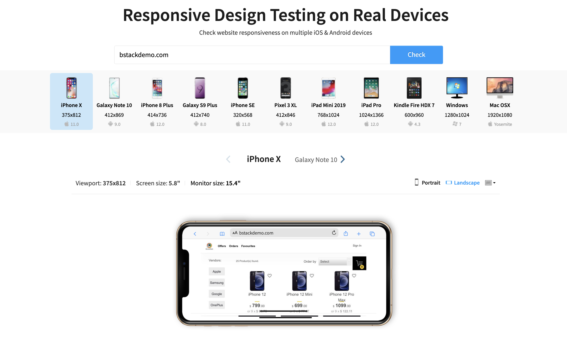
- Use a responsive design testing tool: One of the easiest and quickest ways to test the responsiveness of a website is by using a responsive design testing tool. These tools allow you to see how your website will look on different devices and screen sizes without actually having to physically access those devices.
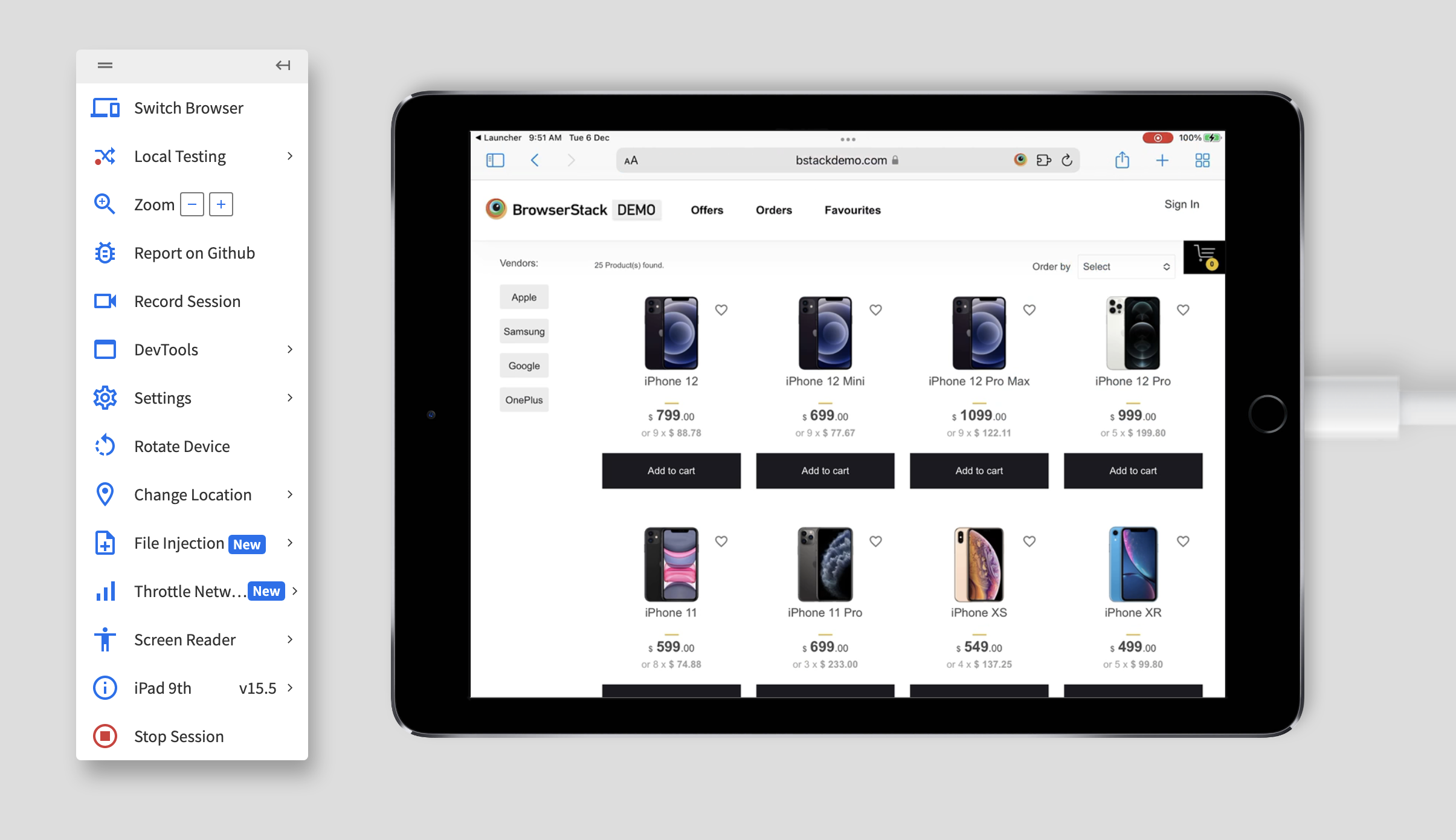
- Test on multiple devices and screen sizes: To ensure that your website is responsive on all devices, it is important to test it on a wide range of devices and screen sizes. This includes testing on both desktop and mobile devices, as well as a variety of screen sizes within each category. Some popular devices and screen sizes to test on include:
Desktop: 1366 x 768, 1920 x 1080, 2560 x 1440
Tablet: 768 x 1024, 1024 x 1366
Mobile: 360 x 640, 375 x 667, 412 x 732
- Check the website’s layout and design: One of the most important aspects of a responsive website is its layout and design. When testing the responsiveness of a website, make sure to check how the layout and design adapt to different screen sizes. Some key elements to check include:
The website’s navigation menu: Is it easy to access and use on all devices?
The website’s images: Do they scale properly on different devices?
The website’s text: Is it easy to read on all devices?
The website’s buttons and links: Are they easy to click on all devices?
- Test the website’s functionality: In addition to checking the website’s layout and design, it is also important to test its functionality on different devices. This includes testing all of the website’s features and making sure that they work properly on all devices. Some key elements to test include:
- Forms: Can users easily fill out and submit forms on all devices?
- Videos: Do videos play properly on all devices?
- Scrolling: Is the website’s content easy to scroll through on all devices?
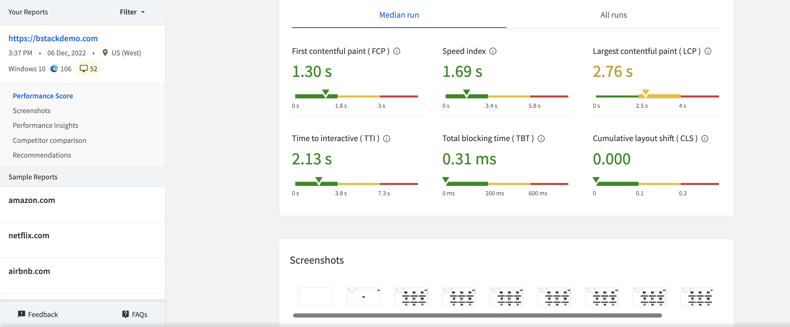
- Test the website’s performance: Another important aspect of a responsive website is its performance. When testing the responsiveness of a website, make sure to check its performance on different devices to ensure that it loads quickly and efficiently. Some key elements to test include:
- Page load time: How long does it take for the website to load on different devices?
- Server response time: How long does it take for the server to respond to requests on different devices?
Best Practices for Responsive Web Development
The internet is constantly evolving, and so is the way we access it. More and more people are using mobile devices to surf the web, and it’s important to make sure your website is optimized for these users.
Here are some best practices for creating responsive websites:
- Use a responsive design framework: Using a responsive design framework, such as Bootstrap or Foundation, can save a lot of time and effort when it comes to building a responsive website. These frameworks provide pre-designed, customizable components and grid systems that help ensure that your website’s layout and content adapts to different screen sizes.
Read More: Top Responsive CSS Frameworks
- Prioritize mobile-first design: With the majority of internet traffic coming from mobile devices, it’s important to prioritize mobile-first design. This means starting the design process with the smallest screen size in mind, and then working your way up to larger screen sizes. By doing this, you can ensure that the most important content is visible on mobile devices, and that the design scales up gracefully for larger screens.
- Use flexible grids and layouts: Flexible grids and layouts are essential for creating responsive websites. Instead of using fixed-width elements, such as pixels, use flexible units, such as percentages or ems, to create grid-based layouts that can adapt to different screen sizes.
- Use responsive images and videos: Responsive images and videos are essential for creating a seamless user experience on responsive websites. Instead of using fixed-width images and videos, use techniques such as srcset and the picture element to serve different versions of images and videos based on the screen size and resolution of the device.
Must Read: How to make images responsive and How to test Responsive Images
- Test, test, test: It’s important to test your responsive website on a variety of devices and browsers to ensure that it looks and functions as intended. Use online tools, such as Responsive Design Checker, to test your website’s responsiveness, and make sure to test on real devices as well.
By following these best practices, you can create a responsive website that provides a great user experience on any device. We encourage you to follow the links provided in this blog and learn more about responsive design.
Conclusion
Integrating React-Responsive into your React app allows you to easily create a flexible and user-friendly interface that adapts to various screen sizes. This ensures your app remains accessible and visually appealing to users, irrespective of the device used.
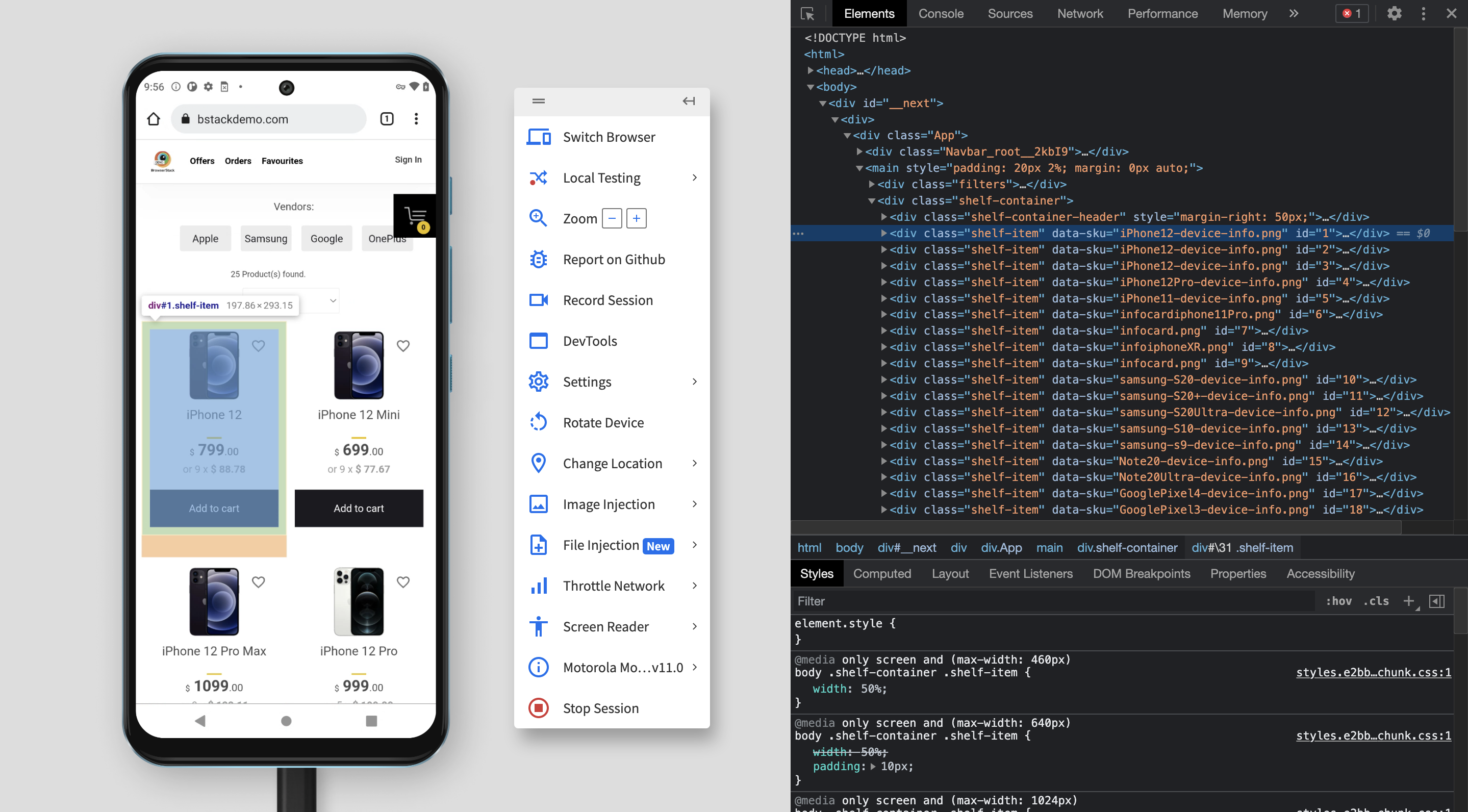
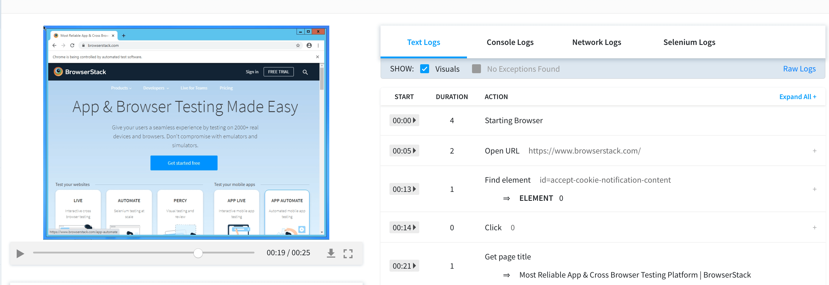
Testing responsiveness across real devices is key, and tools like BrowserStack enable you to run tests on various devices and browsers, ensuring your app works seamlessly in all environments.
Useful Resources for React
- React vs React Native: When to use which?
- React Testing: How to test React components?
- How to Debug React Code: Tools and Tips
- Top Testing Libraries for React
- Cypress vs React Testing Library
- How to use the react testing library debug method?
- Unit Testing of React Apps using JEST : Tutorial
- How to make React App Responsive using react-responsive?
- Storybook for React
- Implementing Lazy Loading in React
- How to test React Apps
- How to Run Cypress Tests for your Create-React-App Application
- How to Test React using Cypress
- Top React Component Libraries
- Angular vs React vs Vue: Core Differences
- Getting Started with Selenium and React
- How to use React-Responsive for Responsive Design?
- Vue vs React: Which is the Best Frontend Framework?

