With the rising use of mobile devices for web access, it became necessary for websites to adapt to different screen sizes and resolutions. Device Fragmentation has led to the emergence of responsive web design where, the websites are expected to work seamlessly across different devices for better user experience.
There are more than 4.88 billion smartphones in use and the number continues to grow. As the projected number of users in 2029 is at a whopping ~7 billion, the variety of screen sizes will also increase making responsive design crucial in the web development process.
More people are accessing the internet on their mobile devices as the Percentage of mobile device website traffic worldwide has reached 61.85% as of 2024. This trend is only expected to increase in the coming years.
With such a large percentage of website traffic coming from mobile devices, your website must be optimized for these users.
What is Responsive Design?
Responsive design is building a website to ensure it looks and functions well on any device, regardless of the OS, browser, screen size, or resolution. One of the main benefits of responsive web design is improved user experience.
Imagine trying to navigate a website on your smartphone that was designed for a desktop computer. The text would be too small to read, the buttons would be too close together, and you would have to constantly zoom in and out to access different parts of the site. This can frustrate users and may even lead them to leave your site.
On the other hand, a website designed responsively will automatically adjust to the size of the user’s device, making it easy to read and navigate. This leads to a better overall user experience and can increase the likelihood of conversions.
Benefits of a Responsive Design
Here are the core reasons why you should consider responsive design.
- Improved User Experience: Provides an optimized browsing experience across all devices, ensuring usability on desktops, tablets, and smartphones.
- Cost-Effective: Eliminates the need for separate mobile and desktop websites, reducing maintenance costs.
- SEO Benefits: Boosts search engine rankings as Google recommends responsive design for mobile-friendly sites.
- Increased Reach: Helps attract a wider audience by providing a seamless experience on various screen sizes and devices.
- Faster Load Times: Optimizes resources for different devices, improving page load speeds and user engagement.
- Future-Proof: Adapts to new devices and screen sizes without needing redesigns.
Read More: How to check Website Loading Time
Things to Consider in a Responsive Design
You should keep several technical and UX-based considerations in mind while planning a responsive web layout, including
- Performance: One of the most critical considerations is performance. Responsive layouts can require more resources, so optimizing your images and code is vital to ensure your site loads quickly.
- Navigation: Your site’s navigation should be easy to use on all devices. This may involve redesigning your menu to make it more mobile-friendly, or using a responsive navigation pattern like a hamburger menu.
- Content prioritization: When designing a responsive layout, you’ll need to consider the content most important to users on each device. You may need to rearrange your content to prioritize the most critical information on smaller screens.
- Text legibility: It’s essential to ensure that text is legible on all devices, which may involve adjusting font and line heights for different screen sizes.
- Image sizes: You’ll need to consider how images will look on different devices and may need to use different sizes for different screen sizes to ensure that they look good and don’t take up too much bandwidth.
In the following sections, we’ll learn about react-responsive design and how to implement it using the React-responsive library. Explore different techniques and best practices for react-responsive design.
What is React Responsive?
React Responsive is a React library that helps manage responsive design in React applications. It allows you to easily adapt your components based on the screen size or device characteristics by using media queries, making it easier to build responsive layouts.
Key Features of React Responsive includes:
- Conditional Rendering: It enables rendering different components based on the screen size or other media queries such as, mobile, tablet, desktop.
- Declarative API: Provides a simple and declarative API to define breakpoints and manage responsiveness within React components.
- Responsive Components: It allows you to create components that adapt to different screen sizes using MediaQuery or useMediaQuery hooks.
Using React with React-Responsive for Responsive Web Design
ReactJS is a JavaScript library for building user interfaces that have become very popular among web developers due to its many benefits.
- One of the main reasons for its popularity is its improved performance, as ReactJS allows developers to create web applications that are fast and efficient, as it only re-renders components that have changed rather than reloading the entire page.
- ReactJS allows developers to create reusable components that can be easily shared and reused throughout an application, saving time and effort when building complex applications.
- Its strong community of developers and widespread adoption by well-known companies such as Facebook, Instagram, and Airbnb have also contributed to its popularity.
- One way to use React for responsive web design is using the React-Responsive library.
- React-Responsive is a simple way to apply different styles based on the dimensions of the user’s device.
Pre-requisites of building React Responsive Website
To build a website with react responsive design, you first need to install react-responsive as a dependency in your project:
First, create a react project by accessing terminal in your desired folder and running:
npx create-react-app <my-app>
After project is created by CLI, you can go into the project directory:
cd <my-app>
You can install react-responsive package using:
npm install react-responsive –save
And launch the web app:
npm start
Once your project is up and running, you are ready to build a react responsive website.
Creating React Responsive Website: Example
For example, using the boilerplate react project to build a simple responsive webpage with adaptive navigation and content container implemented using react-responsive features.
To create react responsive website you need to change the following files:
./App.js
Import all required dependencies using the import statements at the top.
import React from 'react';

import { useMediaQuery } from 'react-responsive';

import MediaQuery from 'react-responsive'

import { DesktopNav, TabletNav, MobileNav } from './components';- The first line imports the core “react” library, which is used to build user interfaces with ReactJS.
- The second line imports the “useMediaQuery” hook from the “react-responsive” library, which allows the application to use media queries to determine the size of the user’s device.
- The third line imports the “MediaQuery” component from the “react-responsive” library, which displays different content based on the size of the user’s device.
- The fourth line imports three components from a file called “components.js” : “DesktopNav”, “TabletNav”, and “MobileNav”. These components are used to render different navigation elements based on the size of the user’s device.
const Container = ({children}) => {

  return (

    <section>

      {children}

    </section>

  );

};

const Navbar = ({children}) => {

  return (

    <nav>

     {children}

    </nav>

  );

};- This code defines two ReactJS components: “Container” and “Navbar“. Both of these components are functional components, which are defined as JavaScript functions that return a React element.
- The components take in a single prop called “children“, representing the content rendered within the component.
const ContentView = () => {

  return (

    <div class="body-cont">

       <div>

        <h1>Device Test!</h1>

        <MediaQuery minWidth={992}>

        <p>You are a desktop or laptop</p>

        </MediaQuery>

        <MediaQuery minWidth={768} maxWidth={991}>

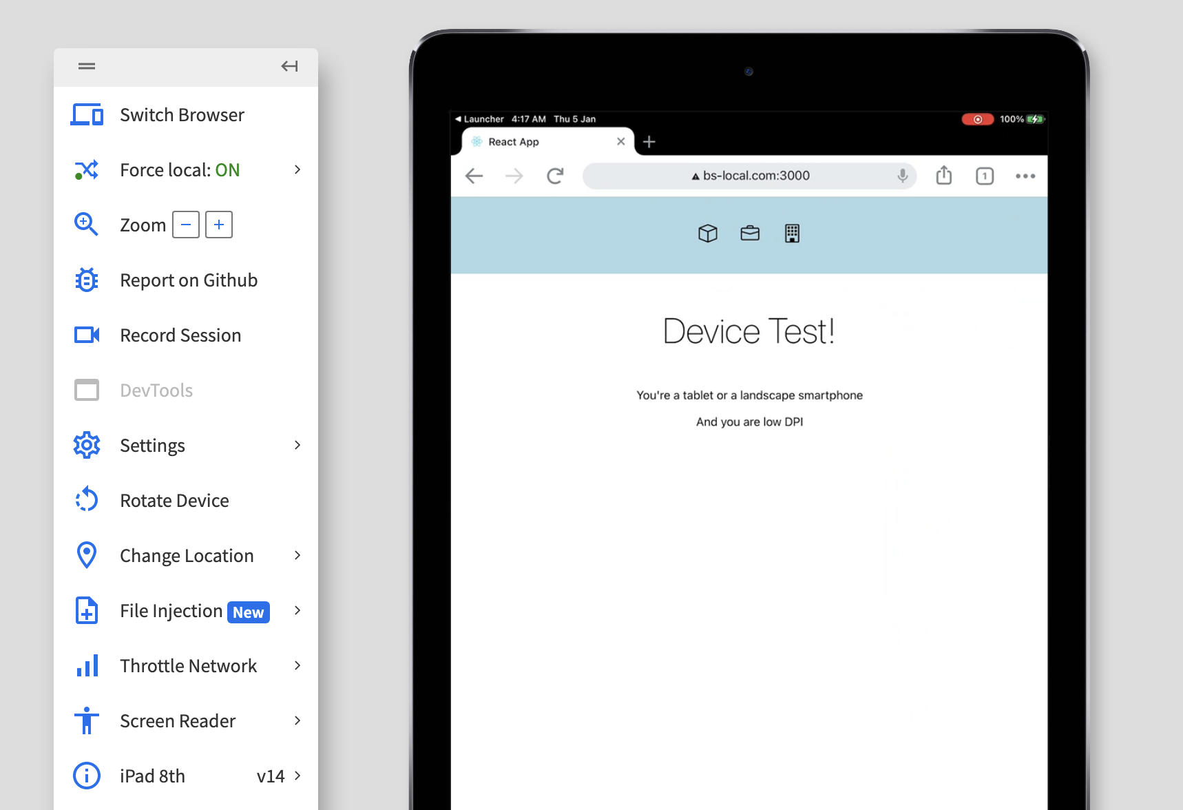
        <p>You're a tablet or a landscape smartphone</p>

        </MediaQuery>

        <MediaQuery maxWidth={767}>

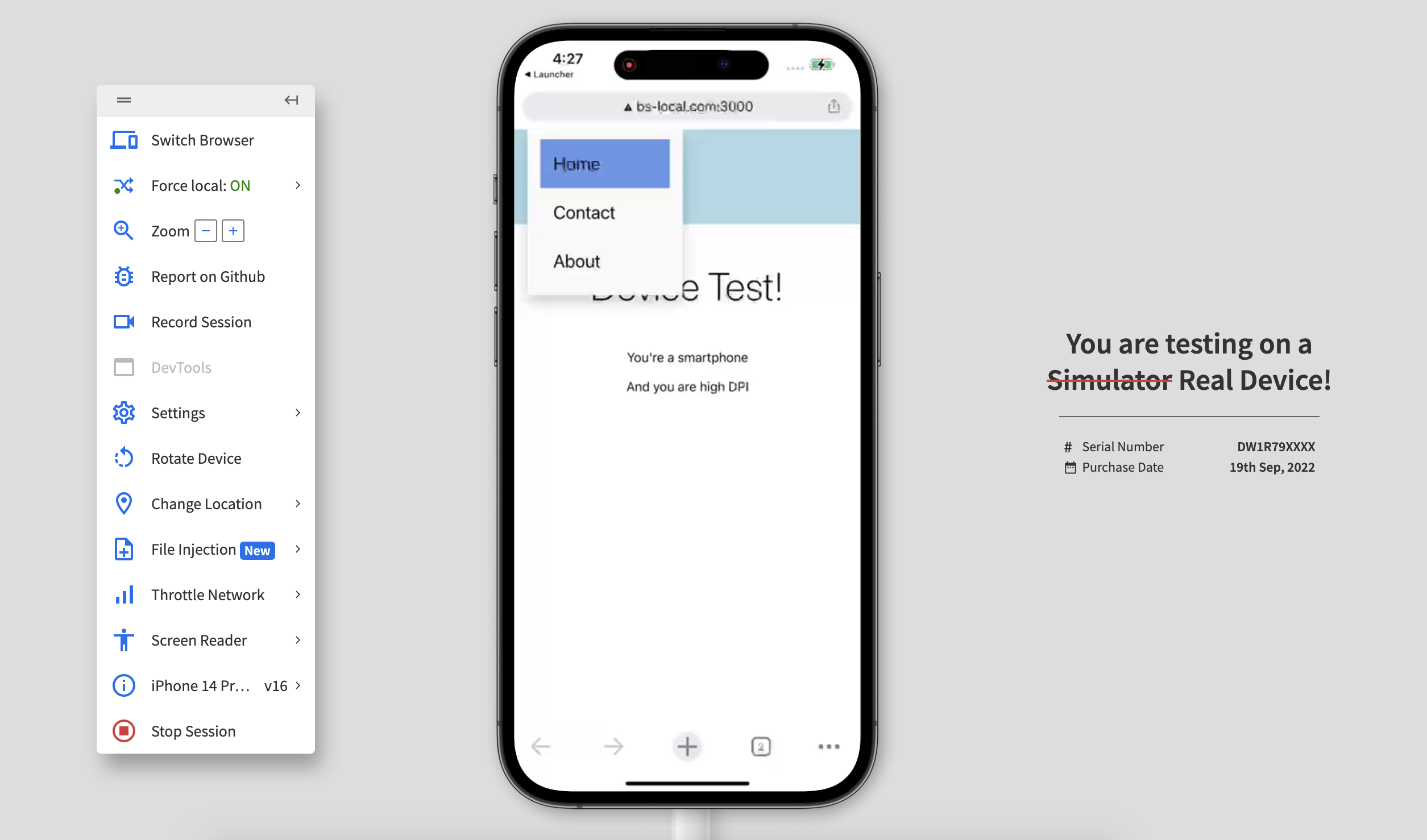
        <p>You're a smartphone</p>

        </MediaQuery>

        <MediaQuery minResolution="2dppx">

        {(matches) =>

            matches

            ? <p>And you are high DPI</p>

            : <p>And you are low DPI</p>

        }

        </MediaQuery>

       </div>

    </div>

  );

};- This code defines a ReactJS component called “ContentView”. A functional component returns a “div” element containing several nested elements.
- Within the “div” element, there is an “h1” element with the text “Device Test!” and four “MediaQuery” elements from the “react-responsive” library.
- Each “MediaQuery” element has a different set of criteria used to determine the size of the user’s device. Depending on which criteria are met, a different “p” element will be displayed with a message indicating the size of the user’s device.
- A “MediaQuery” element also uses the “minResolution” prop to determine whether the user’s device has a high or low DPI.
- If the device has a high DPI, a “p” element with the message “And you are high DPI” will be displayed. If the device has a low DPI, a “p” element with the message “And you are low DPI” will be displayed.
This is not the standard modality of using these features in a production project, but a concise way to demonstrate the various capabilities of the “react-responsive” library.
const App = () => {
const isDesktop = useMediaQuery({ minWidth: 992 });
const isTablet = useMediaQuery({ minWidth: 768, maxWidth: 991 });
const isMobile = useMediaQuery({ maxWidth: 767 });


return (
<Container>
<Navbar>
{isDesktop && <DesktopNav />}
{isTablet && <TabletNav />}
{isMobile && <MobileNav />}
</Navbar>
<Container>
<ContentView />
</Container>
</Container>
);
};


export default App;- This code defines a ReactJS component called “App“. It is a functional component that returns a “Container” element containing a “Navbar” element and a nested “Container” element.
- The “App” component begins by using the “useMediaQuery” hook from the “react-responsive” library to determine whether the user’s device is a desktop, tablet, or mobile device. It does this by defining three variables: “isDesktop“, “isTablet“, and “isMobile“.
- Each of these variables is set to the result of a media query that checks for a specific range of device sizes. The “App” component then returns a “Container” element that contains a “Navbar” element.
- Within the “Navbar” element, it uses the “isDesktop“, “isTablet“, and “isMobile” variables to determine which navigation element to render (either “DesktopNav“, “TabletNav“, or “MobileNav“).
- The “App” component also includes a nested “Container” element that contains a “ContentView” element. This element is used to display different content based on the size of the user’s device.
./Component.js
export function DesktopNav() {

    return(

        <nav class="desktop-nav">

            <a href="#">Home</a>

            <a href="#">About</a>

            <a href="#">Contact</a>

        </nav>

    );

}

export function TabletNav() {

    return(

        <nav class="tablet-nav">

            <a href="#">// SVG ICON</a>

            <a href="#">// SVG ICON</a>

            <a href="#">// SVG ICON</a>

        </nav>

    );

}

export function MobileNav() {

    return(

        <div class="dropdown">

        <span>// SVG ICON </span>

        <div class="dropdown-content">

            <a href="#">Home</a>

            <a href="#">Contact</a>

            <a href="#">About</a>

        </div>

        </div>

    );

}- This code defines three ReactJS components: “DesktopNav”, “TabletNav”, and “MobileNav”. Each of these components is a functional component that returns a different navigation element.
- The “DesktopNav” component returns a “nav” element with three “a” elements that represent links to different pages.
- The “TabletNav” component returns a “nav” element with three “a” elements that contain SVG icons representing links to different pages.
- The “MobileNav” component returns a “div” element with a “span” element containing an SVG icon and a nested “div” element containing three “a” elements that represent links to different pages.
- This “div” element is styled with a “dropdown” class and the nested “div” element is styled with a “dropdown-content” class, which are likely used to create a dropdown menu for mobile devices.
All of these components are exported, which means they can be used in other parts of the application.
./App.css
To add some minimal styling to our components we are using the following CSS by adding it into the App.css file:
.body-cont {

  display: flex;

  justify-content: center;

  align-items: center;

}

.body-cont h1{

  font-weight: 200;

  font-size: 3rem;

}

.body-cont div {

  text-align: center;

}

.desktop-nav {

  display: flex;

  justify-content: center;

  align-items: center;

  min-height: 10vh;

  font-size: 1.4rem;

  background-color: lightblue;

  }

  .desktop-nav a {

  color: black;

  text-decoration: none;

  padding: 1rem;

  }

  .desktop-nav a:hover {

  background-color: cornflowerblue;

  }

  .tablet-nav {

    display: flex;

    justify-content: center;

    align-items: center;

    min-height: 10vh;

    font-size: 1.4rem;

    background-color: lightblue;

  }

  .tablet-nav a {

    color: black;

    font-size: 1em;

    text-decoration: none;

    padding: 1rem;

  }

  .tablet-nav a:hover {

    background-color: cornflowerblue;

  }

  .dropdown {

    display: flex;

    justify-content: left;

    align-items: center;

    min-height: 10vh;

    font-size: 1.4rem;

    padding: 1rem;

    background-color: lightblue;

  }

  .dropdown-content {

    display: none;

    position: absolute;

    top: 0px;

    background-color: #f9f9f9;

    min-width: 160px;

    box-shadow: 0px 8px 16px 0px rgba(0,0,0,0.2);

    padding: 12px 16px;

    z-index: 1;

  }

  .dropdown-content a {

    color: black;

    display: block;

    font-size: 1em;

    text-decoration: none;

    padding: 1rem;

  }

  .dropdown-content a:hover {

    background-color: cornflowerblue;

  }

  .dropdown:hover .dropdown-content {

    display: block;

  }
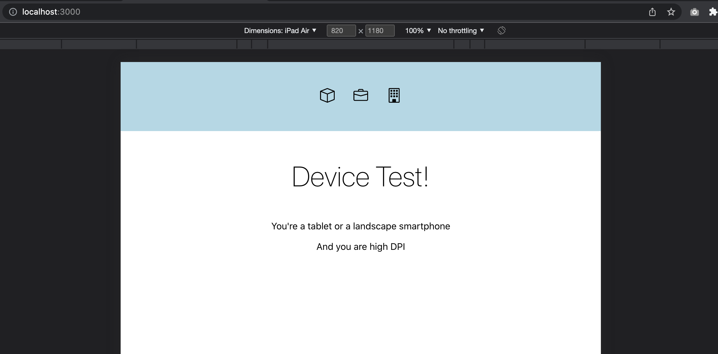
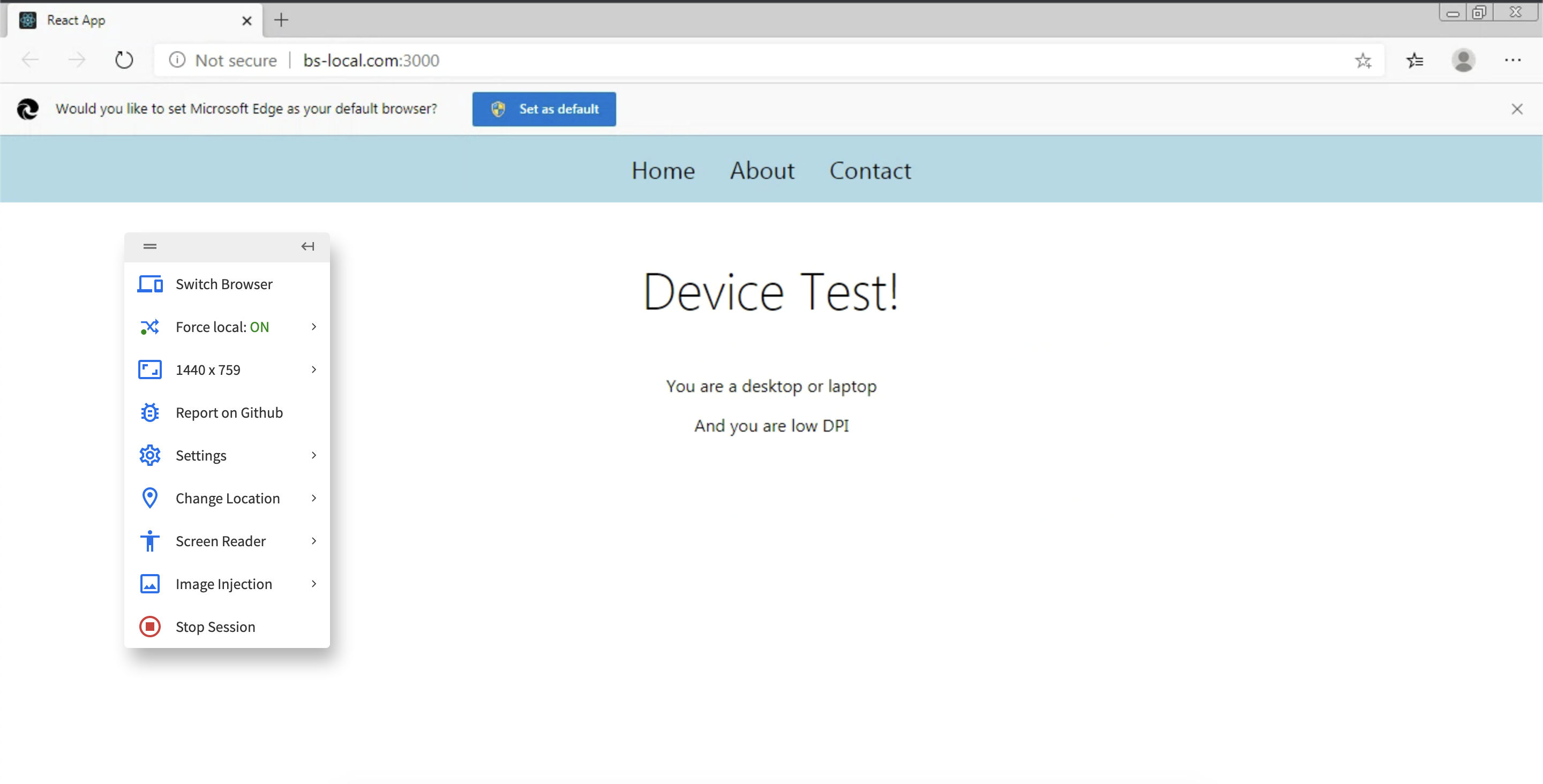
So upon running the above described code we get this on desktop resolution :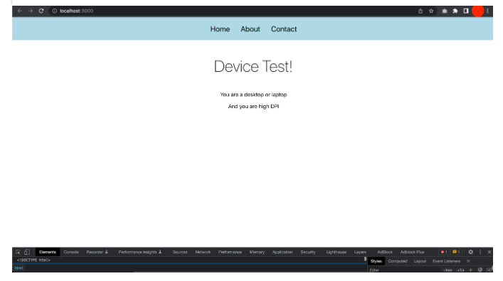
Testing React-Responsive Design
Ensuring a React-Responsive website looks and functions well on various devices is crucial for providing a good user experience. Here are some ways you can test the responsive design of your website:
- Resize your browser window: One of the simplest ways to test a website’s responsive design is to resize the browser window and see how the layout adjusts to different sizes. This is especially useful for checking how the site looks on different desktop resolutions.
- Use developer tools: Most modern browsers have built-in developer tools that allow you to simulate different devices and view the website as it would appear on those devices. This is a quick and easy way to see how the site looks on different screen sizes and orientations.
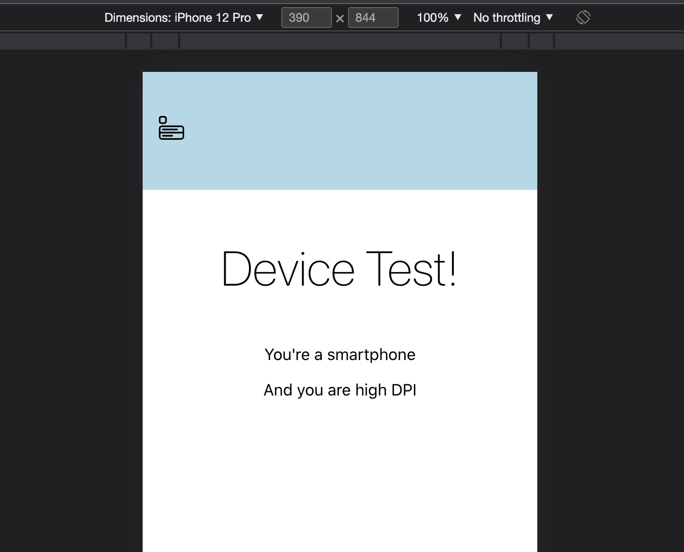
Chrome provides the inbuilt ability to change screen resolution, and our app adapts successfully!
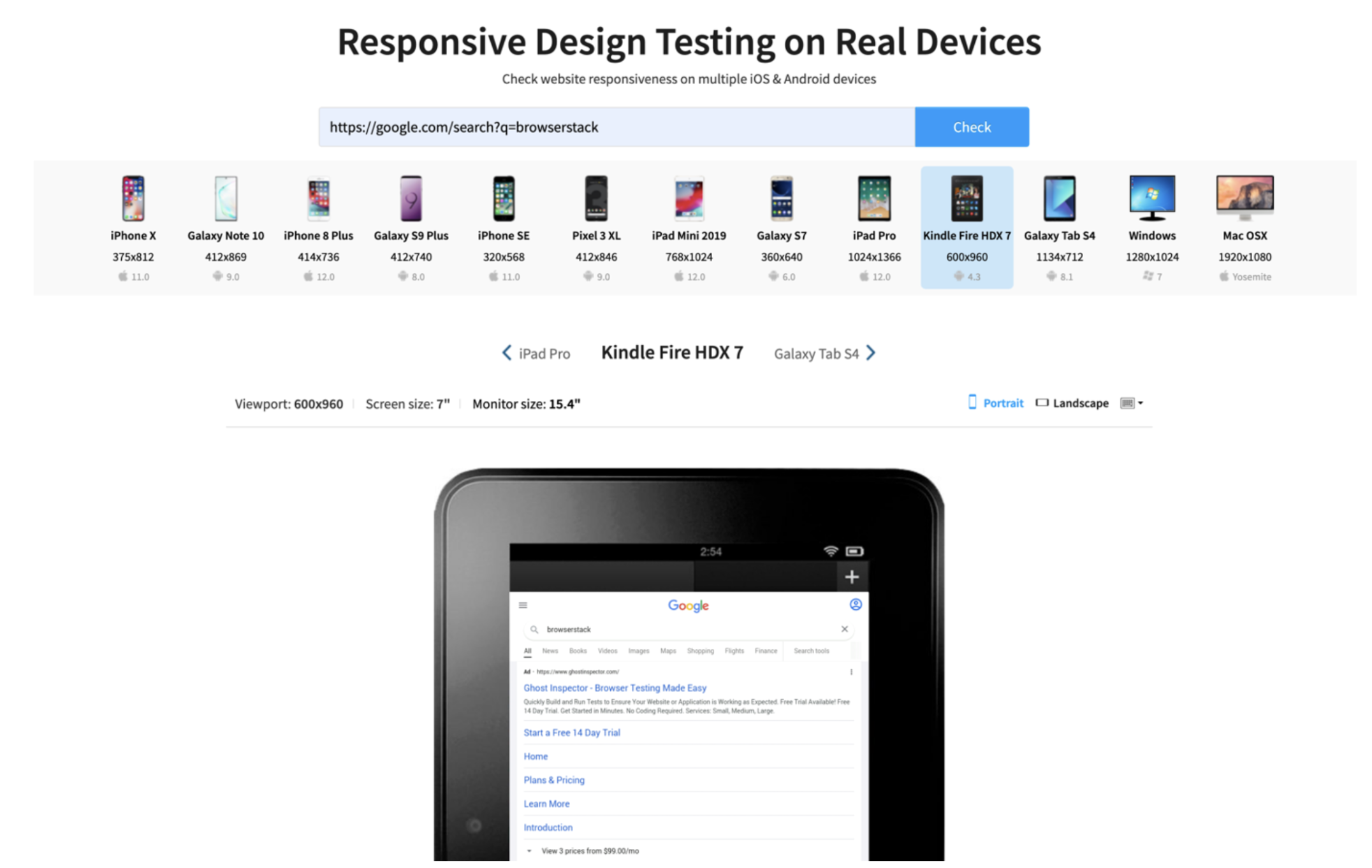
- Use online tools: Responsive is an online tool that allows you to enter the URL of your website and see how it looks on a variety of devices. It is very useful for getting a quick, high-level overview of how the site looks on different devices.
- Test on actual devices: While online tools and developer tools are useful for getting a general idea of how the site looks on different devices, there’s no substitute for testing on actual devices.
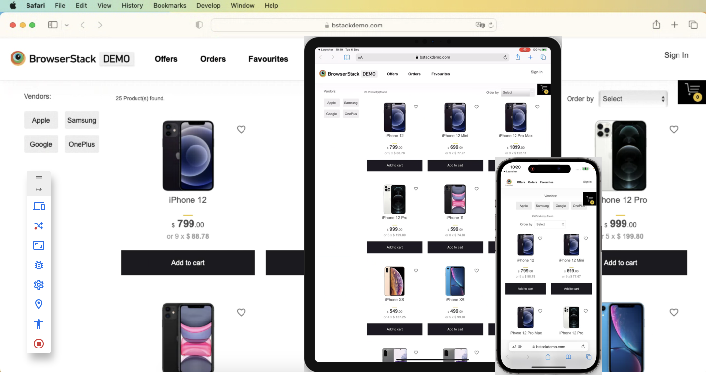
It’s a good idea to test the site on a variety of devices, including smartphones, tablets, and laptops, and this is where the BrowserStack real device cloud plays a crucial role.
BrowserStack offers features like Live and Automate that are particularly useful for testing responsive design.
To get started, follow these steps:
1. Sign up for a BrowserStack account
2. Install the BrowserStack Local binary: The BrowserStack Local binary is a tool that allows you to test your website on a local development environment.
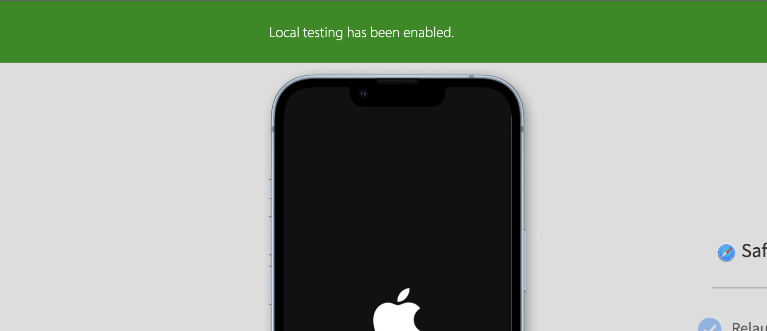
3. Connect to a device or browser: Once you’ve installed the Local binary, you can use the Live or Automate tools to connect to a variety of real devices and browsers.
4. Use powerful Live features like geolocation, timezone, network throttle, and much more
5. Test directly from the browser, collaborate with your team on the cloud
Build robust test infrastructure including legacy OS and browser versions
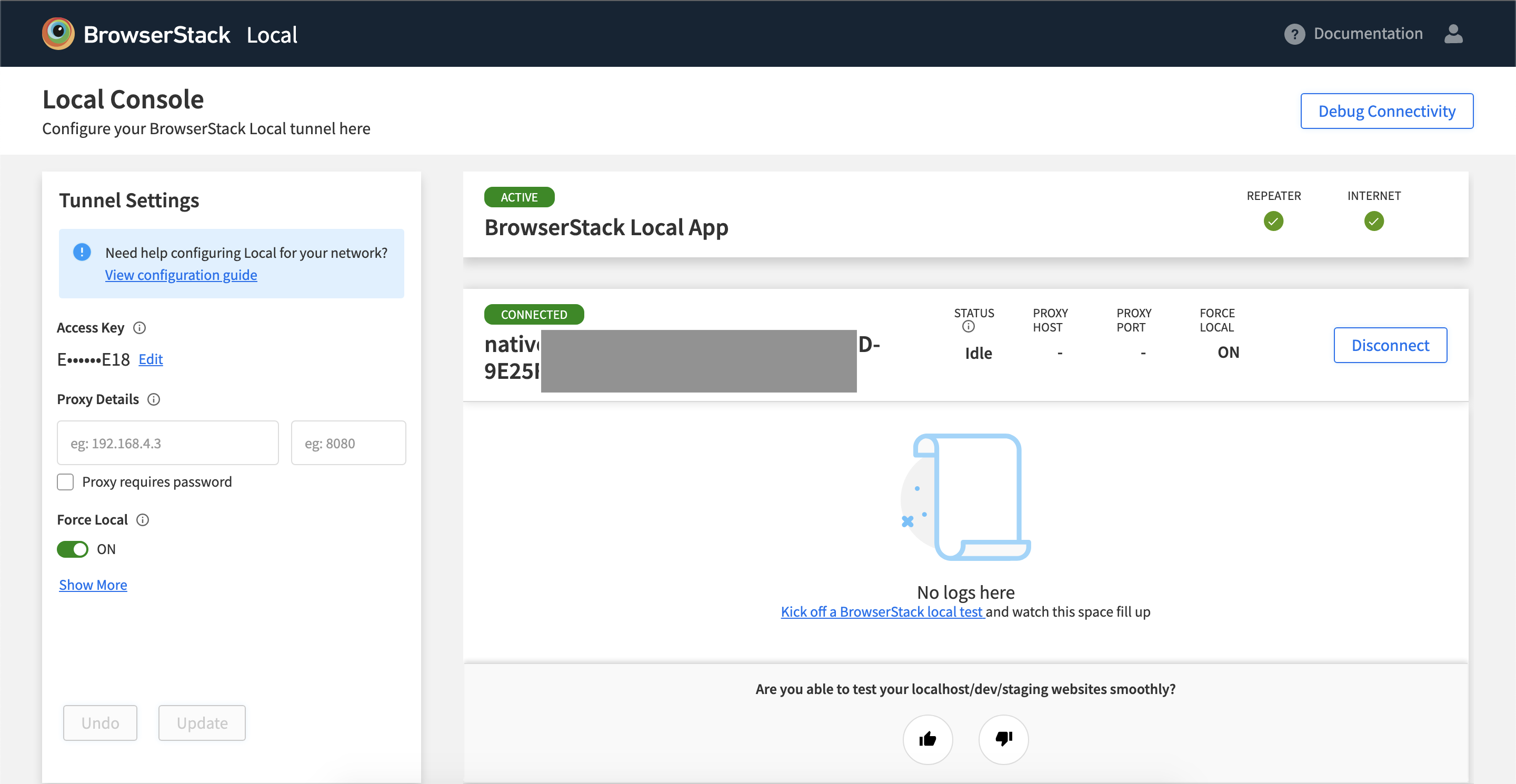
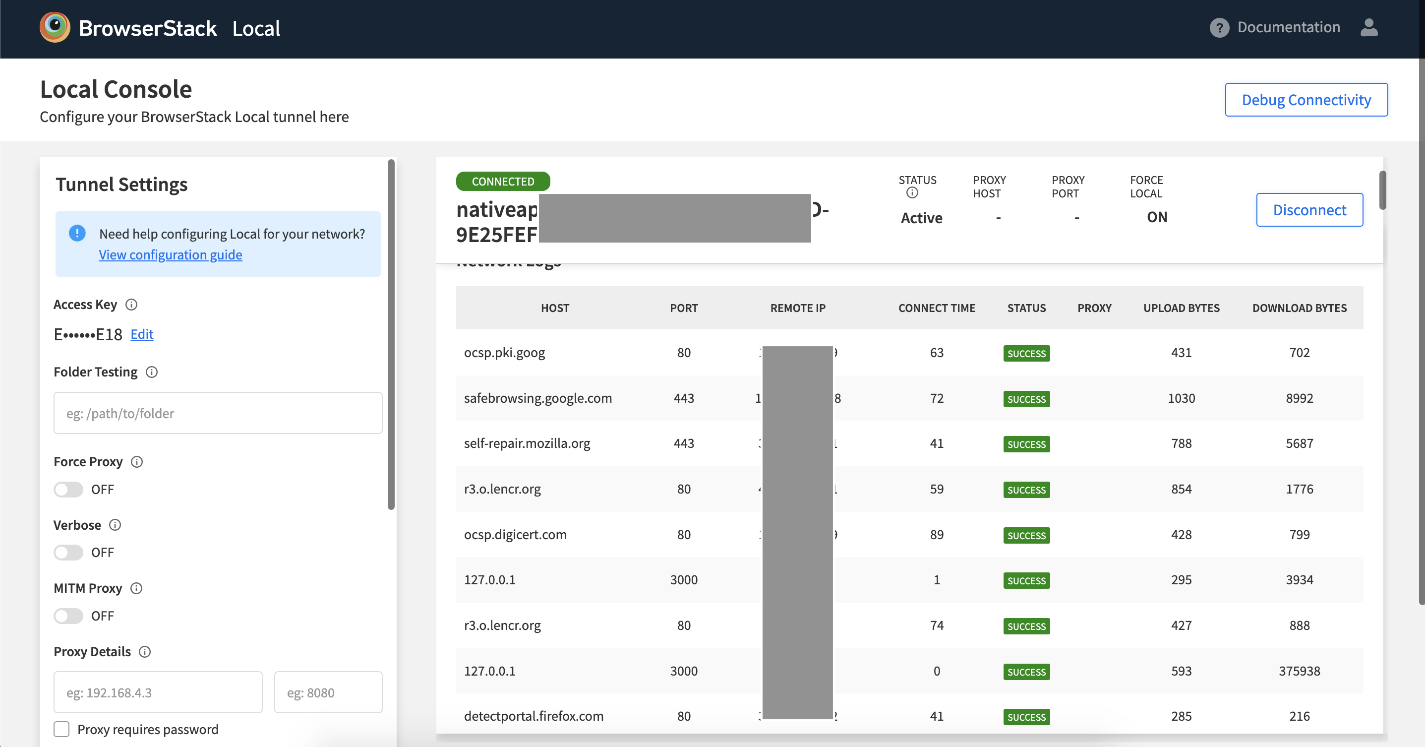
During testing if you need more controls you can use the local console for adjustments, also when you successfully execute tests they will be logged in the local console.
Integrating and Automating your Testing Process
After successful manual validation, you might want to work on integrating and automating your testing process.
Automate is a tool for running automated tests on your website. With Automate, you can write test scripts in a variety of languages and run them on a variety of devices and browsers.
This is a great way to ensure that your react responsive website is functioning properly on all supported devices supercharged with your favorite automation tool, all accessible remotely to you and your team through our hybrid cloud technology.
In addition to the Live and Automate features mentioned above, access a variety of other powerful tools and features for testing and development:
- Bug tracking: Your software testing reports need not be filled with boring text descriptions, with our stack you can record video, take screenshots in between tests, get app logs, device logs and share seamlessly with your team.
- CICD Integration: BrowserStack integrates with a variety of continuous integration and delivery (CI/CD) platforms, including Jenkins, CircleCI, and GitHub Actions. This allows you to automate your testing process and ensure that your website is always tested on the latest code.
- Team Management: With BrowserStack, you can easily manage and collaborate with your team. You can invite team members, set permissions, and track activity conveniently.
- Multiple source plugs: Test from your local development setup, to the final production URLs, all on the same tool stack without any confusion.
- Debugging Tools: BrowserStack provides a variety of debugging tools, including the ability to take screenshots, record videos, and inspect the HTML and CSS of your website.
You can take advantage of these and other powerful features to streamline your testing and development process and ensure that your website is of the highest quality.
Conlcusion
By using tools like React and React-Responsive, you can easily create flexible, universal layouts that adjust to the size and orientation of the user’s device.
Remember that testing the react-responsive design of your website is important and BrowserStack is an industry-leading platform that truly streamlines your manual and automation testing efforts.

