Cypress remains one of the top web automation tools in 2025, with an adoption rate estimated between 16–20% worldwide, especially among JavaScript-centric teams and frontend-focused projects.
However, with so many options available, it can be overwhelming to choose the right CSS framework for your projects.
Overview
Top 7 CSS Frameworks for Website Developers and Designers:
- Bootstrap
- Tailwind CSS
- Foundation
- Bulma
- Skeleton
- UIkit
- Milligram
This guide helps you choose the right framework to save you time, improve your workflow, and help you build responsive, high-quality websites.
What are CSS Frameworks?
In essence, a CSS framework comprises several CSS stylesheets ready for use by web developers and designers. The stylesheets are prepped for standard web design functions: setting colors, layout, fonts, navbars, etc. Generally, stylesheets are supported and expanded by other scripting technologies like SASS and JavaScript.
With a CSS framework, the user has a completed CSS stylesheet, and they only have to code the HTML with accurate classes, structure, and IDs to set up a web page. The framework already has classes built-in for common website elements – footer, slider, navigation bar, hamburger menu, column-based layouts, etc.
Advantages of using CSS Frameworks
Here are some key advantages of using CSS frameworks in web development:
- Developers and designers can use CSS frameworks to implement various advanced features and visual elements on a website – forms, different buttons, navbars, breadcrumbs, and even clean symmetrical layouts.
- CSS frameworks make creating websites compatible with multiple browsers and browser versions simple. This reduces the likelihood of bugs popping up during cross browser testing.
- Since these frameworks have ready-to-use stylesheets, using them allows faster and more convenient web development. Users don’t have to dive deep into CSS code to accomplish required tasks.
- Developers can quickly generate a user-friendly and visually appealing UI that can be modified throughout a project without starting from scratch.
Bonus: Effortlessly convert Rem to Px and Px to Rem for responsive web design with our free tools.
Top 7 CSS Frameworks for Website Developers and Designers in 2025
Here’s a list of the top 7 CSS frameworks that help developers and designers build responsive, scalable, and user-friendly websites with ease
1. Bootstrap
Developed by Jacob Thornton and Mark Otto at Twitter to promote consistency across internal tools, Bootstrap is an open-source framework containing CSS and JavaScript-based templates for interface components.
Bootstrap is known for popularizing the focus on responsive design among web developers. It promoted the now-ubiquitous concept of mobile-first and provided the right tools for its easy implementation. It did so by introducing a grid – partitioning the screen into columns (invisible to the end user’s eye).
With Bootstrap, developers don’t have to build separate projects around adjusting a site for smaller screen sizes. They must incorporate the necessary Bootstrap classes, and the design adjusts itself.
Why Choose Bootstrap?
- Massive Ecosystem: Among front-end frameworks, Bootstrap’s ecosystem is unmatched. It offers a vast library of layouts, themes, UI elements, panels, modals, buttons, alerts, cards, etc., that devs and designers can choose from and implement. Additionally, Bootstrap is backed by best-in-industry community support.
- Accelerated prototyping: Using Bootstrap, designers can write their HTML code, include the relevant CSS classes, and achieve website responsiveness. They don’t have to spend time adjusting for browser incompatibility, CSS positioning, and the like.
- Twitter Support: Unsurprisingly, when a significant commercial player backs an open-source project, users can be assured that it is here to stay and carries high confidence among people who know the industry. The fact that Bootstrap grew out of, and is backed by Twitter, establishes its efficacy.
- Supports SASS and LESS: Although most developers don’t use LESS, significant projects rely on it. SASS support is also highly desirable. Not too many CSS frameworks other than Bootstrap support both.
Example:
html
<link href="https://cdn.jsdelivr.net/npm/bootstrap@5.3.0/dist/css/bootstrap.min.css" rel="stylesheet">


<div class="container">

  <h2>Bootstrap Example</h2>

  <p>This container is responsive using Bootstrap.</p>

</div>
2. Tailwind CSS
Tailwind CSS’s official documentation describes it as a “utility-first CSS framework” with classes equipped to build custom UI designs directly in the users’ markup. It is handy to implement inline styling to rustle up a stunning UI without writing any CSS.
Why Choose Tailwind CSS?
- Highly Customizable: Offers easy configuration to customize styles, themes, and layouts as per project needs.
- Utility-First Approach: Provides a large set of ready-to-use utility classes for faster and cleaner development.
- Optimized with PurgeCSS: Helps reduce CSS file size by automatically removing unused styles.
- Mobile-First Responsive Design: Supports mobile-first approach with built-in responsive utilities for seamless layouts.
Example:
Html
<script src="https://cdn.tailwindcss.com"></script>


<div class="max-w-md mx-auto p-4 bg-gray-100">

  <h2 class="text-xl font-bold">Tailwind CSS Example</h2>

  <p class="text-gray-700">This container is responsive using Tailwind CSS.</p>

</div>
Read More: What are CSS and Media Query Breakpoints?
3. Foundation
The foundation provides a grid, HTML, SASS, and CSS UI elements, templates, and code that covers navigation, buttons, typography, forms, etc. It also comprises optional functionalities offered by JavaScript extensions.
Formerly managed by ZURB, Foundation is open-source project volunteers have run since 2019. It also operates with a mobile-first approach and is particularly useful for building large web apps requiring a design host.
Why Choose Foundation?
- Massive toolkit: Foundation offers more than a CSS framework requires. Its extensive, modular collection of tools helps solve issues for most front-end developers. For example, it offers separate framework elements for websites and emails; each prepped for functioning in those domains. It also provides a command-line interface (CLI), handy for devs working with module bundlers like Webpack.
- Greater Flexibility: Foundation is built to offer front-end devs complete control over their UIs. For example, it doesn’t force devs to use a particular style or language. This makes it a preferred tool for a much wider range of developers.
- UI components and beyond: Along with offering the standard UI components, Foundation also has a responsive image system, a pricing table, responsive embeds, form validation, right-to-left support, and much more. This gives web developers a lot more to play with.
- Training Options: ZURB offers multiple training courses and consulting options for Foundation, which is especially helpful for companies that want to work on big projects and pay for it.
Example:
Html
<link rel="stylesheet" href="https://cdn.jsdelivr.net/npm/foundation-sites@6.7.5/dist/css/foundation.min.css">


<div class="grid-container">

  <h2>Foundation Example</h2>

  <p>This container is responsive using Foundation.</p>

</div>
4. Bulma
Bulma is an open-source, responsive CSS framework based on Flexbox. It has an impressive range of built-in features that facilitate faster turnaround and minimal CSS coding by hand. It implements tiles to create Metro-style grids, resulting in smooth page layouts. Additionally, users can import only the elements they will use, simplifying the process even further.
Since Bulma’s source code is free for download, users can extend its functionality as they see fit. It provides a no-nonsense, CSS-only methodology (no JavaScript components) and visually appealing defaults to get started with.
Bulma has been highly adopted within the Laravel community, which has helped with its increasing popularity.
Why Choose Bulma?
- Easy to use: Bulma’s modular design approach and highly customizable nature make it a preferred tool among devs and designers.
- Easy to learn: Bulma’s modular nature is meant to solve practical problems that individual developers may encounter. Bulma is designed to be easily navigable, and individuals can quickly figure out how it works.
- Browser-Agnostic: Bulma-designed websites are compatible with most major browsers. This makes life easier for testers, especially when conducting cross browser testing.
- Robust Update Schedule: Bulma might be new on the scene, but new features are constantly added. Additionally, updates are implemented to address existing bugs or issues users may be dealing with.
Example:
Html
<link rel="stylesheet" href="https://cdn.jsdelivr.net/npm/bulma@0.9.4/css/bulma.min.css">


<div class="container">

  <h2 class="title">Bulma Example</h2>

  <p>This container is responsive using Bulma.</p>

</div>
Read More: How to Create Browser-Specific CSS Code
5. Skeleton
Skeleton doesn’t even call itself a CSS framework but a “dead simple, responsive boilerplate.” Its minimalism is beyond question: it has only 400 lines of source code!
This lightweight tool is built to create CSS elements compatible with both larger screens and mobile devices. It contains all standard components for responsive design and splits the page into multiple 12-column grids with a maximum width of 960px – something that fits small, medium, and large screens. Of course, if required, the max-width can be changed with a single line of CSS code. The syntax is quick to implement, simple, and makes putting together responsive design a relatively effortless task.
Why Choose Skeleton?
- Lightweight and therefore easy to store, manage and handle.
- Built with a mobile-first approach, the tool is perfect for designers to get started with.
- With only the essential components and HTML elements (including Grid support, Skeleton is the perfect tool for supporting small projects.
- Since it comprises basic CSS building blocks and components, it is easy to learn and implement, even for beginners.
Example:
Html
<link rel="stylesheet" href="https://cdnjs.cloudflare.com/ajax/libs/skeleton/2.0.4/skeleton.min.css">


<div class="container">

  <h2>Skeleton Example</h2>

  <p>This container is responsive using Skeleton.</p>

</div>
6. UIkit
UIkit is a lightweight and modular front-end framework designed to enable rapid and seamless web interface development. It is built with a clear focus on simplicity and customizability, providing a comprehensive collection of easy-to-use components.
UIkit has carved a niche for itself by focusing on modularity and flexibility. Developers can pick and choose components they need, resulting in faster page load times and optimized performance. UIkit’s approach to minimalism does not just apply to its lightweight nature but also reflects in its clean and intuitive API.
Why Choose UIkit?
- Modular Architecture: UIkit allows developers to integrate only the components they need, helping to keep CSS and JavaScript footprint minimal.
- Customization-friendly: It offers extensive customization options through LESS and SASS, making it highly adaptable to specific design needs.
- Robust Documentation and Community: UIkit benefits from strong documentation and community support, which makes it easy for new developers to start using it and for experienced ones to find solutions.
- Focus on Performance: Designed to be performant and efficient, UIkit is ideal for projects where speed and responsiveness are critical.
Example:
Html
<link rel="stylesheet" href="https://cdn.jsdelivr.net/npm/uikit@3.16.3/dist/css/uikit.min.css">

<script src="https://cdn.jsdelivr.net/npm/uikit@3.16.3/dist/js/uikit.min.js"></script>


<div class="uk-container">

  <h2>UIkit Example</h2>

  <p>This container is responsive using UIkit.</p>

</div>
7. Milligram
Milligram is a minimalist CSS framework designed for better performance and higher productivity with fewer properties to reset. It provides a clean starting point for those who want to design with a lightweight framework that doesn’t impose many design choices.
Milligram excels in projects that demand high performance with minimal overhead. It’s particularly useful for developers looking for a no-frills, straightforward framework that integrates smoothly without the complexities of larger frameworks.
Why Choose Milligram?
- Lean and Fast: Milligram is incredibly lightweight (only 2kb gzipped), making it one of the fastest frameworks to load and execute.
- Focus on Essentials: Provides just the essentials to style a website efficiently without bloating your project with excessive design choices.
- Flexibility: Since it’s highly unopinionated, Milligram can be easily integrated with other frameworks or libraries to extend its capabilities.
- Great for Small Projects: Ideal for small projects or as a starting point for more complex designs that require a solid, simple foundation without much initial styling.
Example:
Html
<link rel="stylesheet" href="https://cdnjs.cloudflare.com/ajax/libs/milligram/1.4.1/milligram.min.css">


<div class="container">

  <h2>Milligram Example</h2>

  <p>This container is responsive using Milligram.</p>

</div>
Criteria for Evaluating CSS Frameworks
Evaluating and comparing multiple frameworks based on your specific requirements is essential before deciding. When evaluating and choosing the best CSS framework, you can consider the following criteria:
- Features and Components: Assess the framework’s offerings in pre-designed components, responsive grid systems, typography, icons, form elements, and other UI elements. Look for a comprehensive range of features that align with your project requirements.
- Customizability: Evaluate the framework’s flexibility and ease of customization. Consider whether it allows you to easily modify styles, colors, and layouts without compromising maintainability.
- Responsiveness: Verify the framework’s robust support for creating responsive web designs. Look for features like responsive grids, breakpoints, and utility classes that simplify building responsive layouts.
- Performance: Consider the impact of the framework on website performance. Look for frameworks prioritizing optimized CSS and minimizing file size, reducing page load times for improved user experience.
- Browser Compatibility: Ensure the framework supports major web browsers and their versions. Compatibility with older browsers may be necessary, depending on your target audience.
Cross Browser Compatibility of CSS Frameworks
Cross-browser compatibility is crucial because it ensures that a website looks and functions consistently across different web browsers. This is important for providing all users with a reliable experience, regardless of the browser — whether legacy or new ones they use, which can vary widely in terms of rendering and supported features.
To enhance your cross-browser testing and ensure consistent results, expert advice can help guide your strategy.
Get Expert QA Guidance Today
Schedule a call with BrowserStack QA specialists to discuss your testing challenges, automation strategies, and tool integrations. Gain actionable insights tailored to your projects and ensure faster, more reliable software delivery.
Which CSS frameworks show the most browser compatibility?
Most CSS frameworks, especially Bootstrap, Foundation, and Bulma are engineered to support cross-browser compatibility, providing pre-written styles and components that ensure consistent and responsive behavior across various browsers. They often include CSS resets to normalize styles across different environments.
Best Practices for Cross Browser Compatibility using a CSS Framework
For better cross browser compatibility when using a CSS framework, consider these best practices:
- Testing: Regularly test your website across different browsers and devices, possibly using tools like BrowserStack.
- Progressive Enhancement: Build your site’s foundation on semantic HTML and incrementally add CSS for additional design and functionality, ensuring basic functionality in less capable browsers.
- Vendor Prefixes: Include necessary vendor prefixes for CSS properties that require them, as these help maintain compatibility with older browsers.
- Polyfills: Implement polyfills to emulate modern CSS features in browsers that lack native support.
- While CSS frameworks provide a solid base for browser compatibility, achieving comprehensive compatibility across all browsers may require extra measures and diligent testing.
- Gradient Color on DIVs: Apply standard CSS gradients with vendor prefixes for consistent rendering across all major browsers like Internet Explorer, Chrome, Firefox, Safari, and Opera.
- Border-Radius: The border-radius property is supported universally by modern browsers such as Mozilla Firefox, Google Chrome, Safari, and Opera, enabling smooth, rounded corners.
- Background Image for Select Tags in Chrome: Overriding default styles allows customizing <select> tags with background images in Chrome, though additional adjustments may be required for broader browser support.
Compatibility of different CSS features/methods
Understanding the compatibility of different CSS features and methods is essential to ensure your website works seamlessly across all browsers and devices.
CSS Grid
The CSS Grid feature facilitates content layout by allowing authors to structure the available space into columns and rows using a grid system.
The CSS Grid feature is compatible with the latest devices and major browsers.
- Chrome: Enable through the “Experimental Web Platform features” flag at chrome://flags.
- Internet Explorer: Partial support, adhering to an older version of the specification.
- Firefox: Activate using the layout.css.grid.enabled flag in settings.
- Known Issues: There are several bugs related to overflow in Firefox, identified by their tracking numbers (1356820, 1348857, 1350925).

CSS Nesting
CSS nesting allows for one style rule to be embedded within another, where the child rule’s selector is defined relative to its parent’s selector. This functionality, which previously necessitated a CSS pre-processor, is now directly supported in CSS.

The CSS nesting feature is compatible with the latest devices and major browsers. Specifics include:
- General Availability: Accessible behind the “Experimental Web Platform features” flag.
- Firefox: Can be enabled via the layout.css.nesting.enabled flag.
- Limitations: Chromium does not support nesting of type (element) selectors unless they start with a symbol, such as the ‘&’ nesting selector. This is a known issue in Chromium.
How to test Browser Compatibility of CSS using BrowserStack Live?
To perform manual cross-browser testing, BrowserStack Live allows users to check their website’s functionality. Users can also observe site performance and rendering under real user conditions on popular browsers like Chrome, Firefox, Edge, Safari, Yandex, Opera, and IE using BrowserStack Live.
Importantly, testing is conducted on actual desktop and mobile devices, not emulators, ensuring that the web application operates reliably in real user conditions.
Steps for Manual Cross-Browser Testing Using BrowserStack Live:
Step 1: Sign up for a BrowserStack account.
Step 2: Go to BrowserStack Live.
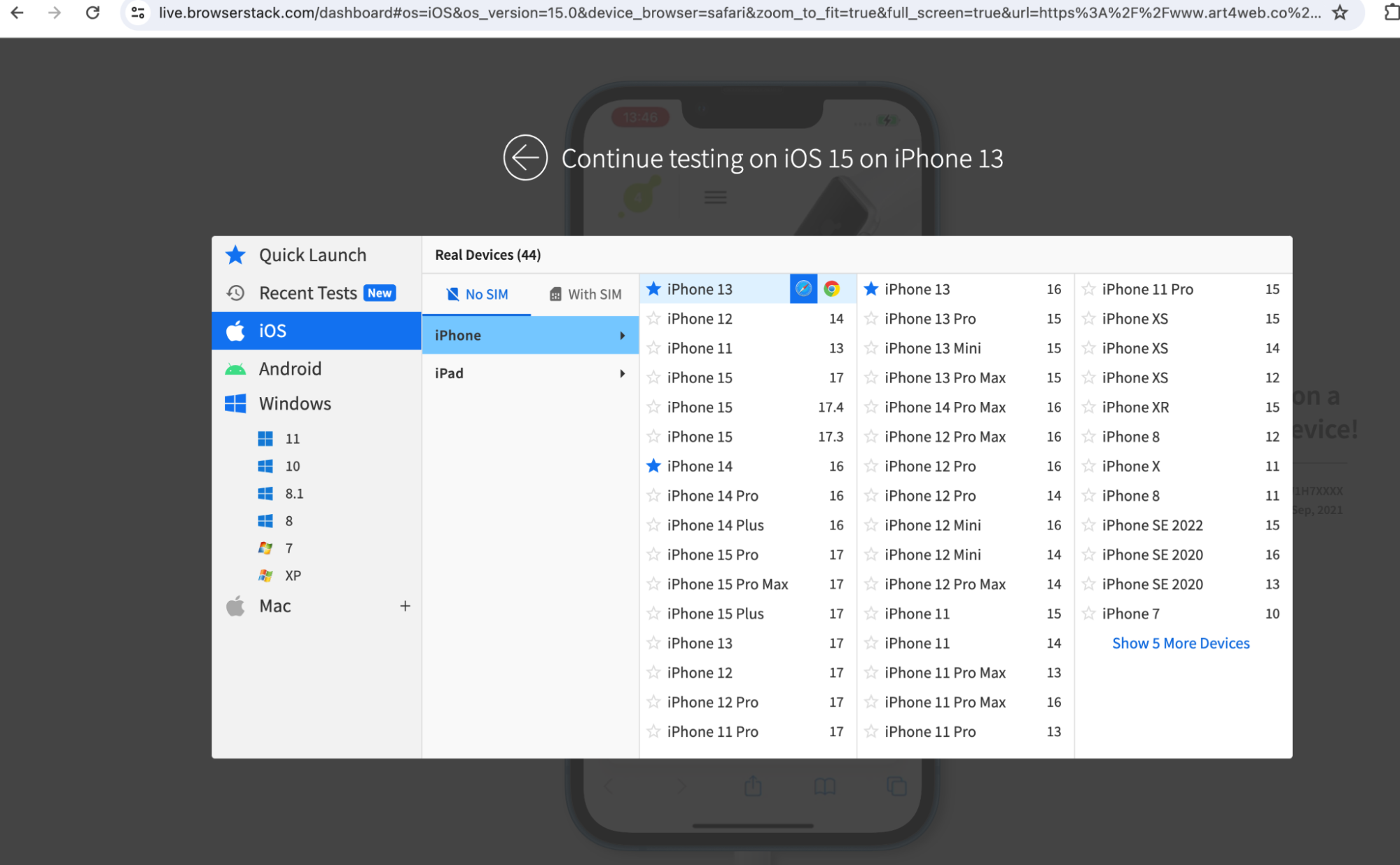
Step 3: Choose the OS and version for the preferred real device on which you want to test. For example, select an iPhone 13 mobile with iOS.

Step 4: Select a browser for testing your website. In this example, use the latest version of Chrome to test the CSS-designed website.

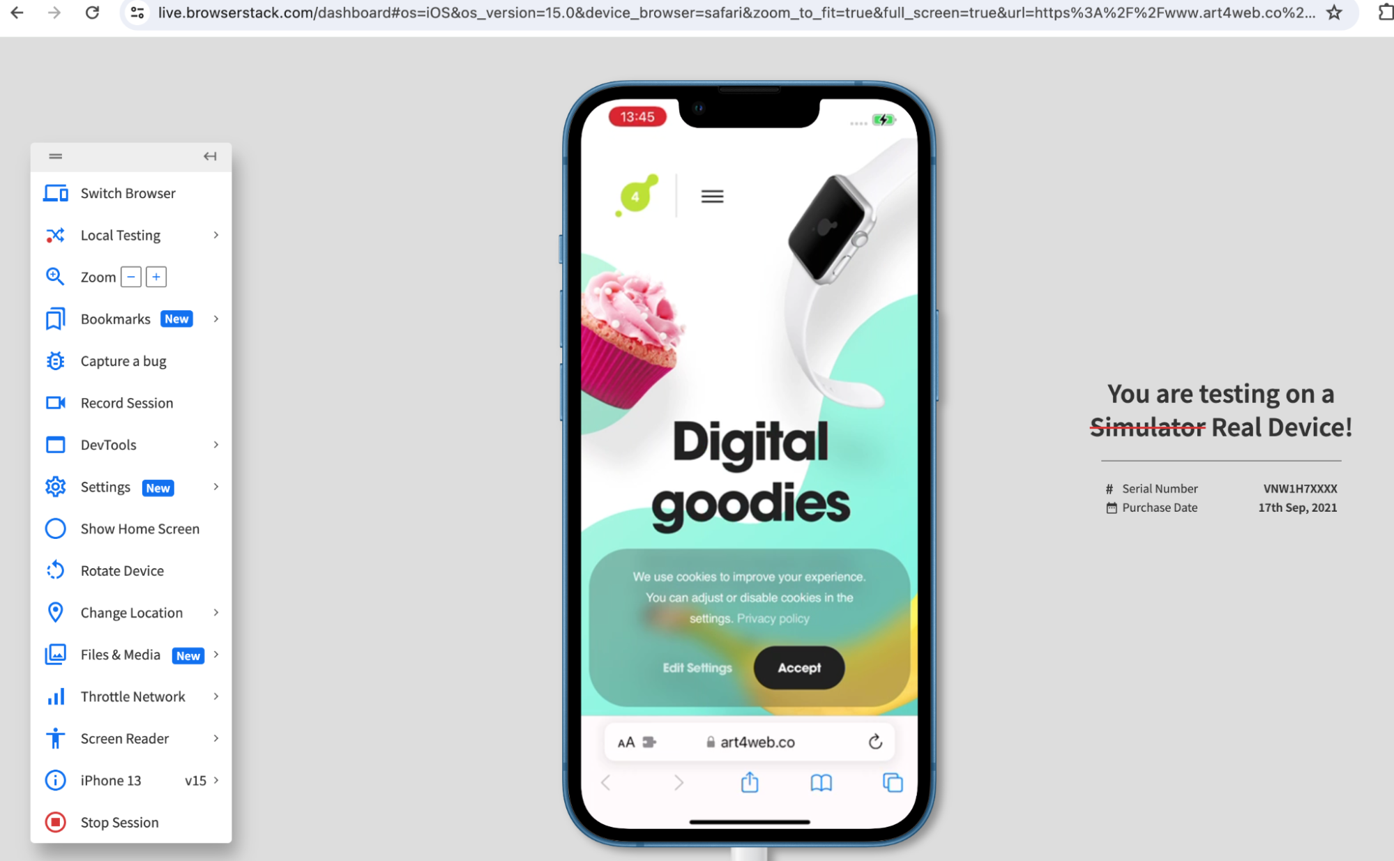
Step 5: Modify settings. BrowserStack Live lets users adjust location, settings, and screen size to simulate real user conditions, ensuring the website functions properly and remains well-organized for most users.
Step 6: Test under varied network conditions. Simulate a poor internet connection by throttling the network speed to see how the website performs under these constraints.
Step 7: Test the website across multiple browser and device combinations. After making corrections, retest on those same devices to ensure that no new issues have arisen.
Why Test CSS Websites on Real Devices Using BrowserStack?
Emulators and simulators do not offer the real user conditions that website or an application must run within, making the results of any tests run on them inaccurate. Consider testing on a real device cloud like Browserstack, which offers the latest to legacy devices, browsers, and OS versions.
It offers the following advantages:
- Comprehensive Device Support: Provides access to a wide range of devices, including the latest and legacy models from Apple (iPhones, iPads) and Android (OnePlus, Google, Samsung, Huawei).
- Browser Variety: Supports various mobile browsers like Chrome, Safari, Firefox, and Opera in their latest versions.
- Network Throttling: Enables simulation of different network conditions to assess web page performance across varying internet speeds.
- Developer Tools: Offers instant access to developer tools for detailed inspection and debugging of web elements.
- Geo-location Testing: Allows for testing location-specific website results and functionalities.
- Automated Screenshots: Automatically captures screenshots during tests to document website behavior for further review and analysis.
- Session Recording: Enables QA teams to record testing sessions, highlighting specific behaviors for detailed review and sharing with development teams.
- Tool Integrations: Integrates smoothly with essential tools for bug reporting and continuous integration/delivery, including Jira, Trello, Slack, Jenkins, and Maven.
Conclusion
CSS grid frameworks are essential in web developers’ and designers’ toolkits. For any project to run smoothly, devs must choose a framework that they are comfortable operating and one equipped with all features to fulfill project requirements. Naturally, research into and comparison between different leading frameworks is of utmost importance before making a choice.
However, no matter which framework is chosen, all websites must be tested on real browsers and devices. Emulators and simulators do not offer the real user conditions that software must run within, making the results of any tests run on them inaccurate. Consider testing websites and apps on a real device cloud, preferably one that offers the latest devices, browsers, and OS versions. This applies to both manual testing and automation testing.
- BrowserStack’s real device cloud provides 2000+ real browsers and devices for instant, on-demand testing.
- It also provides a cloud Selenium grid for automated testing, which can be accelerated by 10X with parallel testing.
- The cloud also provides integrations with popular CI/CD tools such as Jira, Jenkins, TeamCity, Travis CI, and more.
- Additionally, in-built debugging tools let testers identify and resolve bugs immediately.
- BrowserStack also facilitates Cypress testing on 30+ browser versions with instant, hassle-free parallelization.


