With the widespread use of smartphones, tablets, and mobile browsers, users now access websites and applications across various devices. However, what may appear perfectly functional on one screen could be misaligned or perform unexpectedly on another. This is where mobile compatibility testing becomes essential.
Overview
Mobile compatibility testing is the process of evaluating how well a website or application functions across various mobile devices, browsers, and operating systems. This helps deliver consistent performance and user experience regardless of the device used.
Key Aspects of Mobile Compatibility Testing
- Device Diversity: Test across a range of mobile devices, screen sizes, and resolutions to ensure consistent display and functionality.
- Operating System Compatibility: Verify performance across different operating systems, such as Android, iOS, and others.
- Browser Compatibility: Check how the website or app functions on various mobile browsers, including Chrome, Safari, and Firefox.
- Responsive Design: Ensure the design adapts seamlessly to different screen orientations (portrait/landscape) and resolutions.
- Network Conditions: Test under varying network speeds (e.g., 4G, 3G, Wi-Fi) to assess performance with different connectivity levels.
- Forward Compatibility: Ensure the application or website remains compatible with future devices, browsers, and operating systems.
Benefits of Mobile Compatibility Testing:
- Improved User Experience: Ensures seamless interactions across devices, leading to higher satisfaction.
- Reduced Bounce Rates: Identifies and resolves issues that could cause users to leave the site or app.
- Enhanced Brand Reputation: Shows a commitment to providing an accessible and consistent experience.
- Increased Conversion Rates: Optimizes site performance for mobile users, encouraging more successful transactions.
This article explores the essentials of mobile compatibility testing, covering its types, key devices, importance, challenges, and best practices for ensuring optimal performance across different device-browser-OS combinations.
What is Mobile Compatibility Testing?
Mobile compatibility testing ensures that the software application works as expected across different browsers, operating systems, mobile devices, networks, and hardware. It focuses on verifying that all elements of the site or app, such as layout, functionality, and user experience, are consistent and optimized for different screen sizes, resolutions, and mobile environments.
The goal is of this testing is to ensure that users can interact with the website or application without encountering issues, regardless of their device or browser. This includes testing responsiveness, load times, and proper functionality across a range of mobile platforms to maintain a high-quality experience for all users.
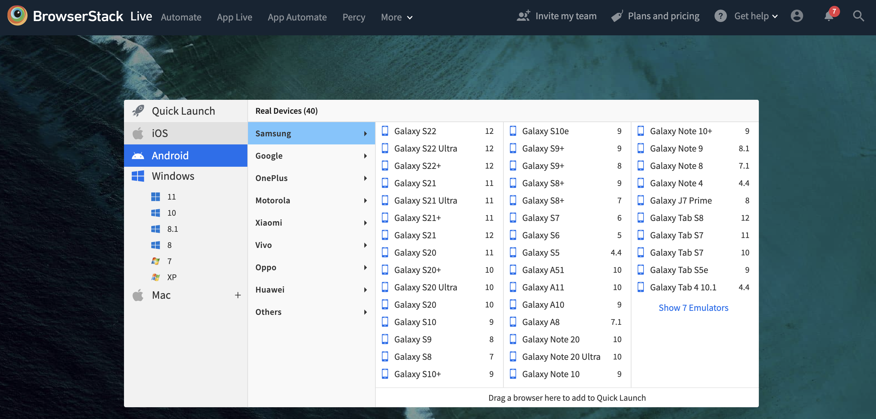
BrowserStack offers access to a wide range of real mobile devices, making it easier to run comprehensive compatibility tests across multiple environments without maintaining a physical device lab.
Types of Mobile Compatibility Testing
Mobile compatibility testing can be categorized into several types based on the factors being evaluated. Each type focuses on a specific aspect of how a website or application behaves across mobile environments.
Understanding these types helps teams plan comprehensive testing strategies that address all critical areas of mobile compatibility.
- Device Compatibility Testing: Verifies that the application performs consistently across various mobile devices with different screen sizes, resolutions, and hardware specifications.
- Operating System Compatibility Testing: This testing ensures that the application functions correctly on multiple versions of operating systems like Android, iOS, and others.
- Browser Compatibility Testing: Checks whether the application displays and behaves as expected across different mobile browsers, including Chrome, Safari, Firefox, and Edge.
Read More: Cross Browser Testing
- Network Compatibility Testing: Assesses the application’s performance under varying network conditions such as Wi-Fi, 3G, 4G, and low-bandwidth environments.
- Orientation Compatibility Testing: Verifies that the user interface adjusts properly when switching between portrait and landscape modes.
- Input Compatibility Testing: Confirms that touch gestures, voice input, and other mobile-specific inputs work correctly across devices.
Read More: Types of Mobile Testing
Type of Devices to Consider in Mobile Compatibility Testing
Effective mobile compatibility testing requires coverage across a wide range of device types to reflect real-world usage. To ensure a consistent experience, it is essential to consider the following types of devices during testing:
- Smartphones: Include popular models across different manufacturers such as Apple, Samsung, Xiaomi, and Google. Test devices with varying screen sizes, resolutions, and operating system versions.
- Tablets: Test on small and large tablets, as layout and usability may differ significantly from smartphones. Consider devices from major vendors running iOS and Android.
- Legacy Devices: Older models that are still in use but may run outdated operating systems or browsers. Testing on these devices helps ensure backward compatibility and avoids alienating a segment of users.
- High-end and Low-end Devices: Include a mix of premium devices with high processing power and budget devices with limited resources. This helps evaluate performance across different hardware capabilities.
- Foldable and Notch Devices: Modern form factors such as foldable screens and devices with notches may impact layout and user interaction. Including them ensures the application adapts to new design standards.
Importance of Mobile Compatibility Testing
Mobile users expect fast, functional, and visually consistent experiences regardless of their device. Any deviation, such as misaligned elements, unresponsive buttons, or content that loads incorrectly, can cause users to leave a site or application within seconds.
Mobile compatibility testing is essential to prevent such issues by ensuring the application functions correctly across various devices, browsers, and operating systems.
For development and quality assurance teams, this type of testing supports better user satisfaction, strengthens brand reputation, and helps meet accessibility and performance standards.
For businesses, it contributes directly to improved engagement, user retention, and conversion rates. As mobile technologies continue to evolve, compatibility testing is a critical step in delivering a consistent and high-quality experience to every user.
Issues impacting User Experience due to Mobile Compatibility
Some of the issues that may impact user experience if mobile compatibility testing is not performed for web applications are:
- Navigation: Navigating a website on a smaller screen (mobile) is different compared to a larger screen (desktop). A check should be made that the navigation should be smooth across multiple devices and browsers.
- Content and layout: A website designed for a desktop may not fit on a mobile device or tablet. It is better to ensure that the website loads completely and fits relative to the device screen size.
- Orientation: Websites on the desktop are always displayed in landscape mode. However, on mobile/ tablet, a website can be viewed in portrait and landscape mode both. A check should be made that the website loads and functions fine in both modes with no UI distortion, glitches, or stretching.
- Font and logo: A website developed for the desktop will have a relative font size, image height and width, and brand logo. A check should be made that the font size, images, and logo on a mobile device are proportionate to the screen size and resolution of the device.
Why should Websites be Compatible with Mobile Devices?
In addition to increasing mobile access of the website, here are are some of the reasons why the website should be mobile compatible:
- Increases website’s accessibility: A mobile user can access the website at any time of the day and at any location. A website which is not mobile compatible or poorly compatible can lead to migration of the existing users to the better mobile compatible web applications serving similar purposes. Therefore, software companies are creating responsive websites to attract all the types of users.
- Increases sales: With the ease of availability of web applications on mobile handsets, it boosts the sales of the product. Before the mobile era, when the web applications were only limited to desktop, the profit of software companies serving web applications was far less as compared to current sales where users can access the same application from different devices (mobile phone/ tablet).
- Increases page views and reduces bounce rate: If the website is displayed perfectly on a smaller device along with a larger screen with same load time, no zoom and convenient navigation, it glues the customer to the screen to spend more time and explore the application. An easy-to-use website helps to preserve the existing users, attract more users, and ultimately reduces bounce rate.
- Contributes customer loyalty: If the user is content with the website’s experience and has a positive impression about it, then they would keep coming back to it and use it again and again. Therefore, a website should be mobile friendly to maintain long term relationships with the customers.
- To have a place in Google search: Mobile-friendly websites are favored by Google’s search algorithm, helping improve rankings and discoverability on mobile search results.
Challenges in Mobile Compatibility Testing
Mobile compatibility testing involves addressing a variety of technical and operational challenges due to the rapidly evolving mobile ecosystem. These challenges can affect both the accuracy and efficiency of the testing process if not properly managed.
- Device Fragmentation: With hundreds of mobile devices available across different brands, screen sizes, hardware specifications, and operating system versions, ensuring consistent behavior across all combinations is complex.
- Operating System and Browser Variations: Frequent updates to operating systems and browsers introduce changes in behavior and compatibility, requiring ongoing testing to ensure uninterrupted user experiences.
- Network Conditions: Mobile users operate in diverse network environments, from high-speed connections to poor coverage. Testing under different network conditions is essential but can be difficult to replicate accurately.
- Limited Access to Physical Devices: Maintaining a large inventory of real devices is expensive and resource intensive, especially with the continuous release of new models.
- Unpredictable User Environments: Factors such as screen orientation, battery levels, background applications, and device performance can affect how an application behaves, making it hard to predict every possible scenario.
- Inconsistent Emulator Performance: While emulators are useful in early testing stages, they do not always reflect real-world usage, leading to missed issues that only surface on physical devices.
Why perform Mobile Compatibility Testing on Real Devices?
While emulators and simulators are commonly used for testing, they differ significantly from real device testing in both accuracy and reliability. Emulators mimic mobile environments but fail to replicate real-world conditions such as hardware limitations, network fluctuations, battery performance, and interruptions like incoming calls or notifications.
As a result, testing solely on emulators can miss critical compatibility issues caused by device fragmentation and user-specific scenarios.
In contrast, testing on real devices offers a more accurate and reliable understanding of how an application behaves in real user conditions. It allows teams to observe performance, responsiveness, and functional behavior as experienced by end users.
Real device testing also enables the simulation of real-world challenges, such as varying network speeds, interruptions, and device-specific quirks, helping identify and resolve issues early in the development cycle.
However, maintaining an in-house real device lab is resource-intensive and costly. With frequent device launches and operating system updates, managing and updating a physical lab quickly becomes impractical.
A more scalable and cost-effective alternative is to use a cloud-based testing platform like BrowserStack. It provides instant access to over 3500+ real device and browser combinations, including both legacy and latest versions.
With BrowserStack’s real device cloud, teams can test websites and mobile applications across various real environments without setting up or maintaining physical infrastructure.
How to perform Mobile Compatibility Testing on Real Devices?
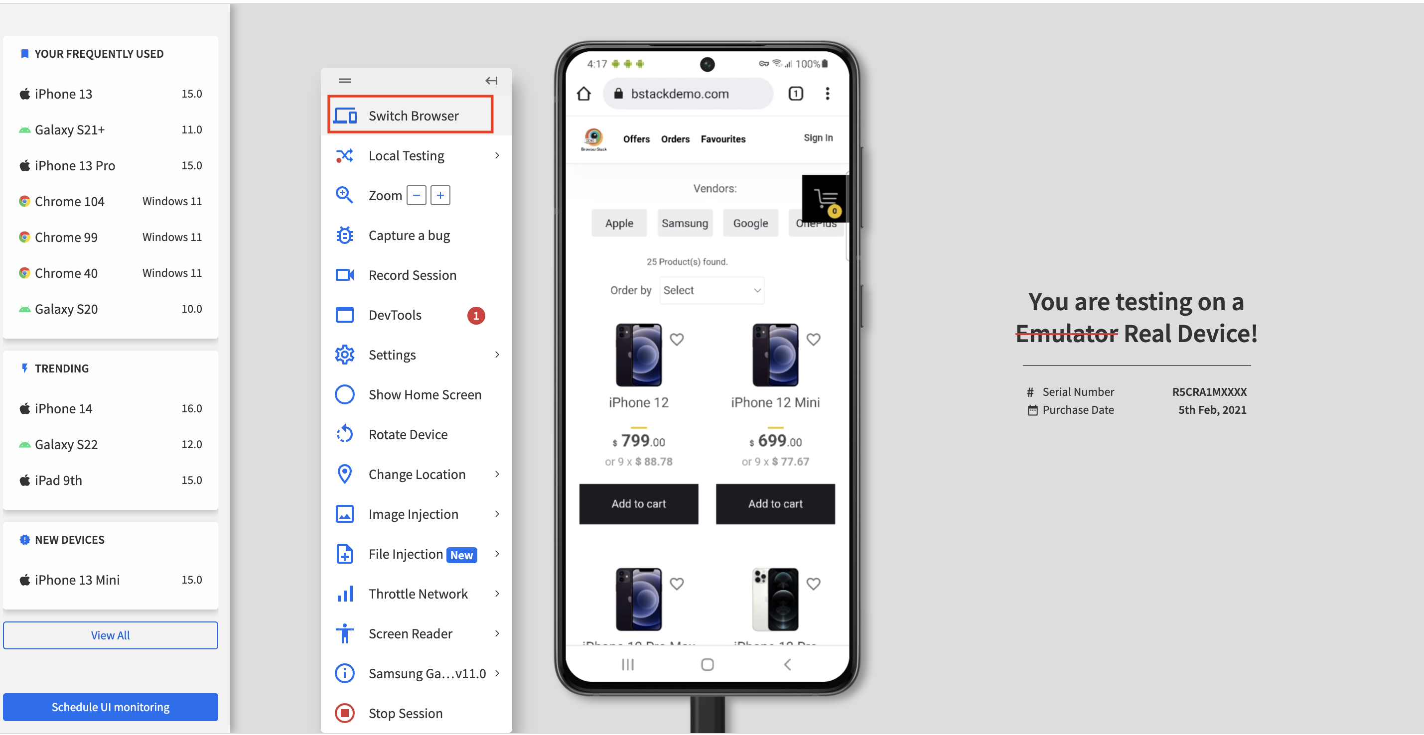
To understand how to perform mobile compatibility tests using BrowserStack Live, consider the following two scenarios. These demonstrate how to test the BStackDemo website across various devices and browsers to ensure mobile compatibility:
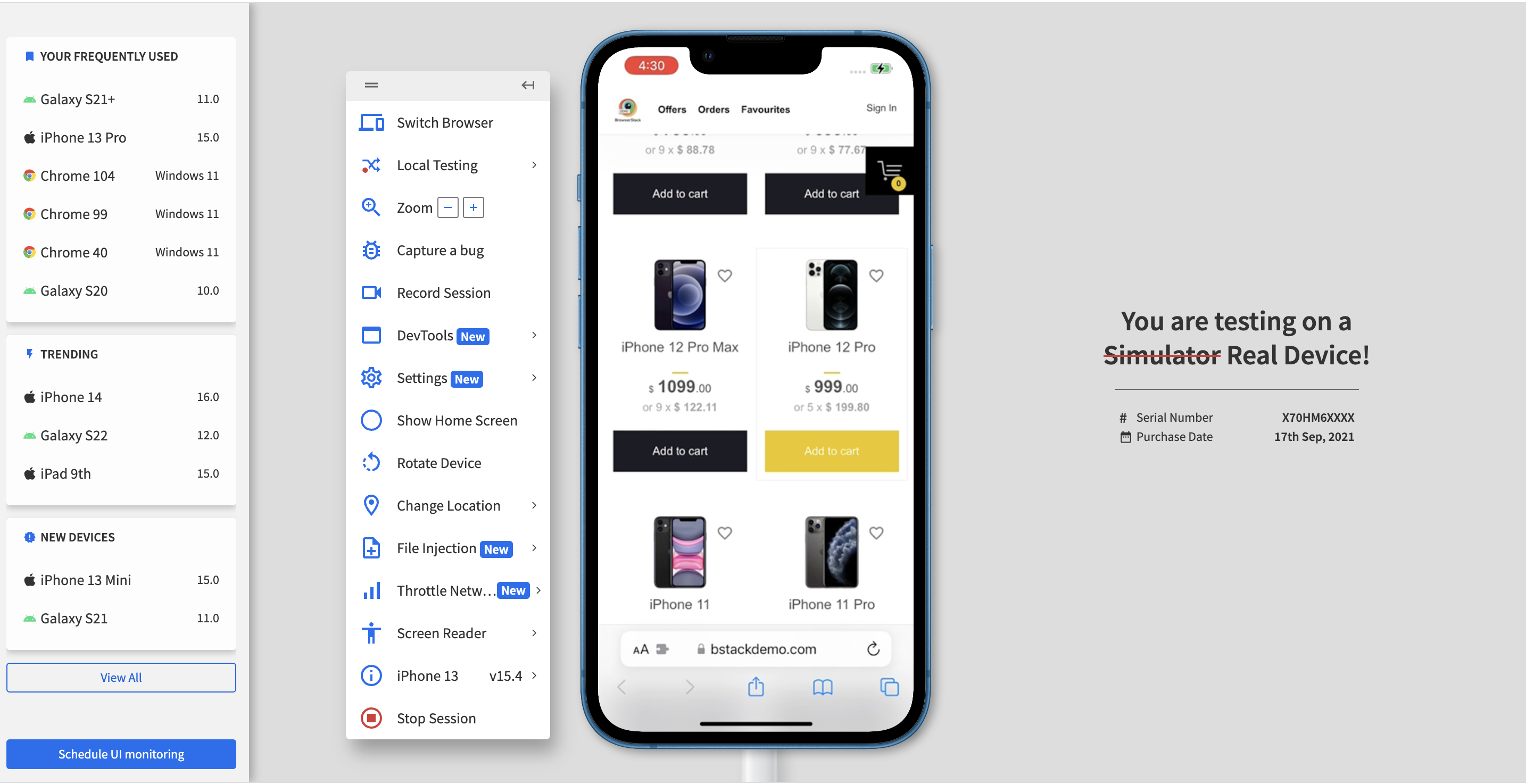
- Verify clicking on “Add to cart” should add the item to the cart.
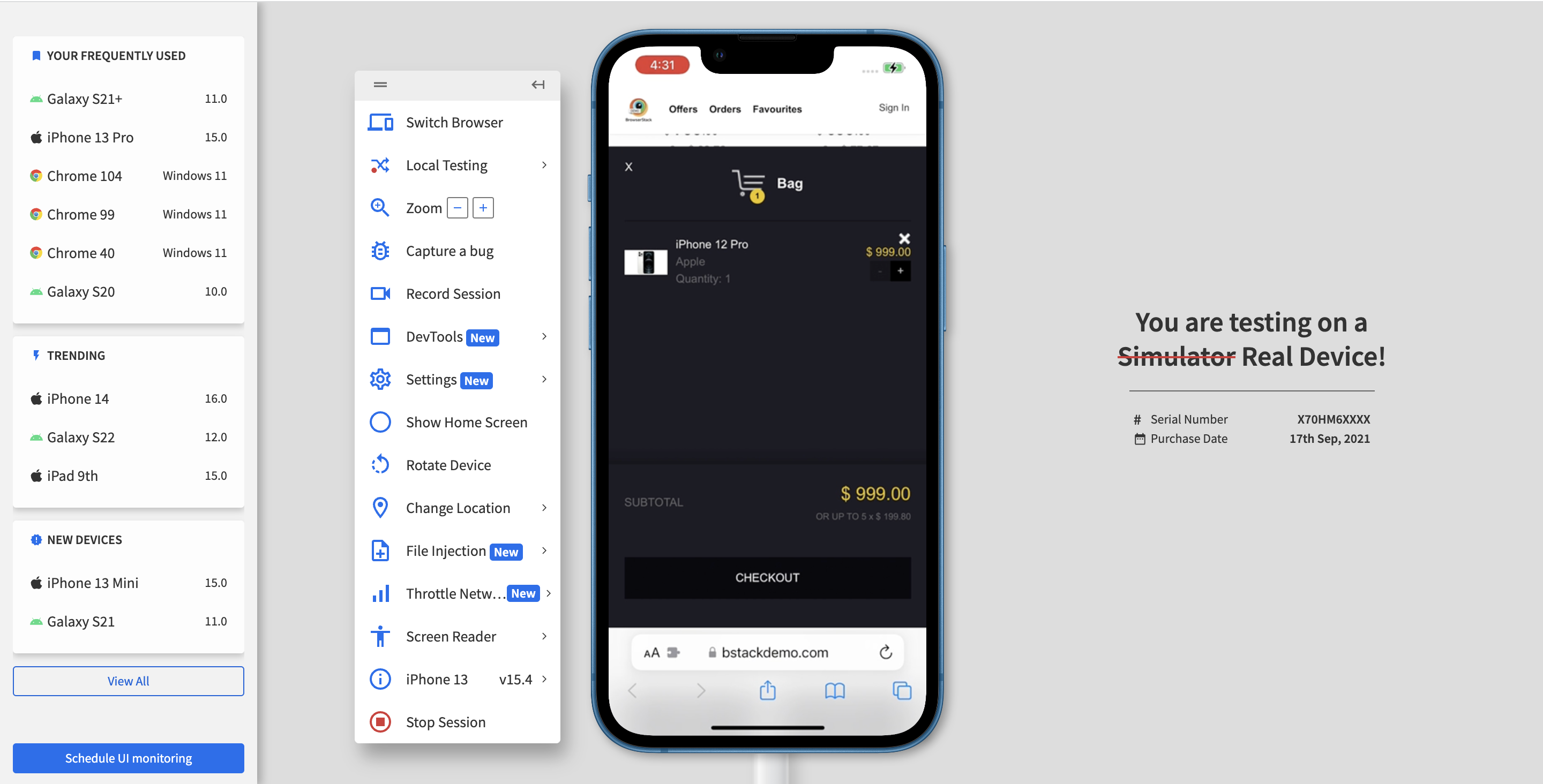
- Verify clicking on the cross icon on the cart pop-up should remove the item from the cart.
Follow the steps given below and test the above scenarios on real devices.
- Sign up for BrowserStack Live.
- Select the desired device, browser, and operating system combination.
- Perform actions such as “adding” and “removing” items from the cart across different device, browser, and operating system combinations to verify compatibility.
- Use the “Switch browser” option in the left toolbar to select a different device, browser, or operating system and continue testing from the updated configuration.
Mobile Compatibility Test Results on different Device-Browser-OS Combinations
- Google Pixel 7 Pro with OS version 13 and Chrome browser
Adding the Product to the Cart by Clicking on Add to Cart
Removing the Product from the Cart by Clicking on the Cross Icon
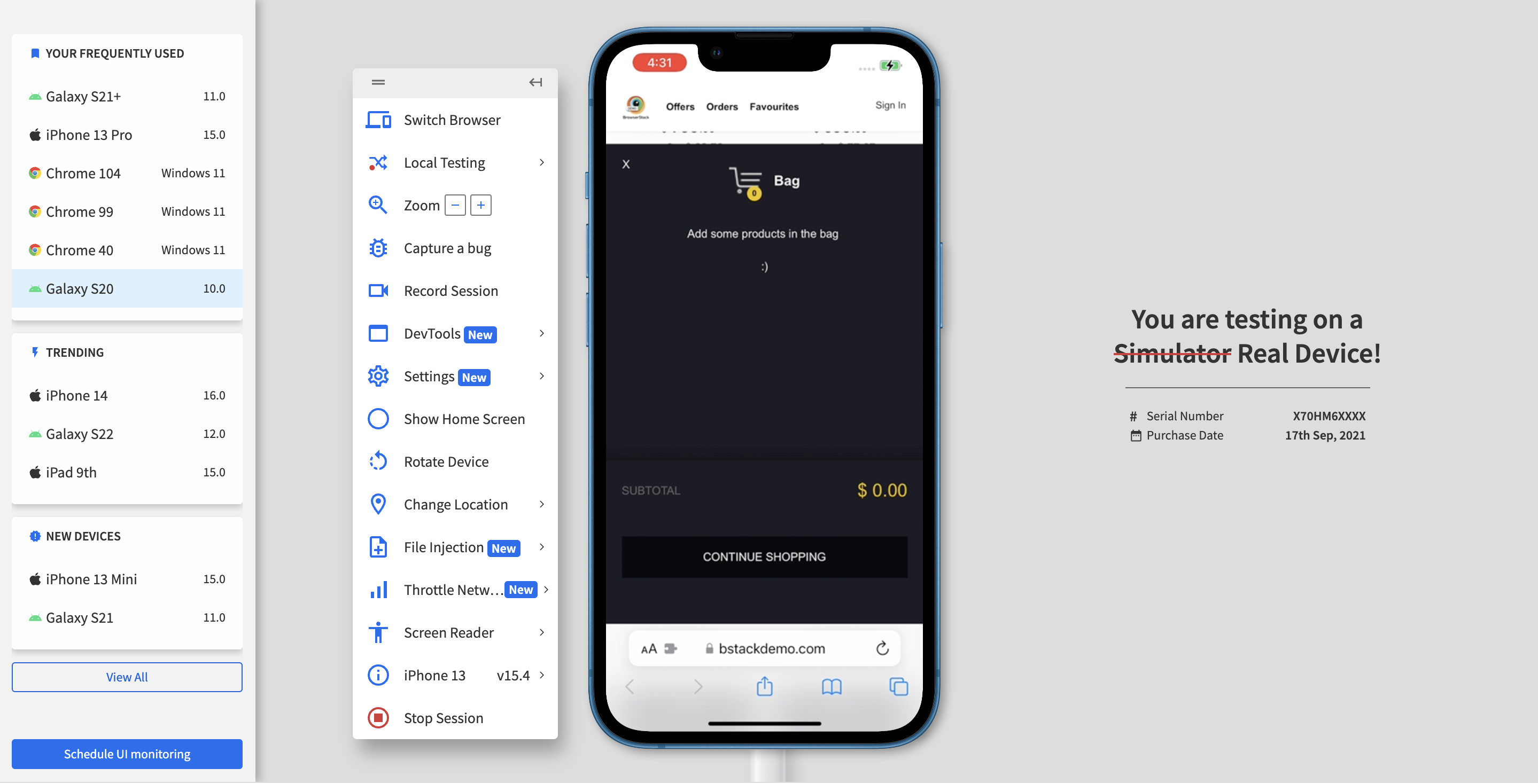
- iPhone 13 with OS version 15.4 and Safari browser
Adding the Product to the Cart by Clicking on Add to Cart
Removing the Product from the Cart by Clicking on the Cross Icon
Empty Cart on Removing the only Product in the cart
Best Practices for Mobile Compatibility Testing
Adopting structured and consistent practices can significantly improve the effectiveness of mobile compatibility testing. The following best practices help ensure broad coverage, reliable results, and an optimal user experience across mobile platforms:
- Test on Real Devices: Use real devices whenever possible to validate actual behavior, performance, and layout. Real device testing captures issues that emulators often miss.
- Prioritize Popular Device-Browser Combinations: Focus on the most commonly used devices, browsers, and operating systems among the target audience to ensure maximum coverage.
- Incorporate Responsive Design Testing: Validate that layouts and elements adjust correctly to different screen sizes, resolutions, and orientations.
- Automate Repetitive Test Scenarios: Where applicable, automate regression and cross-device testing to reduce manual effort and improve consistency across builds.
- Test for Interruptions and Background Behavior: Ensure the application handles real-world interruptions like calls, messages, or switching between apps without crashing or losing state.
- Regularly Update Test Coverage: Review and update the device and browser matrix frequently to account for new releases and evolving usage trends.
Conclusion
It is challenging for any organization to test mobile compatibility across the wide range of available devices and browser combinations. However, mobile compatibility testing is essential before releasing any product to production.
BrowserStack Live enables comprehensive testing across 3500+ real device and browser combinations. It offers access to browser developer tools for debugging and integrates with platforms like Slack, Trello, and JIRA to streamline collaboration and issue tracking, ensuring a seamless user experience across all mobile platforms.


