Test Insights - View advanced analytics
Use Test Insights for analyzing and exploring your test data on BrowserStack.
Test Insights provides visibility into your testing at scale. An interactive dashboard that provides actionable insights to help you improve testing efficiency, identify high impact issues or bottlenecks so you can release quality software at speed.
Visit the following sections to learn more:
Test Insights interface
Test Insights includes visualizations, filters and metrics (like errors, failures, dropped tests and more) to help you get an overall view of your test suite performance. You can also view the desktop and device coverage to optimize your overall testing strategy.
Automate test insights
Get insights about your automated test runs on Browser and Mobile devices. The dashboard gives you insights into the following data:
Test Coverage
This section captures the breadth and width of your test suite, giving you insights into the types of devices, desktops and operating systems that you have been testing.
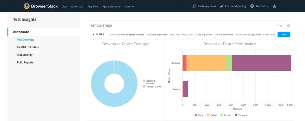
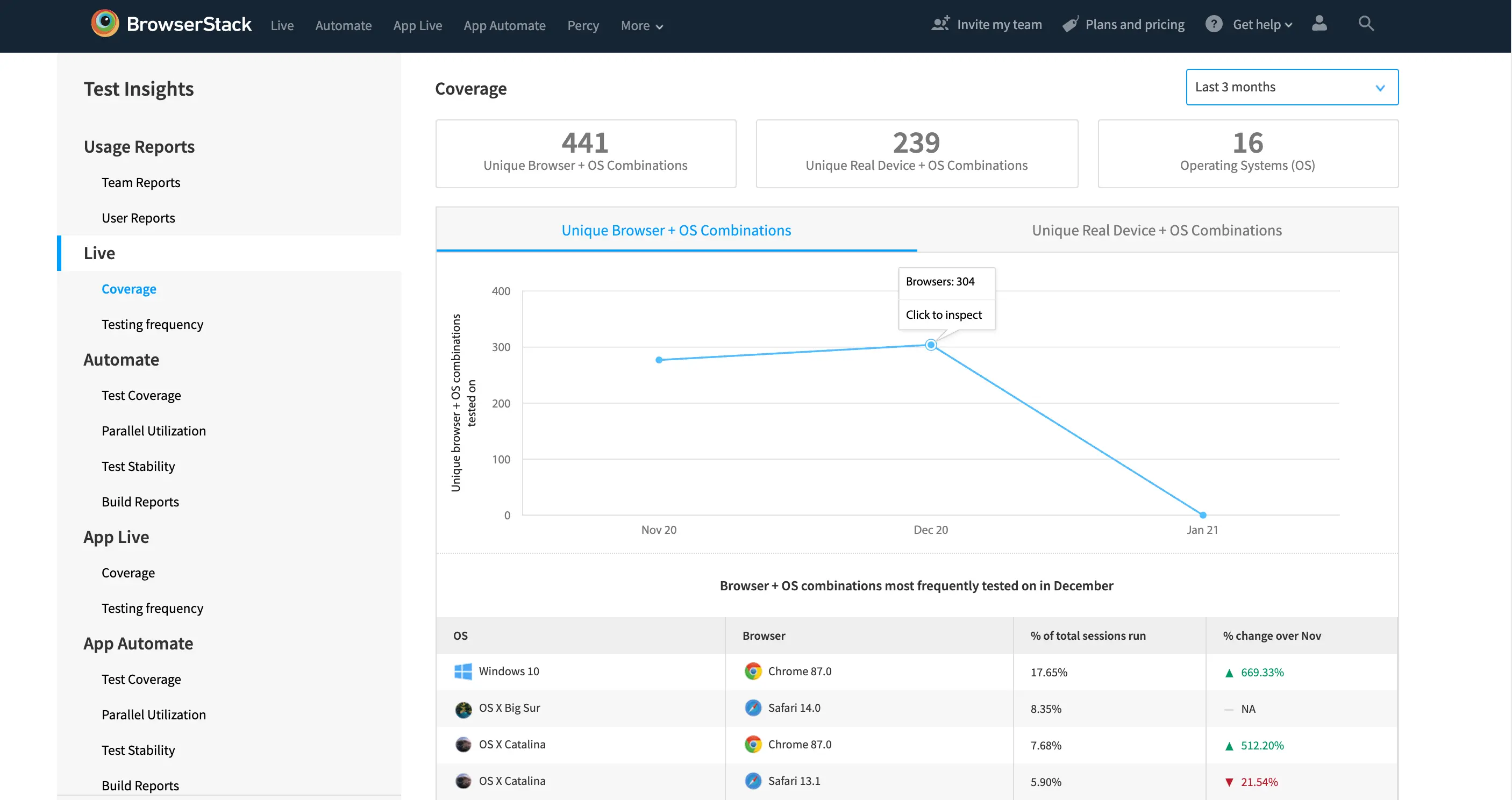
Desktop & Device Coverage
The overall picture of the tests that you are running on desktops & mobile devices. If you are not running device tests, then the fields will be empty.
-
Desktop vs Device Coverage (Visualization):The visualization of the ratio of the tests run on Desktops & Mobile Devices. Hovering over the visualization will give you absolute numbers of test sessions run on each platform.
-
Desktop vs Device Performance (Visualization):The visualization of the performance of tests, to ease the effort of comparing test performances between the platforms. Hovering over the visualization will give you absolute values of the division of the visual.
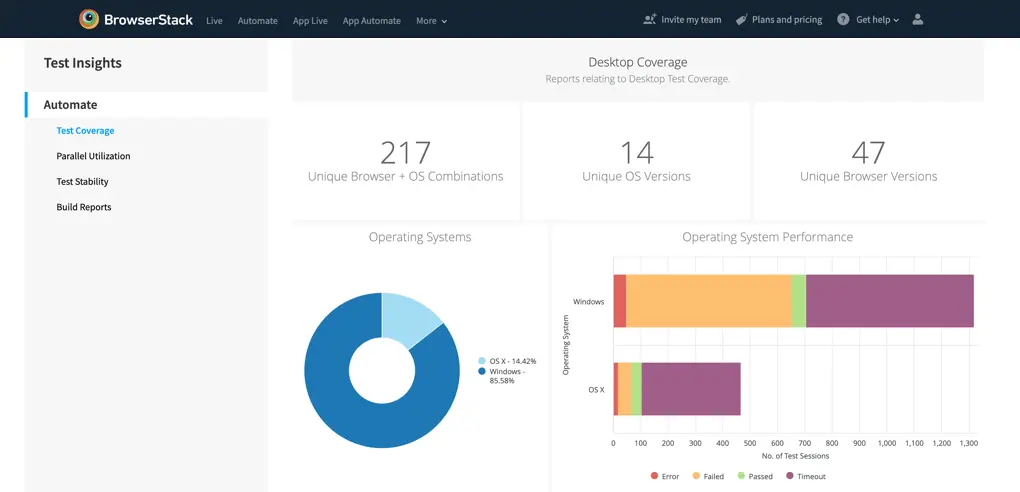
Desktop Coverage
-
Unique Browser + OS Combinations (Tile):The number of unique Browser & Operating System combinations that you have tested. For example, Chrome 77 with Windows 8 & Chrome 75 with Windows 8 are counted as two different browser & OS combinations.
-
Unique OS Versions (Tile): The number of unique Operating System versions that you have tested. For example, Windows 7 and Windows 10 are counted as two unique OS versions.
-
Unique Browsers Versions (Tile): The number of unique Browsers versions that you have tested. For example Chrome 78, Chrome 76 and Chrome 77 are counted as three unique browser versions.
-
Operating Systems (Visualization): The overall ratio of all tests run on the two Operating System platforms, i.e. OS X & Windows. Hovering over the visualization will give you absolute values of the visual.
-
Operating System Performance (Visualization): The visualization of the performance of tests divided by the operating system type, to ease the effort of comparing test performances between the platforms. Hovering over the visualization will give you the absolute value of the division.
-
Browser Family Breakdown (Visualization): The list of most tested browser family in the test suite, as per volume of tests run. Chrome on Windows 10 and Chrome on Windows 7 are considered different browser families. The visual also gives you deep-dive into the performance of the tests on the browser families, to ease the effort of finding devices with maximum failing test cases.

-
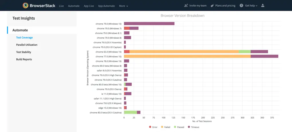
Browser Version Breakdown (Visualization): This list of top tested browser versions in the test suite, as per volume of tests run. Chrome on Windows 10 will be a different family compared to Chrome 78 on Windows 7. The visual also gives you deep-dive into the performance of the tests on the browser versions.
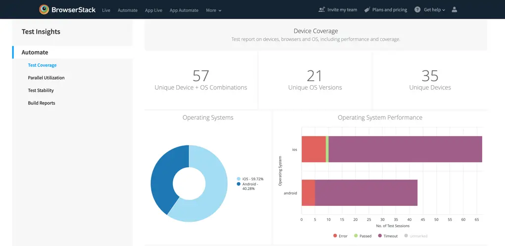
Device Coverage
-
Unique Device + OS Combinations (Tile): The number of unique Device & Operating System combinations that you have tested. For example, iPhone X with iOS 13 & iPhone X with iOS 12 are counted as two unique device & OS combinations.
-
Unique OS Versions (Tile): The number of unique Operating Systems that you have tested. For example, Android 7.1 and Android 7.0 are counted as two unique OS versions.
-
Unique Devices (Tile): The number of unique Devices that you have tested. For example, iPhone X and iPhone Xs are counted as two unique devices.
-
Operating Systems (Visualization): The overall ratio of all tests run on the two Operating System platforms, i.e. iOS & Android. Hovering over the visualization will give you absolute values of the visual.
-
Operating System Performance (Visualization): The visualization of the performance of tests divided by the operating system type, to ease the effort of comparing test performances between the platforms. Hovering over the visualization will give you the absolute value of the division.
-
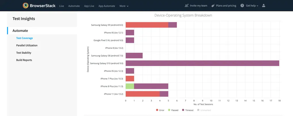
Device-Operating System Breakdown (Visualization): The list of most tested device-operating system combinations in the test suite, as per volume of tests run. Samsung Galaxy S9 with Android 8.0 and Samsung Galaxy S9 with Android 8.1 are unique devices. The visual also gives you deep-dive into the performance of the tests on the browser families, to ease the effort of finding devices with maximum failing test cases.
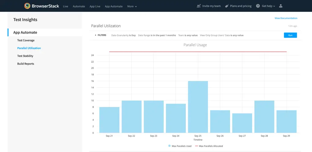
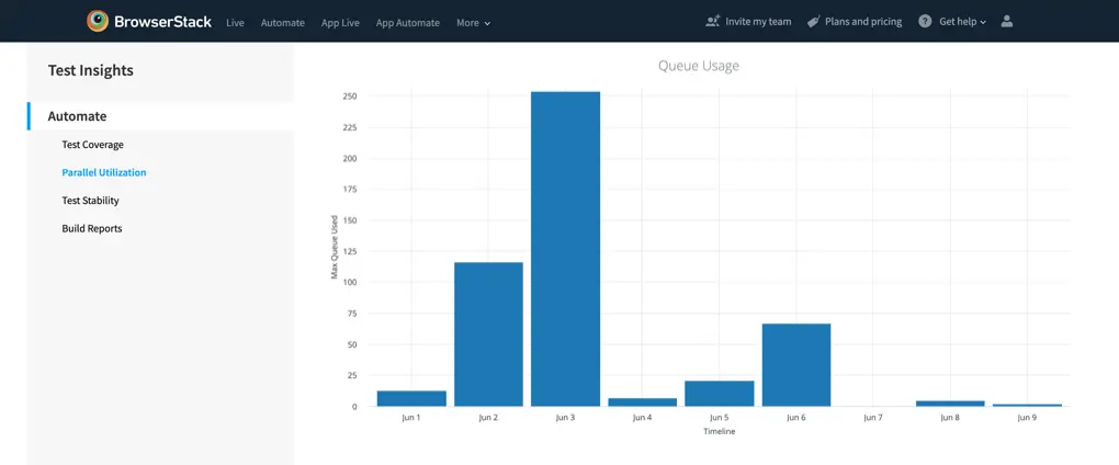
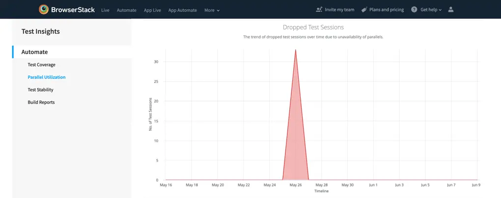
Parallel utilization
This section will give you insights on your parallel usage, queue usage and dropped tests related to unavailable parallel consumption.
-
Parallel Usage (Visualization): Your plan comes with a specific number of parallel tests, allowing you to run automated tests simultaneously, thereby reducing testing time. You can read more about Parallels.
- Max Parallels Used: The maximum parallels that were actively being used during the period.
-
Max Parallels Allocated: Maximum parallel tests available on your plan, this can be allocated by the Group Admins & Owners at the team level or the group level.
-
Queue Usage (Visualization): Our queuing feature enables you to launch additional tests, even after your parallel test limit is hit. Queue limit is as equal to the parallels available in your license. Attempts to launch tests beyond the queuing limit will fail and will be logged as dropped tests.
-
Dropped Test Sessions (Visualization): Test sessions may drop due to various reasons, and this visualization will assist you in avoiding dropping tests related to parallels. A dropped test did not run, it gets dropped either before it got added to the queue or it got queued and then dropped.
-
NPA : No Parallels Available can cause tests to drop; it will happen when the parallels and queue are full.
-
NPA : No Parallels Available can cause tests to drop; it will happen when the parallels and queue are full.
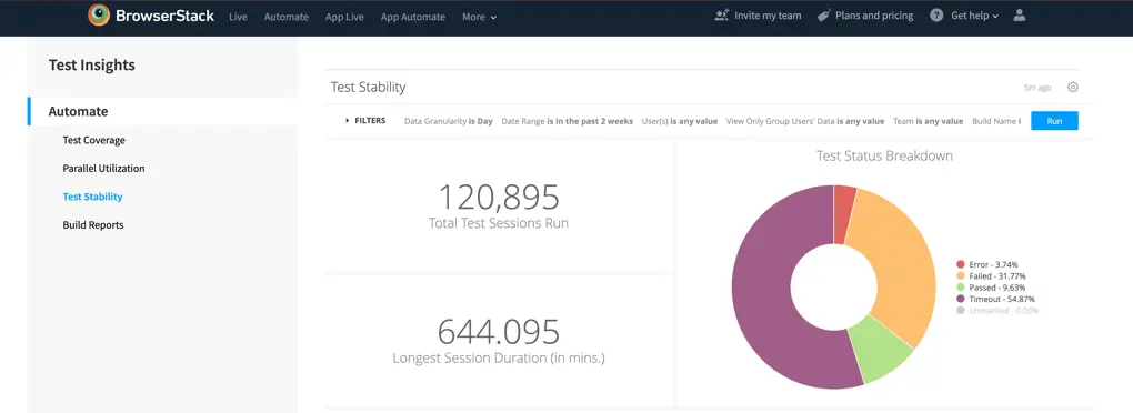
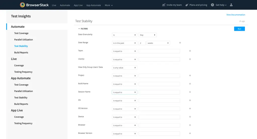
Test Stability
This dashboard will give you insights around the health metrics of your test suites. Focusing on health trends, error deep-dives and more.
-
Total Test Sessions Run (Tile): The total number of Automate test sessions that you have run on BrowserStack.
-
Longest Session Duration (Tile): The longest Automate test session, in minutes, that you have run on BrowserStack. Ideally, it should not be long.
-
Longest Session Duration (Tile): The longest Automate test session, in minutes, that you have run on BrowserStack. Ideally, it should not be long.
-
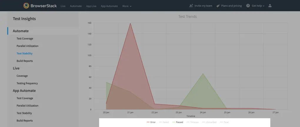
Test Trends (Visualization): The visualization of the overall health of your tests, with a full breakdown of final statuses. Refer to this section for definitions of the statuses, hovering over the visuals will give you details on the absolute values for the particular granularity.
-
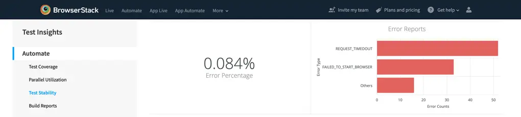
Error Percentage (Tile): The number of tests which were not marked as pass or fail, and ended up giving an error state at the end of the test session as a percentage of total test sessions run.
-
Error Reports (Visualization): The breakdown of the tests which faced errors.
-
FAILED-TO-START-BROWSER: This error occurs when BrowserStack is unable to launch the browser specified in your script, preventing test execution. How to identify the cause and resolve the error, here is the link. -
REQUEST-TIMEDOUT: This error occurs when a socket hangs up error is raised at the hub nodes. The hub waits for a maximum of 240 seconds before an unresponsive browser is killed, changing the session status to ERROR on the dashboard. - OTHERS : There are some other reasons like connectivity issues for an error to occur, we have bucketed all of them into others.
-
-
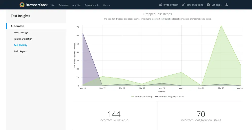
Dropped Test Trends (Visualization): Test sessions may drop due to various reasons, and this visualization will assist you in avoiding dropping tests related to test configuration issues or incorrect local setup. A dropped test did not run - it gets dropped either before it got added to the queue or it got queued and was then dropped.
- Incorrect Local Setup: The most common reason for these tests getting dropped is that Local Testing was enabled in the session capabilities but it wasn’t enabled on the system. To avoid this, either remove the local capability or enable local testing via bash/bin file or chrome extension.
- Incorrect Configuration Issues: These tests get dropped because the capabilities mentioned in the test sessions were incorrect or did not match the system expectations. For example, the specified screen resolution is not compatible with the chosen OS version could be a reason. Please note, as these tests were dropped, OS, OS Version, Browser, Browser Version & Device will not get applied to these visualizations.
-
Incorrect Local Setup (Tile): The absolute number of test sessions which got dropped because of Local Setup Issues. The most common reason for these tests getting dropped is that Local Testing was enabled in the session capabilities, but it wasn’t enabled on the system. To avoid this, either remove the local capability or enable local testing via bash/bin file or chrome extension.
-
Incorrect Configuration Issues (Tile): The absolute number of test sessions which got dropped because of Incorrect Test Configuration Issues. The most common reason for these tests getting dropped is that Local Testing was enabled in the session capabilities, but it wasn’t enabled on the system. To avoid this, either remove the local capability or enable local testing via bash/bin file or chrome extension.
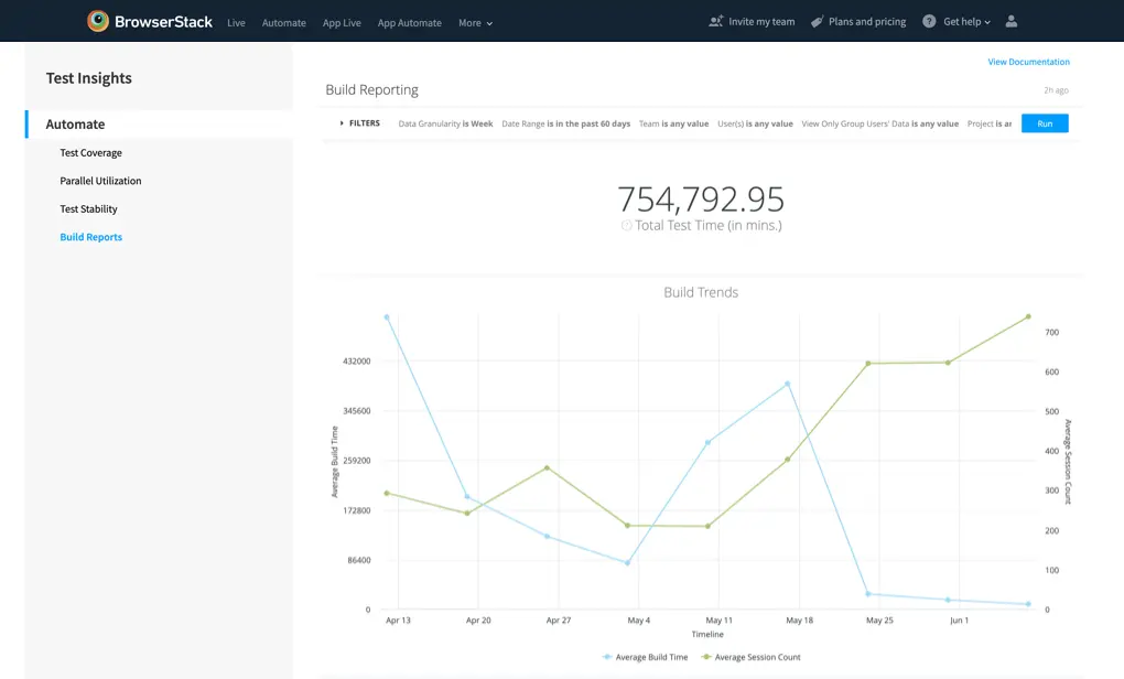
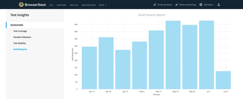
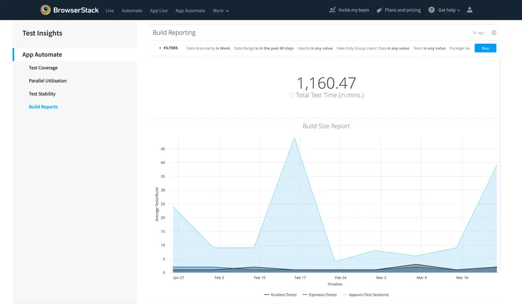
Build Reports
This dashboard provides you with insights into the build related trends, this dashboard is most powerful when combined with the Build Name filter. Take a look at different builds, and unlock insights on the progress of the builds.
-
Total Test Time (Tile): The total time that you have used the BrowserStack Testing Platform, is the cumulative value of all the session times.
-
Build Trends (Visualization): The visualization of the progress of your Build Sizes (Average Test Sessions/Build) and Build Timings (Average Build Time). Useful to gauge the overall progress of your test suites and test time optimization strategies.
-
Build Volume Report (Visualization): Total number of builds tested as per the granularity selection. Really useful to find out the usage of the platform on a daily, weekly or monthly basis.
App Automate test insights
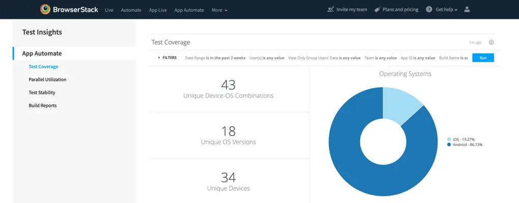
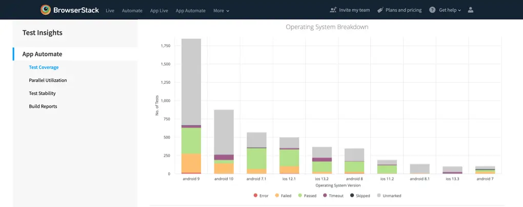
Test Coverage
This dashboard captures the breadth and width of your test suite, giving you insights into the types of devices, and operating systems that you have used for testing your applications.
-
Unique Device-OS Combinations (Tile): The number of unique Device & Operating System combinations that you have tested. For example, iPhone 11 with iOS 12 & iPhone 11 with iOS 13 are counted as two different Device-OS combinations.
-
Unique OS Versions (Tile): The number of unique Operating Systems that you have tested. For example, Android 7.1 and Android 7.0 are counted as two unique OS versions.
-
Unique Devices (Tile): The number of unique Devices that you have tested. For example, iPhone X and iPhone Xs will be considered as different devices.
-
Operating Systems (Visualization): The overall ratio of all tests run on the two Operating System platforms, i.e. iOS & Android. Hovering over the visualization will give you absolute values of the visual.
-
Operating System Breakdown (Visualization): The visualization of the performance of tests divided by the operating system type, to ease the effort of comparing test performances between the platforms. Hovering over the visualization will give you the absolute value of the division.
-
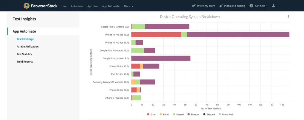
Device-Operating System Breakdown (Visualization): The list of most tested device-operating system combinations in the test suite, as per the volume of tests run. Samsung Galaxy S9 with Android 8.0 and Samsung Galaxy S9 with Android 8.1 are unique devices. The visual also gives you deep-dive into the performance of the tests on the browser families, to ease the effort of finding devices with maximum failing test cases.
Parallel Utilization
This dashboard will give you insights on your parallel usage, and queue usage, as per the app sessions that you have run on BrowserStack.
-
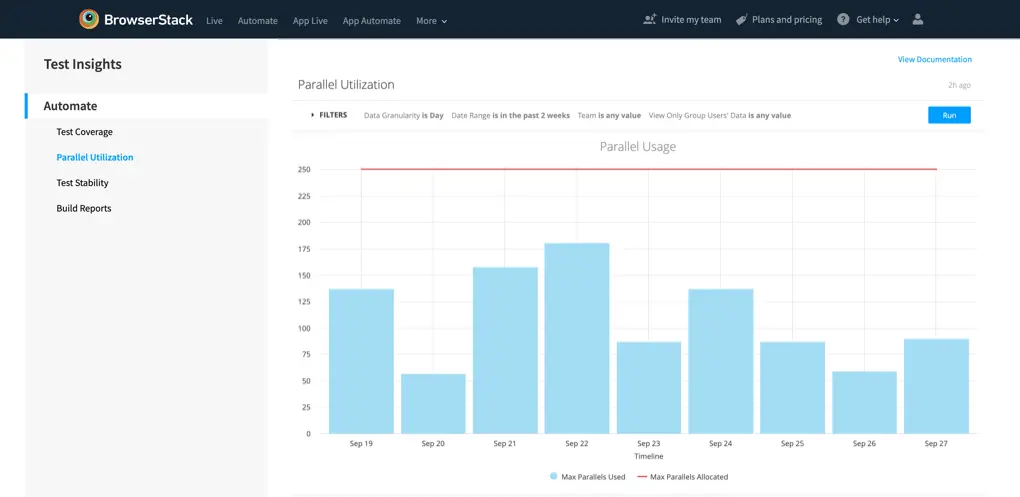
Parallel Usage (Visualization): Your plan comes with a specific number of parallel tests, allowing you to run automated tests simultaneously, thereby reducing testing time. You can read more about Parallels.
- Max Parallels Used: The maximum parallels that were actively being used during the period.
-
Max Parallels Allocated: Maximum parallel tests available on your plan, this can be allocated by the Group Admins & Owners at the team level or the group level.
-
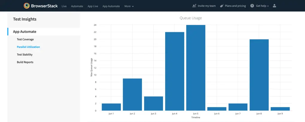
Queue Usage (Visualization): Our queuing feature enables you to launch additional tests, even after your parallel test limit is hit. Queue limit is as equal to the parallels available in your license. Attempts to launch tests beyond the queuing limit will fail and will be logged as dropped tests.
-
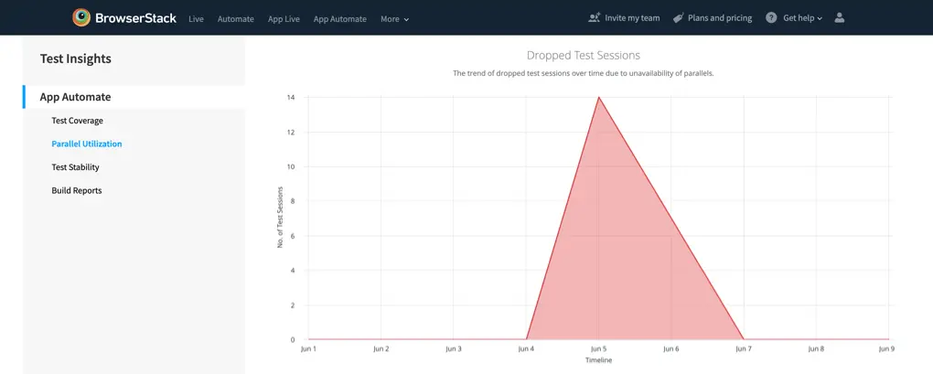
Dropped Test Sessions (Visualization): Test sessions may drop due to various reasons, and this visualization will assist you in avoiding dropping tests related to parallels. A dropped test did not run, it gets dropped either before it got added to the queue or it got queued and then dropped.
-
NPA: No Parallels Available can cause tests to drop; it will happen when the parallels and queues are full.
-
NPA: No Parallels Available can cause tests to drop; it will happen when the parallels and queues are full.
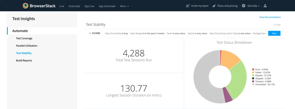
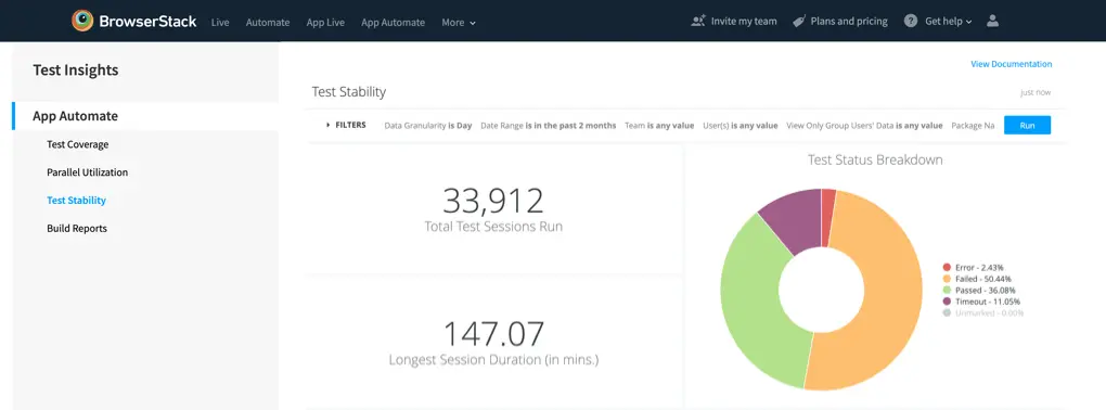
Test Stability
This dashboard will give you insights around the health metrics of your test suites. Focusing on health trends, error deep-dives, and more.
-
Total Test Sessions Run (Tile): The total number of App Automate test sessions that you have run on BrowserStack.
-
Longest Session Duration (Tile): The longest App Automate test session, in minutes, that you have run on BrowserStack. Ideally, it should be a short duration.
-
Test Status Breakdown (Visualization): Overall breakdown of all the Automate test sessions that you have run, with an analysis of the final test status. Refer to this section for definitions of the statuses. Hovering over the individual pie-sections will give you the absolute value of the number of tests with the final status.
-
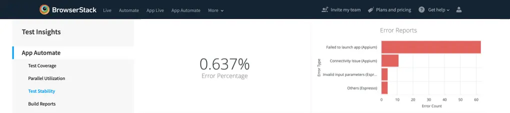
Error Percentage (Tile): The number of tests which were not marked as pass or fail, and ended up giving an error state at the end of the test session as a percentage of total test sessions run.
-
Error Reports (Visualization): The breakdown of the tests which faced errors.
-
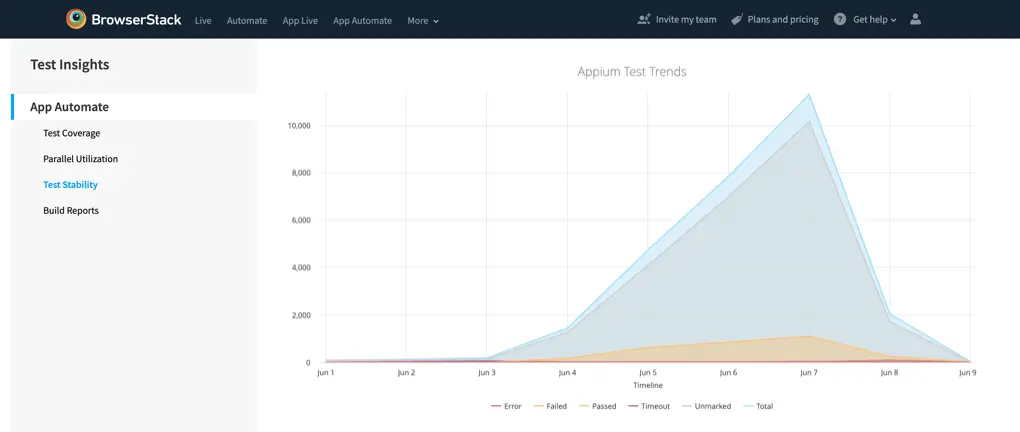
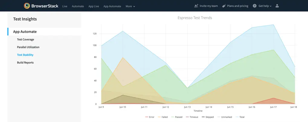
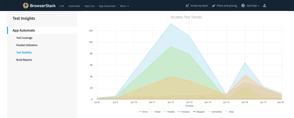
Appium/Espresso/XCUITest Test Trends (Visualization): The visualization of the overall health of your tests, with a full breakdown of final statuses. Refer to this section for definitions of the statuses, hovering over the visuals will give you details on the absolute values for the particular granularity.
-
Appium: Each session is counted as an individual test session.
-
Espresso & Xcuitest: Each build can have multiple test cases executed, and each test case is counted individually in the visualization.
-
Appium: Each session is counted as an individual test session.
-
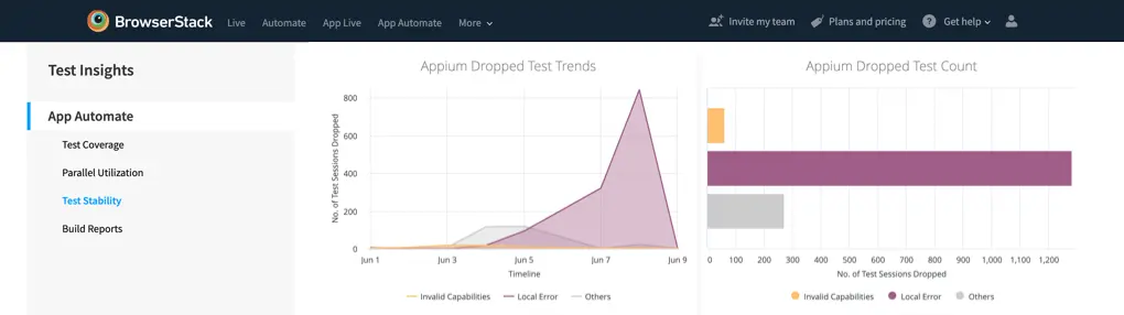
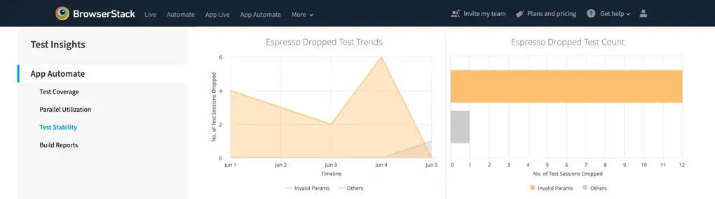
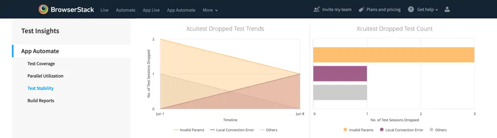
Appium/Espresso/XCUITest Dropped Test Trends (Visualization): Test sessions may drop due to various reasons, and this visualization will assist you in avoiding dropping tests related to test configuration issues. A dropped test did not run, it gets dropped either before it got added to the queue or it got queued and then dropped.
-
Appium/Espresso/XCUITest Dropped Test Count (Visualization): The absolute number of test sessions which got dropped. Test sessions may drop due to various reasons, and this visualization will assist you in avoiding dropping tests related to test configuration issues.
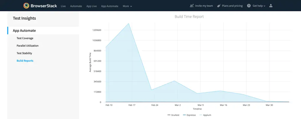
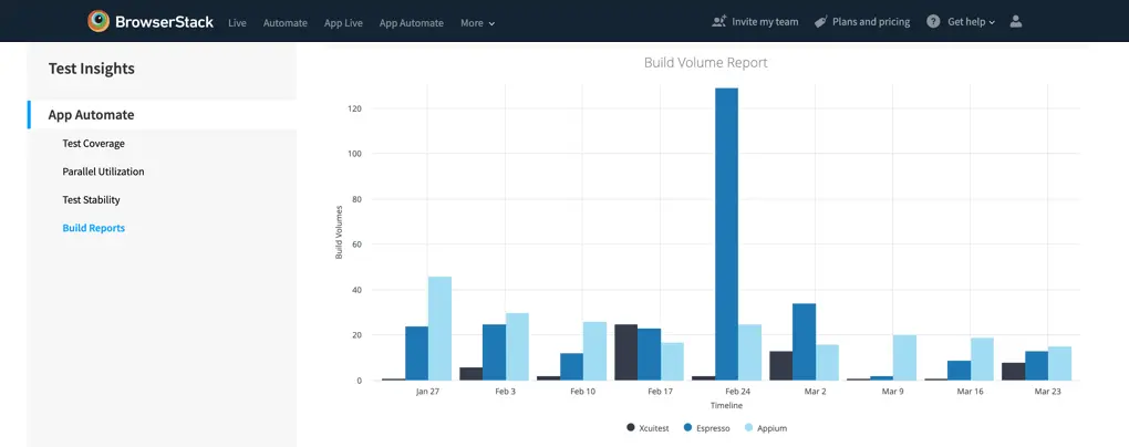
Build Reports
This dashboard provides you with insights into the build related trends, this dashboard is most powerful when combined with the Build Name filter. Take a look at different builds, and unlock insights on the progress of the builds.
-
Total Test Time (Tile): The total time that you have used the BrowserStack Testing Platform, is the cumulative value of all the session times.
-
Build Size Report (Visualization): The average duration of the tests, broken down by frameworks.
- Xcuitest (Tests): Each session is counted as an individual test session.
- Espresso (Tests): Each build can have multiple test cases executed, and each test case is counted individually in the visualization.
-
Appium (Test Sessions): Each build can have multiple test cases executed, and each test case is counted individually in the visualization.
-
Build Time Report (Visualization): The average duration of the tests, broken down by frameworks. The visualization of the progress of your Build Timings (Average Build Time). Useful to gauge the overall progress of your test suites and test time optimization strategies.
-
Build Volume Report (Visualization): Total number of builds tested as per the granularity selection. Really useful to find out the usage of the platform on a daily, weekly or monthly basis.
Live test insights
Get insights about your manual website tests across multiple browsers. The dashboard gives you insights into the following data:
Coverage
This section captures the breadth and width of your test suite, giving you insights into the types of browsers, devices and operating systems tested on.
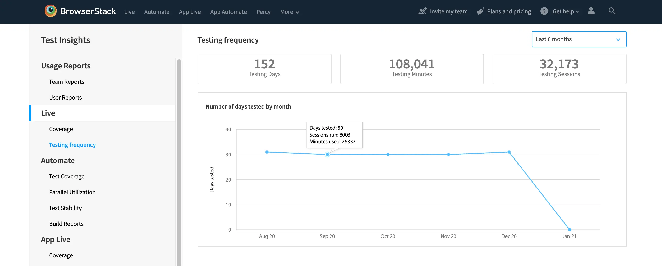
Testing frequency
View the testing frequency in any given month - number of days the tested, number of tests run and total minutes used.
App Live test insights
Get insights about your manual app tests across multiple devices. The dashboard gives you insights into the following data:
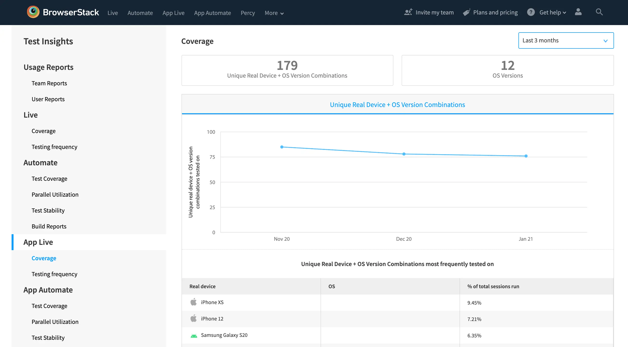
Coverage
This section captures the breadth and width of your test suite, giving you insights into the types of browsers, devices and operating systems tested on.
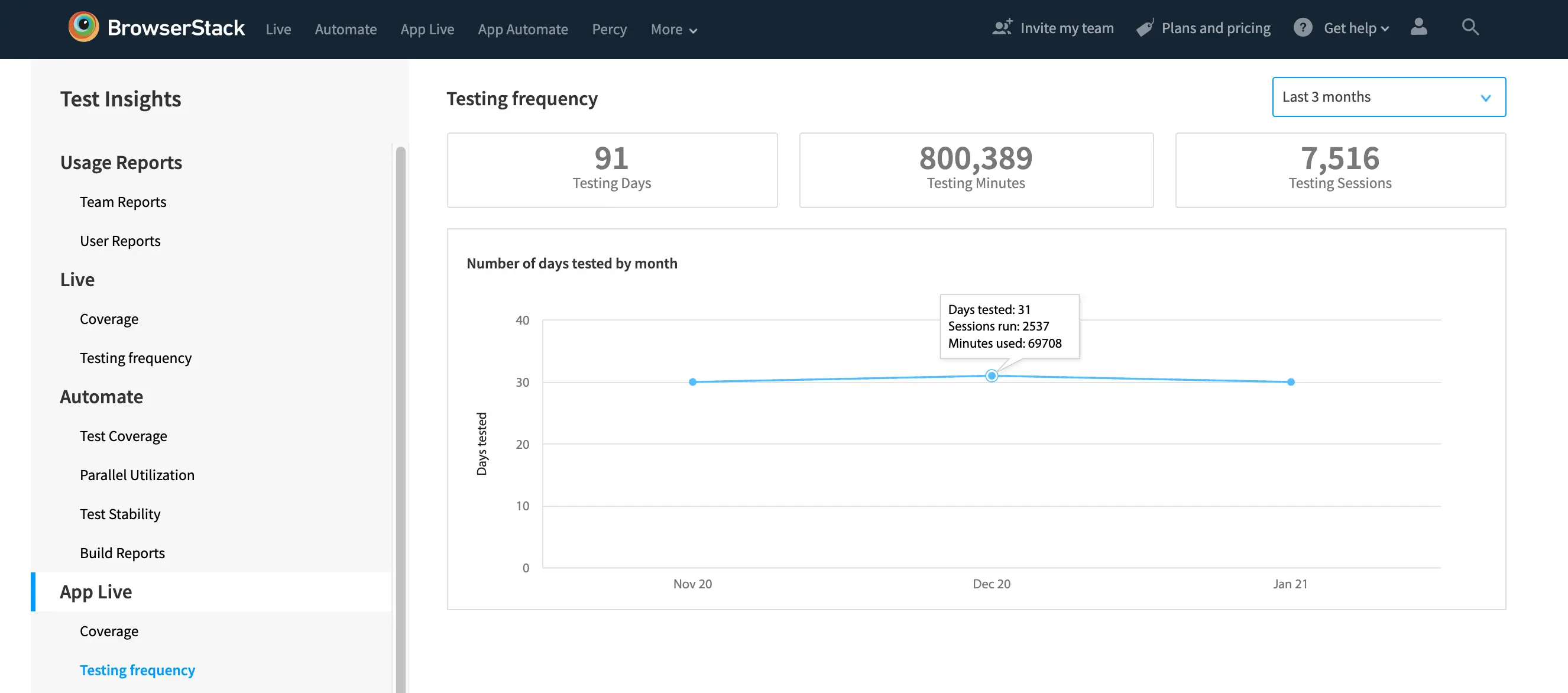
Testing frequency
View the testing frequency in any given month - number of days the tested, number of tests run and total minutes used.
Filter analytics
Filter options
Each dashboard has its own set of filters relevant to the information that is displayed.
These filters allow restricting the data displayed based on the criteria you specify. For example, you might want to filter the builds to the last two months, or for a specific project.
The combination of these three sections provides you with hundreds of permutations, which unlocks powerful data visualization options.
Filter names
The filters are dynamic, meaning depending on the data in the visualizations the filters might be different for different dashboards.
| Name | Description |
|---|---|
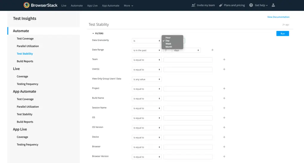
| Data Granularity | The date granularity gives you the option of changing the granularity on timeline-based visualizations. The possibilities range from hourly data to monthly data, really useful to find daily, weekly, or monthly trends. |
| Date Range | The date range filter gives you the option to select the date range for the whole dashboard. Once you choose the same, the entire dashboard will reload data as per the selection. Combining an operator like “is in the past” or “on or after” adds a lot of flexibility to use a simple date range filter. |
| User(s) | The Users filter auto loads the users associated with your group; it uses the user’s name. If you are not sure about the name of a particular user, you can find the list of users on the Organization page. |
| View Only Group User’s Data | To view data for test run by Group level users (Group Owner, Group Admin and Group User), select this filter as “is” and then “yes”. Is any value will show data for everyone, across the group. Is no, will exclude Group Users (Group Owner, Group Admin and Group User). |
| Team(s) | The Teams filter auto loads the teams associated with your group; you will find the list of the teams in the Organization section of your account. |
| Package Name | View data related to your app by using the package name filter, very useful if you are interested in gauging the performance of your app or tests over a timeline. |
| App ID | You can filter out the visualizations according to the App ID which is generated whenever you upload an app for testing. You will find App ID in the test session details or can find it via CLI. |
| Build Name | The Build Name filter loads the names of the builds associated with your account. If your group uses a nomenclature standard for build names, you can use the operator option, for example, if all builds related to regression start with “Reg-”, the “Starts with” operator can be used. |
| Project | The Project filter loads the names of the projects associated with your account. Generally, project capability is used to tag builds for different Engg Projects like App Ver. 2 or New Feature Releases
|
| OS | The OS filter allows you to dig into the visualizations and reports at an OS level, it will suggest the operating systems as per the tests that have been run on your account like OS X, Windows, Android or iOS. |
| OS Version | The OS version filter allows you to dig into the visualizations and reports at an OS level, it will suggest the operating systems as per the tests that have been run on your account like OS X Catalina, Windows XP, etc. |
| Browser | The browser filter lists all the browser families that you have run test sessions on, it will contain the browsers families like Chrome, Safari, etc |
| Browser Version | The browser version gives you the option of slicing the data at Browser version level like Chrome 78, Chrome 79, etc. |
| Device | Device filter allows you to filter the data for different devices that you have tested. Example, Samsung Galaxy S9, iPhone XS, iPhone 11, etc. |
| Session Name | The session name filter will allow you to gauge the timeline of sessions which have been run frequently, for example canary tests, regression tests, or test on iPhone, etc. This filter is highly useful if the sessions and builds have been named properly. Another useful use case would be to check flakiness of a test over a timeline (Using Test Trends in Test Stability dashboard) |
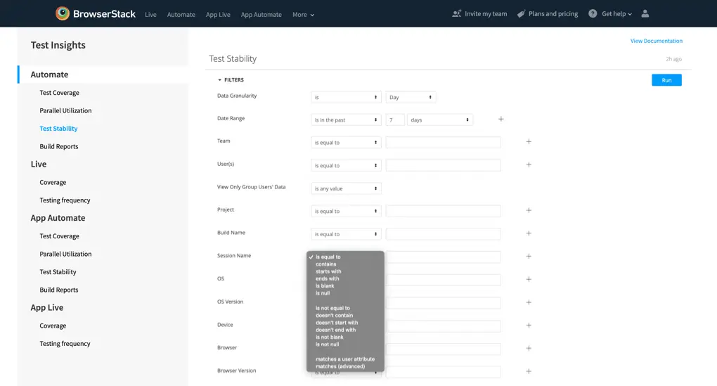
Operator types
-
Date Related Operator Types: There are multiple date related operator types available for filtering data, example
is in the past,is on the day
-
Non-Date Related Operator Types: There are multiple non-date related operator types available for filtering data, example
is equal to,contains,starts with
Advanced operator types
Matches (Advanced)
The filter operator has an option of “Matches (Advanced)”, you can utilize the same to get the most out of the test insights feature.
| Example | Description |
|---|---|
| FOO | is equal to “FOO”, exactly |
| FOO,BAR | is equal to either “FOO” or “BAR”, exactly |
| FOO% | starts with “FOO”, matches “foolish” and “food” but not “buffoon” or “fast food” |
| %FOO | ends with “FOO”, matches “buffoo” and “fast foo” but not “buffoon” or “fast food” |
| F%OD | starts with an “F” and ends with “OD”, matches “fast food” |
| EMPTY | string is empty (has zero characters) or is null (no value) |
| NULL | value is null |
| -FOO | is not equal to “FOO” (is any value except “FOO”), matches “pizza”, “trash”, “fun” but not “foo” |
| -FOO,-BAR | is not equal to either “FOO” or “BAR”, matches any value except “FOO” and “BAR” |
| -%FOO% | doesn’t contain “FOO”, does not match “buffoon” or “fast food” |
| -FOO% | doesn’t start with “FOO”, does not match “foolish” or “food” |
| -%FOO | doesn’t end with “FOO”, does not match “buffoo” or “fast foo” |
| -EMPTY | string is not empty (has at least one character) |
| -NULL | value of column is not null |
| FOO%,BAR | starts with “FOO” or is “BAR” exactly, matches “food” and matches “bar” but not “barfood” |
| FOO%,-FOOD | starts with “FOO” but is not “FOOD” |
| _UF | has any single character followed by “UF”, matches “buffoon” |
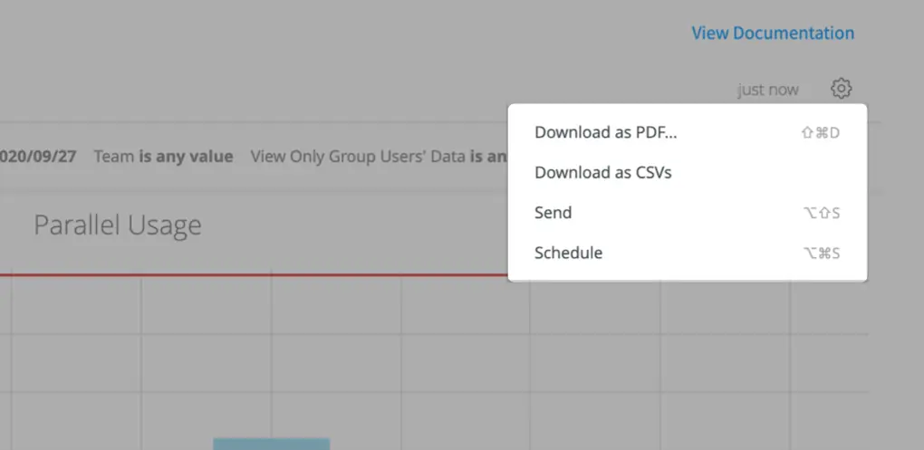
Schedule, Send and Download reports
Test Insights allows you to schedule periodic email, delivered directly to email box. Dashboard level email schedules can be set and also shared with your team members who may not be present on BrowserStack.
Reports can be set up as schedules, or send a one-time email via the Send option, available on the top-right menu. You can also download the dashboards in form of PDF or CSV, to share the reports via internal mediums. The schedules can be set up with different filters.
Schedule reports
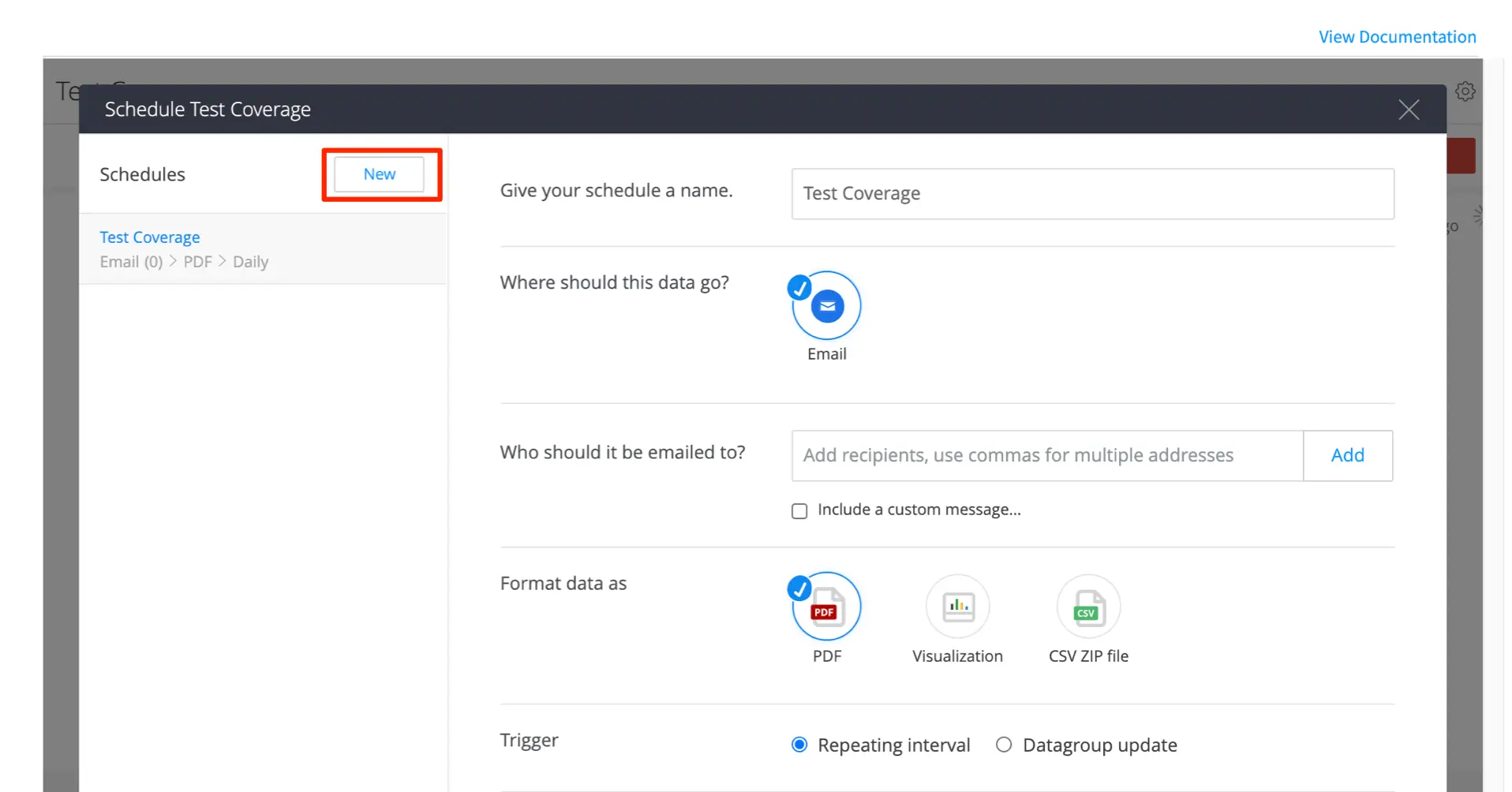
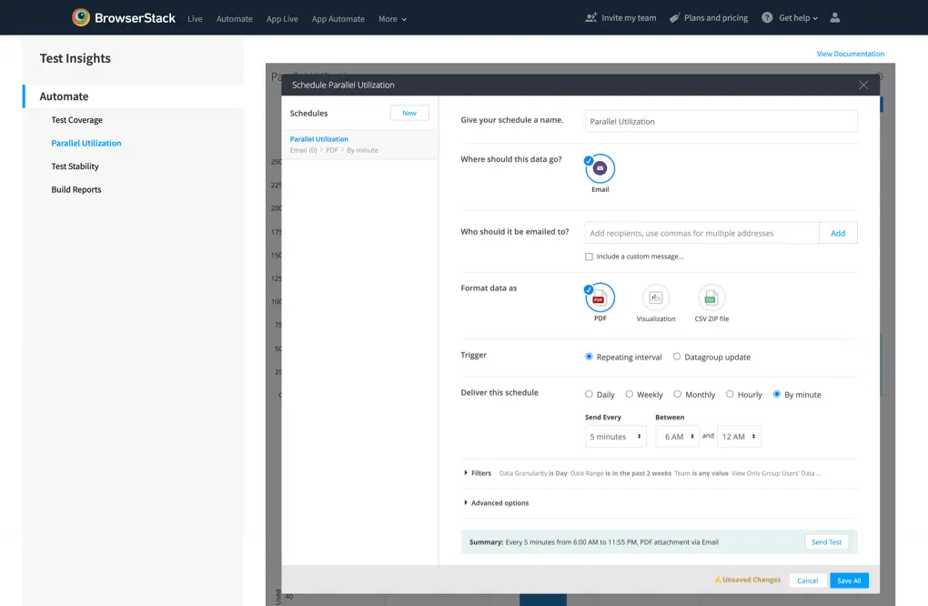
In order to set a schedule, click settings icon on top-right menu and click Schedule from the top-right menu. Click New to create a new schedule. You get the following options:
-
Give your schedule a name: The name that will be used as the subject line of the email. And will show up as the schedules name on the left menu.
-
Who should it be emailed to: Add all the emails that should be sent to the email.Include a custom message that allows you to add a message in the schedules mail body.
-
Format data as: Three options are available
- PDF format
- Visualization which sends an image of the dashboard
- CSV ZIP File attaches CSV file of the data to the email
-
Trigger: Select the repeating interval.
-
Deliver this schedule: Select the frequency and delivery schedules.
-
Filter: Apply all the filters, as per your need.
-
Advanced Options: Select the settings for the following:
- Time zone
- Single column layout
- Paper size
- Formatted data values (for CSV)
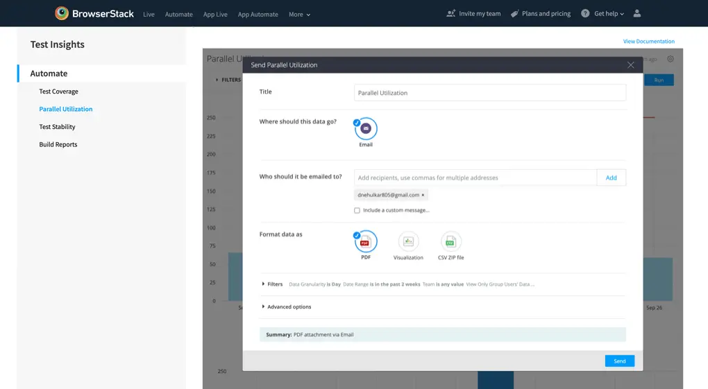
Send reports
Send option gives you the option of sharing the dashboard reports as a one time email. You get all the above options other than scheduling options.
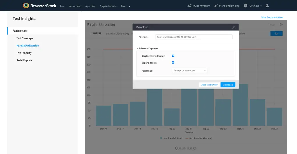
Download reports
Download via CSV or PDF option gives allows you to instantly download the full dashboard, and the file is shareable internally via your organisation’s preferred communication medium.
Toggle reports
You can also choose to hide or show different data points in each report on the dashboard, simply by turning on or off the toggle. The corresponding data point in the report’s legend works as the toggle.
Test performance status
Performance Breakdowns:
PASSED : The tests marked as Passed by the users.
FAILED : The tests marked as Failed by the users.
ERROR : The tests which were not marked pass or failed and there was an error. You can get more details on these in Test Stability section.
TIMEOUT : The tests which faced a timeout, such as a device did not receive the next test command.
UNMARKED* : The test sessions that got completed successfully, but were not marked by the user.
IGNORED** : The tests that were skipped because of OS or test settings.
SKIPPED** : A test case that was never executed by the test runner.
* Applicable only for Appium test sessions.
** Applicable only for Espresso/XCUI tests.
We're sorry to hear that. Please share your feedback so we can do better
Contact our Support team for immediate help while we work on improving our docs.
We're continuously improving our docs. We'd love to know what you liked
We're sorry to hear that. Please share your feedback so we can do better
Contact our Support team for immediate help while we work on improving our docs.
We're continuously improving our docs. We'd love to know what you liked
Thank you for your valuable feedback!