Testing for web accessibility can be overwhelming—QA testers often face an endless cycle of identifying, reporting, and rechecking issues, only to see the same violations persist. What if you knew exactly which WCAG success criteria are most likely to impact your customers — and which ones you need to evaluate deeply to reduce risk?
Our analysis of 1000 web pages uncovered 41,947 accessibility issues across multiple WCAG success criteria. In this blog, we break down the 10 most frequent accessibility violations, show their real-world impact, and provide actionable fixes to help you build a more accessible web experience.
Success Criterion #1: WCAG 1.4.3 – Contrast (Minimum)
Low contrast text makes content hard to read
The most frequent accessibility violation remains insufficient color contrast. This isn't just about aesthetics—it's about readability for all users, including those with visual impairments.
For example, hero sections on modern websites frequently display text over gradient backgrounds. Certain areas of the gradient may not provide sufficient contrast with the text.


Websites, such as news sites, use promotional banners with text overlaid on images or video backgrounds. If no text shadow or overlay is applied, portions of the text may blend into the background.

💡 Solution: Maintain strong contrast by using high-contrast color combinations, text shadows, or overlays when placing text over images.
Testing for Compliance
- Identify Text Elements: Check all text, including headings, buttons, and images of text.
- Check Contrast Ratios: Use a contrast checker to ensure compliance with WCAG standards.
- Required Contrast Levels:
- Normal text: Minimum 4.5:1 contrast ratio.
- Large text (18pt+ or 14pt bold): Minimum 3:1 contrast ratio.
Review Exceptions: Decorative text, inactive elements, and logos may be exempt.
Success Criterion #2: WCAG 4.1.2 – Name, Role, Value
Missing name, role, or value confuses assistive technologies
The next most frequent issue for screen reader users is when interactive elements—like buttons, form fields, or custom widgets—don’t expose their name, role, or current state. When this information is missing or incorrectly coded, assistive technologies can’t communicate what the element is or how to interact with.
For example, in the below image the Track Order’ button is implemented using a <div> but missing a role="button"
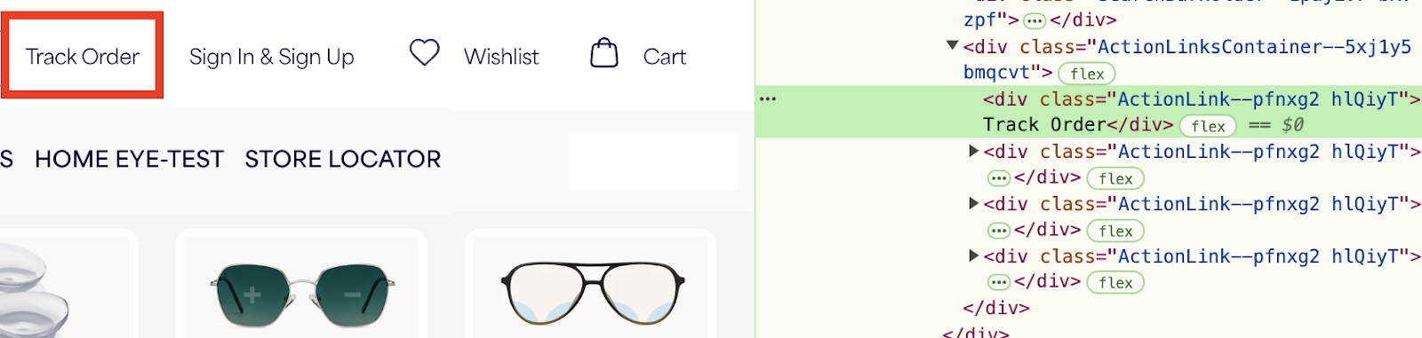
💡 Solution: Always provide appropriate roles, labels, and states for interactive elements to ensure accessibility.
Testing for Compliance
- Identify Interactive Components: List all buttons, links, form fields, and custom controls.
- Check Accessible Names: Ensure elements have meaningful labels (via
<label>,aria-label, oraria-labelledby). - Verify Roles: Use semantic HTML or explicitly define roles (e.g.,
<div role="button">). - Test State and Value Changes: Ensure UI state changes (checked/unchecked, expanded/collapsed) are correctly conveyed.
- Use Accessibility Tools: Test with screen readers (e.g., NVDA, JAWS) to confirm correct announcements.
Success Criterion #3: WCAG 2.4.7 – Focus Visible
No visible focus indicator leaves keyboard users lost
Keyboard users rely on visible focus indicators to navigate a webpage. When websites remove these for aesthetic reasons, it creates a frustrating experience.
For example, a navigation menu without a focus outline can leave users guessing where they are when tabbing through items.
💡 Solution: Ensure a clear focus indicator (e.g., an underline, outline, or background change) that balances usability with design.
Testing for Compliance
- Identify Interactive Elements: Review all links, buttons, form fields, and controls.
- Tab Navigation: Use the Tab key to ensure focus moves logically through elements.
- Visual Inspection: Verify that the focus order matches the page layout.
- Keyboard Shortcuts: Ensure shortcuts don’t disrupt logical navigation.
- Assistive Technology: Test with screen readers to confirm correct focus announcements.
Success Criterion #4: WCAG 2.1.1 – Keyboard
Keyboard users can’t access all features
Many disabled users rely solely on their keyboard to navigate. If a website's interactive elements aren't keyboard-accessible, these users are locked out of key functionality.
For instance, navigation menus or dropdowns that require a mouse make it impossible for keyboard users to interact.
Example, the red highlight shows all elements that were skipped in the tab order. The blue highlights show the order of tabbing over other interactive elements.
💡 Solution: Fixing this is simple: ensure all interactive elements can be navigated using Tab, activated with Enter, and closed with Esc where necessary.
Testing for compliance
- Keyboard Navigation: Use the Tab key to navigate and ensure all interactive elements are accessible and operable with Enter/Space.
- Focus Indicators: Confirm that all focusable elements visibly change state when selected.
- Forms & Controls: Verify that text fields, checkboxes, and buttons are keyboard-friendly.
- Skip Navigation: Look for “skip to content” links to help users bypass repetitive menus.
- No Keyboard Traps: Ensure users can move freely without getting stuck in any element.
- Assistive Tech Compatibility: Test with screen readers to confirm smooth keyboard navigation.
5. Success Criterion #5: WCAG 1.3.1 – Info and Relationships
Poor page structure disrupts assistive technology users
When a webpage lacks a logical structure, assistive technologies struggle to present content properly. This can confuse users with cognitive or visual impairments.
A common mistake? Using headings for styling rather than structure. In the below example, a tagline marked as an <h3> might mislead screen reader users into thinking it represents a major section.
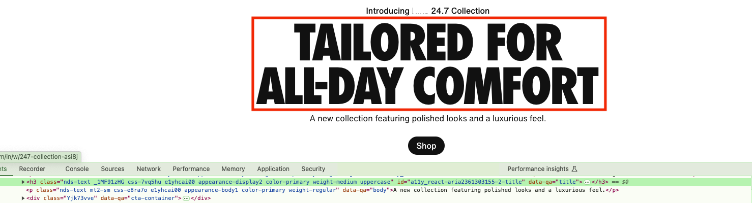
💡 Solution: Instead, use semantic HTML (<p> for paragraphs, <h1>-<h6> for proper headings) to convey the right meaning.
Testing for Compliance
- Review HTML Structure: Ensure headings follow a logical hierarchy (
<h1>→<h2>→<h3>, etc.). - Check Labels & Associations: Form elements should have
<label>tags linked with theforattribute. - Evaluate Tables: Use
<th>for headers and associate them with data cells properly. - Assistive Technology Testing: Use screen readers to verify content relationships and navigation.
- Text Descriptions: Provide clear text explanations for content that isn't programmatically determined.
6. Success Criterion #6: WCAG 2.4.4 – Link Purpose (In Context)
Vague link text creates confusion
Users should be able to understand where a link will take them before clicking. Vague link text makes navigation frustrating, especially for screen reader users.
For example, multiple "Know more" links on a product page provide no context. A screen reader user hears "Know more, Know more" with no clue what the links refer to.
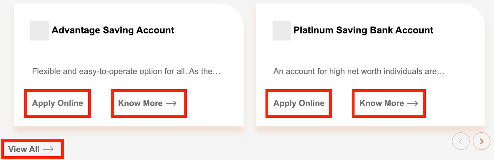
💡 Solution: A better approach is to use descriptive link text like "Learn more about the Platinum Savings Account.”
Testing for Compliance
- Review Link Text: Ensure all links clearly describe their purpose. Avoid vague phrases.
- Contextual Evaluation: If link text alone isn’t descriptive, ensure the surrounding content provides clarity.
- Keyboard Navigation: Tab through links and verify they make sense when announced by a screen reader.
- Check for Redundancy: Avoid repetitive links unless they lead to different destinations.
- Assistive Technology Testing: Use screen readers to confirm links are understandable in context.
7. Success Criterion #7: WCAG 1.1.1 – Non-text Content
Missing alt text prevents screen reader users from understanding images
Images, videos, charts, and buttons need alternative text so screen readers can describe them to users.
For instance, an e-commerce site might display product images with alt="image1.jpg" or omit alt text altogether. This leaves visually impaired users with no way of knowing what’s available.

💡 Solution: Provide meaningful alt text: "Red leather crossbody bag with gold hardware" to help visually-impaired users make purchasing decisions.
Testing for Compliance
- Review All Non-Text Content: Ensure images, icons, charts, and buttons have descriptive alt text.
- Check UI Components: Verify buttons, form fields, and sliders have sufficient contrast (minimum 3:1).
- Assess Graphical Elements: Confirm charts, diagrams, and infographics have enough contrast for clarity.
- Ensure Visual Distinctions Are Accessible: Graph lines, pie chart segments, and icons should meet contrast requirements.
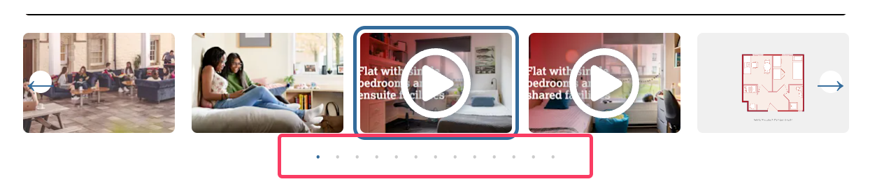
8. Success Criterion #8: WCAG 2.5.8 – Target Size (Minimum)
Tiny buttons and links frustrate users
Small buttons and links make navigation difficult, especially for users with limited dexterity.
For example, carousel navigation dots are often too small to click accurately, leading to frustration.
Testing for Compliance
- Identify Interactive Elements: Review all buttons, links, and controls.
- Measure Target Sizes: Use browser dev tools to check dimensions (minimum 24 x 24 px).
- Check Spacing: If elements are smaller, ensure they have enough space around them.
- Document Findings: Note which elements meet the requirement and flag exceptions.
9. Success Criterion #9: WCAG 1.4.10 – Reflow
Horizontal scrolling at high zoom breaks layouts
Users should be able to zoom in on content without the need of two dimension scrolling. If a site breaks at high zoom levels, it becomes unusable for low-vision users.
For example, some websites force horizontal scrolling at 400% zoom, making reading a painful experience.

Testing for Compliance
- Zoom to 400%: Use browser zoom to check if content remains visible and functional.
- Check for Horizontal Scrolling: Ensure a 1280px-wide viewport (equivalent to 320px at 400% zoom) does not require side-scrolling.
- Confirm Single-Direction Scrolling: Users should only need to scroll vertically, not horizontally, to read or interact with content.
Success Criterion #10: WCAG 3.3.2 – Labels or Instructions
Forms without clear labels lead to input errors
Forms without clear labels or instructions make it harder for users to enter information correctly, leading to frustration and errors.
For example, placeholders used as labels disappear when users start typing, leaving them unsure of the required input.
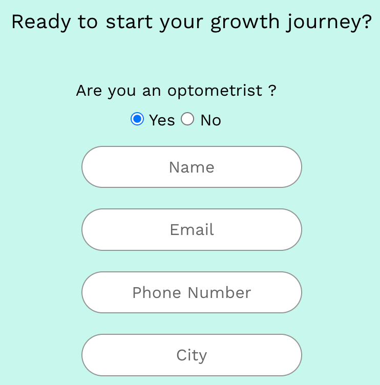
💡 Solution: Fix this by using persistent labels above fields and providing clear instructions, like "Enter Name”.
Testing for compliance
- Identify User Input Fields: Review all form fields, search boxes, and interactive inputs.
- Check for Labels: Ensure each input field has a properly associated label that describes its purpose.
- Evaluate Label Clarity: Confirm that labels provide enough guidance on what to enter.
- Test with Assistive Technologies: Use screen readers to verify that labels and instructions are correctly conveyed.
- Ensure Consistency: Labels and instructions should be uniform across similar form fields.
How much of your website’s accessibility can be automated?
Accessibility testing is critical—but does it have to come with all the manual grunt work? The more tedious the process, the more likely critical issues slip through, increasing your compliance risk. Check out the 2025 Web Coverage Report that provides analysis of 1000+ webpages. It covers issues that are most frequent, and how much of it can be automated. Discover how teams can bridge the existing gaps in accessibility testing to create more accessible digital experiences for all.
Key insights from the report
✔ 97% Accessibility issues can be detected through automation. Find the WCAG success criteria violations that automation can help you catch effectively.
✔ The top 15 WCAG success criteria violations to focus on that can help you make the biggest impact to deliver accessible websites and web apps.
✔ Find examples of infrequent success criteria violations that are crucial to be fixed to overcome real-world accessibility barriers for disabled users
✔ Start early and leverage accessibility testing methods to catch issues before they become costly to fix.
See the full breakdown inside the report!