If you’re a designer, you’ve probably been here before. You hand off your meticulously crafted Figma designs to developers, only to find them back in your inbox a few sprints later. The reason? Accessibility issues. Maybe the color contrast is off. Maybe the touch target size is too small. Or the pages lack a heading structure or reading order.
By the time QA flags it, it’s already late, and fixing it now means rework, delay, and frustration on all sides.
What if you could prevent up to 40% of these issues before a single line of code is written?
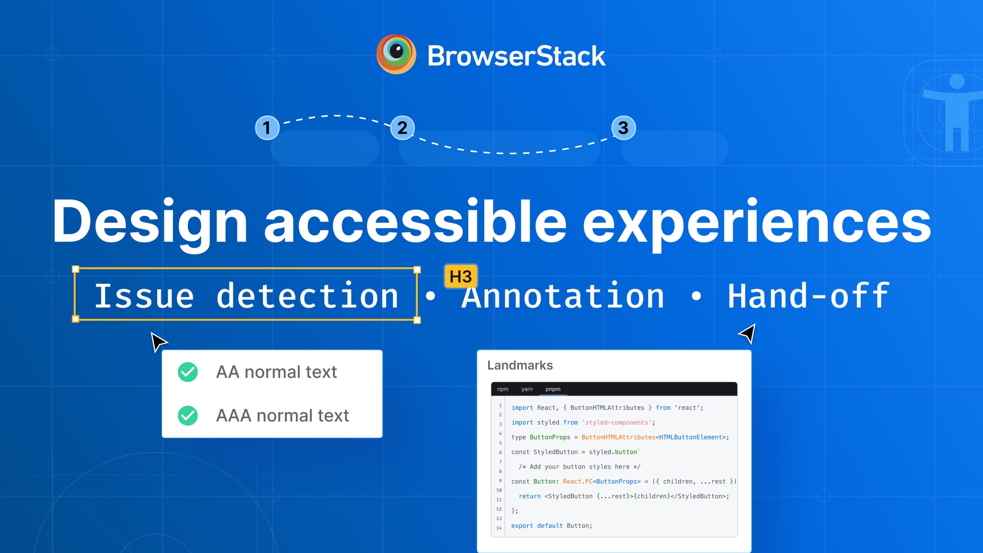
Meet the Accessibility Design Toolkit
The new Figma plugin from BrowserStack helps UI/ UX designers build accessible products right from the start. Powered by our proprietary Spectra™ Rule Engine, it scans your Figma files for WCAG violations and gives you instant, actionable feedback, without leaving your design flow.
Why "Shift Left" on Accessibility?
Accessibility is no longer a nice-to-have. With over 8,800 ADA lawsuits filed in 2024 and the European Accessibility Act now in effect, teams are under growing pressure to meet compliance standards.
However, the current reality for many teams means addressing these critical issues only after launch, leading to rework and delays. The data backs this up. BrowserStack recently partnered with WebAIM to support the 2025 WebAIM Million report, analyzing one million homepages. The results were stark:
- 94.8% had at least one WCAG failure and 51 errors per page, on average
- Color contrast and missing alt text were the top two issues, both preventable during design
That’s why we built this toolkit. To help teams design with accessibility in mind, from the very first pixel.
Design with accessibility built in
Here’s how the Accessibility Design Toolkit helps you catch issues early, build accessible components, and streamline dev handoff, without leaving Figma.
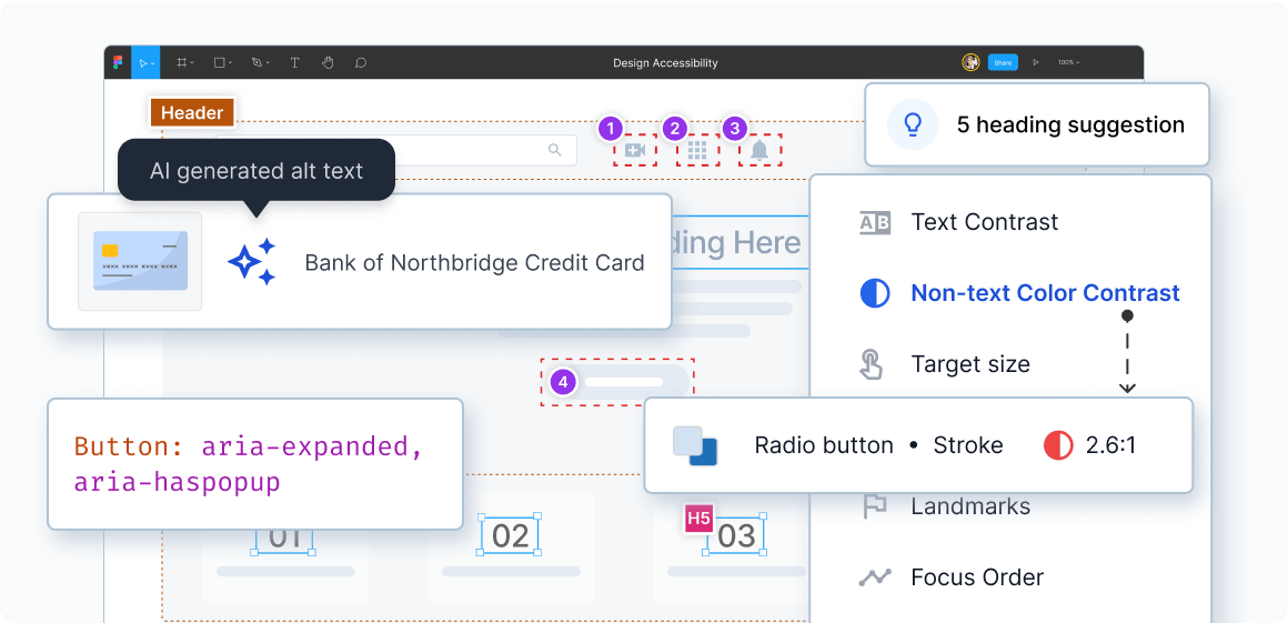
Fix interface accessibility issues with Spectra™ Rule Engine
The Spectra™ Rule Engine works behind the scenes as you design, instantly flagging issues like color contrast, spacing, and touch target violations.
- Auto-annotates page hierarchy, heading structure, reading order, and ARIA roles
- Gets you AI-generated alt-text suggestions for images, and automated sequencing tips for headings and keyboard navigation
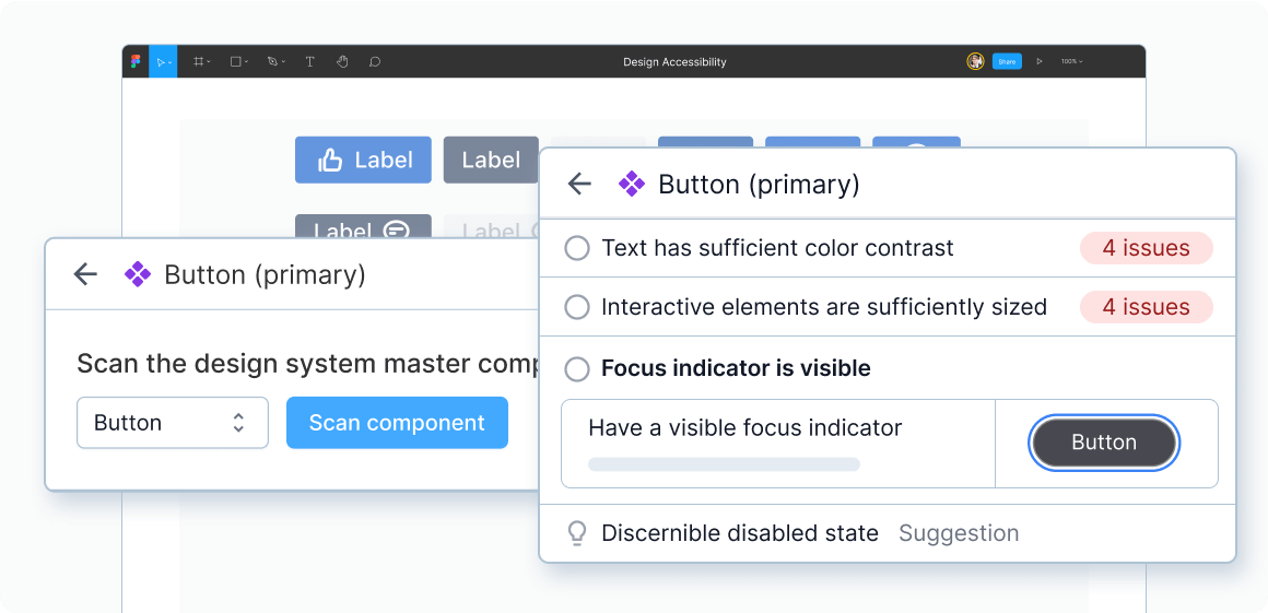
Build accessible UI components once and reuse it everywhere
Design systems are built for consistency. But without accessibility checks, even reusable components can carry forward the same issues again and again. The Accessibility Design Toolkit helps you break that cycle.
- Automatically detects all component variants and interaction states in your Figma file and checks them for accessibility
- Adds ARIA attributes to make reusable components screen reader–friendly
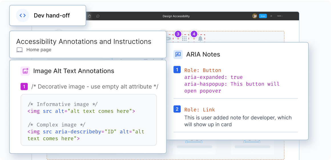
Handoff accessible, annotated design files to developers
Accessibility isn’t just a design problem, it’s a communication problem too. When accessibility annotations are missing or unclear, developers are left to guess. That’s where things slip through the cracks.
“Dev handoff is a major challenge for us, especially with headings, focus order, and labels. We spend a lot of manual effort on this—but BrowserStack solves those problems effortlessly. I wish we had it when we started our design system!"
— Mark Sadecki, Associate Director of Accessibility, Chewy
Our toolkit bridges that gap, with built-in guidance, accessibility specs, and even code snippets that make the dev handoff seamless.
A Key Building Block in BrowserStack’s End-to-End Accessibility Suite
The Accessibility Design Toolkit joins BrowserStack's comprehensive accessibility suite, which includes accessibility testing for web and mobile applications, together providing end-to-end accessibility coverage from design to deployment.
Accessibility, Simplified
You don’t need to be an accessibility expert to build accessible designs. The Accessibility Design Toolkit puts best practices at your fingertips — so you can design with confidence.