Images play a vital role in web design, but large files can slow page loading and negatively impact user experience, especially on mobile devices.
Reducing image size improves load times, saves bandwidth, and boosts SEO performance.
Overview
How to Make an Image Smaller Using HTML and CSS
- Use HTML width and height: Set dimensions directly in the <img> tag to control image size.
- Add inline CSS: Use the style attribute for quick resizing, keeping height: auto to preserve proportions.
- Use CSS classes: Define image size and styling once in CSS and apply via class names for cleaner code.
- Preserve aspect ratio: Set only the width or use height: auto to avoid stretching.
- Make it responsive: Use % or em units and add srcset to load different sizes based on screen width.
This article explores various techniques to reduce image size using HTML and CSS.
How to Make an Image Smaller in HTML
You may need to make an image smaller for many reasons, such as ensuring faster page loading, less bandwidth consumption, a smoother experience for mobile users, and more.
The most fundamental way to make an image smaller in HTML is by using the width and height Attributes in the <img> tag.
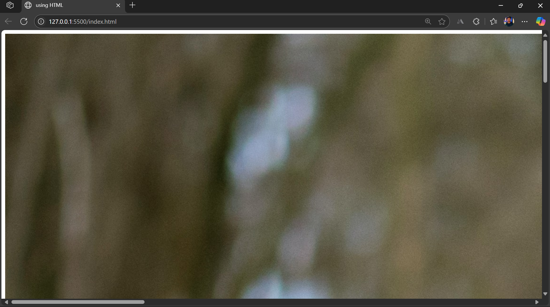
For instance, here’s the original image with original dimensions of 4460 x 3302 pixels. Here’s how you can make the image smaller in HTML.
The original image appears so large on the webpage that it doesn’t fit properly on the screen.
<body>

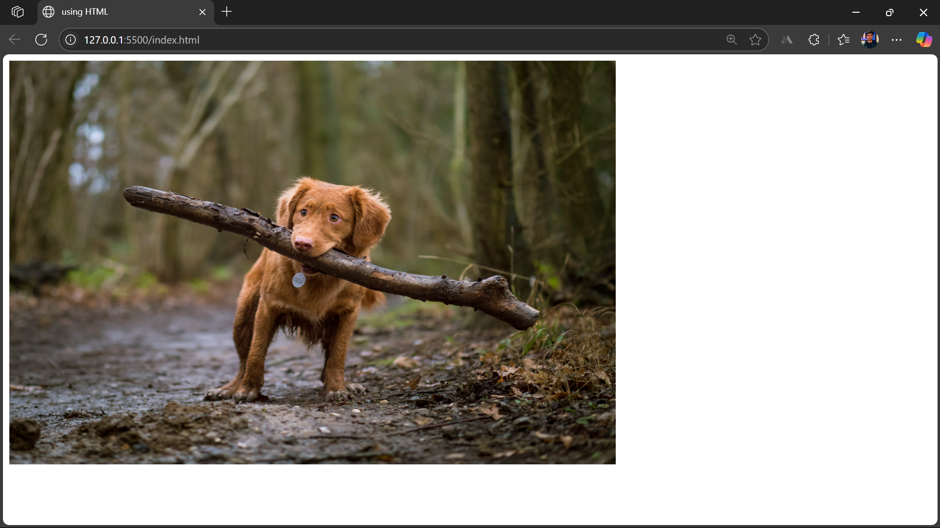
    <img src="freeDogImage.jpg" width="750px" height="500px">

</body>
After applying the width and height attributes, the image is resized to a smaller, more manageable size that fits well on the screen and can be easily styled.
How to Make an Image Smaller Using CSS
While HTML allows you to alter basic height and width to resize an image, CSS offers more flexibility and control over how you want to show the image on the webpage.
Here’s how to make an image smaller using CSS.
Using Inline CSS
The syntax for using the inline CSS to resize an image is as follows.
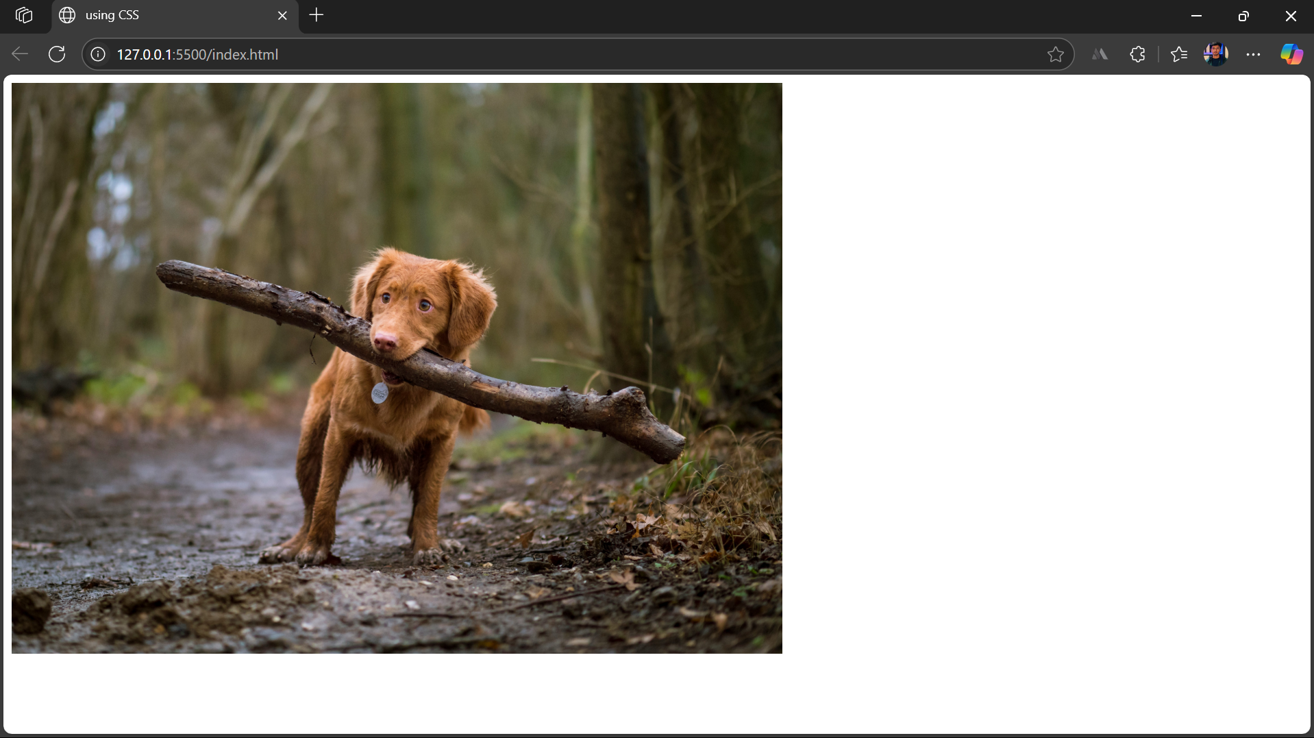
<img src="image.jpg" style="width: 750px; height: auto;" alt="sample Image">
Using CSS Classes
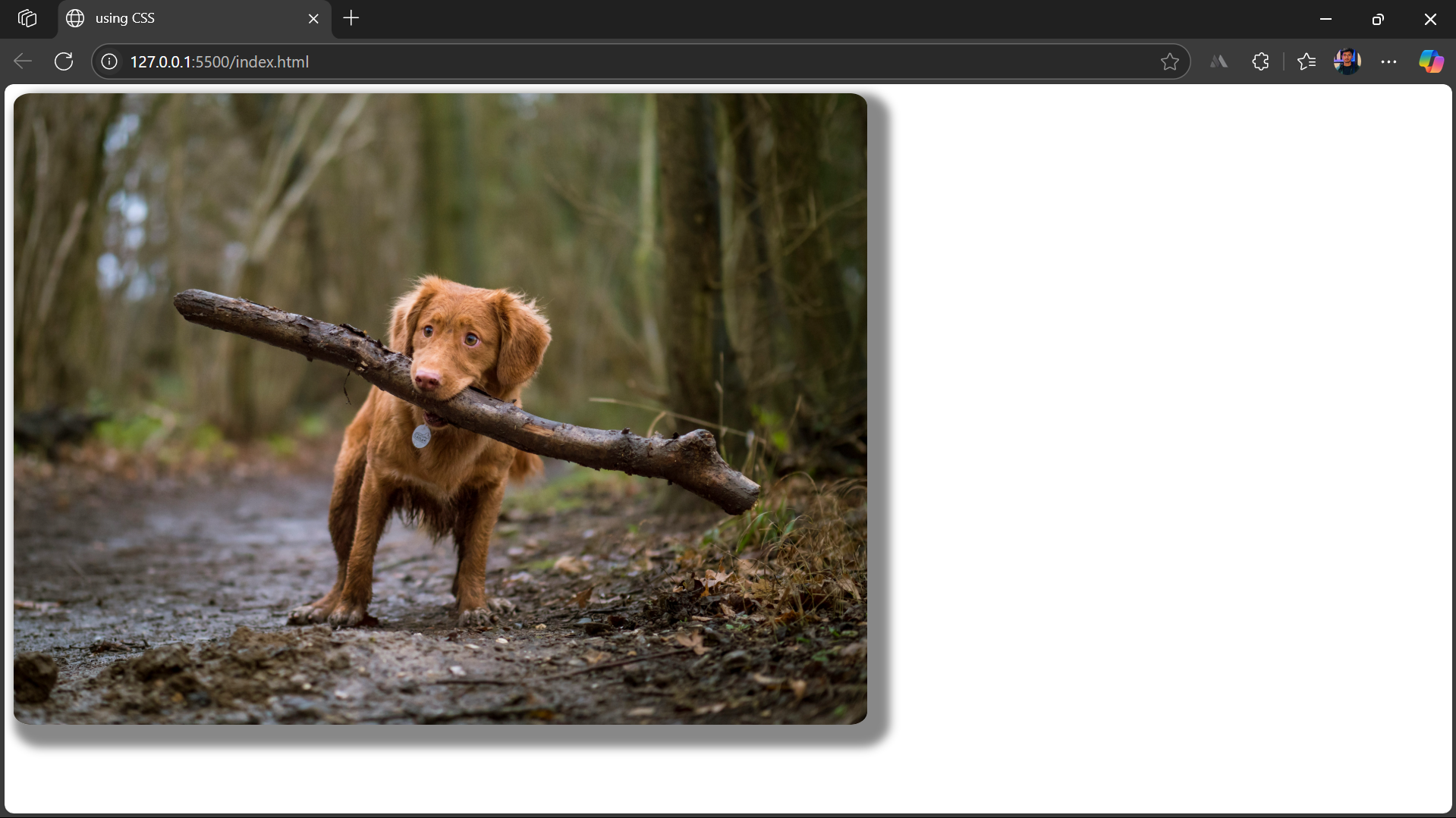
In this method, you assign a class name to the image element in your HTML and apply the desired styling to that class within the CSS section or an external CSS file.
Since CSS offers more styling options, you can add borders, effects, transitions, and more.
HTML
<html>

<head>

    <title>using HTML</title>

    <link rel="stylesheet" href="style.css">

</head>

<body>

    <img src="freeDogImage.jpg" class="SmallImage" alt="sample image">

</body>

</html>
CSS
.SmallImage{

    height: auto;

    width: 750px;

    border-radius: 2%;

    box-shadow: 10px 10px 8px 10px #888888;

}
Making Images Responsive using CSS
A responsive image helps maintain a consistent design across all devices. It also caters to the high volume of mobile users, which directly enhances user experience and positively impacts business performance. Here’s how to make an image responsive using CSS.
CSS Media Queries
Using media queries, you can apply different styles for different viewport dimensions.
To leverage it for a responsive layout, several breakpoints where the layout will change are decided based on tablet, mobile, and desktop viewport dimensions.
Here’s how to use media queries for responsive design.
HTML
<html>

<head>

  <title>Responsive Layout with Image</title>

  <link rel="stylesheet" href="style.css" />

</head>

<body>

  <div class="container">

    <div class="text">

      <h1>Welcome to My Website</h1>

      <p>This layout adjusts based on the screen size using media queries.</p>

    </div>

    <div class="image-wrapper">

      <img src="freeDogImage.jpg" alt="Sample Image" alt="sample image">

    </div>

  </div>

</body>

</html>
CSS for styling elements
body {

    margin: 0;

    font-family: Arial, sans-serif;

  }


  .container {

    display: flex;

    justify-content: space-between;

    align-items: center;

    padding: 20px;

    gap: 20px;

  }


  .text {

    flex: 1;

  }


  .image-wrapper img {

    max-width: 100%;

    height: auto;

    border-radius: 8px;

  }
CSS for using Media Queries
 /* Media Query for tablets and smaller (<=768px) */

  @media (max-width: 768px) {

    .container {

      flex-direction: column;

      text-align: center;

    }


    .image-wrapper img {

      width: 80%;

    }

  }


  /* Media Query for small phones (<=480px) */

  @media (max-width: 480px) {

    .image-wrapper img {

      width: 100%;

    }


    .container {

      padding: 10px;

    }


    .text h1 {

      font-size: 1.5rem;

    }


    .text p {

      font-size: 1rem;

    }

  }
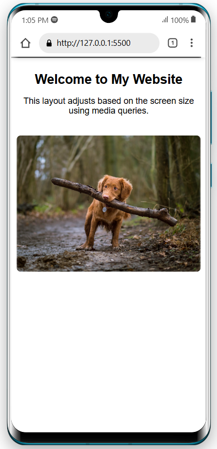
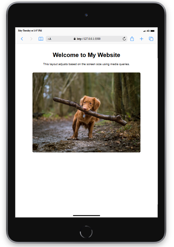
Here’s how the website looks on different devices.
Desktop Responsive
Mobile Responsive
iPad/Tablet Responsive
Learn More: How to Create a Website using HTML and CSS
Using max-width
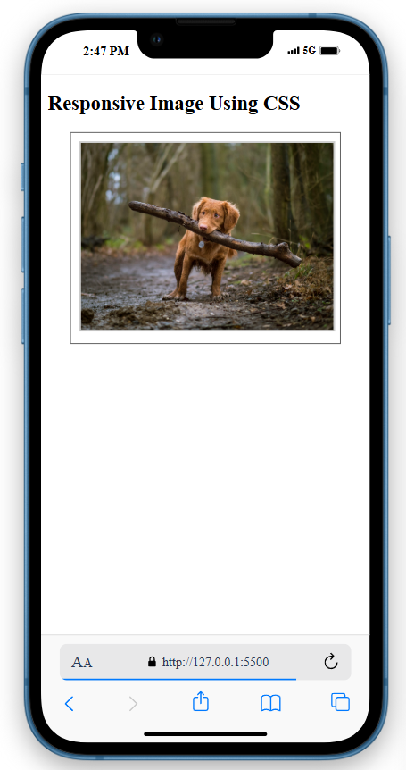
The max-width property allows the image not to overflow its parent container or the width you specify. However, it can scale down when accessed on smaller screens.
Moreover, if you set the height value to auto, the image will maintain its aspect ratio and not stretch or compress.
Here’s an example of how to use the max-width property for responsive image designs.
HTML
<body>


  <h2>Responsive Image Using CSS</h2>

  <div class="container">

    <img src="freeDogImage.jpg" class="responsive-image" alt="sample image">

  </div>


</body>
CSS
   .responsive-image {

      max-width: 100%;

      height: auto;

      border: 2px solid #ccc;

    }


    .container {

      width: 80%;

      margin: auto;

      border: 1px solid #333;

      padding: 10px;

    }
Testing on Real Devices with BrowserStack
Testing images’ responsiveness on real devices is essential to ensure they render correctly on devices with varying resolutions and screen sizes.
With BrowserStack Live, you can harness several key benefits:
- Real-World Testing: Experience your website as actual users do, ensuring accurate rendering on various devices.
- Accelerated Debugging: Quickly identify and fix issues, saving time during development.
- Multi-device Testing: This allows users to test web applications on families of device-browser combinations simultaneously and compare them.
- Enhanced User Experience: Optimise images for fast loading and flawless display across all platforms.
- Seamless Integration: Easily incorporate testing into your existing workflow, maintaining efficiency and productivity.
- Comprehensive Coverage: Access a vast array of real devices and browsers, ensuring your site is robust and universally compatible.
Best Practices for Making Images Smaller in HTML
Optimizing image size is crucial for responsive design and faster load times. Here are the key practices:
- Keep aspect ratio: Set only the width and let the height adjust automatically.
- Use responsive units: Prefer %, em, or rem over fixed pixel values for scalability.
- Use srcset for responsiveness: Load different image sizes based on screen resolution.
- Centralize styling with classes: Avoid repeating styles by using CSS classes.
- Enable lazy loading: Load images only when they enter the viewport.
Common Mistakes to Avoid while Making an Image Smaller in HTML
Avoid these errors when resizing images in HTML:
- Using uncompressed files: Resize and compress images to reduce load times.
- Distorting aspect ratio: Don’t set width and height without preserving proportions.
- Inline styling for every image leads to messy code and increases the risk of inconsistencies.
- Skipping lazy loading causes slow initial page loads, especially with many images.
Conclusion
Optimizing images is essential for building fast, responsive, visually consistent websites. While HTML width and height attributes offer basic resizing, CSS provides greater flexibility through dynamic units, responsive layouts, and centralized styling.
Use techniques like lazy loading, srcset, and compression to create efficient and scalable designs.
Combine these with thorough cross-device testing using tools like BrowserStack to ensure your images and your site perform well across all screen sizes.


