As software development cycles accelerate, maintaining control over the quality and reliability of applications becomes increasingly challenging. To stay ahead, teams need a more efficient way to track testing progress, detect issues, and ensure coverage.
This is where software testing dashboards come into play, offering a comprehensive, real-time view of key testing metrics to drive smarter, faster decision-making and improve overall software quality.
Overview
Why Teams Need Testing Dashboards?
- Centralizes QA progress for clear, unified tracking.
- Aligns testing with business goals like faster releases.
- Spots issues early to prevent production problems.
- Keeps stakeholders informed with instant insights.
- Measures team performance through key metrics.
- Syncs with CI/CD for real-time quality feedback.
Types of Software Testing Dashboards
- Executive Dashboards
- Operational QA Dashboards
- CI/CD Integration Dashboards
- Regression & Coverage Dashboards
- Custom Dashboards
Key Metrics Every Testing Dashboard Should Display
- Test Coverage
- Defect Leakage
- Build Stability
- Cycle Time
- Flaky Test Rate
- Regression Test Trends
- Bug Reopen Rate
This article breaks down what software testing dashboards are, why they matter, the key metrics to track, and best practices for using them effectively.
What is a Software Testing Dashboard?
A software testing dashboard is a visual interface that provides real-time insights into the quality and performance of software testing activities. It consolidates test execution data, builds performance, defect trends, and more into an easy-to-understand format.
At its core, the purpose of a testing dashboard is twofold:
- Visibility: Make test results, issues, and trends immediately visible to stakeholders.
- Decision-making: Enable faster and more informed decisions around product readiness, release stability, and quality gaps.
Dashboards can vary in complexity—from basic pass/fail widgets to advanced analytics with drill-downs, filters, and historical comparisons.
Why Do Teams Need Testing Dashboards?
Without a dashboard, tracking QA progress can feel like flying blind. You might be executing tests and reporting bugs, but without centralized visibility, the value of your efforts gets diluted.
Here’s why testing dashboards matter:
- Product Alignment: Dashboards help align testing efforts with business and product goals. If the product needs a faster release cycle, the dashboard highlights cycle time inefficiencies.
- Faster Debugging: Spot regression trends or unstable builds early before they cascade into production issues.
- Stakeholder Communication: Non-technical stakeholders can grasp quality status instantly without digging into Jira or test case spreadsheets.
- Accountability: Track individual or team performance based on metrics like test execution speed, defect fix rates, etc.
- CI/CD Integration: Real-time sync with pipelines means zero lag in quality feedback.
Key Metrics Every Testing Dashboard Should Display
An effective software testing dashboard isn’t just a collection of colorful charts—it’s a decision-making tool. To deliver real value, dashboards must prioritize actionable metrics over vanity data. Below are the essential KPIs every team should track, all aligned with the unified metric capabilities provided by Quality Engineering Insights (QEI) from BrowserStack.
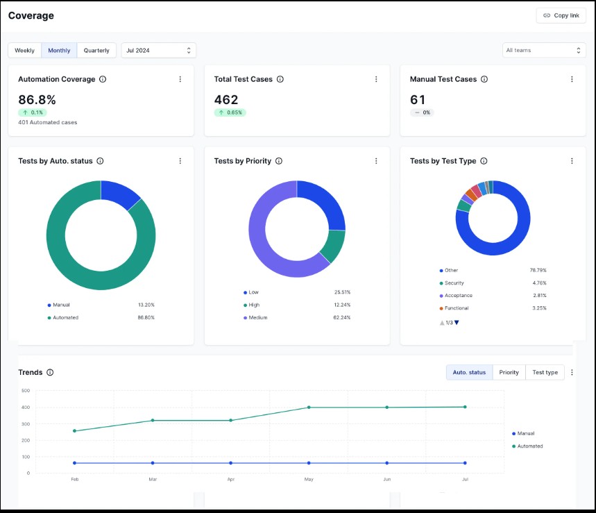
Test Coverage
- What it shows: The percentage of application codebase covered by automated tests.
- Why it matters: Higher test coverage often correlates with fewer undetected bugs, but what’s more important is where the coverage lies.
- With QEI: Can drill down by feature or module to identify under-tested areas—especially critical in high-impact zones like checkout or login.
Defect Leakage
- What it shows: The number of bugs that escape QA and are found in production.
- Why it matters: This metric directly reflects test effectiveness. High leakage is a red flag that demands better coverage or deeper regression testing.
- With QEI: Easily trace back to specific builds or test suites that allowed critical defects to slip through.
Read More: Defect Management in Software Testing
Build Stability
- What it shows: The success-to-failure ratio of builds in CI/CD pipeline.
- Why it matters: Frequent build failures can slow down releases and erode team confidence in the system.
- With QEI: Monitor build health trends over time to pinpoint unstable components and improve CI reliability.
Cycle Time
- What it shows: The time taken from initial test planning to final deployment.
- Why it matters: Shorter cycle times lead to faster feedback loops and quicker releases, making it essential for agile teams.
- With QEI: Get precise breakdowns across planning, testing, review, and deployment phases to spot bottlenecks.
Flaky Test Rate
- What it shows: How often tests fail intermittently, without actual code changes.
- Why it matters: Flaky tests waste time, breed mistrust in automation, and mask real issues.
- With QEI: Highlight persistent flaky tests and tag them for stabilization or rewrite before they pollute CI results.
Regression Test Trends
- What it shows: Patterns where previously fixed bugs are reappearing.
- Why it matters: Frequent regressions suggest either poor test coverage or weak root-cause resolution.
- With QEI: Visualize regression hotspots and correlate them with developer commits or sprint changes.
Bug Reopen Rate
- What it shows: The frequency at which supposedly fixed bugs are reopened.
- Why it matters: A high reopen rate may point to inadequate testing, unclear requirements, or ineffective collaboration between QA and Dev teams.
- With QEI: Track reopen rates by feature, assignee, or sprint to identify training needs or process gaps.
These metrics do more than describe the state of testing—they uncover the story behind the state. By tracking them collectively, teams gain visibility into:
- What’s working well (key wins)
- What needs attention (focus areas)
- Where to optimize processes for better release confidence
A dashboard powered by insights like these—especially through a unified platform such as QEI—becomes an indispensable asset in driving quality engineering forward.
Types of Software Testing Dashboards
Just as different roles across engineering, QA, and product management have distinct needs, software testing dashboards come in various forms—each tailored to provide the most relevant insights to its intended audience. Understanding the types of dashboards available can help teams select or build the most effective views for their workflows.
Below are the primary types of software testing dashboards, along with their use cases and typical users:
1. Executive Dashboards
Purpose: Provide a high-level, strategic overview of software quality across projects and releases.
Ideal For: CTOs, QA Directors, Product Managers, Stakeholders
Key Features:
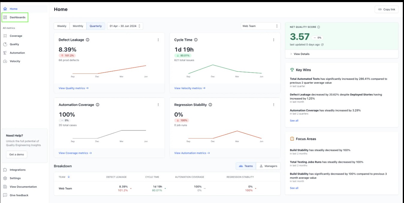
- Net Quality Score (NQS) across teams or products
- Test execution success trends
- Release readiness indicators
- Defect leakage summaries
- Historical performance comparisons
Benefits: Executive dashboards distill complex data into clean, visual summaries that enable quick go/no-go decisions for releases and highlight areas needing executive intervention.
2. Operational QA Dashboards
Purpose: Monitor real-time QA progress, test executions, and bug trends during the development cycle.
Ideal For: QA Engineers, Test Leads, Scrum Masters
Key Features:
- Pass/fail test case breakdowns by type (unit, integration, E2E)
- Defect distribution by severity, module, or status
- Environment-specific test results (e.g., staging vs. production)
- Test case execution velocity per sprint
- Flaky test identification and prioritization
Benefits: These dashboards serve as the daily cockpit for QA teams—enabling quick triaging, sprint planning, and identifying regressions or blockers during ongoing sprints.
3. CI/CD Integration Dashboards
Purpose: Sync quality metrics directly with continuous integration/continuous deployment (CI/CD) pipeline.
Ideal For: DevOps Engineers, SDETs, Release Managers
Key Features:
- Real-time pipeline status (success/failure/pass rates)
- Automated test feedback per build
- Duration of individual test jobs
- Build failure patterns and root causes
- Integration with tools like Jenkins, GitLab, CircleCI, GitHub Actions
Benefits: These dashboards shorten feedback loops by surfacing quality insights within the same tools used to build and deploy code, facilitating faster and more confident shipping.
4. Regression & Coverage Dashboards
Purpose: Track regression trends and test coverage evolution across time and codebase changes.
Ideal For: QA Analysts, Engineering Managers, Security Testers
Key Features:
- Regression hotspots by module or feature
- Test case redundancy and overlap indicators
- Code coverage delta per commit
- Uncovered critical paths and new functionalities
Benefits: These dashboards promote risk-based testing by identifying where test coverage is thin or regressions are frequent, helping teams focus efforts where they matter most.
5. Custom Dashboards
Purpose: Provide fully tailored views built around specific business, technical, or compliance needs.
Ideal For: Teams with advanced analytics requirements
Key Features:
- Role-based widgets and filters
- Custom KPIs (e.g., SLA adherence, support tickets tied to test gaps)
- Visualizations built via BI tools like Tableau, Power BI, or Grafana
- Integration of multiple data sources (e.g., Jira, BrowserStack QEI)
Benefits: Custom dashboards empower organizations to monitor quality KPIs that align directly with business goals, customer impact, or industry-specific standards.
Integrating Software Testing Dashboards into your CI/CD Pipeline
As software teams adopt DevOps and continuous delivery practices, it becomes essential to embed quality visibility directly into the development pipeline.
Dashboards that operate in isolation are no longer sufficient. For a testing dashboard to be truly effective, it must integrate seamlessly with your CI/CD pipeline—allowing teams to access live test insights, act on failures early, and improve delivery velocity.
Modern CI/CD platforms like Jenkins, GitLab CI, GitHub Actions, CircleCI, and Azure DevOps offer robust hooks for automation and reporting. Here’s how to integrate dashboards effectively:
- Embed Reporting Hooks in Test Jobs: Add reporting steps at the end of your test automation scripts that push test results to your dashboard system (e.g., via APIs).
curl -X POST https://dashboard.example.com/api/report \

 -H "Authorization: Bearer $DASHBOARD_TOKEN" \

 -F "build_id=$CI_PIPELINE_ID" \

 -F "results=@test-results.json"
- Use Dashboard Plugins or Marketplace Add-ons: Many platforms offer native integrations. For example:
- Jenkins has plugins for Allure, QEI, TestRail, etc.
- GitLab CI supports custom dashboards via artifacts and badge APIs.
- GitHub Actions can report directly into external systems using workflow dispatch.
- Leverage RESTful APIs: If the team uses a custom dashboard tool or an advanced analytics platform like BrowserStack’s QEI, utilize their REST APIs to:
- Pull live pipeline data into the dashboard
- Push test artifacts for visualization
- Synchronize release metadata (tags, commits, deploy notes)
How to choose the Right Testing Dashboard Tool?
With a growing number of dashboard solutions available on the market, choosing the right tool for your organization can feel overwhelming. The ideal testing dashboard should not only display your quality metrics—it should empower your team to make better, faster decisions. Selecting the wrong tool, on the other hand, can lead to misalignment, siloed data, and reduced ROI from your QA efforts.
To ensure you pick the best fit, here are the most important evaluation criteria to consider:
- Data Unification Across Testing Tools: Look for a dashboard tool that can consolidate data from multiple sources—manual tests, automation suites, CI tools, bug trackers, and test case managers—into a single, coherent interface. Fragmented data leads to blind spots and redundant reporting.
- Customizability and Role-Based Views: Different roles need different insights. A QA engineer may want execution logs, while a VP of Engineering might prefer a big-picture overview.
- CI/CD and DevOps Integration: The dashboard should plug directly into your CI/CD pipeline, pulling in live test data with minimal setup. Real-time sync eliminates the need for manual updates and ensures continuous visibility.
- Smart Analytics and Insight Generation: Beyond static metrics, modern tools should surface actionable insights—patterns, anomalies, and focus areas that help prioritize action.
- Scalability and Pricing Flexibility: Dashboard needs today may be basic—but will they scale with your team’s growth? Choose a tool that supports scale without inflating costs.
Read More: Essential Metrics for the QA Process
Best Practices to follow when using a Software Testing Dashboard
Here are some field-tested tips to get the most out of testing dashboards:
- Keep It Actionable: Don’t clutter the dashboard. Focus on metrics that inform decisions.
- Automate Data Collection: Manual updates defeat the purpose. Use scripts, plugins, or webhooks.
- Use Annotations: Add notes to explain anomalies like sudden failure spikes.
- Segment by Release: Filter metrics by release cycles for better historical insights.
- Review Regularly: Make dashboards part of your sprint and release retrospectives.
- Establish Baselines: Use historical data to define “normal” performance.
- Visualize Trends: Use line charts, heatmaps, and scatter plots to spot patterns over time.
Why choose BrowserStack Quality Engineering Insights (QEI) as a Software Testing Dashboard?
When it comes to software testing dashboards, BrowserStack’s Quality Engineering Insights (QEI) is not just a reporting tool—it’s a full-fledged decision engine. Designed for modern QA and DevOps teams, QEI brings together test data, CI/CD visibility, and actionable insights in a unified platform.
Unified Quality Metrics: QEI unifies the most critical KPIs into one clear dashboard, eliminating data silos across teams.
- Test Coverage—Track how much of your application is under test, broken down by modules or features.
- Defect Leakage—Visualize bugs that escape into production, helping reduce user-facing issues.
- Build Stability—Analyze the reliability of builds to detect regressions early.
- Cycle Time – Measure the time from code commit to production deployment, identifying delays or inefficiencies.
These metrics give QA, development, and leadership a shared understanding of software quality.
Customizable Dashboards for Every Role: No two users need the same dashboard—and QEI understands that.
- Role-Based Views: Create different dashboard layouts for executives, QA leads, or SDETs.
- Filter by Context: Narrow metrics down by environment (staging, UAT), release version, or test type.
- Widget Configuration: Drag-and-drop modular components make it easy to design the layout that suits your team.
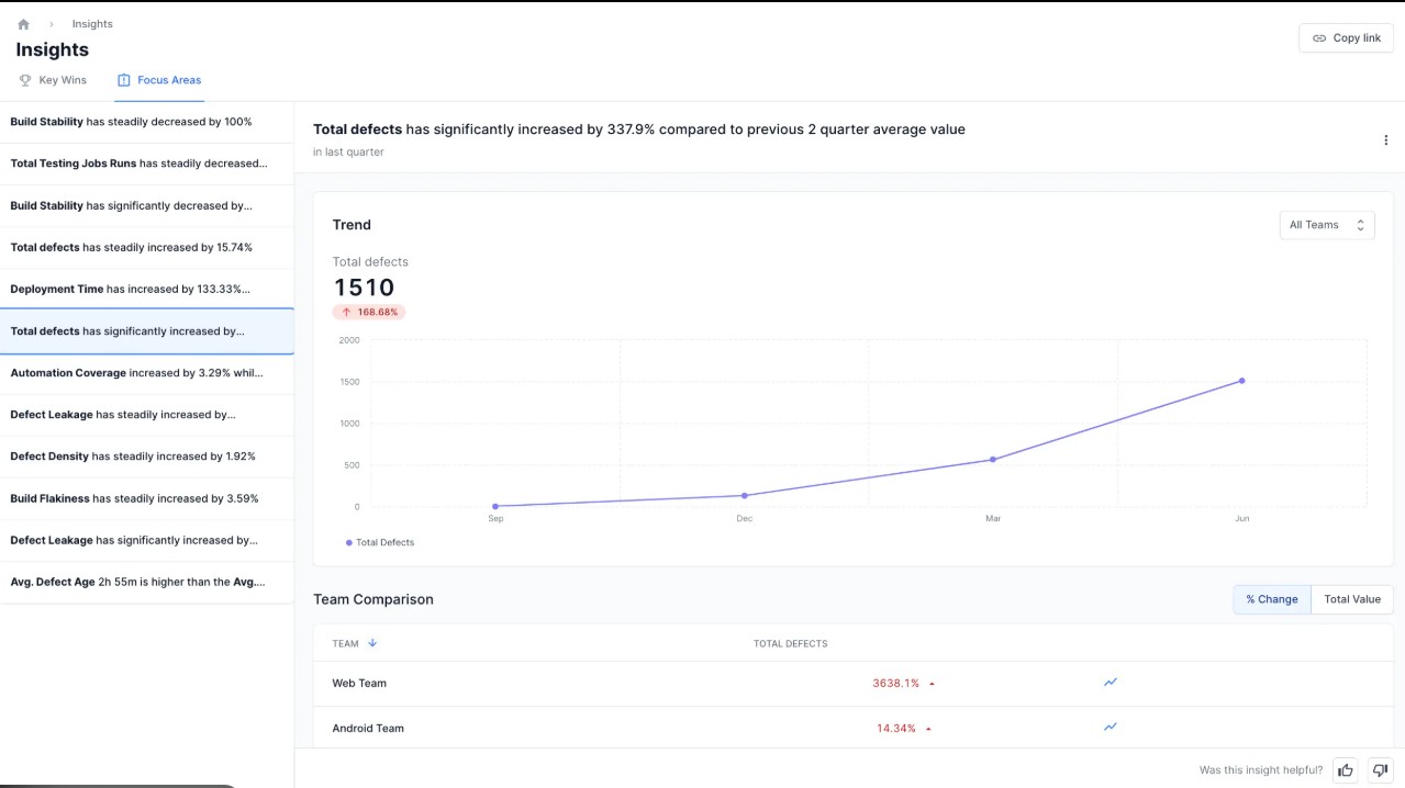
Smart Insights: Go Beyond the Metrics: QEI helps teams understand the ‘why’ behind the numbers using intelligent insights:
- Key Wins: Automatic highlights of improved areas (e.g., reduced flakiness or improved test pass rate).
- Focus Areas: Pinpoints problem zones such as failing modules or unstable builds.
- Trend Detection: Visual timelines reveal when metrics are improving or deteriorating.
Built for CI/CD Integration: QEI integrates deeply into your delivery pipeline, keeping quality feedback looped into every stage.
- Supports tools like GitHub Actions, GitLab CI, Jenkins, Azure DevOps
- Real-time sync of test results per pipeline run
- Build-level metrics and regression risk indicators
One-Pane Executive Reporting: Leadership needs a bird’s-eye view, not granular logs. QEI delivers:
- Net Quality Score (NQS): A powerful metric summarizing the health of builds across coverage, cycle time, and defect rates.
- Release Readiness Tracker: One glance reveals whether your product is production-ready.
- Historical Dashboards: Analyze improvement over time to justify QA investment and guide sprint retrospectives.
If you’re looking for a testing dashboard that scales with your team, adapts to your workflow, and doesn’t just show data—but makes sense of it—BrowserStack’s QEI is the gold standard.
It’s more than a dashboard. It’s your quality command center.
Conclusion
A well-designed software testing dashboard improves visibility, fosters collaboration, and drives accountability. By embracing best practices, tracking meaningful metrics, and using the right tools like BrowserStack’s QEI, teams can enhance quality outcomes and deliver confidently.
Whether you’re launching a new product, scaling your QA efforts, or troubleshooting a stubborn test failure, a robust dashboard is your most valuable ally.


