Color Contrast Checker
Color contrast directly affects how easily users can read and understand on-screen content. The WCAG (Web Content Accessibility Guidelines) sets contrast requirements to ensure text is readable for users with low vision or color blindness. Following these rules also helps meet accessibility laws and avoid potential legal issues.
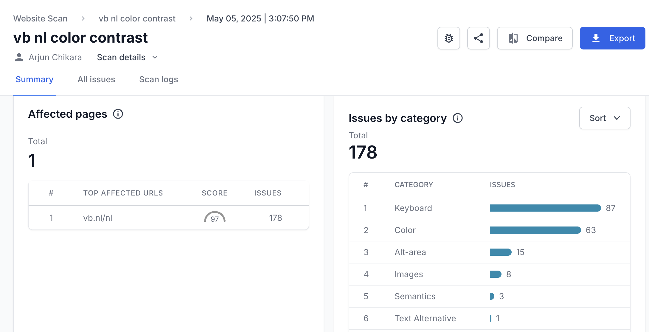
BrowserStack offers a free color contrast checker that helps developers and QA teams find and fix contrast issues across web pages. Just enter a URL and get a detailed color contrast report.
What Is Color Contrast in Web Accessibility?
Color contrast refers to the difference in brightness between foreground elements (like text) and background colors. In web accessibility, this contrast ensures that users with visual impairments can perceive content clearly.
This is particularly important for:
- Text readability
- Buttons and calls-to-action visibility
- Form field labels and inputs
- Icons and interface controls
The WCAG (Web Content Accessibility Guidelines) 2.1 requires a contrast ratio of at least 4.5:1 for normal text and 3:1 for large text (18pt or 14pt bold). If your site fails to meet these standards, users may struggle to read or understand your content, and your site could be flagged as non-compliant with accessibility laws or guidelines.
Why is Color Contrast Important for Compliance
Color contrast is one of the most common accessibility failures flagged during audits. It directly affects how readable and usable a website is for people with visual impairments. Here are some more reasons why color contrast is essential for accessibility compliance.
- Incomplete VPATs: Poor contrast often leads to failed sections in Voluntary Product Accessibility Templates. This can block sales, especially in government and enterprise deals.
- False positives in testing: Low contrast can cause users to misreport visual issues as functional bugs, adding noise to QA and support workflows.
- Legal and remediation risks: Failing to meet contrast requirements can result in legal challenges. Since color choices are often reused across components and pages, fixing them can require broad updates across the site.
- Design inconsistencies during development: Design tokens or themes that don’t include contrast-safe color pairs delay handoffs and increase the risk of rework during implementation.
- Audit failures: Third-party accessibility audits often flag even minor contrast issues. These findings can damage your reputation in procurement and compliance reviews.
- Impact on keyboard and screen reader users: Low contrast combined with poor focus indicators creates barriers that automated tools often miss, leading to undetected issues in production.
Also Read: How to Test Websites with Screen Readers
Understanding Contrast Ratios
WCAG includes different contrast requirements depending on the level of accessibility you’re aiming for. These fall under the broader conformance levels: A, AA, and AAA. While color contrast is just one part of the overall WCAG framework, it’s one of the most measurable and commonly tested criteria.
Most organizations target AA as the baseline for accessibility. AAA is stricter and typically used where maximum readability is critical, like in healthcare or government services.
Here’s how the contrast requirements differ between levels.
AA (minimum contrast requirement)
This is the standard most websites aim to meet.
- Normal text must have a contrast ratio of at least 4.5:1
- Large text (18 pt regular or 14 pt bold and above) must have a ratio of at least 3:1
- UI components and graphical objects also need to meet the 3:1 ratio
AAA (enhanced contrast requirement)
This level is more demanding and is usually applied to content that needs to serve users with more severe vision impairments.
- Normal text must have a contrast ratio of at least 7:1
- Large text must have a ratio of at least 4.5:1
These ratios are based on how users with different types of vision loss perceive contrast. Meeting AAA may limit design flexibility, but it improves readability across the widest range of users.
What Is a Color Contrast Checker?
A color contrast checker is a tool that helps determine whether the contrast between two colors, usually text and background, meets accessibility standards.
The accessibility contrast checker analyzes the contrast ratio and compares it against requirements defined in the Web Content Accessibility Guidelines (WCAG), which set minimum thresholds to ensure readability for people with visual impairments.
How to Use BrowserStack Color Contrast Checker?
Here’s how to use BrowserStack’s website contrast checker to find contrast issues on your website.
- Scan full pages or specific flows: Use the Workflow Scanner to analyze an entire page or the part you interact with. It audits your site in real time as you move through workflows.
- Detect contrast issues: Color contrast violations are automatically flagged based on the WCAG level you select (2.0, 2.1, or 2.2; AA or AAA).
- Grouped and de-duplicated results: Issues are grouped by type and component, with duplicates removed, so teams can focus on fixing what matters without sifting through noise.
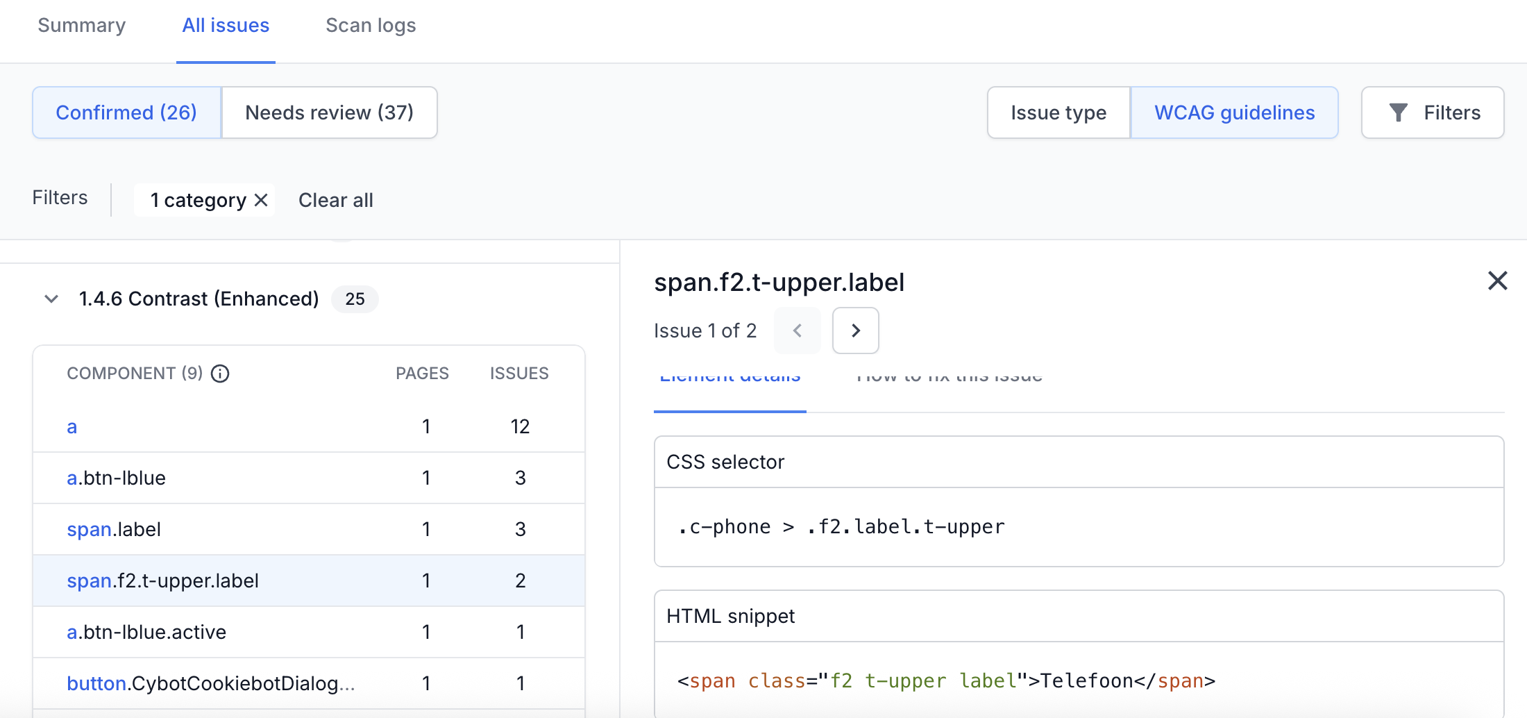
- Drill down into issue details: Each contrast issue includes a complete breakdown with the affected page, specific element, and WCAG rule violated. You can click into any issue for a detailed view, which helps you prioritize and resolve problems more efficiently.
Try BrowserStack Website Scanner
How to Fix Color Contrast Issues?
BrowserStack’s color contrast report provides specific suggestions for resolving each issue. For example, it highlights the current contrast ratio, the foreground and background color values, font size, and the expected ratio based on the WCAG level.
It also lists the exact CSS selector involved so developers can quickly locate the issue in the codebase and make the necessary updates. This level of detail removes guesswork and accelerates the fix process.
Frequently Asked Questions
WCAG allows lower contrast ratios for larger text because it’s generally easier to read. The minimum contrast ratio for normal text is 4.5:1, while for large text (at least 18pt regular or 14pt bold), the minimum is 3:1.
Yes. Color contrast is essential for WCAG compliance. It ensures readability for users with visual impairments and ensures legal compliance with the ADA (Americans with Disabilities Act), EAA (European Accessibility Act), and AODA (Accessibility for Ontarians with Disabilities Act).
Use the BrowserStack color contrast checker to test text and background combinations. It calculates contrast ratios, flags WCAG violations, and suggests accessible alternatives to help you fix issues quickly.
Yes. BrowserStack’s Workflow Analyzer can scan user flows, detect color contrast issues during real interactions, and generate detailed reports. However, this is available in paid plans.


