Responsive
-

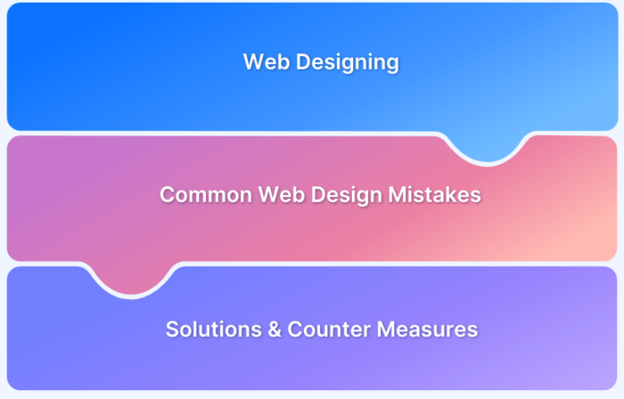
10 Common Web Design Mistakes To Avoid
Avoid these common website design mistakes, which affect your UX and CRO and degrade the site's overall ROI performance.
Learn More -
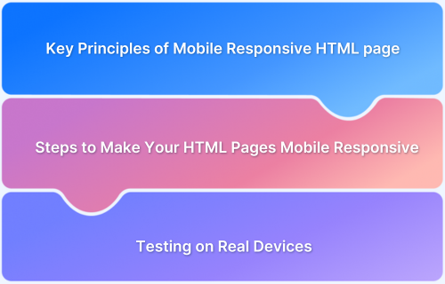
How to Make Your HTML Pages Mobile Responsive
Learn how to make your HTML pages mobile responsive for a seamless user experience across all screen sizes. Improve accessibility, performance, and engagement.
Learn More -
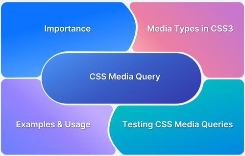
A complete guide to CSS Media Query
Learn all about CSS Media Query: what is CSS Media Query, why use it, Media Types in CSS, how to support older browsers using CSS Media Query with example
Learn More -
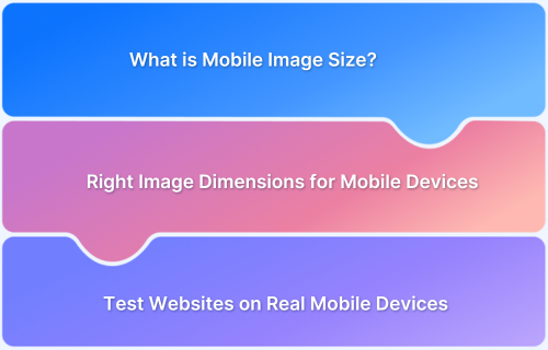
Top Strategies for Optimizing Images for Mobile
Know why image size is important, what are common image sizes for mobile, strategies for optimizing images for mobile, and best practices with this guide
Learn More -
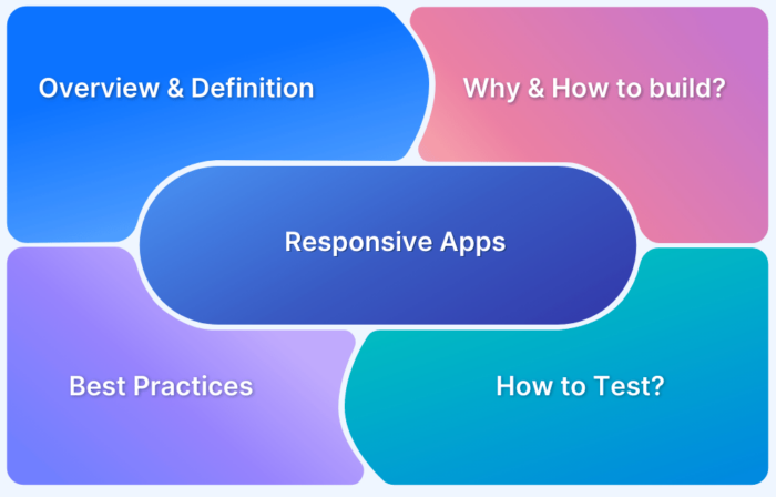
What are Responsive Apps?
Learn about responsive web apps and go through the best practices and testing methods to build quality web apps and deliver seamless user experience.
Learn More -
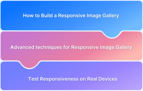
How to Build a Responsive Image Gallery with HTML and CSS
Learn how to build a responsive image gallery using HTML and CSS. Ensure seamless display across devices with modern design techniques.
Learn More -
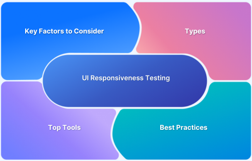
What is UI Responsiveness Testing?
Ensure a consistent, optimized UI across devices with UI responsiveness testing. Detect issues, improve performance, and enhance user experience effortlessly.
Learn More -
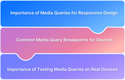
Mastering Media Queries for Responsive Web Design: A Comprehensive Guide
Learn how to use media queries for responsive design and create adaptable websites. Discover how BrowserStack can simplify your testing process.
Learn More -
How to Define and Use Responsive CSS Sizes for Dynamic Web Layouts
Learn the basics of responsive CSS size, its impact on web design, and best practices. Explore how BrowserStack ensures accurate real-device testing.
Learn More -
How to Create Responsive Div Containers Using CSS: Techniques and Examples
Learn how to create responsive div containers using CSS. Explore key techniques, examples, and best practices to ensure seamless adaptability.
Learn More
