Responsive
-

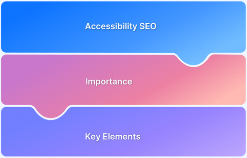
Accessibility and SEO: Improving Web Visibility and Usability
Learn how accessibility SEO improves user experience and search rankings. Explore key strategies to make your website inclusive, user-friendly, and optimized.
Learn More -
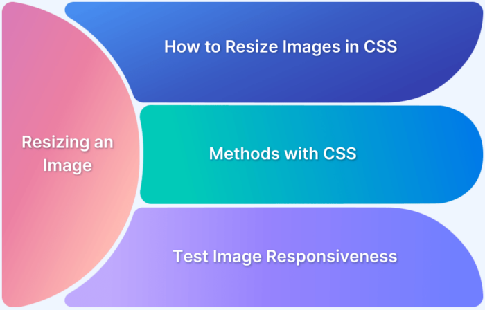
How to resize an image using CSS
Images are integral to visual aesthetics of a website design. Learn how to resize an image using CSS using different methods and test their responsiveness
Learn More -
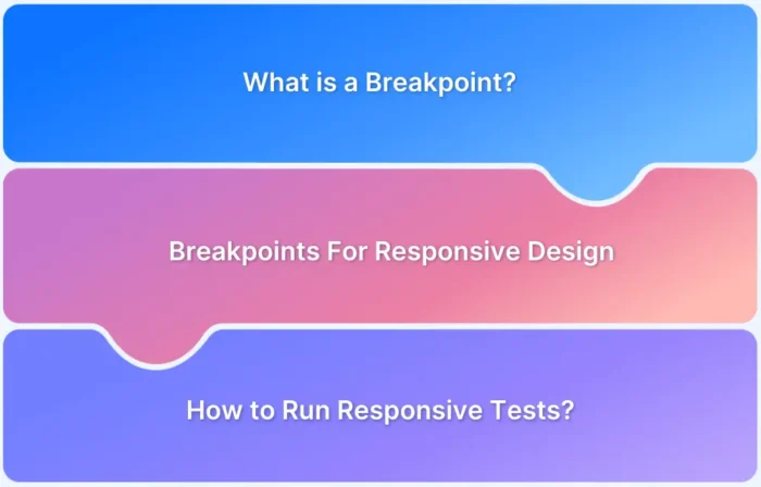
Breakpoints for Responsive Web Design in 2025
Learn about responsive breakpoints, explore their types, discover common breakpoint values, and understand how to test them across screen sizes.
Learn More -
How to Request a Desktop Site on the iPhone [2026]
Learn how to request desktop websites on iPhone across Safari, Chrome, Firefox, and Edge with quick troubleshooting tips.
Learn More -
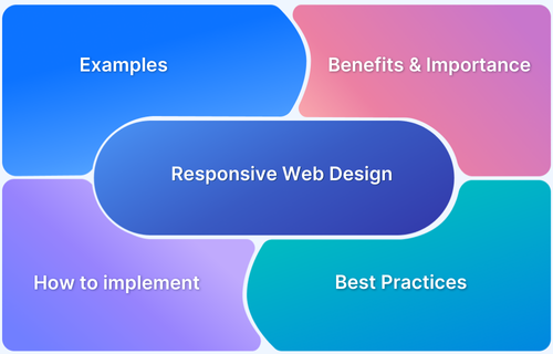
Responsive Web Design: What is it and How to Use it?
Learn everything about responsive web design and why it is important for websites, along with examples and best practices.
Learn More -
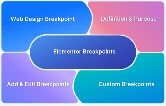
What are Elementor Breakpoints
Learn what breakpoints are in Elementor, how they work, why they're important, how to use them effectively, and what's new in breakpoints in Elementor.
Learn More -
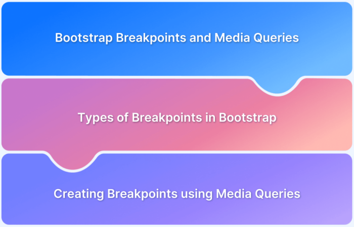
Bootstrap Breakpoints and Media Queries
Learn about Bootstrap breakpoints and media queries, when to use each, and how to test them to create a fully responsive website.
Learn More -
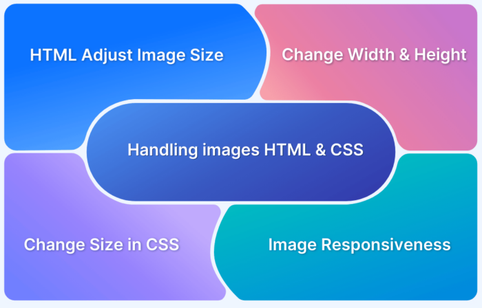
Handling Images in HTML and CSS: Everything you need to know
Learn how to handle images in HTML and CSS with best practices, responsive techniques, optimization tips, and styling methods for seamless web design.
Learn More -
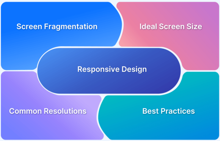
What is the Ideal Screen Size for Responsive Design?
Find out ideal screen sizes & common screen resolutions in 2025 to test your responsive web design along with the best practices.
Learn More -
How to Align an Image in Centre in HTML and CSS
Learn simple and effective ways to center images using HTML and CSS, including Flexbox, Grid, and inline styles, for a clean, responsive layout.
Learn More

