Center-aligning images ensures a clean, consistent layout across devices, enhancing visual appeal. It creates a balanced, professional look that improves user engagement and perception
In this article, you will understand how to align an image in the centre using HTML and CSS, the most efficient ways, and what not to do for an effective web project.
How to Center an Image in HTML and CSS
An image is inserted in the HTML document using the <img> tag, which also takes several attributes. However, the <img> tag is an inline element, that is, it is displayed with the flow of elements and allows other elements to appear on the same line.
Considering this <img> tag property, there are several ways to center an image in HTML and CSS.
The syntax for the image tag is as follows.
<img src="image.jpg" alt="Description of the image">
Applying inline styling to the image requires attributes such as ‘style’. Here is a brief overview of a few methods for centering an image.
Steps to Center Align an Image in HTML and CSS
- Inline Style: Use text-align: center in the image’s container.
- Block Element: Set display: block and margin: 0 auto on the image.
- CSS text-align: Apply text-align: center to the parent container.
- Flexbox: Use justify-content and align-items to center both ways.
- CSS Grid: Use place-items: center for horizontal and vertical centering.
Steps to Align an Image in the Center in HTML
Centre aligning the images makes the webpage more symmetrical and aesthetically pleasing. Here are a few steps to align an image in the centre in HTML.
Using the <style> attribute
The style attribute is used when you want to apply inline styles to the elements instead of using a separate CSS file. In this approach, the styling for the element is applied in the HTML file.
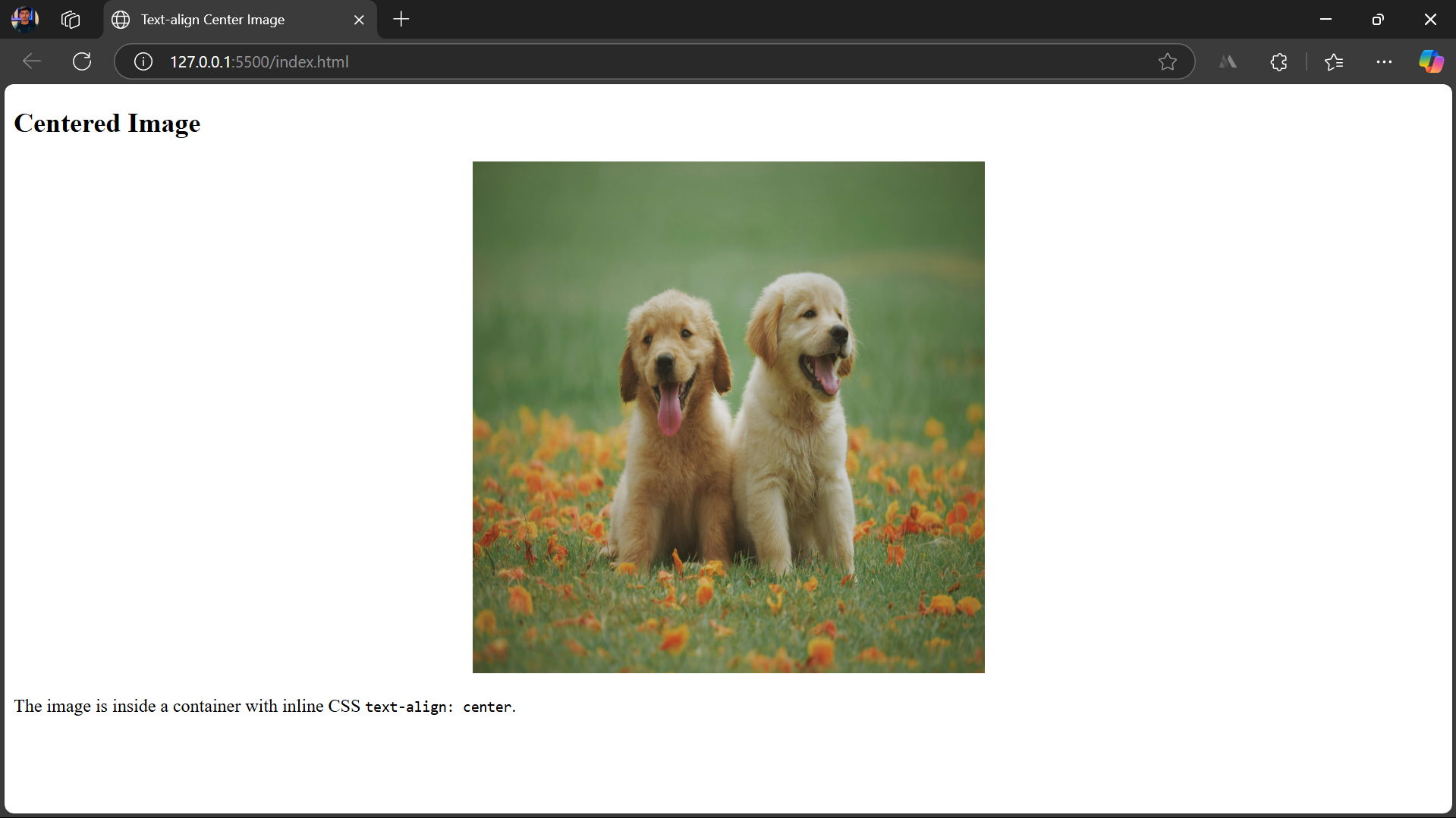
Here’s an example of using the <style> attribute to center-align the image.
<body>

  <h2>Centered Image </h2>

  <div style="text-align: center;">

    <img src="/dog.jpg" alt="Centered Image" width="450px" height="450px">

  </div>

  <p>The image is inside a container with inline CSS <code>text-align: center</code>.</p>

</body>
Specifying the <img> element as a block-level element
By default, the <img> element is an inline element, which floats around with the surrounding text. Therefore, it does not get horizontally centred directly.
However, after converting it to a block-level element, the margin provides equal spaces on both sides.
To convert the element to a block-level element, display: block;.
Using margin: 0 auto; the top & bottom margins are 0, left & right margins automatically center the image.
Html
<body>

  <h2>Centered Image Example</h2>

  <img src="./dog.jpg" alt="Sample Image">

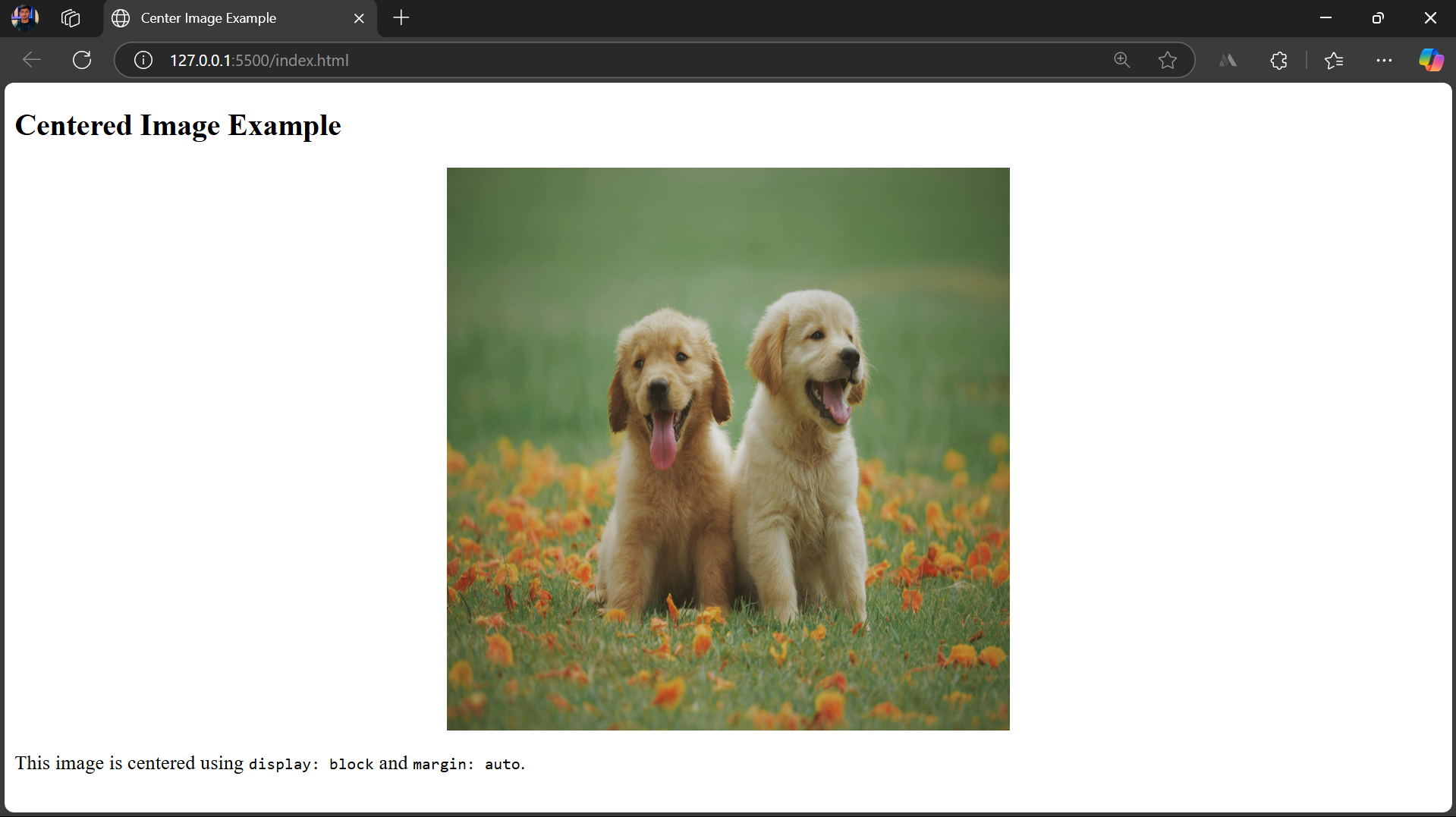
  <p>This image is centered using <code>display: block</code> and <code>margin: auto</code>.</p>

</body>
Css
img{

    display: block;

    margin: 0 auto;

}
Output Image
Also Read: Best Practices for Responsive Web Design
Steps to Align an Image in the Center in HTML using CSS
Here are a few more steps to align an image in the centre in HTML using CSS rules. These steps include aligning the images horizontally and vertically in the centre.
Horizontally Center an Image using CSS
A horizontally centred image in the webpage has even spaces on the left and right sides. The image is centred along the left-to-right axis, so it doesn’t stick to the left side by default.
Using the text-align Property
The text-align property is used on the container element of the image, which allows all the inline elements inside that container to be centered.
Moreover, if you have converted your image to a block-level element, the text-align CSS property no longer works.
Html
<body>

  <h2>Centered Image </h2>

  <div>

    <img src="./dog.jpg" alt="Sample Image">

  </div>

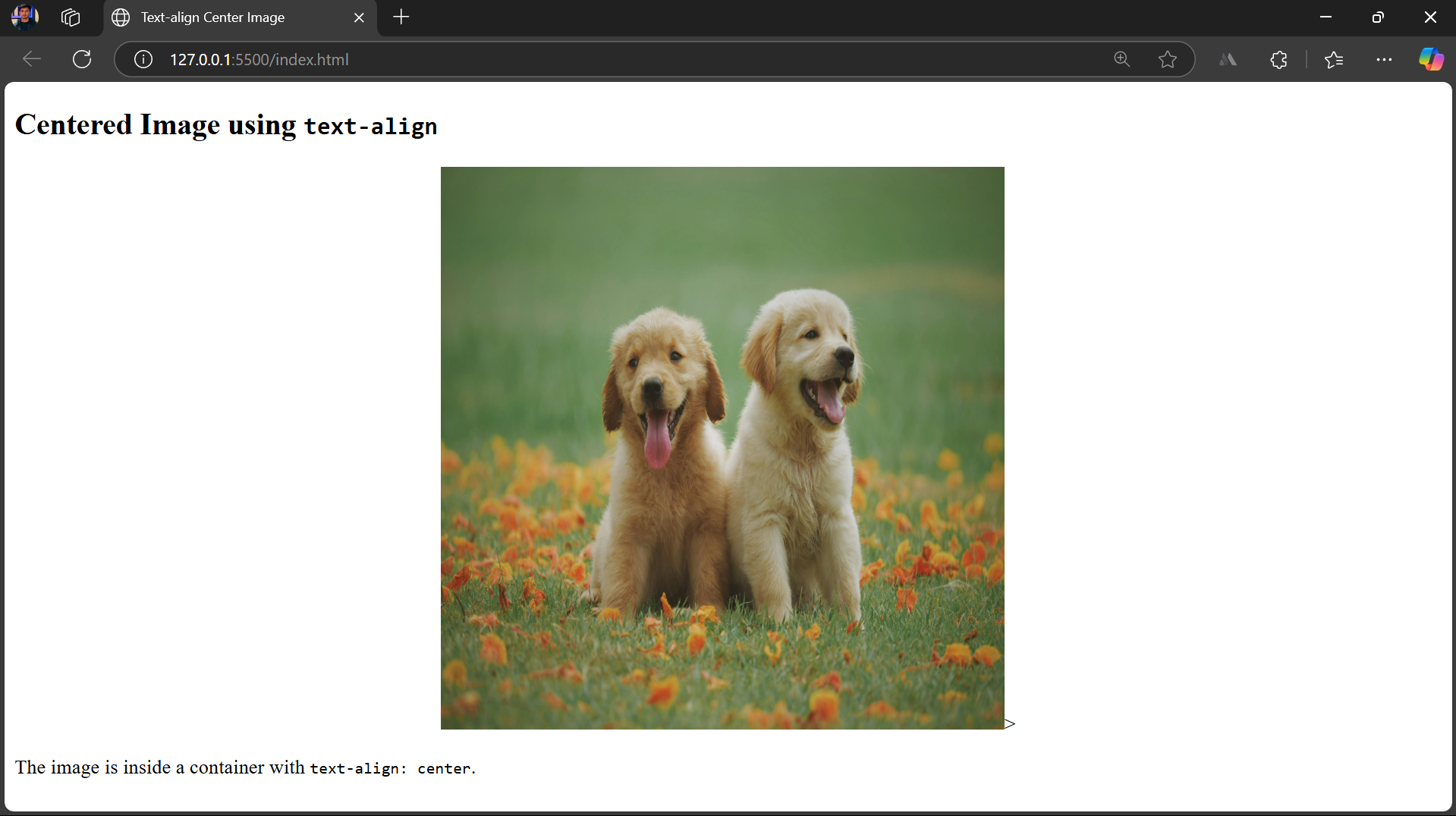
  <p>The image is inside a container with <code>text-align: center</code>.</p>

</body>
Css
div{

    text-align: center;

}
Output Image
Vertically Center an Image using CSS Flexbox
Flexbox is a layout technique to align elements in a row or column effectively to maintain responsiveness.
However, Flexbox is a one-dimensional layout system and can only work in either row or column at a time.
Here’s how to control vertical and horizontal alignment using the following attributes.
- justify-content: controls horizontal alignment
- align-items: controls vertical alignment
Html
<body>

  <h2>Vertically & Horizontally Centered Image Using Flexbox</h2>

  <div class="flex-container">

    <img src="./dog.jpg" alt="Sample Image">

  </div>

</body>
Css
    .flex-container {

      display: flex;

      justify-content: center; /* Horizontal center */

      align-items: center;     /* Vertical center */

      height: 100vh;           /* Full viewport height */

      border: 2px dashed #ccc; }
Output Image
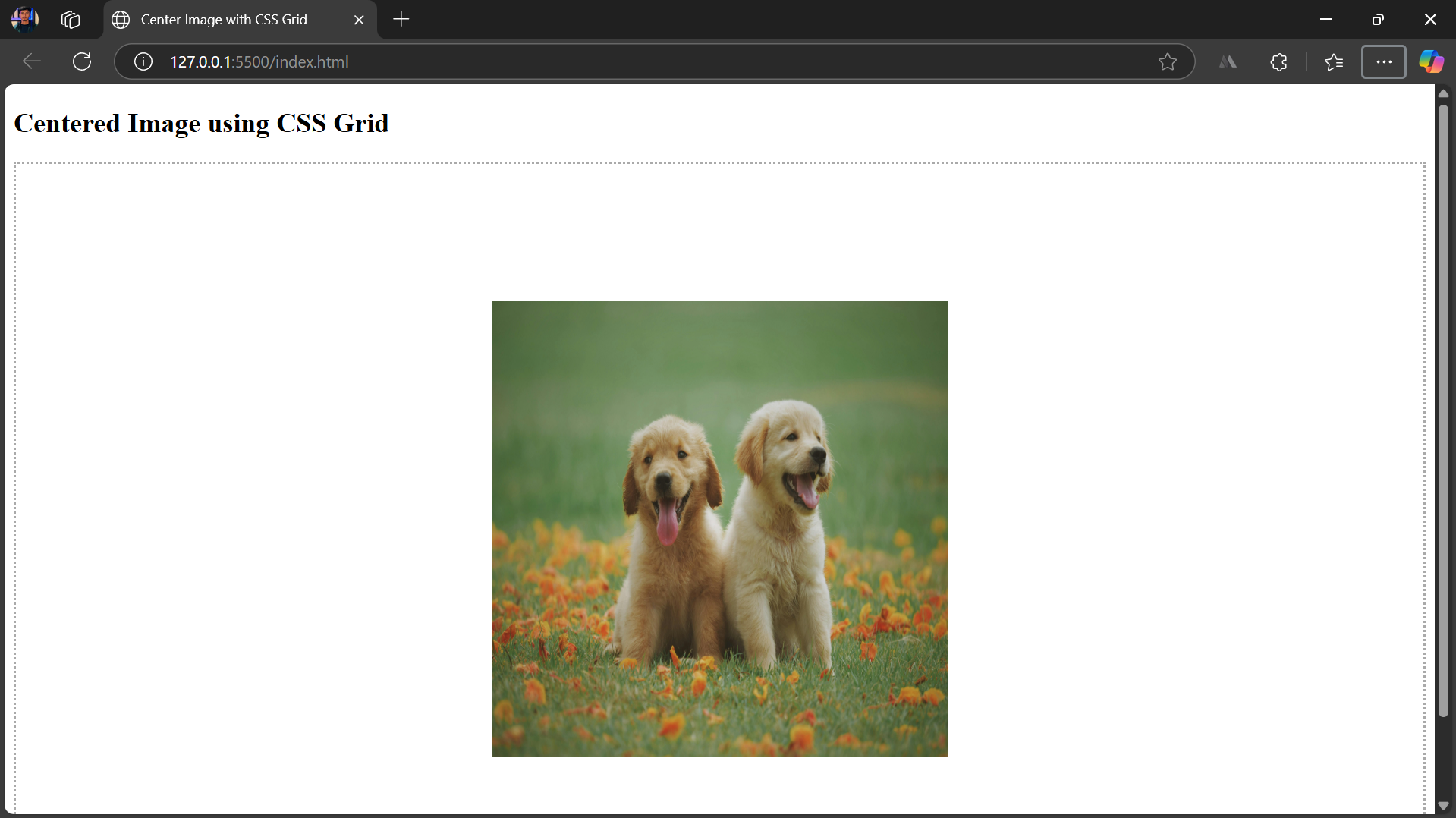
Center an Image Horizontally & Vertically using CSS Grid Layout
CSS Grid is a layout model in CSS that allows you to align images into rows and columns easily.
CSS Grid is a two-dimensional model, which means it can simultaneously work along rows and columns.
display: grid creates a grid container.
place-items: center aligns items both horizontally and vertically.
HTML
<body>

  <h2>Centered Image using CSS Grid</h2>

  <div class="grid-container">

    <img src="./dog.jpg" alt="Sample Image">

  </div>

</body>
CSS
    .grid-container {

      display: grid;

      place-items: center;     /* Shortcut for align-items + justify-items */

      height: 100vh;           /* Full screen height */

      border: 2px dotted #aaa;

    }
Output Image
Testing Image Alignment on Real Devices and Browsers
Testing is a crucial step in the development cycle. Proper focused testing helps identify and resolve minor to critical issues before launching the product to the users. This ensures the brand image remains intact and you deliver customer satisfaction.
With BrowserStack Live, you can harness several key benefits:
- Testing in Real User Conditions: Experience your website as users do, ensuring accurate rendering on various devices.
- Accelerated Debugging: Quickly identify and fix issues, saving time during development.
- Enhanced User Experience: Optimize images for fast loading and flawless display across all platforms.
- Seamless Integration: Easily incorporate testing into your existing workflow, maintaining efficiency and productivity.
- Comprehensive Coverage: Access a vast array of real devices and browsers, ensuring your site is robust and universally compatible.
Common Mistakes to Avoid While Aligning Images
Here are a few mistakes one might make while developing; therefore, you should avoid these mistakes while aligning images.
- Avoid using text-align directly on the image; apply it to the image’s container instead.
- Use one layout method at a time. Don’t mix float, flex, grid, or text-align.
- Prefer relative units (em, rem, %, vw, vh) over fixed values for better responsiveness.
- Use display: block or flex to make margin: auto effective.
- Test your layout regularly to catch alignment or responsiveness issues early.
Conclusion
Centering images enhances visual consistency, responsiveness, and overall user experience.
Whether using inline styles, block-level elements with margins, or layout techniques like Flexbox and Grid, choosing the right method ensures a clean, balanced design across devices.
Useful Resources for CSS
Tutorials
- Advanced CSS Tutorial
- Understanding Sibling Selectors in CSS
- Understanding CSS radial-gradient() function
- How to position Text Over an Image using CSS
- How to resize an image using CSS
- How to use CSS rgba() function correctly?
- Handling Images in HTML and CSS: Everything you need to know
- Dynamic Rendering using HTML and CSS
- Why CSS Position Sticky is Not Working
- A complete guide to CSS Media Query
- CSS Subgrid: What is it and Why do you need it
- What are CSS Breakpoints and Media Query Breakpoints
- How to Create Responsive Designs with CSS
- CSS Selectors in Cypress
- CSS Selector in Selenium: Locate Elements with Examples
- CSS Selectors Cheat Sheet (Basic & Advanced)
Differences
- CSS Grid vs Bootstrap: Which one is better for you?
- What is Responsive CSS vs Reactive CSS?
- Xpath Vs CSS Selector: Key Differences
Frameworks
- Top Responsive CSS Frameworks
- Top 7 CSS Frameworks for Developers
- What are CSS Modules and why use them?
Browser Compatibility & Cross-Browser Testing
- Browser compatibility with CSS Gradients
- Browser Compatibility of Cursor Grab & Grabbing in CSS
- How to Create Browser Compatible Smooth Scrolling with CSS and JavaScript
- How to Create Browser Specific CSS Code
- Fixing Browser Compatibility Issues with CSS Opacity & RGBA
- CSS techniques for Improved Cross Browser Compatibility

