A latency throughput graph helps visualize how system responsiveness changes under varying loads.
Overview
What is a Latency Throughput Graph?
It is a performance graph that plots latency against throughput to reveal how efficiently a system operates.
What is the relationship between Latency and Throughput?
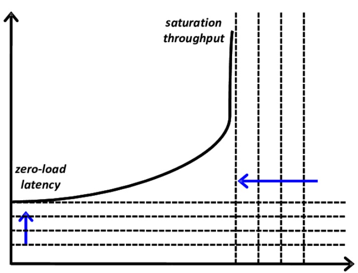
As throughput (requests per second) increases, latency (response time) remains low up to a point, beyond which latency spikes, signaling system strain or saturation.
Importance of a Latency Throughput Graph:
- Identifies the system’s optimal operating range
- Highlights performance bottlenecks under load
- Helps detect the saturation point before failure
- Aids in capacity planning and scaling decisions
- Useful for performance tuning and optimization
This article explains what a latency throughput graph is, how to create and interpret one, and why it’s essential for system performance analysis.
What is Latency?
Latency is the time data travels from the source to the destination and returns with a response. In web systems, it refers to the delay between a user action (like clicking a button) and the system’s response.
It includes processing time, transmission delay, and network travel. Low latency ensures faster responses, while high latency causes noticeable delays.
Latency directly impacts system performance and user experience, especially in web applications, cloud services, and distributed systems. Even minor delays can reduce efficiency and responsiveness.
Must Read: Understanding the Basics of Web Performance
How Does Latency Work?
Latency refers to the time it takes for a data request to travel from the client to the server and back. It includes transmission delay, processing time, and response delivery.
In web applications, latency is measured from when a user action is initiated to when a response is received.
Must Read: Response Time Testing in Software Testing
Factors That Cause High Latency
Here are key factors that cause high latency:
- Network Congestion: Too much traffic slows down data delivery.
- Server Processing Delays: Inefficient backend logic increases response time.
- Geographic Distance: Longer physical distance between user and server causes delays.
- DNS Resolution Time: Slow domain lookups delay initial connections.
- Payload Size: Large files or heavy data transfers take longer to transmit.
- Third-Party Dependencies: External services can introduce delays outside your control.
How to Measure Latency?
Latency can be measured using tools like browser DevTools, performance monitoring software, or load testing frameworks.
Key metrics include Time to First Byte (TTFB), round-trip time (RTT), and response time. Tools like Ping, Apache JMeter, or k6 help capture and analyze latency under different conditions.
What is Throughput?
Throughput is the amount of data or number of requests a system can process in a given time. It reflects how efficiently the system handles load.
For example, in a web server, it refers to successful responses per second. Higher throughput means better capacity to manage increasing user activity without performance loss.
Also Read: What is End User Experience Monitoring?
How Does Throughput Work?
Throughput reflects how many requests or transactions a system can handle in a given time. It increases with load until system capacity is reached, after which it may plateau or drop due to resource constraints.
Also Read: JMeter Constant Throughput Timer : Tutorial
Factors Affecting Throughput
Here are the factors that can effect throughput:
- Network Bandwidth: Limited bandwidth restricts data transfer rates.
- Concurrency Limits: Too many simultaneous requests can throttle processing.
- Server Capacity: CPU, memory, and I/O limitations reduce request handling speed.
- Application Bottlenecks: Poor code, database locks, or unoptimized queries slow.processing.
- Latency Levels: Higher latency can reduce the number of successful transactions per second.
- Protocol Overhead: Excessive handshakes or heavy headers reduce data efficiency.
How to Measure Throughput
Throughput is typically measured in requests per second (RPS) or transactions per second (TPS). Use tools like JMeter, k6, or Gatling to simulate load and track completed operations over time.
Importance of Latency and Throughput
Latency and throughput are interdependent metrics that together define how efficiently a system responds to and handles user requests under load. Both must be optimized to ensure high performance and reliability.
- Affects User Experience: Low latency ensures faster responses; high throughput ensures more users are served simultaneously.
- Impacts System Scalability: Balancing both allows systems to scale effectively without sacrificing performance.
- Guides Performance Tuning: Monitoring both metrics helps identify bottlenecks and optimization opportunities.
- Essential for Real-Time Systems: Applications like video calls or trading platforms require both low latency and high throughput.
- Supports Capacity Planning: Understanding their relationship helps teams set realistic load expectations and resource allocation.
- Prevents Performance Trade-Offs: Optimizing one without considering the other can degrade overall system behavior.
Also Read: Top 20 Performance Testing Tools in 2025
What is a Latency Throughput Graph?
A latency throughput graph visualizes how system response time (latency) changes as load or request rate (throughput) increases.
The X-axis shows throughput (requests per second), and the Y-axis shows latency (response time). Initially, latency remains low as throughput rises, indicating efficient performance under light to moderate load.
When the load increases, the system saturates. At this point, latency rises sharply while throughput plateaus or decreases. This graph shows the system’s peak capacity and the threshold at which delays are unacceptable.
Watch out for these shapes and trends:
- Flat Curve in the Beginning: Low latency when throughput rises.
- Inflection Point: Latency sharply increases at the system’s limit.
- Steep Curve After Saturation: Latency surges, and throughput can grind to a halt or decrease.
- Optimal Zone: The region just before the curve steepens sharply is perfect for stable operation.
System architects and engineers can examine this graph to identify when a system is overloaded and schedule optimizations.
Learn More: Performance Testing Vs Load testing
How to Create a Latency Throughput Graph
Creating a latency throughput graph is all about collecting performance information under various loads and plotting it on a graph to display how your system operates. Here’s how it can be done:
- Set Up a Test Environment: Mirror the production environment for accurate performance insights.
- Choose a Load Testing Tool: Use tools like JMeter, k6, Gatling, or Locust to simulate traffic and capture metrics.
- Define Test Scenarios: Create user flows and gradually ramp up concurrent users or request volume.
- Run the Tests: Execute the test while capturing latency, throughput, and system behavior.
- Collect and Analyse Data: Export metrics and observe how latency changes with increased throughput.
- Visualise the Graph: Plot throughput (X-axis) vs latency (Y-axis) using Excel, Grafana, or Python tools.
- Interpret the Curve: Identify stable zones, saturation points, and signs of performance degradation.
Common Mistakes When Reading Latency Throughput Graphs
Reading lines and curves on a latency throughput graph requires more than that. Misreading data can lead to poor performance decisions and poor user experiences.
Here are common mistakes teams often make.
- Only Considering Throughput: High throughput with rising latency indicates degraded user experience. Always analyze both together.
- Ignoring the Saturation Point: A rise in latency while throughput climbs signals system stress; ignoring it can lead to overload or failure.
- Blind to Workload Models: Real-world usage varies; failing to simulate realistic traffic patterns skews latency and throughput analysis.
- Basing Decisions on Averages Alone: Average latency hides outliers; use percentile metrics like p95 or p99 for accurate performance insights.
- Comparing Unequal Test Environments: Mismatched environments or test setups produce misleading graphs; keep test variables consistent for valid conclusions.
Throughput vs. Latency: Quick Overview
Throughput and latency measure different aspects of system performance but must be evaluated together to get a complete picture. Here’s a quick comparison:
| Aspect | Latency | Throughput |
|---|---|---|
| Definition | Time taken to respond to a request | Number of requests processed per second |
| Focus | Speed of individual operations | Volume of operations handled |
| Lower Value Means | Faster response | Not applicable |
| Higher Value Means | Slower performance | Better capacity |
| Key Metric Example | Response time in milliseconds | Requests per second (RPS) |
| Ideal Scenario | As low as possible | As high as possible without raising latency |
Testing Latency on Real Devices with BrowserStack
Testing on actual devices ensures that your latency measurements will reflect how users will view your application in the real user conditions.
You can thus get an accurate record of your application’s true performance, considering network unpredictability, device capability, and user behavior.
Benefits of Using BrowserStack Automate
- Real Device Cloud: Test latency on actual devices for realistic performance insights.
- Framework Support: Seamlessly integrates with Appium, Espresso, and XCUITest for automated latency testing.
- CI/CD Integration: Easily plug into your pipeline to detect performance issues early.
- Comprehensive Metrics: Access detailed reports on CPU, memory, and network usage impacting latency.
- Scalable Testing: Run parallel tests across multiple devices without manual switching.
- Extensive Coverage: Ensure performance across a wide range of real-world devices and OS versions.
Benefits of using BrowserStack for Latency Testing
Websites often face performance issues under heavy traffic, causing slow load times, crashes, and poor user experiences.
BrowserStack Load Testing is a cloud-based solution to measure, analyze, and optimize website performance with precision and flexibility. It helps simulate both browser and API traffic, monitor overall performance, and identify regressions early to ensure your website remains fast and reliable
Why Choose BrowserStack?
- Simulate Real-World Traffic: Generate thousands of virtual users from multiple geographies without complex infrastructure.
- Unified Insights: View both frontend and backend metrics in one dashboard, quickly spot bottlenecks, and troubleshoot efficiently.
- CI/CD Integration: Run browser and API load tests from your existing scripts, catching performance regressions before production.
Conclusion
Latency and throughput are two critical aspects of system performance. Latency throughput graphs become essential when one wants to visualize these metrics and track performance with increasing demand.
Knowledge of saturation points and the ideal zone would allow tuning the system for optimized performance. They help with data-driven choices for enhancing user experience.
BrowserStack Load Testing reduces setup and maintenance costs, simulates real-world load at scale, and provides unified frontend and backend performance insights for quicker debugging.


